Widget: Media Container
Overview
The media container widget allows designers to group content into a collection and display based on formatting properties. The widget is commonly used to create and manage multi-level menus, containing a combination of textual or graphic content for interactive applications. This widget provides support for advance scripting, thus making this widget perfect for interactive application functions, such as:
- Directories with tiered content
- Media galleries with mixed content
- Navigation menus
Managing Media Container Widget Appearances
Step 1
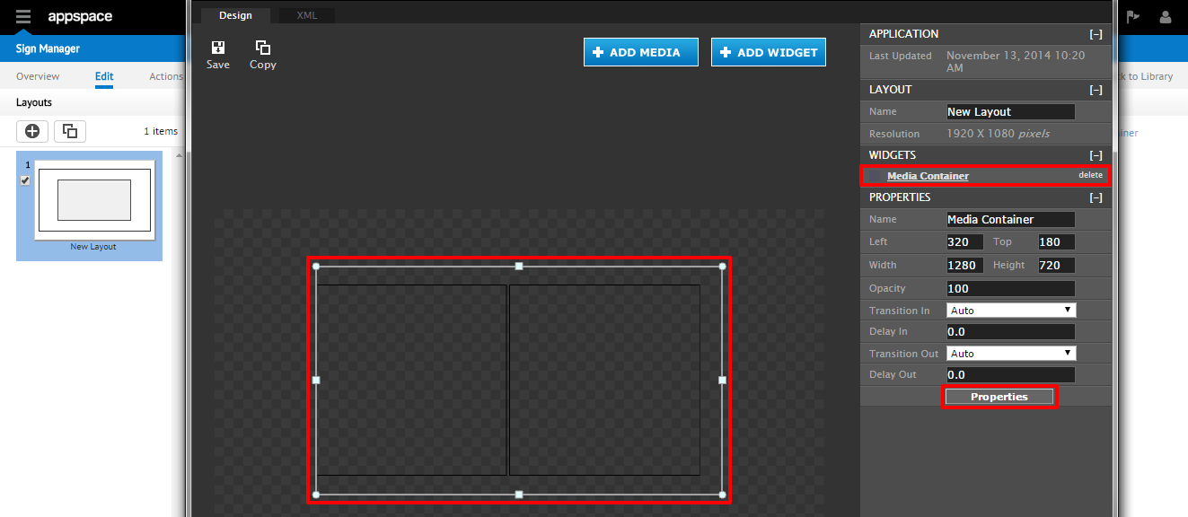
From an existing application, click on the widget from the selected layout or select it from the list of widgets on the right. To edit the widget in the Visual Editor, click on the Properties button at the bottom right. This will bring up the widget properties dialog.
Step 2
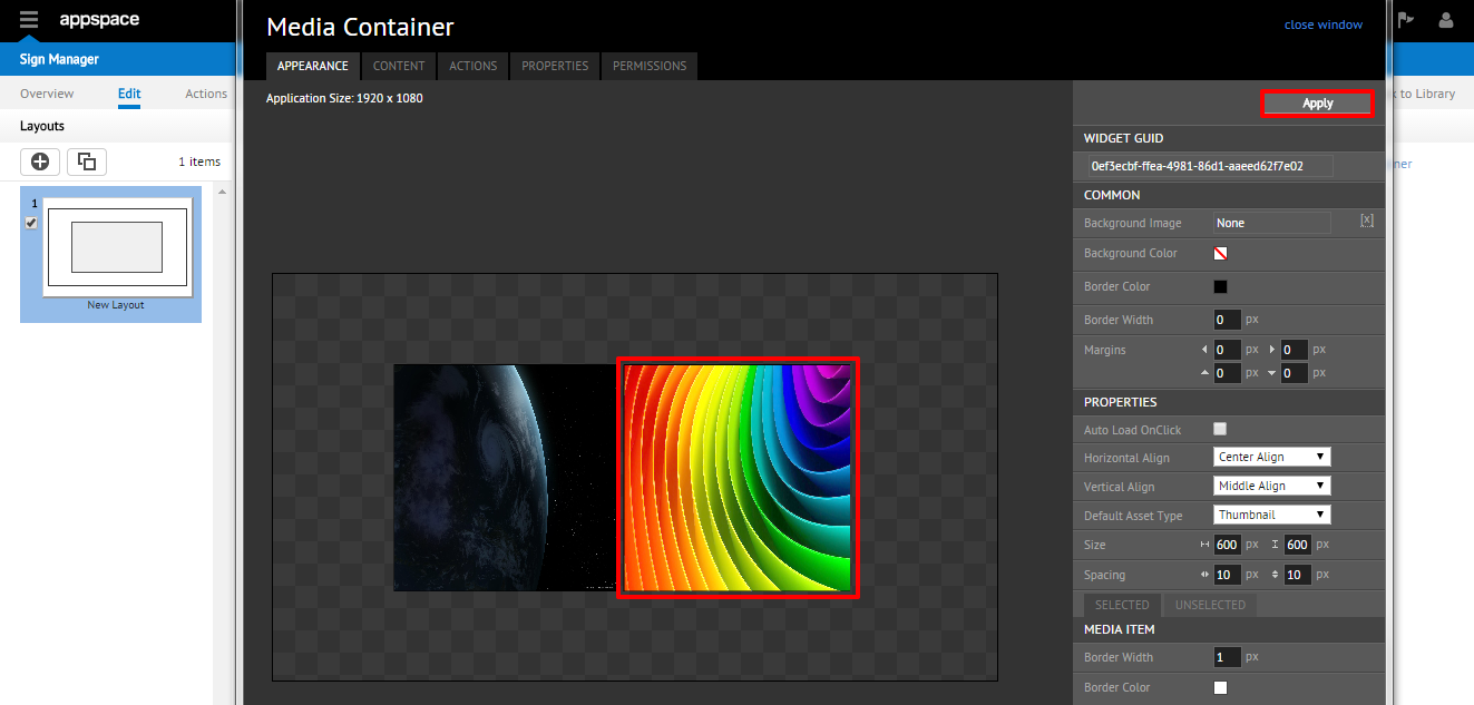
On the APPEARANCE tab, you will be able to view the layout of the widget. The right hand side of the page contains all the editable properties of the widget which includes:
- COMMON: general widget color, width, and margin settings
- PROPERTIES: the various alignment and way that the content will be displayed
- MEDIA ITEM: provides customization of the selected (and unselected) media
Note
Refer to the tables below for additional details of the PROPERTIES and MEDIA ITEM settings.

The PROPERTIES section allows you to alter the behavior of the content being displayed, which includes:
| PROPERTIES | DESCRIPTION |
|---|---|
| Auto Load OnClick | Enable/disable the content to load automatically with a mouse click |
| Horizontal Align | Controls the horizontal alignment of the content (Left, Right, Center) |
| Vertical Align | Controls the vertical alignment of the content (Top, Bottom, Middle) |
| Default Asset Type | Selects the default asset type based on those listed in the Content tab |
| Size | Specifies the dimensions of the widget |
| Spacing | Controls the horizontal and vertical spacing of the content within the widget |
The MEDIA ITEM section utilizes tabs for customizing the look of the SELECTED and UNSELECTED media item using a variety of formatting options.
| Property Name | Description |
|---|---|
| Border Width | Controls the thickness of the border around the media item |
| Border Color | Designates the color of the border around the media item |
| Background Color | Defines the color of the background for the media item |
| Asset Type (only in the SELECTED tab) | Selects the Asset Type for the media item, based on those created in the Content tab |
Managing Media Container Widget Content
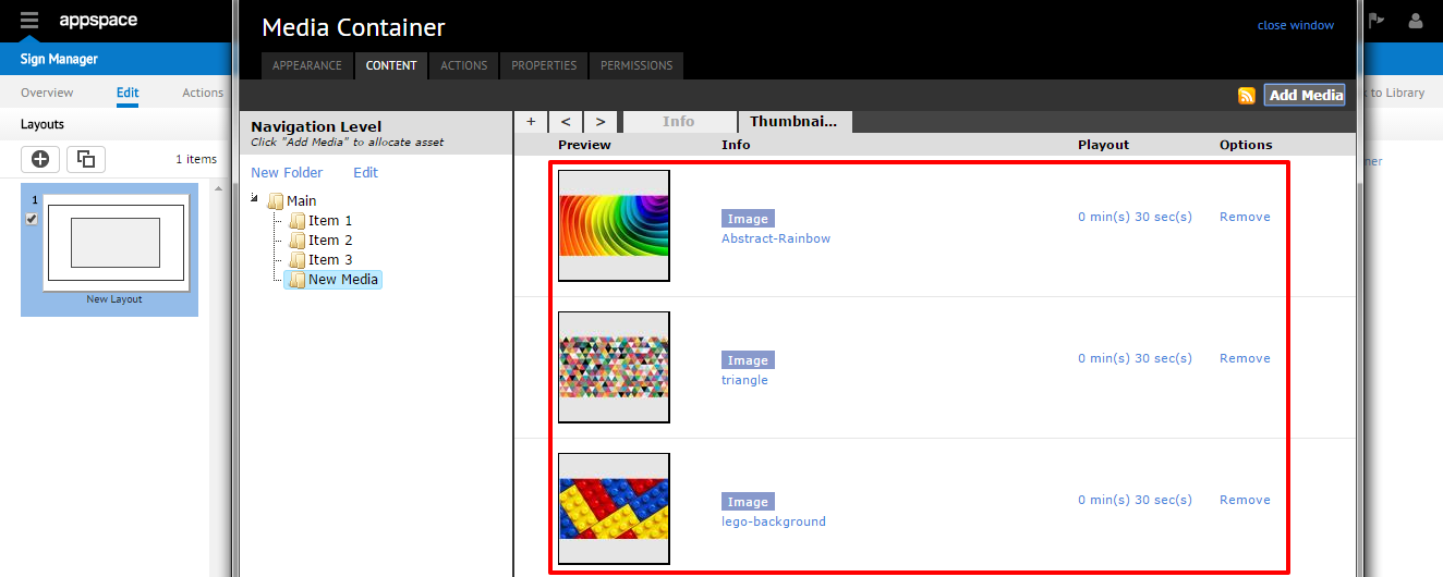
From the widget editing window, select the CONTENT tab, where you will be able to view the list of media items you have added. This tab is divided into two sections: Navigation Level on the left and Asset Type with tab views on the right. Various functions are found on the CONTENT tab:
- RSS Feed viewer icon: click this icon to view the RSS feed of this widget on a web browser
- Add Media: click here to add new media content from your library into the respective folder
- New Folder: select this link to create new subfolders within the hierarchy of folders in Navigation Level
- Edit: select this link to change the title of a selected subfolder in Navigation

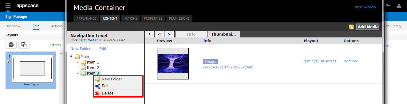
Additional media folder management can be performed within the Navigation Level by right-clicking each folder to bring up additional options that include New Folder, Edit, and Delete.
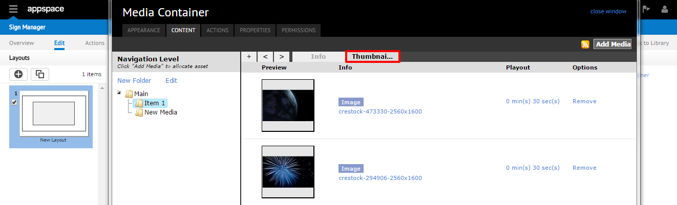
Media Container Widget Asset Types
The function of an Asset Type is to associate content with a particular item. In the Asset Type section of the CONTENT tab, there are two permanent asset tabs (Info and Thumbnail) situated on top of the section, along with any other asset tabs that you have created.
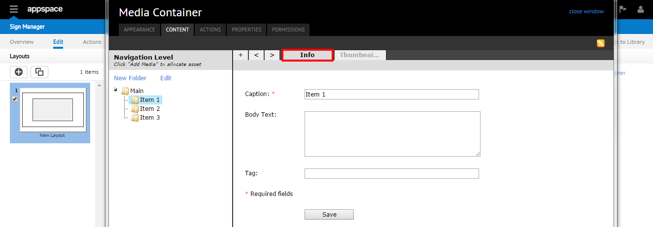
The Info asset tab contains information on the folder you have created in Navigation Level and has some editable fields.
Note
Changing the text in the Caption field will also change the corresponding folder name in the Navigation Level section.
The Thumbnail asset tab displays a thumbnail view of the content in the widget layout for the currently selected folder.
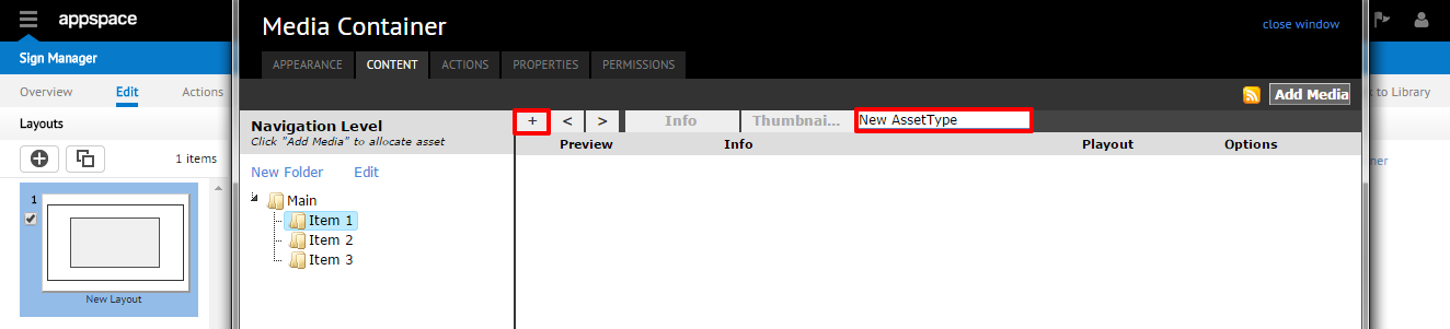
You are also able to add new asset tabs next to the Thumbnail tab by clicking the + sign to the far left of the tabs and typing the name of the new tab (or double-click to rename/edit the name of the new asset tab)
Adding Media Container Widget Assets
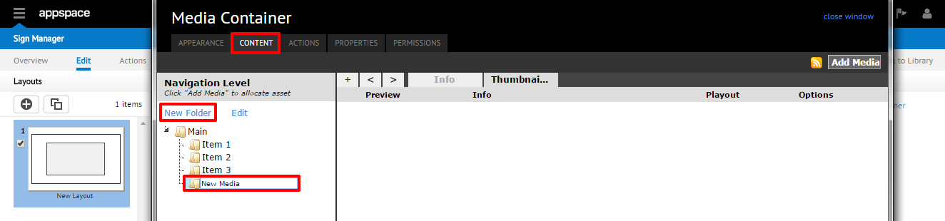
Step 1
From the widget editing window, select the CONTENT tab, where you will be able to view the list of media items you have added. Create a new folder by either clicking the New Folder link or by right-clicking on the Main folder and selecting New Folder. Rename the new folder created as desired.
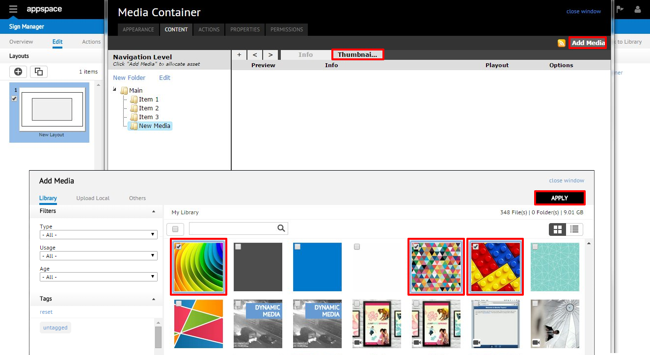
Step 2
Click on the Thumbnail asset tab and click the Add Media button. The Add Media window should appear and allow you to select the desired media to be added from the appropriate folder in your content library. When finished selecting the assets to be added, click APPLY.
Step 3
You should be returned to the CONTENT tab of the editing window with the new media item added to the folder.
Step 4
The new item will also be displayed in the APPEARANCE tab of the editing window (you may need to click Apply to refresh the window).
Removing Media Container Widget Assets
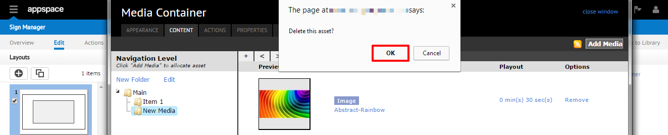
Step 1
From the CONTENT tab, select the folder and asset tab containing the media item to be removed. Click the Remove link under the Options column.

Step 2
You should see a pop-up dialog window confirming deletion of the asset. Click OK to remove this item.
Step 3
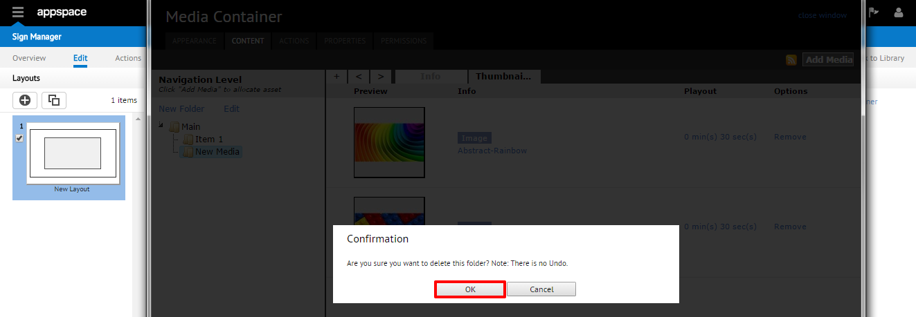
An alternate option of removing an entire asset folder is also available by directly right-clicking the folder and select Delete.

When attempting to remove an entire folder (and media assets within) you will be prompted with a confirmation message. Click OK to delete the whole folder.