Editing Widgets
Overview
Widgets are configured with default properties that determine the appearance and behaviour of content when being displayed or interacted with. Users can modify widget properties within the Edit tab while editing an application or by selecting the widget in the Visual Editor.
Editing a Widget
Step 1
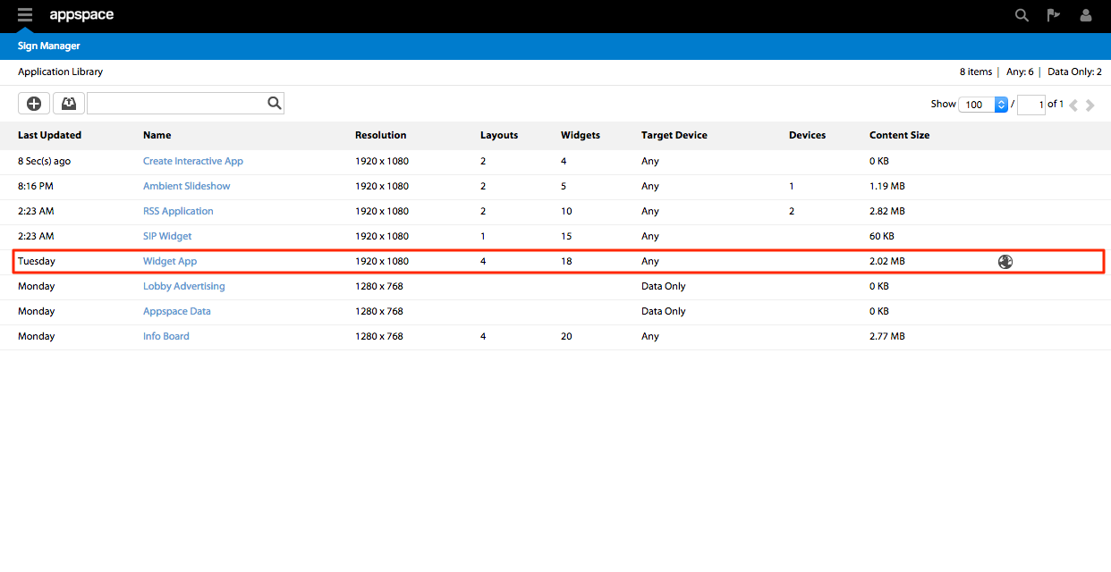
From the Sign Manager extension Application Library select the application you want to edit.
Step 2
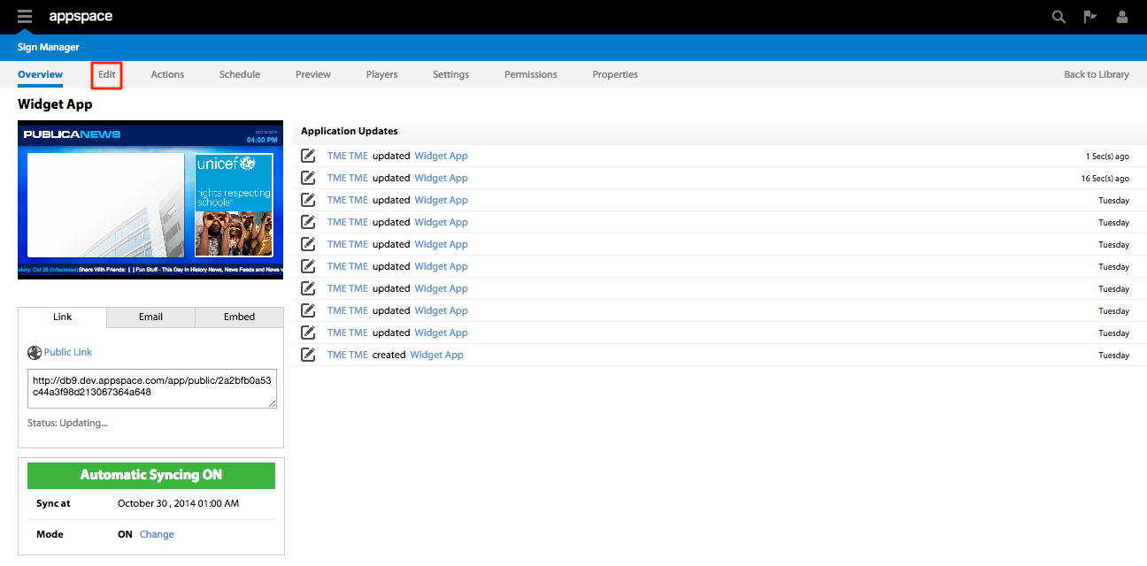
Click on the Edit tab of the application.
Step 3
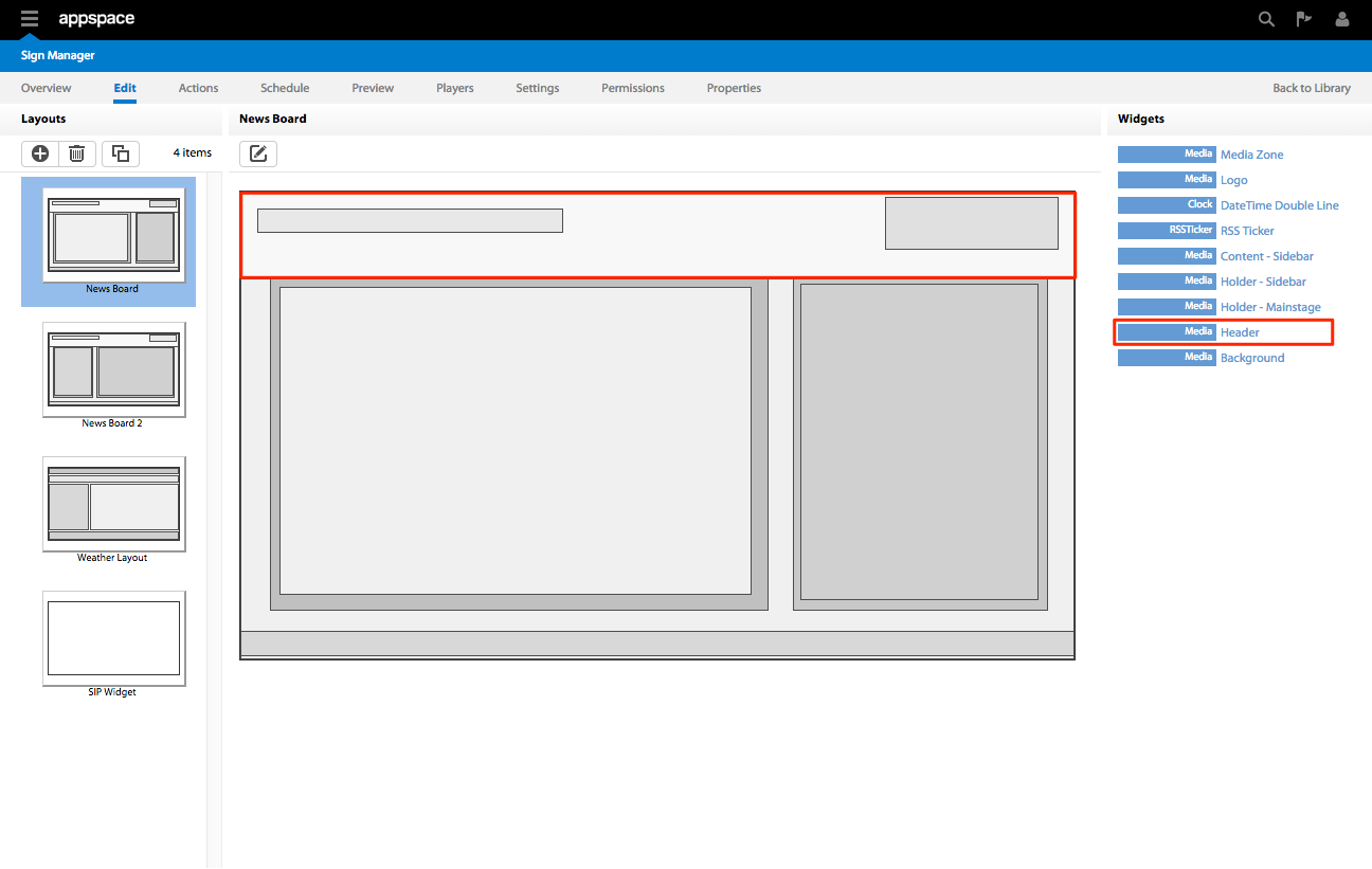
Select the appropriate layout under Layouts and click on the name of the widget under the Widgets column. Alternatively, you can also click on the visual representation of the widget in the Current Layout section. In this case we will be editing the Header which is a Mediazone widget.
Step 4
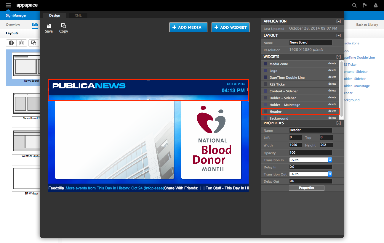
You may alternatively choose to edit the widget in the Visual Editor by clicking on the edit icon under Current Layout and select the the widget that you want to edit in the Visual Editor page.
Step 5
In the Visual Editor window, select the name of the widget in the Widget column or click on the visual representation of the widget in the layout. Click on the Properties button. You will now be able to edit the widget accordingly. When finished, save your changes to the widget by clicking the Apply button.

Widget Editing Tabs
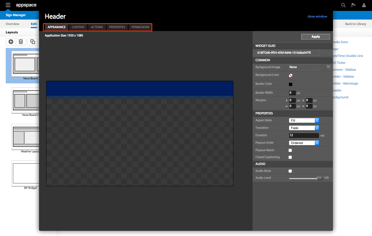
Depending on the type of widget being edited, the following tabs are available:
| Tabs | Description |
|---|---|
| APPEARANCE | Describes the common and widget specific properties that affect its appearance |
| CONTENT | If the widget displays content, the CONTENT tab allows users to manage the content |
| ACTIONS | Allows users to create basic and advanced scripting actions |
| PROPERTIES | Allows users to perform advanced editing to Key-Value pairs within the widget |
| PERMISSIONS | Allows database information to be sent via a provider (e.g. MySQL Server) into the widgets target sheet |
| DATA PROVIDER | Allows Administrators to set per user access permissions for the widget |
The COMMON Section
In the editing window of every widget, there is a COMMON section. This section enables you to assign various parameters surrounding the widget.
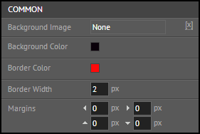
These parameter settings include:
| Properties | Description |
|---|---|
| Background Image | Defines the image to be used as a background to the widget |
| Background Color | Controls the color and the opacity of the background to be used in the widget |
| Border Color | Selects the color of the border around the widget |
| Border Width | Designates the width of the border for the widget |
| Margin | Specifies the spacing of the content from the widget border |
| Visual Effect | Defines the visual effect to be utilized in displaying the widget |