Widget: Table Listing
Overview
A Table Listing widget allows designers to create table listings to display any type of tabular information in a clear, easy-to-read format. This widget can be used to retrieve information from external data sources, allowing for dynamic, flexible usage and the display of up-to-date content.
A Table Listing widget is commonly used for:
- Displaying event timetables and restaurant menus
- Providing the latest updates on currency exchange rates or arrival/departure times at airports
- Sharing of dashboard information like stock indices and sales performance
Additionally, a Table Listing widget allows users to define a query expression to filter the set of data to be displayed. Queries can be executed by statically defining a query on a Table Listing widget or dynamically executed using AppSpace action scripting.
Managing Appearance
Step 1
From an existing application, click on the widget from the selected layout or select it from the list of widgets on the right. To edit the widget in the Visual Editor, click on the Properties button at the bottom right. This will bring up the widget properties dialog.

Step 2
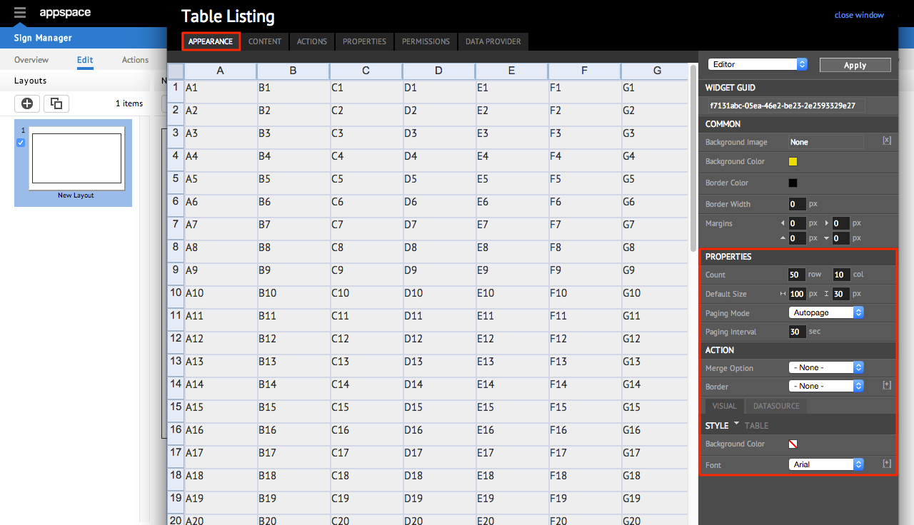
On the APPEARANCE tab, you will be able to view the layout of the widget. The right hand side of the page contains all the editable properties of the widget itself. In this tab, you are able to edit the properties in the COMMON section, as well as specific properties in the PROPERTIES, ACTION and VISUAL / DATASOURCE sections.
Step 3
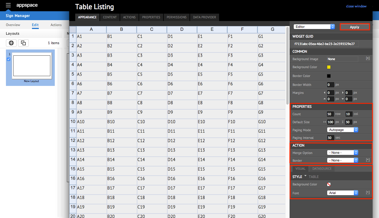
In the PROPERTIES section, you are able to change the way the content is displayed. The ACTION section allows you to merge and unmerge two or more cells via the Merge Option, and designate the border around the table using the Border drop-down menu. The VISUAL / DATASOURCE section enables you to customize the look of the table and also define the datasource settingsMake the changes to the widget accordingly, and click Apply to save your changes.
Note
Refer to the following tables for a description of the properties.
The PROPERTIES section allows you to alter the behaviour of the content being displayed, which includes:
- Count – Determines how many horizontal rows (row) and vertical columns (col) are to be shown in the layout
- Default Size – Controls the horizontal and vertical dimensions of each cell in the table
- Paging Mode – Controls the paging mode of the content (Autopage or None)
- Paging Interval – Specifies the period of time for the table to move to the next page if Autopage is selected as the paging mode
The VISUAL / DATASOURCE section utilizes tabs two tabs for customizing the visual look as well as the datasource settings, respectively.
The VISUAL Tab
For the VISUAL tab in the VISUAL / DATASOURCE section, the customization involves the setting of the BackgroundColor and Font type.
To set the background color for individual cells, select the desired area in the table (you can also select whole rows/columns as well as the entire table). Click on the Background Color box and choose a color from the COLOR PICKER window. Click Apply to save the changes. The same method also applies for the Font setting; simply select the desired area (single cells, whole rows or columns, entire table) and choose the desired font from the drop-down list. Designers can customize each designated area to have a unique font for differentiation of content.
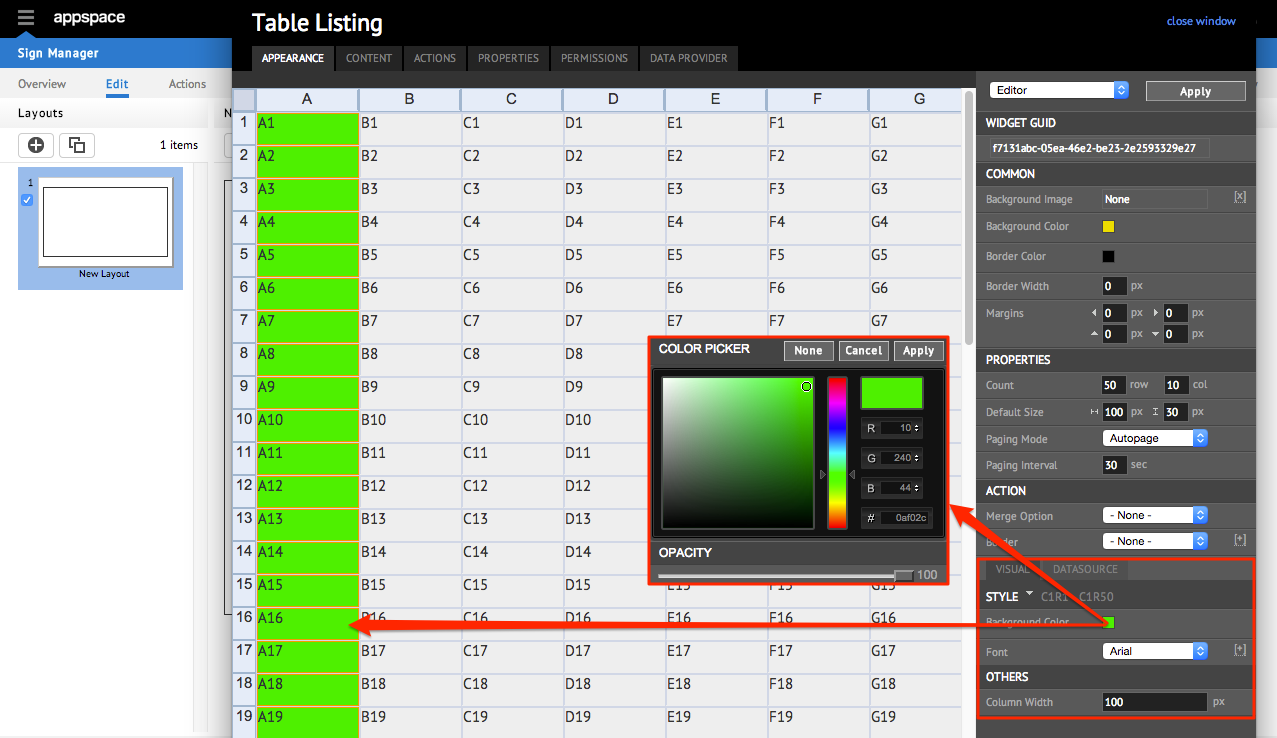
Note
When a whole column is selected (by clicking the alphabet at the top of each column), designers can also set the exact width of the column by entering a pixel value in the Column Width field in the OTHERS section.
The DATASOURCE Tab
Often times, a table listing may contain a large amount of data, making it difficult to quickly find entries that need to be altered or removed. This is where the DATASOURCE tab in the VISUAL / DATASOURCE section comes in; it enables designers to instantly retrieve and display a subset of the information in the table from the CONTENT tab that matches a specific detail by utilizing a Structured Query Language (SQL) query.
From the DATASOURCE tab, the customization involves the setting of the Query Value, as per the following sample. Clicking on the Edit button will result in the Query Builder window being displayed:
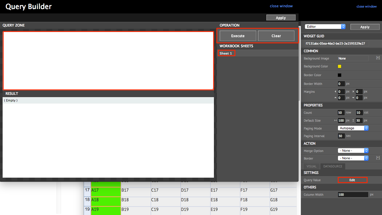
The following table describes the functions of each section in Query Builder:
| Property Name | Type | Description |
|---|---|---|
| QUERY ZONE | Entry field | Receives query input in Structured Query Language (SQL) to retrieve tabular data from the content in WORKBOOK SHEETS |
| RESULT | Entry field | Outputs and displays the results of the SQL query from the QUERY ZONE |
| OPERATION – Execute | Button | Runs the SQL query created in QUERY ZONE and displays the output in RESULT |
| OPERATION – Clear | Button | Clears the SQL query text from the QUERY ZONE |
| WORKBOOK SHEET Sheet 1 | Linked Contact | Provides the source of content to structure SQL queries from. Clicking on the link (Sheet 1) will display the full content of the tabular data in RESULT |
Managing Content
Step 1
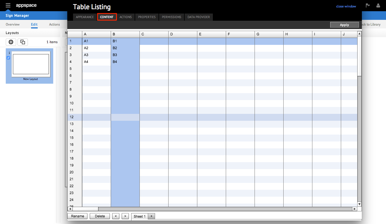
From the widget editing window, select the CONTENT tab, where you will be able to view the list of media items you have added.
Step 2
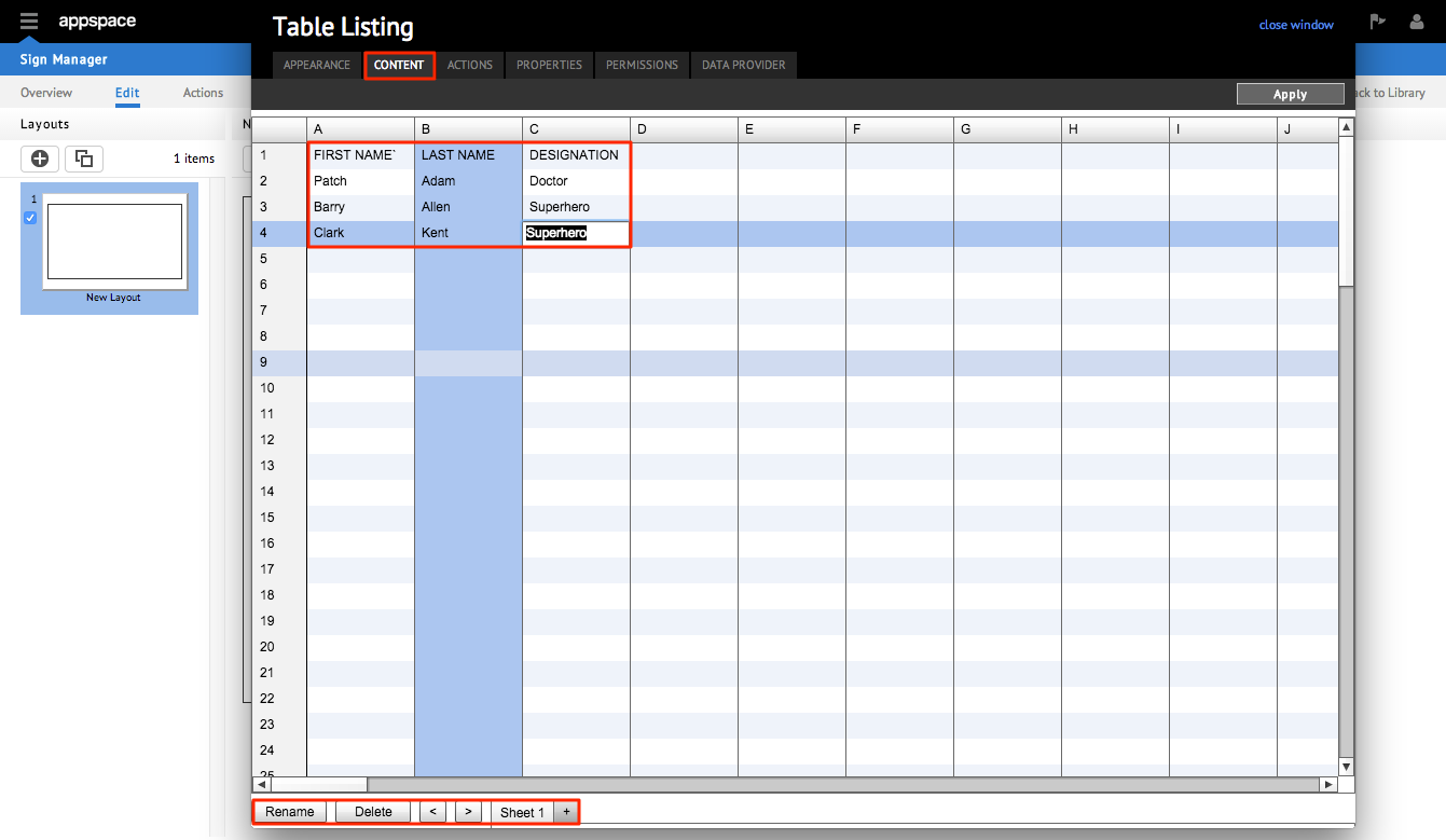
The tabular data (if available) is arranged on the grid of columns and rows. Select the appropriate cell to add, edit and remove content. At the bottom of the window, there is a row of buttons, followed by a set of tabs (the default name for the first tab is Sheet 1).
Step 3
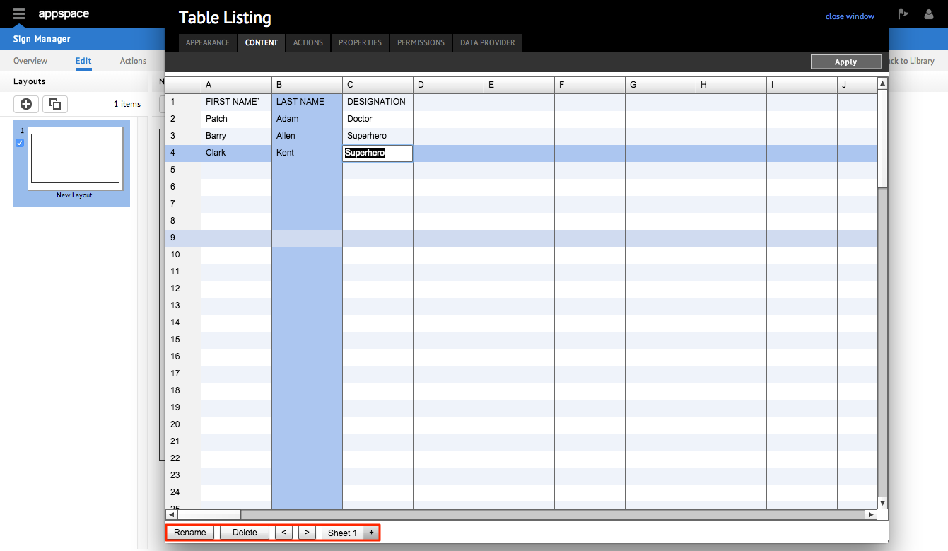
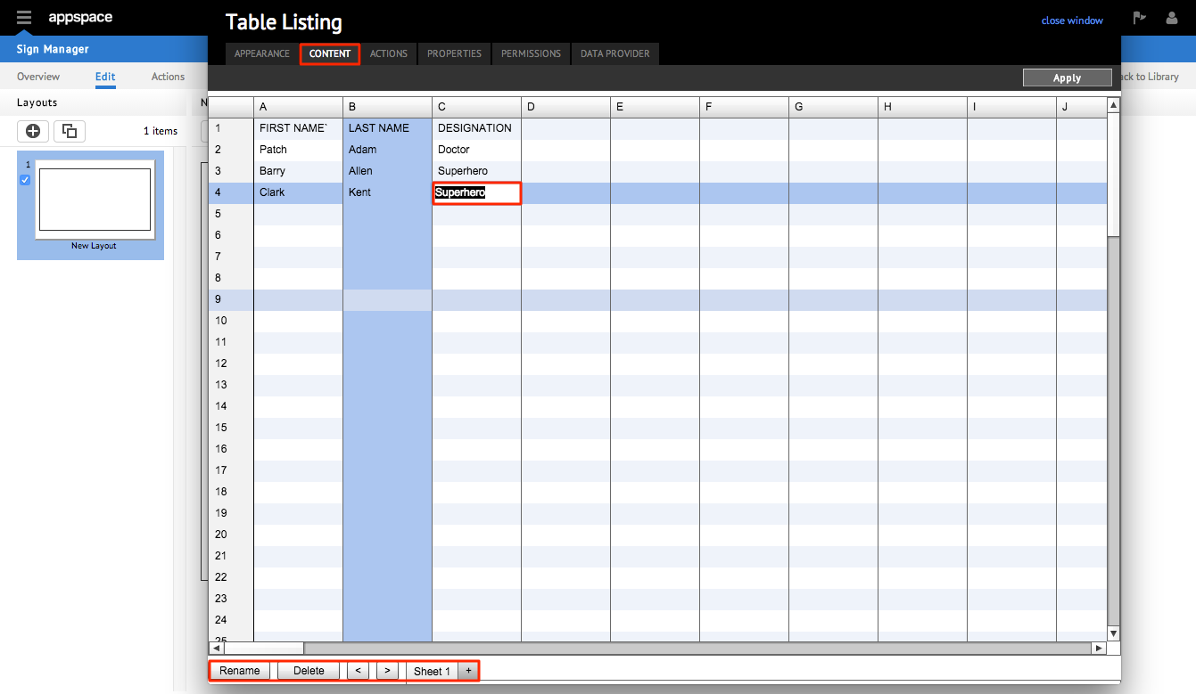
Click the Rename button to change the name of a selected workbook from the default name, or the Delete button to remove the selected workbook from the tabbed list. Use the [<] [>] buttons to cycle left and right, respectively, through the list of workbooks in the tabbed list. This is especially useful when there are too many workbooks in the tabs to fit in the window. Click the [+] button next to the first workbook to add additional tabular data in new workbooks. Click Apply to save any changes you have made.
Adding Content
Adding content to the Table Listing widget is a similar experience to using the Microsoft Excel spreadsheet application. Follow these steps to add content to the widgets’ workbook.
Step 1
From the CONTENT tab, click on any cell in the data sheet. Enter your data accordingly and press Enter on the keyboard to go to the next cell below.
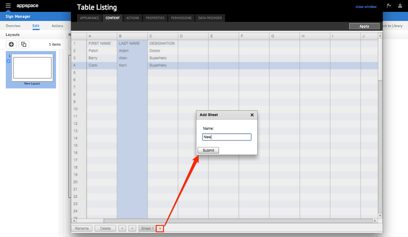
Step 2
To add additional data in new workbooks, click the [+] button next to the first workbook, and name the workbook according to your preference. Click Submit. The new, blank workbook will be displayed next to the current one on the tabbed list.
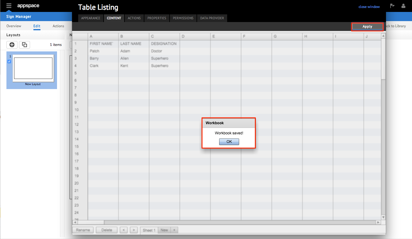
Step 3
Click Apply at the top right corner of the page to save the changes and click OK in the Workbook dialog box. Once you have completed all the changes, click close window and the system will return to the main application page.
Editing Content
Editing content is similar to adding content to the Table Listing widget. Follow these steps to edit existing content in the widgets’ workbook.
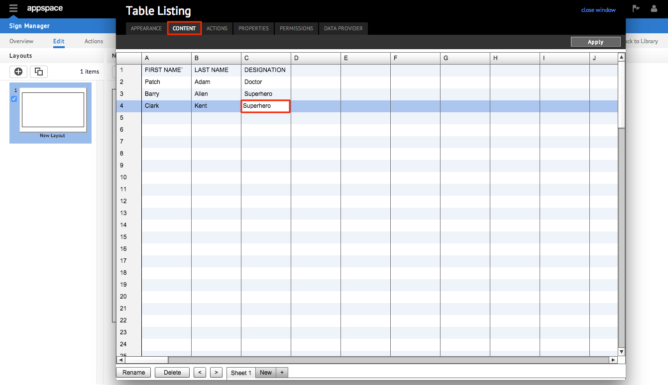
Step 1A
From the CONTENT tab, click on the box containing the data to be edited in the workbook. Make the changes to the data and press Enter on the keyboard or click on any other area in the table to confirm the changes.

Step 1B
You can also edit the name of a workbook. Just select the appropriate tab and click Rename. Click the Submit button to confirm the name change.

Step 2
Click Apply at the top right corner of the page to save the changes. Click OK in the Workbook dialog box. Once you have completed all the changes, click close window and the system will return to the main application page.

Removing Content
Step 1A
From the CONTENT tab, click on the box containing the data to be removed in the workbook. Press Backspace or Delete on the keyboard.
Step 1B
You can also delete an entire workbook. Select the appropriate tab and click Delete. Click Yes in the Delete Sheet dialog box.

Step 2
Click Apply at the top right corner of the page to save the changes. Click OK in the Workbook dialog box. Once you have completed all the changes, click close window and the system will return to the main application page.

Adding External Content
Step 1
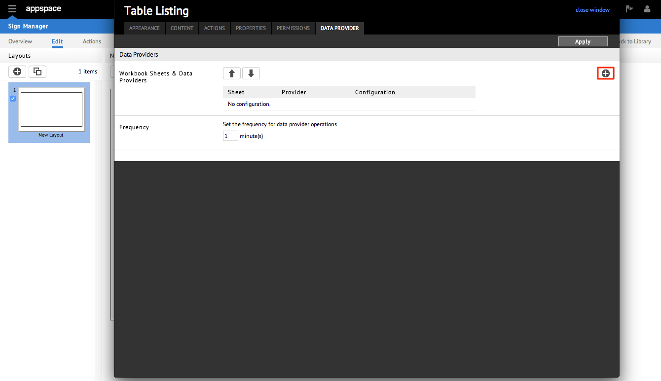
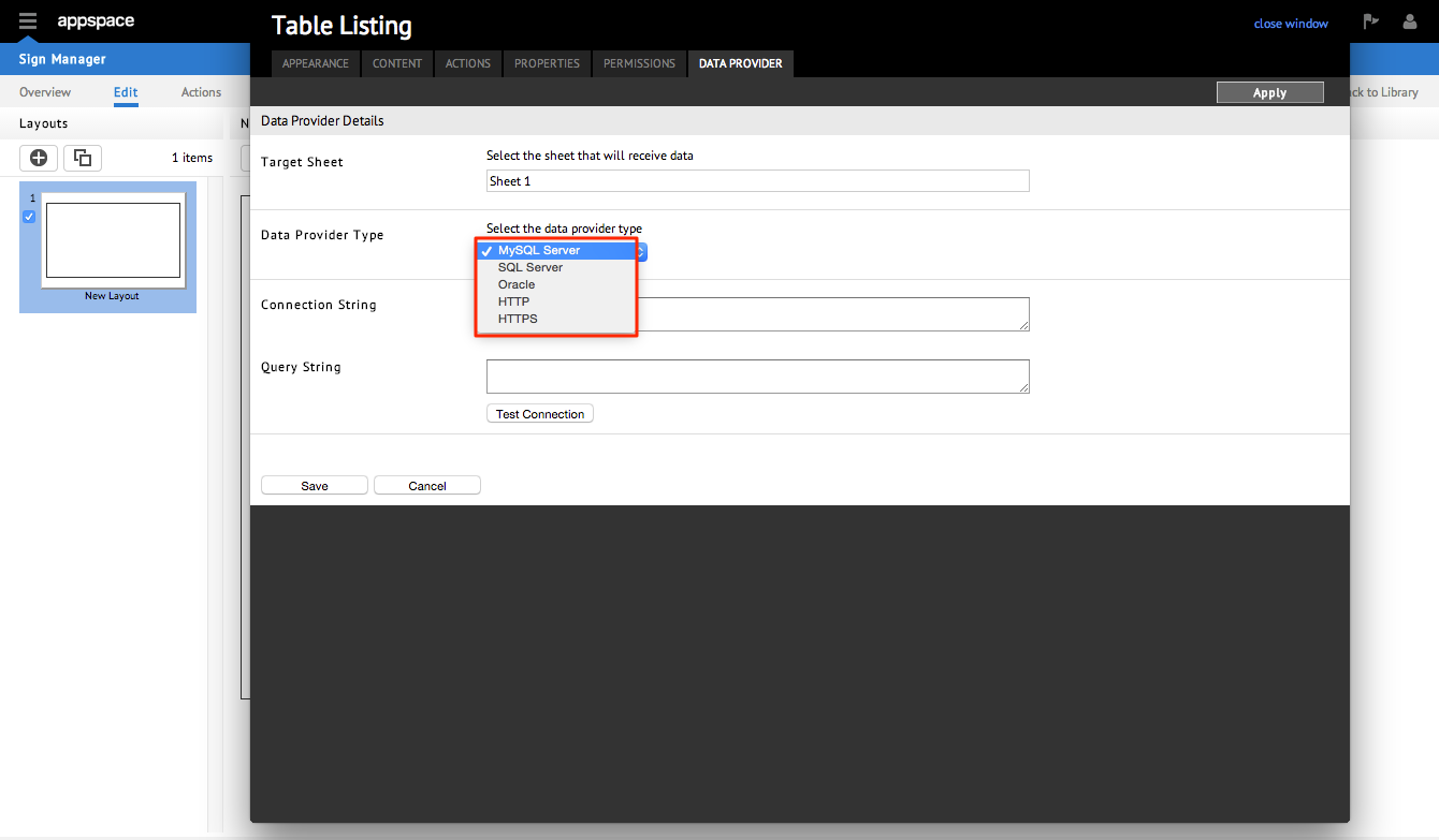
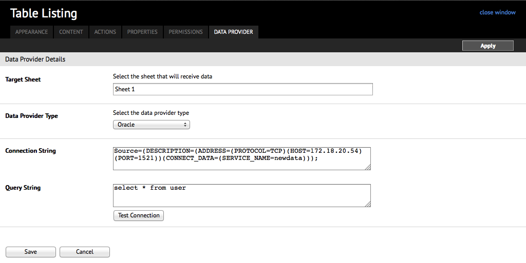
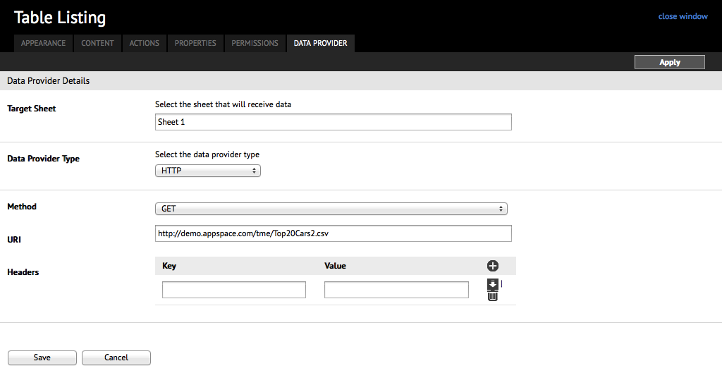
In the DATA PROVIDER tab, click the Add ‘+’ button.
Step 2
Select the data provider type from the dropdown list.
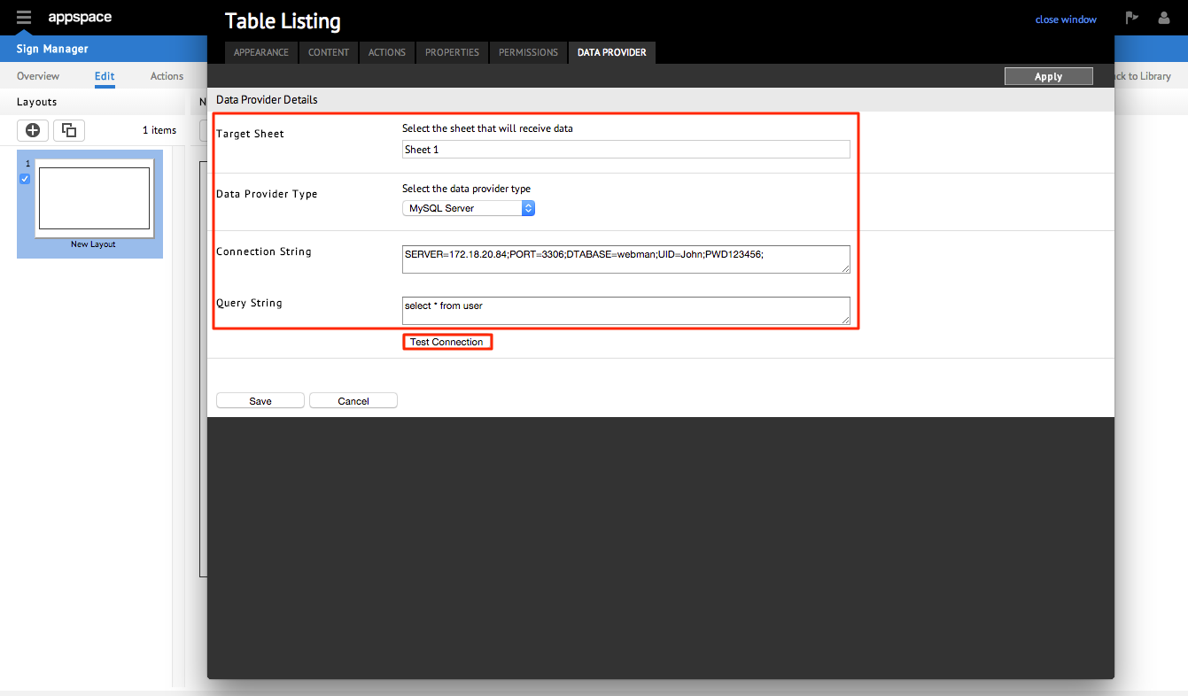
Step 3
Key in the Target Sheet, Connection String and Query String information. Click Test Connection.
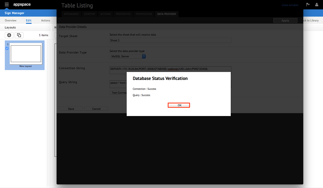
Step 4
A Database Status Verification pop-up will be prompted. Click OK and click Save in the Data Provider Details.
Step 5
The simplified information for the workbook sheets and data providers will be displayed in the Data Provider tab. The sheet details can be either edited by clicking the Pencil sign or deleted by clicking the Trash Can sign. You can set the frequency for data provider operations in minutes and click Apply to save.

Additional Examples
Example 1
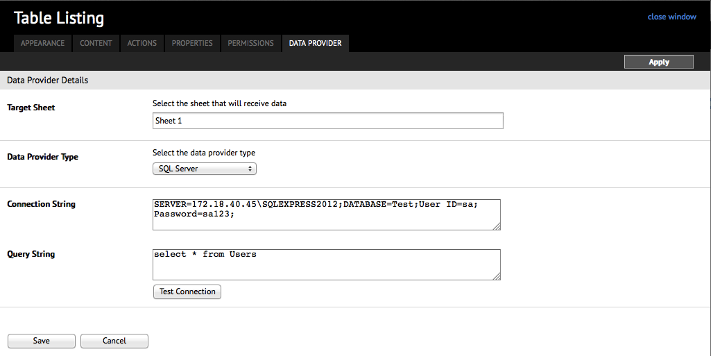
SQL Server
Example 2
Oracle
Note
In order to use or connect to an Oracle database you will need to install Oracle Data Provider for .Net (ODP.NET) x86.
Example 3
HTTP
Widget Query Expressions
For query expressions, the Table Listing widget supports the main reserved keywords SELECT, FROM, WHERE, AND,and OR, in addition to the following types of queries:
- Select Queries – selects a collection of data columns from a single table listing sheet (table)
- Joining Tables – selects a collection of data columns from multiple table listing sheets (tables)
- Conditional Queries – selects a collection of data columns from single or multiple table listing sheets based on a literal value or comparison (equality) value
Select Queries
The syntax for the select query is as follows:
SELECT {table name}.{column index} FROM {table name}
For table names that have a white space, it is required to enclose it in square brackets. For example if the table name is car models, a select query for all data would be:
SELECT [car models].* FROM [car models]
If the table name has no white space, simply use the table name. For example, if the table name is owner, a select query for all data would be:
SELECT owner.* FROM owner
To select a specific column in a table, use the prefix c followed by the column index. For example to select column 2 in a table called collection, a select query would be:
SELECT collection.c2 FROM collection
Joining Tables
Joining tables allows queries to be built to select columns from multiple tables in the Table Listing widget. The general syntax is as follows:
SELECT {table1}.{column}, {table2}.{column},…{tableN}.{column} FROM {table1},{table2},…{tableN}
For example, to select column 1 from table 1 called car models and column 2 from table 2 called owner, a join query would be:
SELECT [car models].c1, owner.c2 FROM [car models], owner
Conditional Queries
User can use the WHERE clause to do comparison of tables or literal values when selecting a data set. For example, to select car models that match the literal Toyota a query would be:
SELECT [car models].* FROM [car models] WHERE [car models].c1 = “Toyota”
To compare column values when selecting a sample query would be:
SELECT [car models].*, owner.* FROM [car models],owner WHERE [car models].c1 = owner.c2
All comparisons are string based comparisons (case sensitive). Comparisons only support the equality (=) function.
Boolean Expressions
Expressions can also be further detailed by including Boolean expressions in the WHERE clause. An example is as follows:
SELECT [car models].c2, company.c2, origin.c2 WHERE [car models].c1 = company.c1 AND company.c3 = origin.c1
Scripting Tips
The Table Listing widget can perform action scripts to extract specific information based on tabular data retrieved from the workbooks or from the external data source.
The most common script events are:
Name: ItemClick/Touch
Target: Plain Text
Parameters: $event.value
This event is fired when a user clicks an item in the table data. Typically a designer can catch this event and launch the associated content in another zone.
Name: RowClick/Touch
Target: Plain Text
Parameters: $event.value.c<column number>
This event is fired when a user clicks an item in the table data, which will select the whole row in the table. Typically a designer can catch this event and launch the associated content in another zone.
The most common script actions are:
Name: Set Text
Target: Plain Text
Parameters: $event.value.c<column number>
This method is used to load the content of the selected item in the table listing into another zone (e.g. Plain Text widget).
Name: Set Text
Target: Plain Text
Parameters: $event.value
This method is used to load the content of the whole row for the selected item in the table listing into another zone (e.g. Plain Text widget).
Name: NextPage
Target: Table Listing
Parameters: NONE
This method is used to load the content of the next set of items in the table listing when an action is fired from another widget (e.g. Media zone).