Introduction to cards
A card is a new way to remove the unnecessary overhead when creating content. They are the simple and fast way to create content that can include text, images or data visualization. Cards automatically work across any device and orientation and don’t require a design team or system integration skills. Use cases include corporate announcements, sales dashboards, customer satisfaction ratings, event promotion and social media feeds, plus many more.
You can use card templates to create your own cards in the Library, and then add them to your sign or channel exactly the same way you would an image, video or any other media type. Card templates currently include:
- Announcement: A multi-purpose card template that can be used for corporate messaging such as product updates, event promotion, employee birthdays and much more.
- Data Table: Import or manually enter your tabular data and stylize it with this Card.
- Donut Chart: Import or manually enter your data and stylize it into a donut chart.
- Facebook: Display the news feed from any Facebook page by linking it to this card.
- Line Chart: Import or manually enter your data and stylize it into a line chart.
- RSS: Display any RSS news feed by linking it to this card.
A card is:
- User friendly - you can create a card with a specific layout, background, images, and different data types in a few easy steps.
- User centric - you can create custom card templates for specific user needs.
Cards Interface
The following illustrates the basic interface of a card template.

Please take note of the following:
The card title is also the name used when saving the card to the Library. Therefore this is a mandatory field.
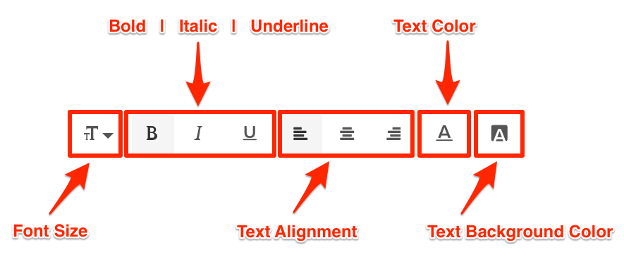
The Text Editor is only displayed for each field when you click and type in the field (Title, Headline, Summary). It provides basic text editing capabilities such as Font Size, Font Style, Text Alignment, and Text Color.
You may only upload one image to the image placeholder.
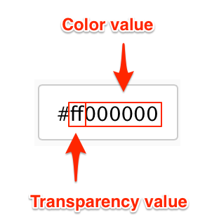
The Color Picker, enables color selection for text and backgrounds in the Card.

Note
The first two characters in the Hex Color Code are the Transparency value, while the next six characters are the Color values. Please be mindful when including a custom Hex color code.
Note
To add cards in your library, please refer to the Adding a card article.