- Article purpose: This document serves as a developer’s guide to creating custom Appspace cards.
- Business problem: Appspace provides a collection of default cards that are prebuilt with common functions, but there are scenarios where users need custom functionality beyond the default scope. For custom functionality, Appspace allows a customer or third party to develop custom cards to meet specialized communications needs.
- Solution: Appspace provides a framework to build these cards. Understanding the card anatomy, API, and input types will provide the basics of developing a card.
- Conclusion: The framework presented in this document will ease developers into the card creation process.
WHAT’s IN THIS ARTICLE:
Introduction
Cards are a type of HTML content that a user can create in the Appspace console and then publish to their channels. They present a simple and fast way to create good looking content that does not require extensive design experience. Users can pick from a list of predefined themes and then customize the content with their own text, images, or video.
In Appspace we have a few different types of cards:
- Messaging cards: This is the most common type of card used in Appspace. Messaging cards give the user multiple themes to choose from to fit to any type of message. Users can simply just use a text field to handle a message from the CEO, or incorporate images and animations to create “Congratulations” or “Happy Birthday” announcements. Appspace provides the Announcement card for this purpose.
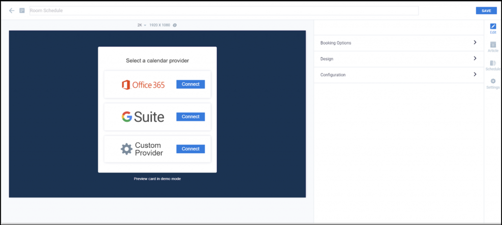
- Service cards: These are cards that have a specific functional purpose. The Room Schedule and Schedule Board cards are great examples of this card type. This card displays room information from an external provider (e.g. Google Calendar), and provides options on how the information is displayed.
- Feed cards: This type of card gets its content from an external source. Social media, weather, traffic, and RSS cards fall into this category. And just like the service cards, the author can decide how the content is displayed.
Why use cards?
Cards help to simplify content creation and ensure brand consistency. By using cards, anyone is able to create good looking content easily. The following are key reasons for using cards.- Brand consistency: Brand owners can create base card themes and make those available to users in their organization. With these themes, users can create their own cards by simply adding text or images in the fields provided for them. This helps to preserve branding, and helps users simply focus on creating a message with the card and publishing it to a channel.
- Responsive design: Cards are designed to be responsive. This means that a card can automatically adapt itself to different resolutions and orientations while preserving the message created by the user.
- Integration with external systems: Cards can also be used to integrate with external systems, allowing our partners to provide value by building and owning the integrations their clients require. A good example of this is the Seenspire social media card. This card is created and maintained by Seenspire, and it allows customers to display Facebook, Twitter, or Instagram feeds in their Appspace channels.
Business problem
Appspace provides a collection of cards that are easy to use, but there is also a need to create custom cards with functionality for unique situations. The question that gets frequently asked by some advanced customers and developers is, “How can I develop my own custom card?”To date, the information about developing custom cards has been extremely limited, and the details surrounding the Card API have not been readily available.
Requirements
Knowledge of HTML, JavaScript, or AngularJS is required to develop custom Appspace cards:
- Developers are free to use any JavaScript development toolkit of their choice.
- For developers who are familiar with AngularJS, we recommend using our scaffolding project. Details for setting up the scaffolding project are available at the end of this guide.
Solution Overview
The goal of this guide is to provide the necessary details for developers to understand the anatomy of a card, along with a base framework for developers to create a custom card.
Card Playback Context
The behavior of a card is defined by its playback context. There are a total of six contexts, as listed below:
- Editing
- Screenshot
- Device
- Theme editing
- Theme screenshot
- None
A card can only be loaded with a single context at a time. Depending on the playback context that is loaded, the behaviour of the card will follow its current context appropriately.
Editing context
The Editing context is used during initial card creation or when editing a card configuration in the Appspace console. In this mode the Appspace console editor pushes model updates to the card.
Screenshot context
The screenshot context is set by the Appspace screenshot service. It is used to allow card developers to modify how they want their card to look when a screenshot is taken for a thumbnail or static image.
Device context
The device context is used when the card is running on a device. In this mode, the Appspace App renders the card, which needs to communicate with the App. The card needs to listen to the events to know when to start and end its playback, as well as provide feedback to the App when the card is ready to play, completed playback, or throws an error.
Events – These events are triggered by the Appspace App:
-
- play – if the card has any transitions or animations they should only start once it gets this event from the App running on the device.
- pause – this should stop all transitions/animations.
- api.init – this event is fired when the configuration is fully loaded into the card.
Methods – These methods are used by the developer:
- NotifyOnLoad – notifies the App that the card is loaded and ready to play.
- NotifyOnComplete – notifies the App that the card has completed its playback.
- NotifyOnError – notifies the App that the card has encountered an error while loading.
Theme editing context
The theme editing context is used when a user creates a new theme or edits an existing theme. This allows the developer to have edit options that are only available during theme editing.
Theme screenshot context
The theme screenshot context is set by the Appspace screenshot service. It is used to allow card developers to modify how they want their theme to look when a screenshot is taken for a thumbnail or static image.
None
This context is used when the card is embedded in a website. In this context, the card should just autoplay since it will not get any events from the App. The model.json is loaded from the Appspace Console.
Building the Card
To build a card, a developer will first need to create a card template using a development toolkit of their choice. A card template must have a base theme, but it can also be packaged with additional themes. A theme is just a set of values that determine the presentation of the card. It can have certain card features enabled or disabled, depending on how much control the end user needs to have.
How Templates Work
- A brand owner can lock the theme of a template to a specific font style and color scheme, and allow other users to change the text. In this way, the user can customize the card with their own message but still remain on brand for the look and feel.
- Users who are content authors will be able to see available card themes in the library. They will then be able to create a card based on any of the available themes.
Once a card is created, it becomes a content item that can be published to channels and devices. A card is essentially a standalone instance of a card template that is based on one of the available themes. Once created, it can be fully customized by the author for display in the Appspace App.
Card Template Anatomy
A card template must be packaged as a ZIP file and must contain the following files:
- \manifest.json – contains information about the card package and what’s needed to be able to install the card in the Appspace console.
- \model.json – this is the default model for the card.
- \schema.json – defines the form used to get card inputs.
- \index.html – this is the startup file that is launched in a browser.
- \thumbnail.svg – this is the icon for the card template (it can also be a jpeg or png).
A card template can have additional assets such as fonts, CSS or JS files from the developer which need to be packaged into a separate folder at the root of the ZIP file:
- \assets – this is an optional folder that can contain additional fonts, CSS or JS files
manifest.json
The manifest is a JSON file that contains information about the card packaged in the ZIP. This example shows the structure:
{
    "Name": "Card Name",
    "Id": "appspace.card.name",
    "Description": "Short description of the card.",
    "Thumbnail": "thumbnail.svg",
    "Startup": "index.html",
    "Schema": "schema.json",
    "Developer": "Appspace",
    "Model": "model.json",
    "Version": "1.0.0",
    "Category": "messaging",
    "DisplayFormats": [
        {
            "Type": "tv"
        },
        {
            "Type": "mobile"
        }
    ],
    "Network": {
        "RequiresConnection": false
    }
}
}
Here is detailed explanation of some of the properties:
{

"Name": "Card Name", // The name of the Card template
"Id": "com.dev.cardname", // The developer-set unique id for the card.
"Developer": "Company", // The card developer name
"Description": "Description goes here", // Optional set of text describing the card
"Thumbnail": "thumbnail.svg", // A relative path to the image that is used as a thumbnail for the card
"Schema": "schema.json", // A relative path to the card schema
"Model": "model.json", // A relative path to the card model
"Startup": "index.html", // A relative path to the index page of the card
"Version": "x.x.x", // Version number for the card
"Category": "messaging", //this will determine in which category the card shows up in the library. A card can only have one category from a predefined list(messaging, data, feeds, services)
"DisplayFormats": [ // Optional list of supported display formats and their configuration for card display
    {
        "Type": "tv",
    },
    {
        "Type": "mobile"
    }
],

"NaturalDuration": true, // If the card has a natural duration and can fire on complete. Default is false
"Network": {
"RequiresConnection": true, // the card will be streamed from Appspace server if set to true
}
}
model.json
The model contains the configuration for a card and is validated against the schema for correctness. The model is a JSON file with the following sample structure:
{
  "inputs": [
    {
        "name": "headline",
        "value": "Hi Im A Card"
    },
    {
        "name": "biline",
        "value": "Hi Im A bi-line"
    },
    {
        "name": "layout",
        "value": "ior"
    },
    {
        "name": "textcolor",
        "value": "#ff0000"
    },
    {
        "name": "background",
        "color": "#ff0000",
        "image": "/content/bg.jpg"
    },
    {
        "name": "bannerimage",
        "files": ["/content/banner.jpg"]
    },
  ]
}
schema.json
The schema describes the structure of the model and is used by the platform to generate an appropriate UI for a user to populate the model during creation. For more information on the supported types, see Schema.
The schema is a JSON file. Here is an example:
{
   "version": "1.1",
   "settings": {
       "fontfamily": [
           "Arial"
       ]
   },

   "themeeditor": {
       "form": {
           "visible": false
        }
    },

    "editor": {
        "form": {
            "visible": false
        },
        "preview": {
            "scale": "auto"
        }
    },
   "inputs": [
       {
           "name": "headline",
           "label": "Headline",
           "placeholder": "Headline",
           "type": "richtext",
           "value": "",
           "options": {
               "style": {
                   "font": true,
                   "color": true,
                   "size": [
                       "50%",
                       "100%",
                       "150%",
                       "200%",
                       "250%",
                       "300%"
                   ],
                   "alignment": true,
                   "backgroundcolor": true,
                   "containercolor": false,
                   "decorations": true
               }
           },
           "validation": {
               "required": false
           }
       }
   ]
}
Here is the detailed explanation for a single input:
{
  "inputs": [ //Collection of inputs contained in the model
    {
        "name": "property", //Name of the input property
        "locked": false, // When true the input is not displayed in the card form. Can be updated during theme creation to hide or show the input based on theme
        "label": "My Property", //Label to use to display in the form
        "type": "input_type", //Type of property object (see Card input type dictionary)
        "validation": { //Optional validation rules for the input type
            "minlength": 0,
            "maxlength": 255,
            "required": true
        }
    }
  ]
}
Customizing the form using the schema
Full Screen Card Schema
Some cards have just a couple of options and don’t require a form. Or some developers may wish to show the card in full screen during editing mode and overlay the options. A good example of this is the Google Traffic card. In these situations, the form is not visible and the developer will need to use CustomData to update the model.
In these situations, the form can be hidden and the card can be set to display at a set preview resolution. To show the preview responsive set the “scale” property to “auto”’.
Example of Schema for a full-screen card:
//..................
    "version": "1.1",
    "editor": {
        "form": {
            "visible": false
        },
        "preview": {
            "background": {"background-color":"rgb(250,250,250)", "background-image":"none"},
            "scale": "auto"
        }
     },
//..................
Grouping Inputs in the Form
In the Appspace 8 card editor, we introduced a feature that will allow developers to group different form inputs together. These are most commonly used to group card options into categories like design, configuration, etc.
To group inputs like in the example above, the input just needs to have a property defined in its section in the schema.json. The key is ‘group’ and the value is the name of the group. Here is an example that shows the background color input belongs to the ‘Design’ group.
{
            "name": "backgroundColor",
            "type": "colorpicker",
            "group": "Design",
            "visible": true,
            "options": {
                "defaultcolor": "#133455",
                "palette": [
                    "#ffffff",
                    "#f00",
                    "#00ff00"
                ],
                "allowTransparency": false,
                "allowEmpty": false
            },
            "form": {
                "css": {
                    "width": "30px",
                    "display": "inline-block",
                    "margin-right": "1%",
                    "float": "left"
                }
            }
        },
The inputs in the schema can also be overridden if needed. In the example below we show how to override an input’s form (color picker in this case) css to make all sit on same row by defining a css property( “display”: “inline-block”,)
 {
      "name": "palette1",
      "type": "colorpicker",
      "options": {
        "defaultcolor": "#77ABD7",
        "palette": [
          "#ffffff",
          "#f00",
          "#00ff00"
        ],
        "allowtransparency": true,
        "allowempty": true
      },
      "form": {
        "css": {
          "width": "10%",
          "display": "inline-block",
          "margin-right": "1%",
          "padding-bottom": "1em"
        }
      },
      "visible": false,
      "locked": false
    },
Card API
The Card API is a JS module that must be included in the startup index.html file of the card template. It provides a set of methods and events to facilitate communication between the host and the card. To review the list of all available methods, please take a look at Card API: Methods and Events.
Supported Input Types
To see all of the supported input types that can be used when developing a custom card, take a look at Cards: Dictionary of Input Types.
Appspace Development Tools
Appspace provides two tools to help developers get started with creating cards:
- The first is an AngularJS scaffolding project.
Appspace Cards Scaffolding Project
The scaffolding project is designed to help developers easily create their cards. All you have to do is place your files in the appropriate folders, and when the template is built, your JS and CSS code will be automatically added to the index.html and minified.
Scaffolding Project Setup
Download the scaffolding project from the community forum and follow the steps below to get it all set up.
Prerequisites: Node.js and NPM
To build and run the project:
- Navigate to the ‘src’ directory in your terminal window.
- Run ‘npm update -g’.
- Run ‘npm install’.
- Run ‘npm start’ or ‘npm run start:ssl’.
- This will automatically start hosting your card at port 8000 on HTTP & HTTPS.
- To open in the browser, use the following URL: http://localhost:8000/ or https://localhost:8000/
To build the template ZIP file for uploading to the Appspace console:
- Navigate to the src directory in your terminal window.
- Run ‘npm run-script build’.
- The ZIP file will be created in the project artifacts folder.
Custom Data
The scaffolding project expands on the methods you can use when using custom data. The Card API offers the following method to update custom data object:
- api.updateModelCustomData(object)
- This requires that you update the full object each time.
The Card API service includes useful methods to handle custom data easily:
- cardApiService.appendCustomData({“card.path.to.property”: “value”, “card.secondproperty”:”val”}) will create the custom data object and create both properties in their correct path. Consecutive calls to the method will append and update the custom data object instead of replacing the whole object.
- cardApiService.readCustomData(“card.path.to.property”) will get that value for you so you don’t have to worry about handling undefined or non-existent paths.
Components
Everything in the Scaffold card is built as a component, so everything is reusable, and follows the single responsibility principle. The main components of the card are the following:
- Base View: The root component and is always included.
- Editing View: Displayed when the card is in ‘Editing’ or ‘Theme Editing’ Context.
- Screenshot View: Displayed when the card is in ‘Screenshot’ or ‘Theme Screenshot’ Context.
- Playback View: This is where the actual view of the card will reside, and can be included in other views. It will be used as the default view when the device is in ‘Device’ or ‘None’ Context.
- You can change which components appear on which context by editing the base view component.
Custom Components
You can create a folder for a custom view under the components folder. You just need to follow the below structure:
Components\
  my_custom_view\
    my_custom_view.html
    my_custom_view.js
    my_custom_view.scss
Conclusion
The information presented in this guide provides the initial framework for a developer to create a custom Appspace card. With a JavaScript or AngularJS development toolkit of choice, developers can refer to the Card API and the collection of supported input types to start building custom cards.