Configuring Widget Properties
In an application layout, when you click a widget link, the Widget Properties window is displayed with several tabs to allow the configuration of the widget. The tabs and property sections that are displayed in the Widget Properties window vary depending on the type of widget being edited.
The following are the common tabs available in the Widget Properties window:
- APPEARANCE - Describes the common and widget specific properties that affect its appearance.
- CONTENT - If the widget displays content, the CONTENT tab allows users to manage the content.
- ACTIONS - Allows users to create basic and advanced scripting actions.
- PROPERTIES - Allows users to perform advanced editing to Key-Value pairs within the widget.
- PERMISSIONS - Allows Administrators to set per user access permissions for the widget.
- DATA PROVIDER - Allows database information to be sent via a provider (e.g. MySQL Server) into the widget target sheet.
This article provides the instructions to configure the properties in a Widget Properties window.
Note
Please read the Managing Widgets article prior to configuring a widget.
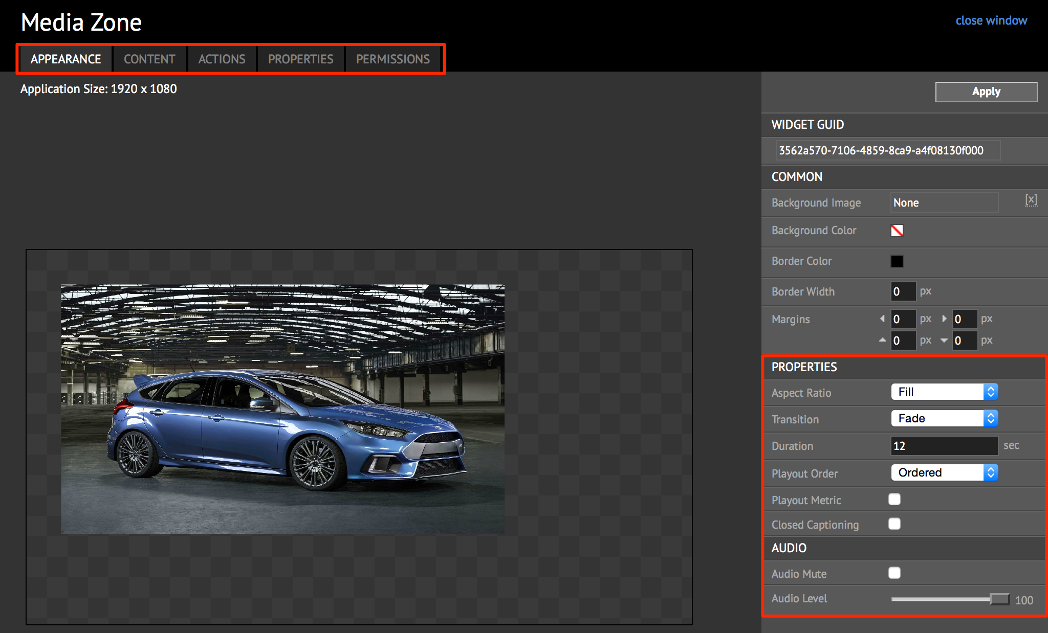
APPEARANCE Tab
The APPEARANCE tab is default for every widget type. However, only the COMMON section is displayed for every widget type. Other sections below or above this section may vary based on the widget type.
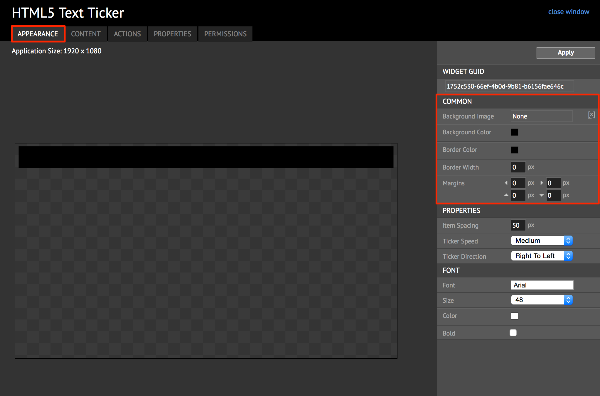
The table below describes the property parameters to configure in the COMMON section:
| Properties | Description |
|---|---|
| Background Image | Select the image for the widget background. |
| Background Color | Select the color and the opacity for the widget background. |
| Border Color | Select the color of the border around the widget. |
| Border Width | Designate the width of the border for the widget. |
| Margins | Specify the spacing between the content and the widget border. |
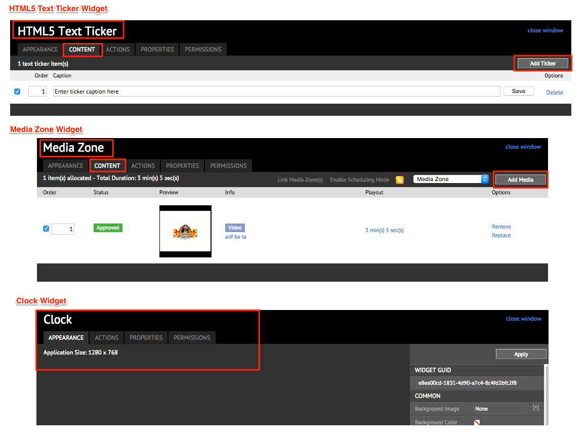
CONTENT Tab
This tab appears only for widgets that contain content or media. You may add content/ media/ticker. For example, when editing a HTML5 Text Ticker, you have the option to Add Ticker, and in a Media Zone widget you have the option to Add Media, but the Clock widget does not have a CONTENT tab.
Adding Media
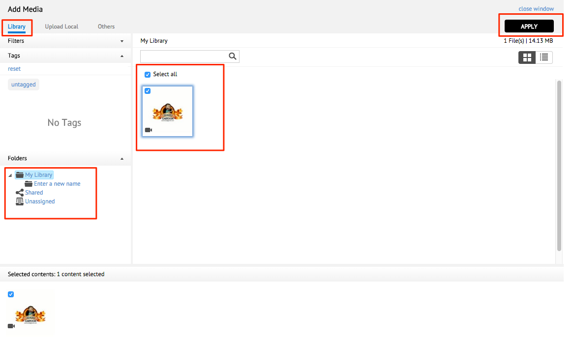
To add media, select the CONTENT tab and click the Add Media button.
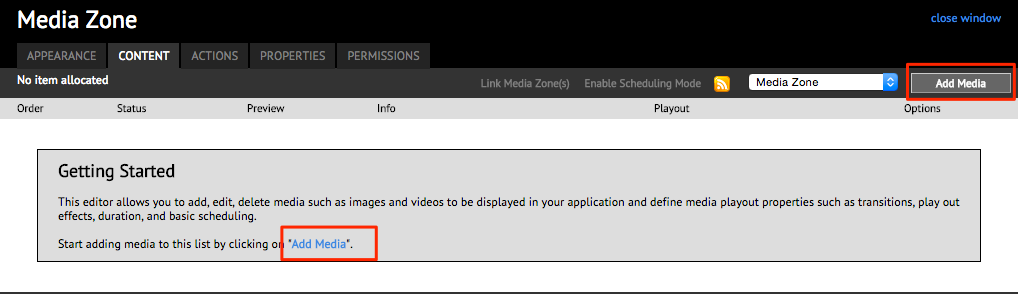
In the Add Media window, select your folder, and content(s) that are available in your Appspace Library.
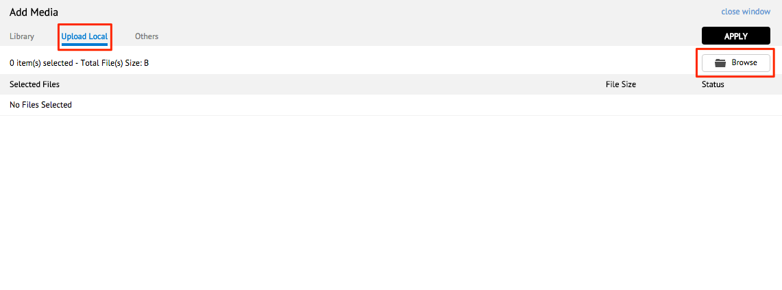
You may also click the Upload Local tab and click the Browse button to add a media from your local machine.
You may also add other types of content such as Text, HTML, or filetypes such as PDF, Flash, etc. from the Others tab, and click the ADD CONTENT button.
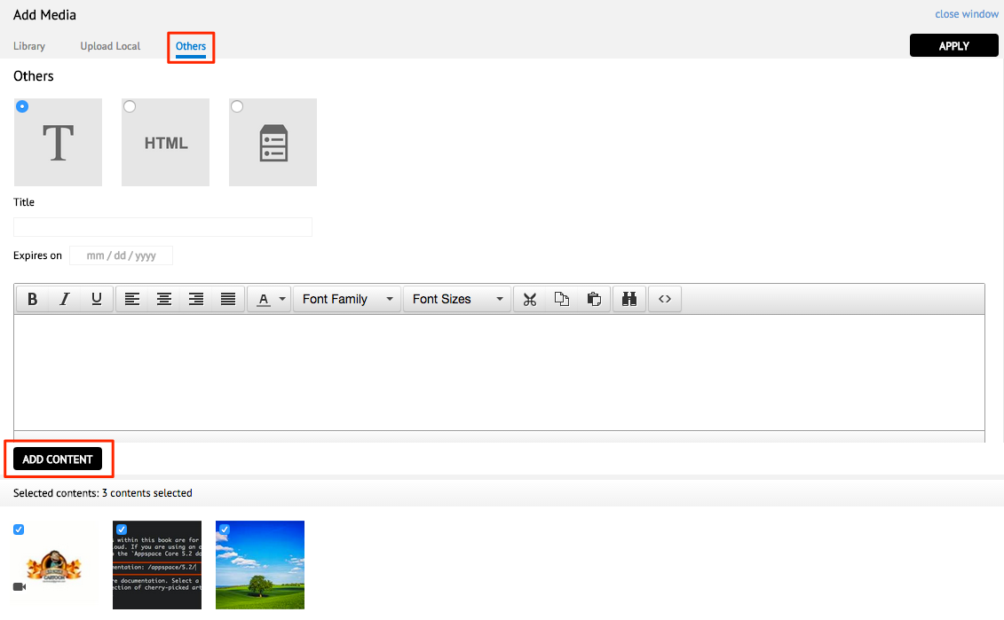
Click APPLY once you are done.
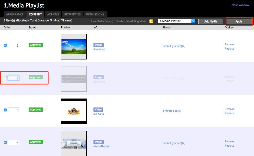
Setting Media Order
Once media or content has been added, you can select the order of appearance in the app for each content.
Change the number in the Order column for each media you wish to change the order for.
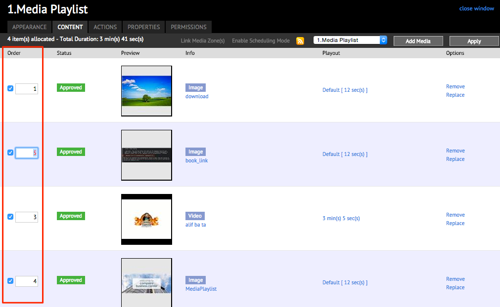
You may also check or uncheck the media to show or hide the media respectively. Click Apply when done.
Removing/Replacing Media
In the CONTENT tab, to remove media, click the Remove link next to the desired media, and click OK on the confirmation window.
To replace the media, click Replace, and select a new content from the Add Media window to overwrite the existing media. The media order will be preserved.
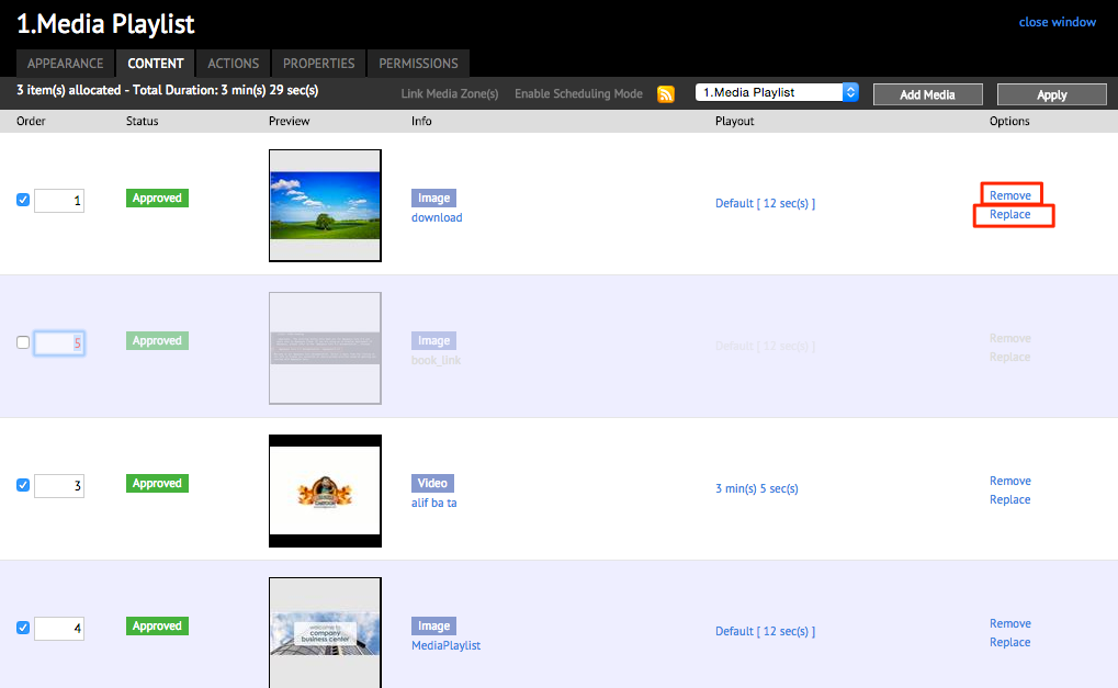
Click Apply
ACTIONS Tab
The ACTIONS tab allows you to configure event actions for your widgets. Please refer to the Managing Event Actions in Widgets article for detailed instructions.
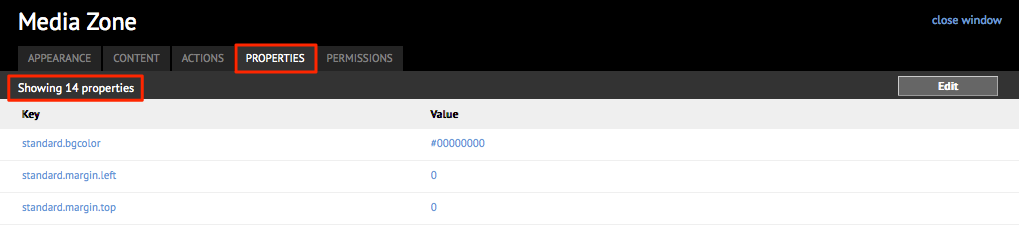
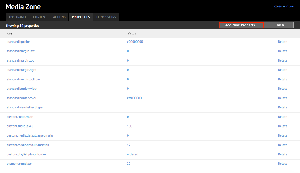
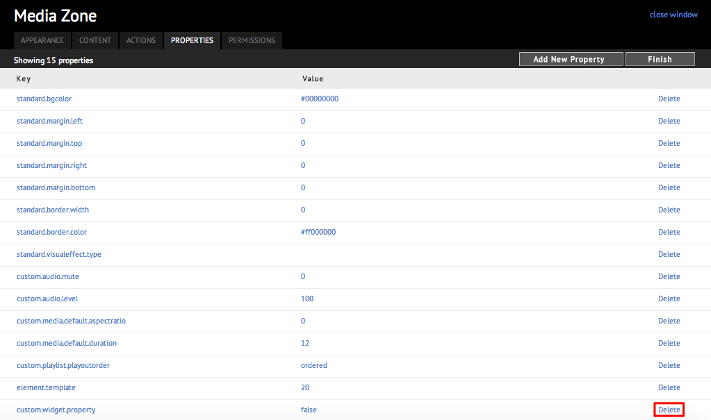
PROPERTIES Tab
The individual properties are laid out in the form of a table, with the property name under the Key column and it’s corresponding value under the Value column in the PROPERTIES tab. The top left-hand corner of the layout displays the total number of properties that are assigned to this widget.
Adding Widget Property
In the PROPERTIES tab, click the Edit button.
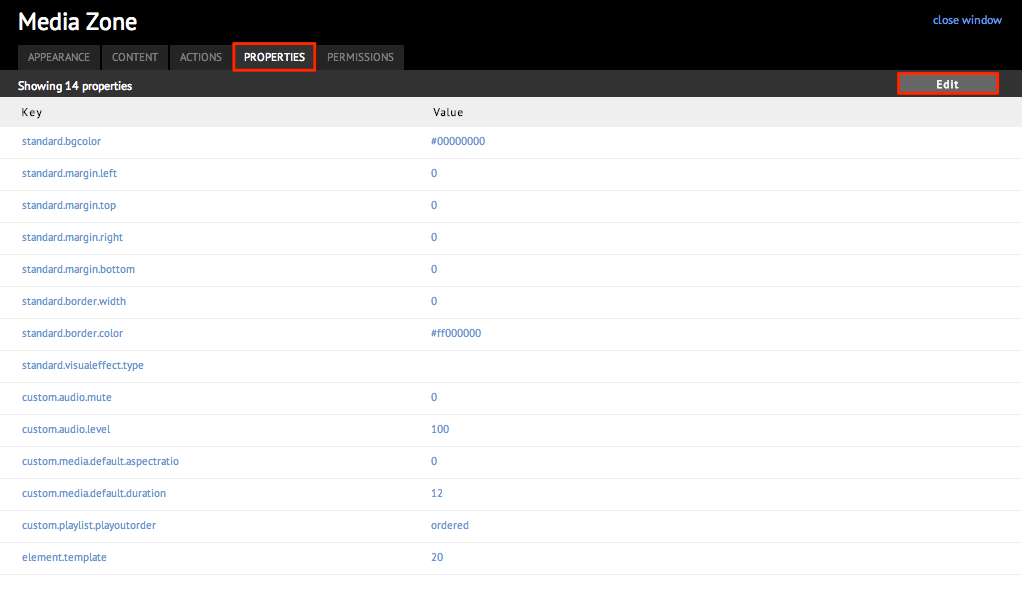
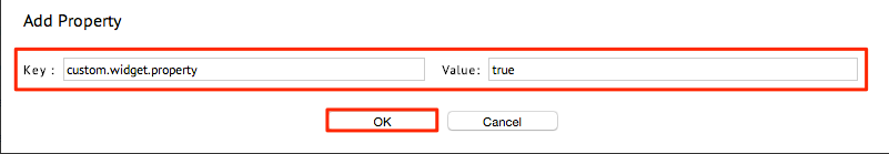
The following wo additional buttons are displayed: Add New Property and Finish. Click Add New Property.
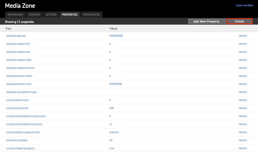
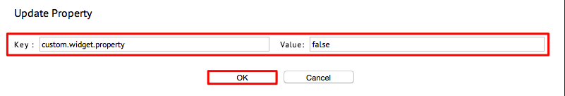
Input the desired property key and its associated value. Click OK when done.
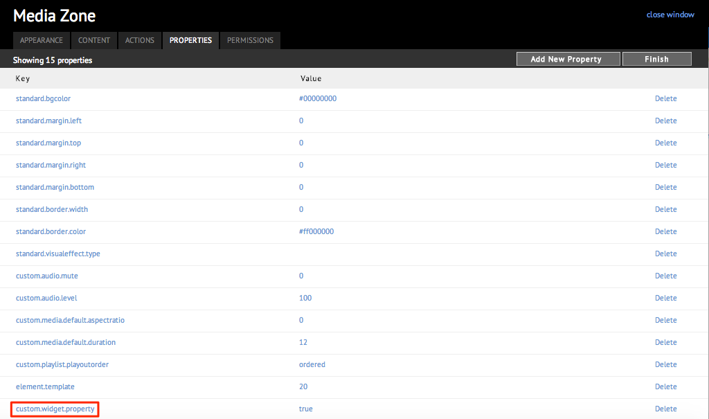
Click Finish.
Editing Widget Property
In the PROPERTIES tab, click the Edit button.
Click the Key or Value link of the property to be edited.
Make changes to the property key or value, and click OK.
Click Finish.
Deleting Widget Property
In the PROPERTIES tab, click the Edit button.
Select the Key or Value link of the property, and click Delete.
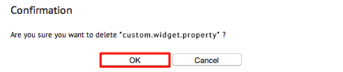
Click OK when prompted for confirmation.
Click Finish.
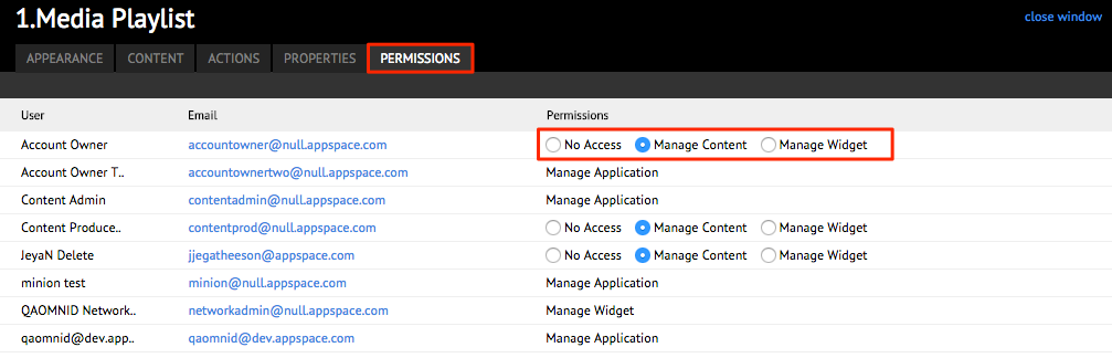
PERMISSIONS Tab
The permissions tab allows you to change permissions for some user roles that have access to your widget. Just select the options to allow or deny users access to manage your widget or the content in your widget.
However, permissions are set at the application level. Please refer to the Configuring Application Permissions article.
Note
For more information on configuring specific widgets, please refer to the Standard Widgets section and pick your widget.