Overview
When building cards, there are a collection of supported input types that can be included in the schema. These input types are essentially UI controls that the user interacts with to provide content or data into a card. There are currently a total of fifteen input types, and the collection will continue to grow as new input types are created in the future.
Summary of input types
|
Input type |
Description |
|
fileupload |
Upload files |
|
fontupload |
Upload custom fonts |
|
richtext |
Richtext formatting control |
|
textbox |
Single line text entry |
|
textarea |
Larger text block entry |
|
textstyle |
Define text format style |
|
tagsinput |
Tag input field |
|
background |
Background color or image |
|
checkbox |
Checkbox item list |
|
radio |
Radio option list |
|
dropdown |
Single select dropdown list |
|
multiselect |
Multiselect dropdown list |
|
colorpicker |
Color picker tool |
|
duration |
Time duration entry |
|
datepicker |
Calendar entry to select a date |
|
daterangepicker |
Calendar entry to select a date range |
|
toggle |
Toggle switch entry |
|
actions |
Buttons that can trigger actions |
|
codeview |
HTML snippet entry |
|
celldata |
Tabular data entry |
Input type dictionary
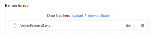
Input type: fileupload
This input type is used to upload files to the card; most commonly used to add media files (images or videos) from the library or a user’s computer so they can be used as content inside the card.
Form UI example:
Schema example:
{
         "name": "bannerimage",
         "label": "Banner Image",
         "type": "fileupload",
         "options": {
            "maxfiles": 5,
            "sortEnabled": true,
            "toolbarButtons": [
               {
                  "label": "Crop",
                  "extensions": [
                     ".bmp",
                     ".jpeg",
                     ".wmv"
                  ]
               },
               {
                  "label": "Edit <span class=\"glyphicon glyphicon-pencil\"></span>",
                  "extensions": null
               }
            ]
         },
         "validation": {
            "fileextensions": [
               ".bmp",
               ".jpg",
               ".png"
            ],
            "required": false
         }
}
Model example:
{
  "name": "bannerimage",
  "type": "fileupload",
  "value": [
    {
      "file": "sample2",
      "path": "/content/sample2.png",
      "id": 1
    }
  ]
}
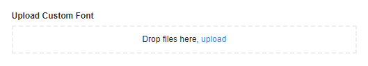
Input type: fontupload
This allows the user to upload custom fonts to the card. The fonts will become available for use in the text fields. The Card API will auto download and install the fonts into the browser when loading the card.
Form UI example:
Schema example:
{
    "name": "fontuploader",
    "label": "Upload Custom Font",
    "type": "fontupload",
    "options": {},
    "validation": {
       "required": false
    }
}
Model example:
{
    "name": "fontuploader",
    "value": [],
    "type": "fontupload"
}
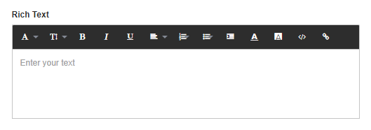
Input type: richtext
This input type is used when a user needs to have all the formatting options available in a text field. This is used mainly if a user would need to have text with multiple font styles in a single field.
Form UI example:
Schema example:
{
        "name": "richtext",
        "label": "Rich Text",
        "placeholder": "Enter your text",
        "type": "richtext",
        "options": {
           "sticky": true,
           "style": {
              "font": true,
              "color": true,
              "size": [
                 "200%",
                 "150%",
                 "125%",
                 "100%",
                 "75%",
                 "50%",
                 "25%"
              ],
              "alignment": true,
              "backgroundcolor": true,
              "decorations": true,
              "list": true,
              "indent": true,
              "insertLink": true
           }
        },
        "validation": {
           "minlength": 2,
           "maxlength": 10,
           "required": true
        }
}
Model example:
{
   "name": "richtext",
   "type": "richtext",
   "style": {},
   "value": ""
 }
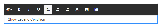
Input type: textbox
This input type allows the user to enter a line of text. This is generally used for titles or headlines where the text format is the same. Under the options in the schema you can optionally set the ‘type’ as well to number or password to change the behavior of the input field.
Form UI example:
Schema example:
{
         "name": "headline",
         "label": "Headline",
         "placeholder": "Sample card",
         "type": "textbox",
         "options": {
            "tooltip": "Enter title",
            "type" : "password",
            "style": {
               "locked": false,
               "color": true,
               "size": [
                  "200%",
                  "150%",
                  "125%",
                  "100%",
                  "75%",
                  "50%",
                  "25%"
               ],
               "
               "alignment": true,
               "backgroundcolor": true,
               "gridcolor": true,
               "decorations": true
            }
         },
         "validation": {
            "required": false,
            "minlength": 3,
            "maxlength": 50
         },
         "locked": false
      }
Model example:
{
   "name": "headline",
   "value": "Show Legend Condition",
   "style": {
     "color": "#0000ff",
     "size": "200%",
     "alignment": "center",
     "decorations": [
       "italic",
       "underline"
     ],
     "backgroundcolor": "#cccccc"
   },
   "type": "textbox"
 }
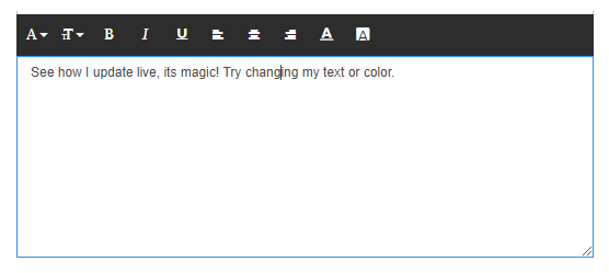
Input type: textarea
This input is similar to the textbox, but it displays multiple lines of text which is generally used when users need to enter more text than just a headline or title. Just like the text box, this input field has a single formatting style for the entire text entered.
Form UI example:
Schema example:
{
    "name": "biline",
    "label": "Bi-line",
    "placeholder": "Enter your bi-line",
    "type": "textarea",
    "rows": 10,
    "options": {
       "style": {
          "locked": false,
          "font": true,
          "color": true,
          "size": [
             "200%",
             "150%",
             "125%",
             "100%",
             "75%",
             "50%",
             "25%"
          ],
          "alignment": true,
          "backgroundcolor": true,
          "decorations": true
       }
    },
    "validation": {
       "minlength": 0,
       "maxlength": 100,
       "required": true
    }
 }
Model example:
{
  "name": "biline",
  "value": "See how I update live, its magic! Try changing my text or color.",
  "style": {
    "size": "100%"
  },
  "type": "textarea"
}
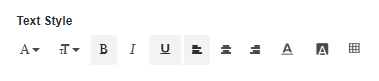
Input type: textstyle
This input type is used to define the formatting of text that the user cannot change. An example of this would be the date and/or time that is displayed in the card.
Form UI example:
Schema example:
{
   "type": "textstyle",
   "name": "textstyle",
   "label": "Text Style",
   "options": {
      "style": {
         "font": true,
         "color": true,
         "size": [
            "200%",
            "150%",
            "125%",
            "100%",
            "75%",
            "50%",
            "25%"
         ],
         "alignment": true,
         "backgroundcolor": true,
         "gridcolor": true,
         "decorations": true
      }
   }
}
Model example:
{
  "name": "textstyle",
  "style": {
    "decorations": [
      "bold",
      "underline"
    ],
    "alignment": "left",
    "size": "150%",
    "color": "rgb(185, 31, 31)",
    "backgroundcolor": null
  },
  "type": "textstyle",
  "value": ""
}
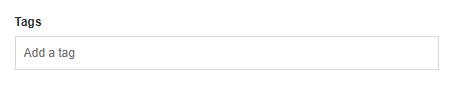
Input type: tagsinput
This allows the user to enter a number of tags that can then be referenced inside the card.
Form UI example:
Schema example:
{
    "name": "tagsInput1",
    "label": "Tags",
    "type": "tagsinput",
    "placeholder": "Enter your tag",
    "template": "user",
    "displayProperty": "Name",
    "autocompleteSettings": {
       "data": [
          {
             "Name": "John Smith",
             "Type": "user"
          },
          {
             "Name": "Jane Boyd",
             "Type": "user"
          },
          {
             "Name": "Marketing",
             "Type": "usergroup"
          }
       ],
       "addFromAutocompleteOnly": false
    },
    "options": {},
    "validation": {
       "required": false
    }
 }
Model example:
{
  "name": "tagsInput1",
  "type": "tagsinput",
  "value": []
}
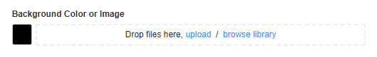
Input type: background
This component allows the user to set up the background of the card. The user can have an image (or multiple images) or set a background color. Alternatively, a user can do both if the image is a PNG that has transparency.
Form UI example:
Schema example:
{
   "name": "background",
   "label": "Background Color or Image",
   "type": "background",
   "options": {
      "palette": [
         "#ffffff",
         "#f00",
         "#00ff00"
      ],
      "defaultcolor": "#000000",
      "showcolor": true,
      "showimage": true
   },
   "validation": {
      "fileextensions": [
         ".mp4"
      ]
   }
}
Model example:
{
  "name": "background",
  "value": {
    "bgColor": "#000000",
    "bgImage": ""
  },
  "type": "background"
}
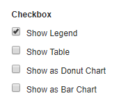
Input type: checkbox
This component allows the developer to expose various options that the user can enable/disable when they create a card.
Form UI example:
Schema example:
{
   "type": "checkbox",
   "name": "cb",
   "label": "Checkbox",
   "validation": {
      "required": false,
      "minitems": 2,
      "maxitems": 3
   },
   "options": {},
   "items": [
      {
         "value": "1",
         "label": "Show Legend",
         "checked": true
      },
      {
         "value": "2",
         "label": "Show Table",
         "checked": false
      },
      {
         "value": "3",
         "label": "Show as Donut Chart",
         "checked": false
      },
      {
         "value": "4",
         "label": "Show as Bar Chart",
         "checked": false
      }
   ],
   "conditions": [
      {
         "condition": "model.value.length > 0 && model.value.indexOf('1') >= 0",
         "actions": [
            "headline.model.value='Show Legend Condition'"
         ]
      },
      {
         "condition": "model.value.length > 0 && model.value.indexOf('2') >= 0",
         "actions": [
            "biline.schema.visible=false"
         ]
      },
      {
         "condition": "model.value.length > 0 && model.value.indexOf('2') < 0",
         "actions": [
            "biline.schema.visible=true"
         ]
      }
   ]
}
Model example:
{
  "name": "cb",
  "value": [
    "1"
  ],
  "type": "checkbox"
}
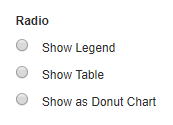
Input type: radio
This component allows the user to select one of the multiple options available, which are defined by the developer for the card.
Form UI example:
Schema example:
{
   "type": "radio",
   "name": "radio",
   "label": "Radio",
   "validation": {
      "required": false
   },
   "options": {
      "defaultitem": 1
   },
   "items": [
      {
         "value": 1,
         "label": "Show Legend"
      },
      {
         "value": 2,
         "label": "Show Table"
      },
      {
         "value": 3,
         "label": "Show as Donut Chart"
      }
   ]
}
Model example:
{
  "name": "radio",
  "value": {},
  "type": "radio"
}
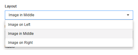
Input type: dropdown
This component is similar to the radio buttons, as it also allows the end user to select one option from multiple options available. The example below allows the user to select the image placement in the card. The three options are predefined by the developer, but the user can select which one to use.
Form UI example:
Schema example:
{
   "name": "layout",
   "label": "Layout",
   "type": "dropdown",
   "options": {
      "defaultitem": "ior"
   },
   "items": [
      {
         "icon": "",
         "label": "Image on Left",
         "value": "iol"
      },
      {
         "icon": "<img src='http://icons.iconarchive.com/icons/yellowicon/game-stars/256/Mario-icon.png'>",
         "label": "Image in Middle",
         "value": "iim"
      },
      {
         "icon": "<i class='fa fa-film'></i>",
         "label": "Image on Right",
         "value": "ior"
      }
   ]
}
Model example:
{
  "name": "layout",
  "value": "iim",
  "type": "dropdown"
}
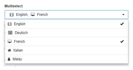
Input type: multiselect
This component allows the developer to expose multiple features and then give the end user the option of which ones they want to enable during card creation.
Form UI example:
Schema example:
{
    "type": "multiselect",
    "name": "language",
    "label": "Multiselect",
    "placeholder": "Select language",
    "options": {
       "maxselection": 2
    },
    "validation": {
       "required": true
    },
    "items": [
       {
          "value": "english",
          "label": "English",
          "icon": "<i class='fa fa-film'></i>"
       },
       {
          "value": "deutsch",
          "label": "Deutsch",
          "icon": "<img src='app/asset/images/calendar.svg'>"
       },
       {
          "value": "french",
          "label": "French",
          "icon": "<i class='fa fa-desktop'></i>"
       },
       {
          "value": "italian",
          "label": "Italian",
          "icon": "<i class='fa fa-home'></i>"
       },
       {
          "value": "malay",
          "label": "Malay",
          "icon": "<i class='fa fa-user'></i>"
       }
    ]
 }
Model example:
{
  "name": "language",
  "value": [
    "english",
    "french"
  ],
  "type": "multiselect"
}
Input type: colorpicker
This component allows the user to specify the color of an object in the card. This is generally used for non-text objects like the background of a zone, the color of a header, etc. You also have the ability to customize the CSS for the input by using the ‘form’ in the schema.
Form UI example:

Schema example:
{
   "name": "textcolor",
   "label": "Text Color",
   "type": "colorpicker",
   "options": {
      "defaultcolor": "#ffffff",
      "palette": [
         "#ffffff",
         "#f00",
         "#00ff00"
      ],
      "allowtransparency": true,
      "allowempty": true
   },
        "form": {
           "css": {
              "width": "10%",
              "display":"inline-block",
              "margin-right": "1%",
              "padding-bottom": "1em"
           }
        },
        "$$domID": "palette1_20",
        "visible": false,
        "locked": false
     }, (edited)
}
Model example:
{
   "name": "textcolor",
   "value": "#ffff00",
   "type": "colorpicker"
}
Input type: duration
This input allows a user to select a time value.
Form UI example:
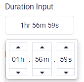
Schema example:
{
       "name": "duration",
        "label": "Duration Input",
        "type": "duration",
        "options": {
            "placeholder": "Default (8s)",
            "showClear": true,
            "initialDuration": 480,
            "minDuration": 1,
            "maxDuration": 7200
        },
        "locked": false
}
Model example:
{
        "name": "duration",
        "type": "duration",
        "value": 0
}
Input type: datepicker
This input allows a user to select a date value.
Form UI example:
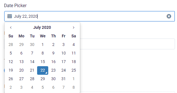
Schema example:
{
    "name": "datepicker",
    "label": "Date Picker",
    "type": "datepicker",
    "options": {
        "showIcon": true,
        "placeholder": "Select a date",
        "format": "d"
    },
    "locked": false
}
Model example:
{
    "name": "datepicker",
    "type": "datepicker",
    "value": {}
}
Input type: daterangepicker
This input allows a user to select a time value with a start and end range.
Form UI example:
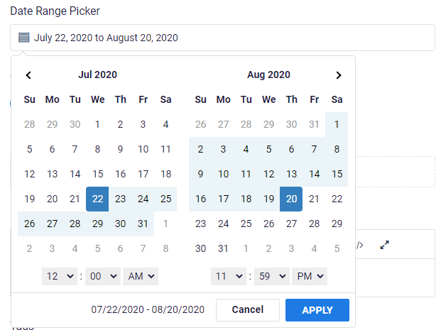
Schema example:
{
    "name": "daterangepicker",
    "label": "Date Range Picker",
    "type": "daterangepicker",
    "options": {
        "showIcon": true,
        "timePicker": true,
        "autoApply": false,
        "placeholder": "Select a date range",
        "drops": "down",
        "showCustomRangeLabel": false
    },
    "locked": false
}
Model example:
{
    "name": "daterangepicker",
    "type": "daterangepicker",
    "value": {}
}
Input type: toggle
This input creates a toggle switch. Similar to checkboxes, it can be used to enable or disable features in the card.
Form UI example:

Schema example:
{
    "name": "toggle",
    "label": "Toggle Switch",
    "type": "toggle",
    "options": {
        "label": "",
        "size": "btn-sm",
        "onText": "ON",
        "offText": "OFF"
    },
    "locked": false
}
Model example:
{
    "name": "toggle",
    "type": "toggle",
    "value": {}
}
Input type: actions
This is an advanced input which allows a user to enter their own HTML snippet into the card. The result can be rendered inside an iframe in the card.Form UI example:
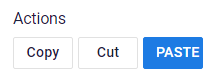
Schema example:
{
            "name": "actions",
            "label": "Actions",
            "type": "actions",
            "options": {
                "buttons": [{
                        "style": {
                            "width": "60px"
                        },
                        "label": "Copy",
                        "value": "copy"
                    }, {
                        "style": {
                            "width": "60px"
                        },
                        "label": "Cut",
                        "value": "cut"
                    }, {
                        "style": {
                            "width": "60px"
                        },
                        "label": "Paste",
                        "value": "paste",
                        "class": "btn-primary"
                    }
                ]
            },
            "locked": false
}
Model example:
{
            "name": "actions",
            "type": "actions",
            "value": {}
}
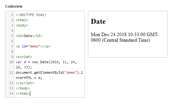
Input type: codeview
This is an advanced input that allows a user to enter their own HTML snippet into the card. The result can be rendered inside an iframe in the card.
Form UI example:
Schema example:
{
   "name": "codeview",
   "label": "Codeview",
   "type": "codeview",
   "options": {},
   "validation": {}
}
Model example:
{
   "name": "codeview",
   "value": "<!DOCTYPE html>\n<html>\n<body>\n\n<h2>Date</h2>\n\n<p id=\"demo\"></p>\n\n<script>\nvar d = new Date(2018, 11, 24, 10, 33);\ndocument.getElementById(\"demo\").innerHTML = d;\n</script>\n</body>\n</html>",
   "type": "codeview"
}
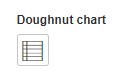
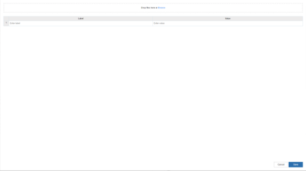
Input type: celldata
This component allows the user to enter tabular data. The data can then be used to display the data, display select parts of the data or generate charts and graphs based on the data. The data can be manually entered or the user can upload an .xlsx file.
Form UI example:
Modal for data entry:
Schema example:
{
   "name": "doughnutchart",
   "label": "Doughnut chart",
   "type": "celldata",
   "options": {
      "tooltip": "",
      "columns": [
         {
            "name": "label",
            "label": "Label",
            "type": "text",
            "format": null,
            "placeholder": "Enter label"
         },
         {
            "name": "value",
            "label": "Value",
            "type": "text",
            "format": null,
            "placeholder": "Enter value"
         }
      ]
   }
}
Model example:
{
    "name": "doughnutchart",
    "type": "celldata"
}
Was this article helpful?