These release notes provide information on the new features, enhancements, resolved escalations, and bug fixes completed in each release for the Table card, which is also an Appspace supported card.
v 1.7
Release Date: 19 Nov 2024
FEATURE IMPROVEMENTS
- This release updates the cloud libraries for the Table card.
v 1.6
Release Date: 8 Oct 2021
Improved UI
The following UI improvements have been made to the Table card:
- The Table card, originally tagged with the Messaging category in the Appspace Library, will now be tagged under the Communication category.
- This change will be visible in the Template Type drop-down menu when creating a card in the Appspace Library.
v 1.5
Release Date: 29 Jan 2021
Updated Card Theme
The following updates have been made to the card theme:
- The card theme has been updated in the Library with a new design, improving card standardization.
- The card base theme will not be generated during deployment, as the BaseCardTemplate property has been set to false in the manifest.json file in the card template.
- The default fonts have been updated to the following:
- Header text = Poppin font, previously Monserrat.
- Body text = Roboto font, previously Lato.
- The card template has been assigned to use the “Productivity and Engagement” as the default content category.
Introducing Card Content Categories
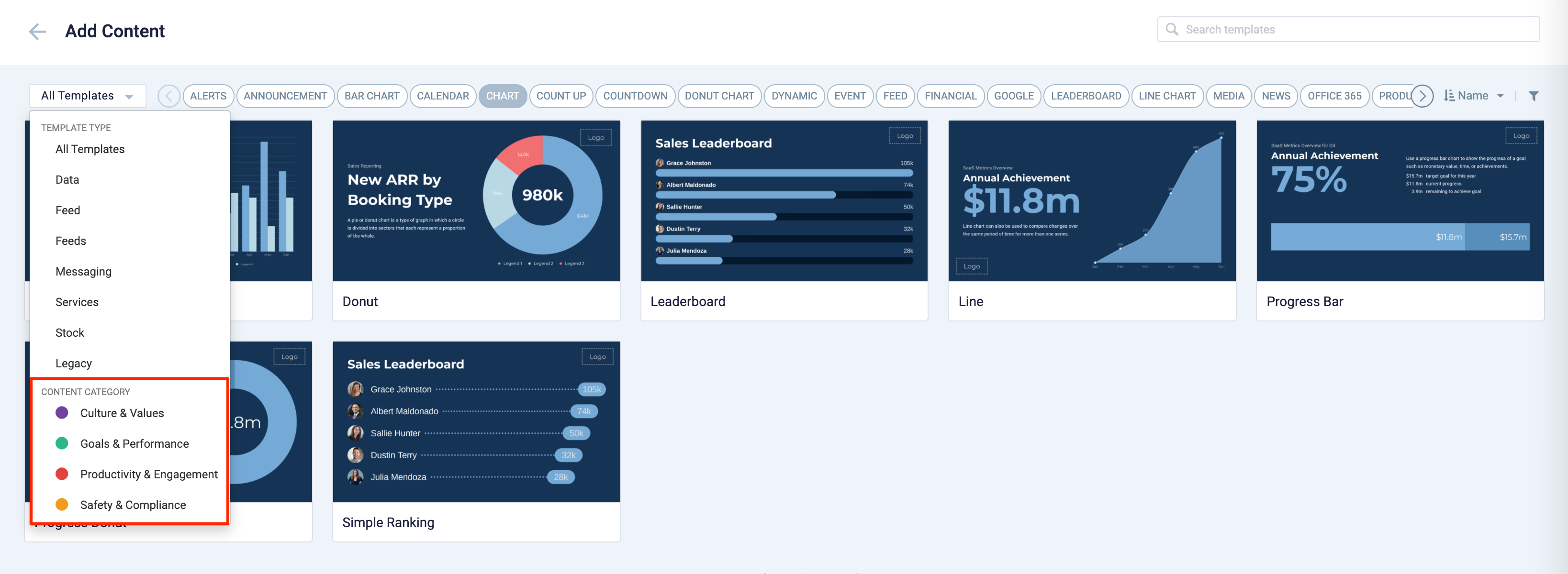
With the introduction of Content Categories in Appspace 8.0 ac.22, all card themes will be assigned with a default content category, allowing organizations to create content, build channels, and target messaging according to workplace communications best practices and internal communication goals.

These content categories can be changed during card creation by the Publisher or Author, as the card theme has been assigned a content category based on the messaging focus. These content categories are defined as follows:
- Culture & Values – Content that promotes company values and affects the employee experience, to help customers drive company values throughout their organization.
- Goals & Performance – content that showcases both long- and short-term goals and measurements of performance, to create shared ownership of company goals and drive employee performance.
- Productivity & Engagement – content with information that keeps the company running, day-to-day, facilitating organizational productivity.
- Safety & Compliance – content with information that supports employee safety and ensures company compliance with regulatory requirements, to help create a safe environment and promote safe behavior amongst employees.
Users will also be able to view the Content Category for every piece of content within a channel playlist. However, cards created prior to this release will not contain a content category, and will be considered as “Unassigned”.
Patch Updates
v 1.5.1
Release Date: 25 Mar 2021
Resolved Escalations
- AE-6665 – Table card header is blank and does not display once the card is created and saved.
v 1.4
Release Date: 8 July 2020
The Table card content creation workflow and card editing user interface has been updated and streamlined in conjunction with the release of the completely redesigned Library module in Appspace 8.0.
Redesigned Card Editor
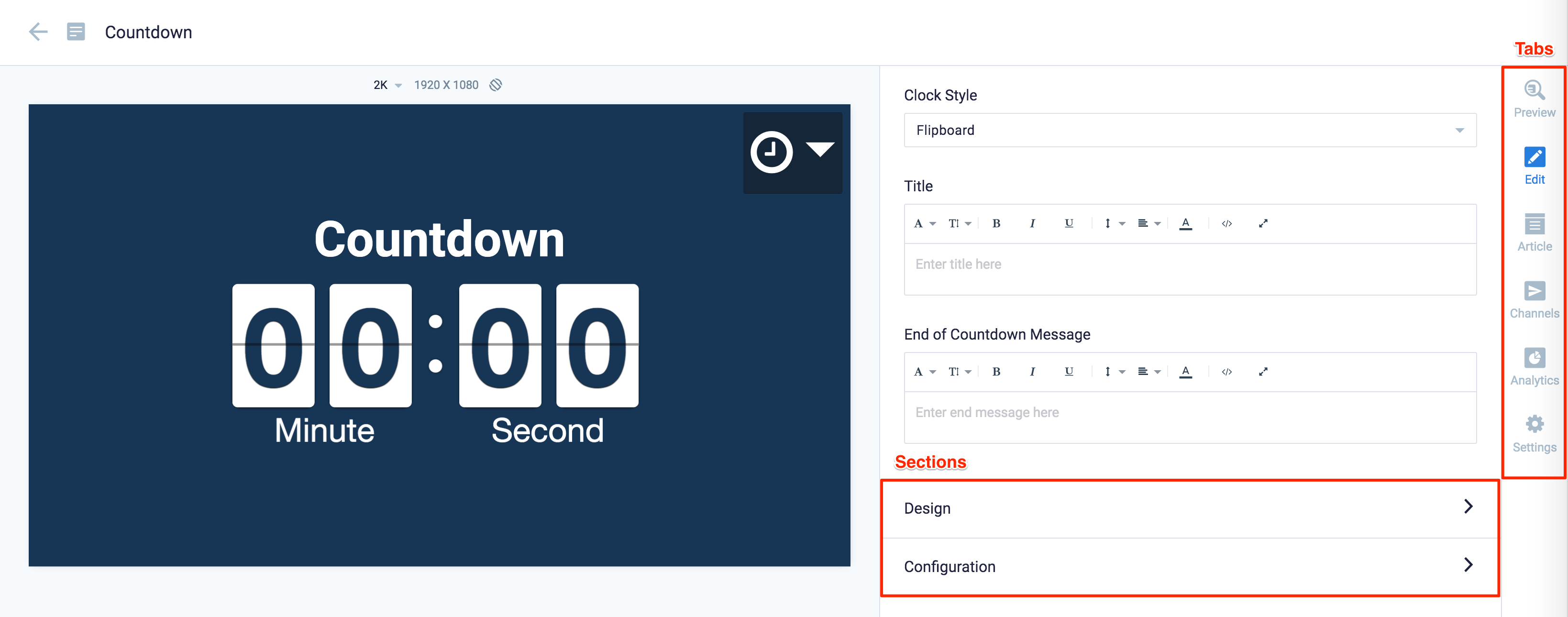
The card editor has been updated with a new UI and workflow, which groups key functions and features into tabs and sections for improved user experience, such as:
- Preview tab – this tab appears only after the content is saved and the editor window is opened. Preview options include Responsive, Responsive 16:9, 2K, 4K, Tablet, Phone, or Custom.
- Edit tab – configure the card layout, message title and summary, logo, background and a featured media/image. Also, depending on card or template type, you may see these additional sections:
- Design section – includes customized design options for each card type, which includes color palette, background, logo, and style selection options.
- Configuration section – includes customized configuration options for each card type, such as chart options.
- Article tab – write the content article, caption, and include a referral link if any.
- Schedule tab – here you add the content directly to any existing channel, and configure its playback schedule and display properties.
- Settings tab – in this tab you may add a name for this card, configure its expiry date, add tags, and add a thumbnail image.
New Category and Tags
When creating a card, you now have the option to filter results based on tags and card template categories which are based on card types such as Messaging, Data, Services, Feeds, and Legacy content – to easily find what you need from a huge list of templates available.
Patch Updates
v 1.4.1
Release Date: 5 Aug 2020
Resolved Escalations
- AE-6073 – The table scrolling animation lags and is not seamless on LG webOS 3.0 devices.
v 1.3
Release Date: 28 Mar 2020
Support for external data sources via URL link
Users are now provided with an option to define a URL link that retrieves data from an external data source, instead of manually entering, or importing data into the dataset. Users can also define how often the card updates data from the external source via the URL link, by setting a duration to retrieve data, or to reload the card.
The following external data sources formats via a URL link are supported:
- An array of array object
- .csv file
- .xlsx fileImportantThe .xlsx file format requires Appspace App 2.10 to work correctly, which is scheduled to be released on the 10th of April 2020. If a .xlsx file is used in the card, the card and the Appspace App will crash during playback.
Card animation
The Table card is now presented with animation during loading.
New Advanced Device Tasks templates
Support for the following post messaging APIs with Device Task templates:
- Get current raw data
- On data change
- Set data
Patch Updates
v 1.3.1
Release Date: 20 May 2019
Resolved Escalations
- AE-6009 – Table formatting issue when displayed on LG webOS 3.0 devices.
v 1.2
Release Date: 7 Feb 2020
Conditional formatting
Users can now create and define conditional cell formatting using the inline control available when hovering on the table cell.
The following conditional formatting options are available:- Positive values
- Negative values
- Is empty
- Is not empty
- Greater than
- Greater than or equals to
- Less than
- Less than or equals to
- In range
- Out of range
- Text contains
- Text does not contains
- Text is exactly
- Exactly
Column Sorting
Records within the column can now be sorted either in either ascending or descending order, and can be reverted back to its original data order.
The ascending sort order is based on the following sequence:- Empty value
- Number
- Date
- Character
- Media
Data Filtering
Columns can now be filtered to only display records that match the following conditions:
- Positive values
- Negative values
- Is empty
- Is not empty
- Greater than
- Greater than or equals to
- Less than
- Less than or equals to
- In range
- Out of range
- Text contains
- Text does not contains
- Text is exactly
v 1.1
Release Date: 6 Dec 2019
The Table card has been updated with the following features:
- Reorganization of the input fields to provide a better user experience.
- Row Shading, a new Display Option that allows alternate rows to be shaded in the table.
- Column Formatting, allowing users to now format each column differently via the column inline controls, which can be invoked by hovering over the column. Formatting options include:
- Text Font, and Size
- Text Color, and Background Text Color
- Text Alignment, and Text Wrapping.
- Column Highlight, enable users to highlight or give more perferences to a column.
- Support for adding images to cells within the table.

- The following default settings of the card has been changed to:
- Row Height: Fixed
- Rows per page: 5
- Column Width: Auto
- First column being highlighted. (with the inline formatting: highlight icon clicked)
Patch Updates
v 1.1.1
Release Date: 27 Dec 2019
Resolved Escalations
- AE-5694 – Does not display temperature, when temperature is 0 celsius.
- AE-5695 – Motion background does not display, but displays in web preview.
- AE-5748 – Word wrap does not function correctly.
- AE-5749 – The table column width does not function correctly.
v 1.0
Release Date: 9 Oct 2019
Patch Updates
v 1.0.2
Release Date: 24 Oct 2019
Dark Theme
A Dark theme has been added to the Table card.
v 1.0.1
Release Date: 18 Oct 2019
Introducing A New Table Card
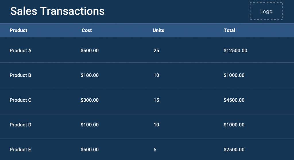
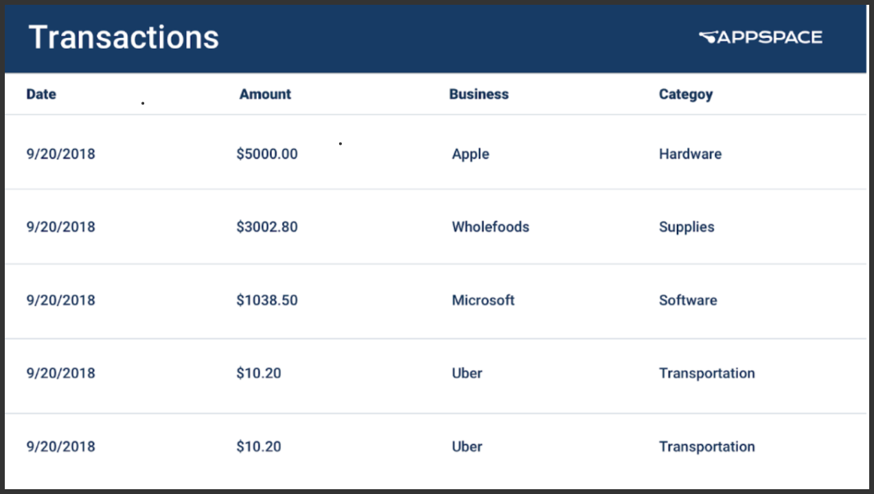
The Table card is the latest addition to the supported Appspace cards deck, that allows users to enter in data manually, or upload a spreadsheet to display data in a table format.
The following features are available for the Table card:
- Supports user scrolling.
- Formatting card background color.
- Inserting media as card background.
- Formatting of the table header and body.
- Enable or disable word wrap.
- Position the logo on the top left, top right, bottom left, or bottom right.
- Enable or disable Auto Paging. Enabling auto paging will allow users to select either ‘continuous scrolling’ or ‘page-by-page’ as the desired page transition.
- Configure the row and column width of the table as ‘fixed’ or ‘auto’:
- Fixed – First column / Header is automatically set, while the body width is distributed equally.
- Auto – The row height takes up the natural height of the content. Pagination is turned on by default if rows are set to Auto.
- Configure the pagination row height of the table as ‘fixed’ or ‘auto’:
-
- Fixed – Allows the user to determine the number of rows to be displayed in a page.
- Auto – Entire table would be displayed, and content will automatically scroll based on the set duration.
-
Was this article helpful?


