This article provides the instructions to create and configure a Table card, which allows you to display data or quantitative information in a structured table, either by manually adding the data into the table, or importing it from an Excel spreadsheet.
The following features and customizations are available on the Table card:
- With the introduction of Content Categories in Appspace 8.0 ac.22, the Data Visualization card template is assigned with the Goals & Performance content category.
- Manual data input or from an external source using a URL.
- Table title, header and body customizations.
- Background color and media support.
- Custom row height and column width settings.
- Conditional formatting.
- Column sorting.
- Data filtering.
- Table pagination, with transitions and custom durations.
Existing Table card templates (prior to this release) which were categorized as Community Cards will be removed from the Appspace console.
Visit our Appspace Card Gallery to find the perfect card to deliver your message.
This article provides instructions on how to create, configure, and customize the Table card.
Prerequisites
- Ensure your device is compatible. Refer to the Supported Appspace Cards article.
- Account Owner, Publisher, or Author role to add or edit content in Library.
Create and Configure Table Card
The instructions below allow you to create a table in Library.
- Log in to your Appspace console.
- To create this card, select one of the following options:
- Click +Quick Action from the Appspace menu bar on the top right, and select Create Card.
- Click Library from the ☰ Appspace menu, and select a library or folder you wish to create the content in. Click +CREATE, and select Card.
- To create and add the card directly to an existing channel, refer to Add Content to Playlist Channels.
- Select Communication from the All Templates panel, and click Table.
ImportantIf you are unable to locate the content, try using either the Search bar, the Order by, or Filter icon to narrow down the content that you are looking for.
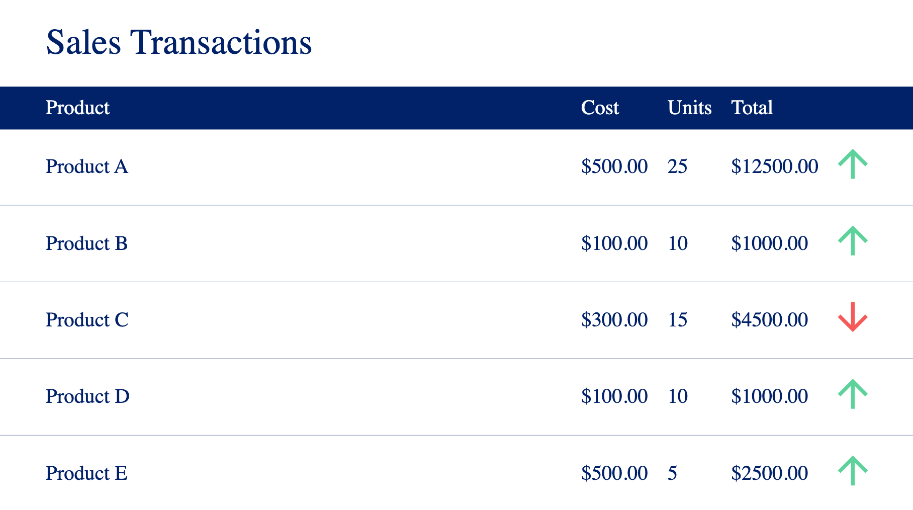
- Enter the Title of the content as this will also act as the filename for the content. This is a mandatory field.
- In the Edit tab:
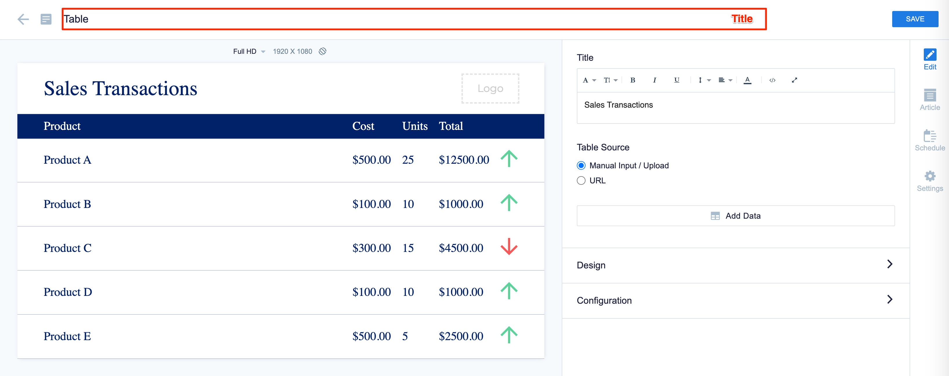
- Enter the Title of the table. Use the Text Editor to customize the text font and style.
- There are two options to populate data into the Table card, select your preferred option:
- Manual Input / Upload (Internal Data Source) ImportantOnly an Excel spreadsheet (.xlsx) is supported for imports.
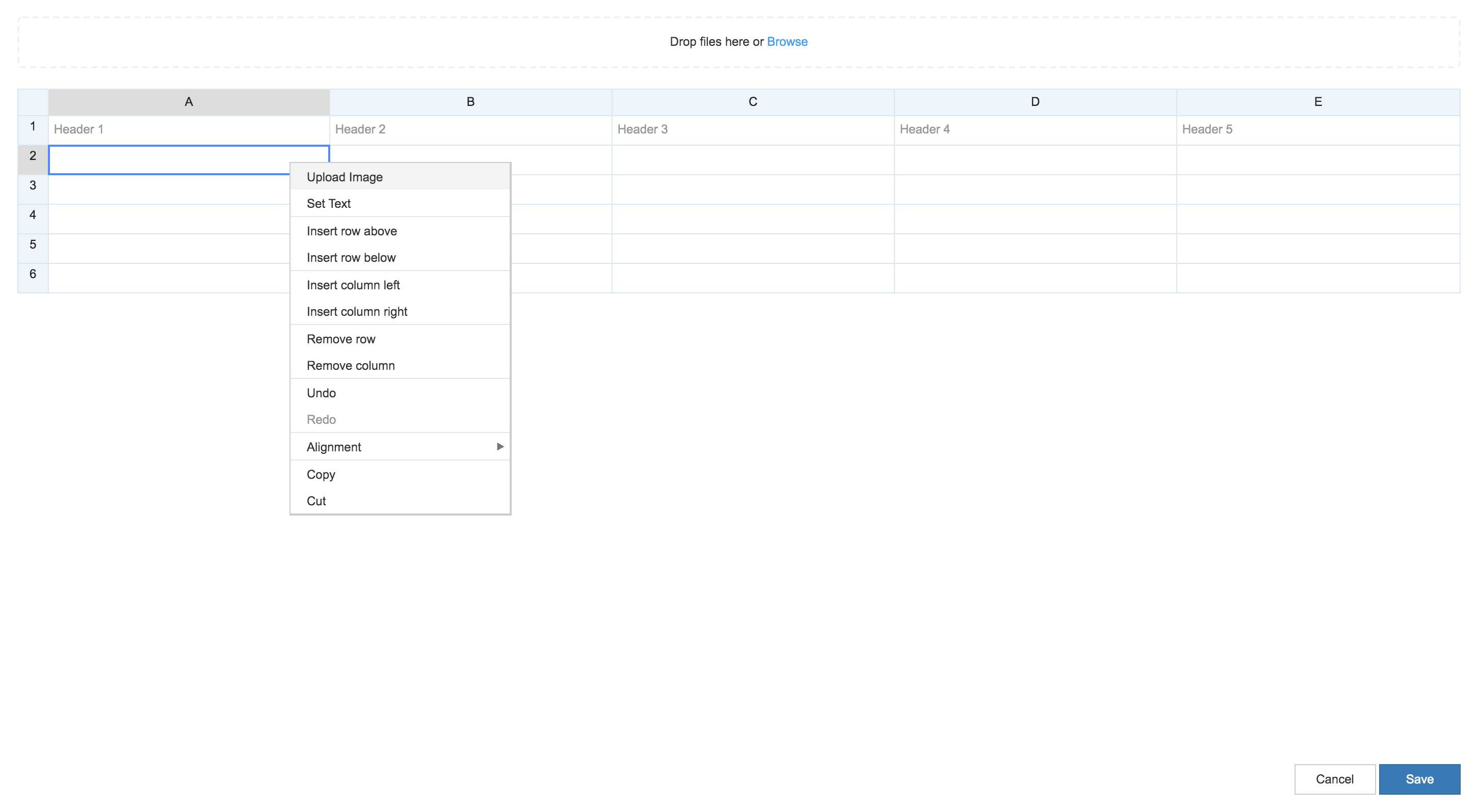
- Click the Add Data button, and populate the card’s table using one of the following methods:
- Manually enter data or an image into the table.
NoteOnly Table Card 1.1 and later support adding images to a cell. We recommend the following dataset requirements to prevent loading issues on certain devices:- Recommended dataset without images in cells, is up to 100 rows and 15 columns.
- Recommended dataset with images in cells, is up to 20 rows and 10 columns.
- Copy and paste data from an external table.
- Import data from an Excel spreadsheet (.xlsx).
- Manually enter data or an image into the table.
- Click the Add Data button, and populate the card’s table using one of the following methods:
- URL (External Data Source)
ImportantWe support URL links to an array of array object, a CSV file (.CSV), or an XLSX file (.xlsx).
- Enter in the URL link for the external data source ( array of object array, .csv, or .xslx )
- Select the Refresh URL, and enter in the duration in minutes.
- Set Duration – Retrieves external data from the URL link provided depending on the duration set.
- Card Reload – Reloads the entire Table card depending on the duration set.
- Manual Input / Upload (Internal Data Source)
- Hover over the column to bring up the column inline controls, which allow users to:
- Format Column – Enables individual column styling and text wrapping options for the selected column.
- Conditional Formatting – Enables conditional formatting for the selected column.
The following conditional formatting options are available:- Positive values
- Negative values
- Is empty
- Is not empty
- Greater than
- Greater than or equals to
- Less than
- Less than or equals to
- In range
- Out of range
- Text contains
- Text does not contains
- Text is exactly
- Exactly
- Highlight Column – Expands the selected column by using the remaining width of the table, once non-highlighted columns take on the natural width of the table.
- Sort Column – Enables the selected column to be sorted either acsending or descending order.
The acsending order is sorted based on the following sequence:- Empty value
- Number
- Date
- Character
- Media
- Filter Column – Enables the selected column to display only the filtered records.
The following filter options are available:- Positive values
- Negative values
- Is empty
- Is not empty
- Greater than
- Greater than or equals to
- Less than
- Less than or equals to
- In range
- Out of range
- Text contains
- Text does not contains
- Text is exactly
- In the Design section: click the arrow to expand.
- Customize the Header Styling and Body Styling, such as font, size, color, background.
- Customize the Banner, and the Background color or image.
- Upload a Logo.
- In the Configuration section: click the arrow to expand.
- Select the Row Height:
- Auto
- Fixed – Displays the Rows per page option, allowing users to set the number of rows to display in a page.
- Select the Column Width:
- Auto
- Distribute equally
- Select the Display Options:
- Enable intro transitions
- Enable auto paging
- Enable table carousel
- Enable word wrap
- Enable row shading
- Select the Page Transition
- Continuous scrolling
- Page-by-page
- Select the Page Duration (Seconds)
- 8 secs
- 12 secs
- 24 secs
- Select the Row Height:
- In the Article tab: This section may be skipped.
- Include an Article or Caption to accompany the content item when being displayed on mobile apps, tablets, and other social collaboration apps.
- Enter a Referral Link to link more information to the content.
- In the Schedule tab: This section may be skipped.
- You may add the content to a channel by selecting the channel from the Add to channel drop-down menu, or leave it unassigned to be added later.
- When the content is assigned to a channel, the SCHEDULING and DISPLAY PROPERTIES options are displayed. Refer to the Configure Content Playback Properties: Dayparting, Frequency, Scheduling, in a Playlist Channel article for detailed configuration instructions.
- In the Settings tab: This section may be skipped.
- The Name field will be auto-populated to match the Title of the content which will also act as the filename for the content. This is a mandatory field.
- Select the Content Category from the drop-down menu to match the focus of the message, or leave it at the default content category.
- Enter any relevant Tags for the content. (Optional)
- Select a folder for the content in the Library Location drop-down menu to change the default folder location.
- Select an expiry date for the content from the Auto Delete Content from Library drop-down menu. (Optional)
- Upload an image to be used as the Thumbnail for the content.
- Once done, click SAVE.
Edit Table Card
The instructions below show you how to edit a Table card.
- Log in to your Appspace console.
- Click Library from the ☰ Appspace menu, and select a library or folder containing the content you wish to edit.
- Select and click the Table card to edit, and select the desired tab to edit or view.
- In the Edit, Article, and Settings tabs:
- You may edit the content the same way as it was configured. For detailed instructions on how to do this, please refer to the Create and Configure Table Card section above.
- In the Preview tab:
- Preview how the content is displayed on your device.
- In the Channels tab:
- You may add the content to a channel by selecting the channel from the Add to channel drop-down menu, or leave it unassigned to be added later.
- When the content is assigned to a channel, the SCHEDULING and DISPLAY PROPERTIES options are displayed. Refer to the Configure Content Playback Properties: Dayparting, Frequency, Scheduling, in a Playlist Channel article for detailed configuration instructions.
- In the Analytics tab:
- View the individual content analytics in this tab. For more information, please refer to the Individual Content Analytics section of the Analytics article.
- In the Edit, Article, and Settings tabs:
- Once done, click SAVE.
Was this article helpful?