Creating a card
This article provides the instructions to creating a card in the Library.
Appspace Supported cards are officially created by Appspace, and are available to all cloud users, while cards that are created by a third-party community developer are categorized as Community Cards. Below is a list of cards currently available:
Appspace Supported cards
- Announcement card
- Web View Card
Community cards
- Data Table card
- Donut Chart card
- Facebook card
- Line Chart card
- RSS card
- Google Slides card
- Youtube card
- Social Media card by Seenspire
Note
The Seenspire Social Media card is a community developed card and is compatible with Appspace 6.2.2 and later. For detailed configuration instructions of the card, please contact Seenspire.
Important
Community cards will be turned off by default. Contact us to learn more about our developer community.
Please take note of the following when adding a card:
The card title is also the name used when saving the card to the Library. Therefore this is a mandatory field.
The Text Editor is only displayed for each field when you click and type in the field (Title, Headline, Summary). It provides basic text editing capabilities such as Font Size, Font Style, Text Alignment, and Text Color.
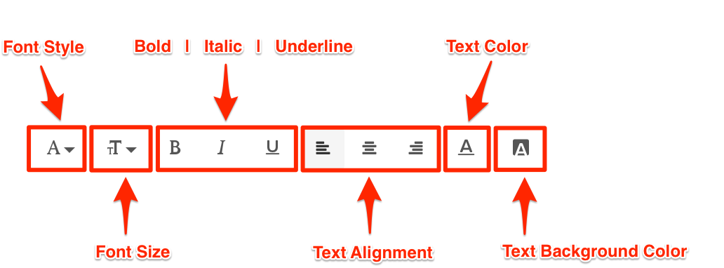
You can add images to the card by browsing the library for existing content. You can also upload, or drag and drop an image directly into the image placeholder, from a folder in your computer.
However, you may only upload one image to the image placeholder.

The Color Picker, enables color selection for text and backgrounds in the Card.
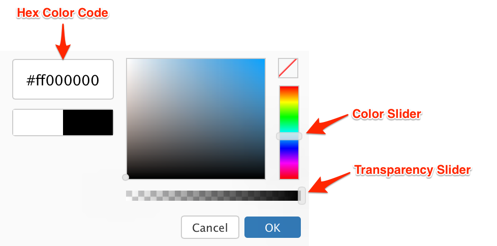
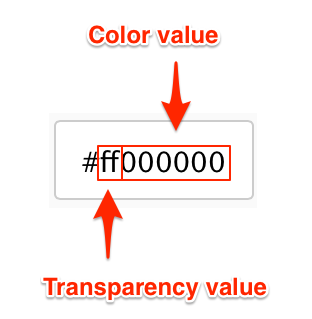
The first two characters in the Hex Color Code are the Transparency value, while the next six characters are the Color values. Please be mindful when including a custom Hex color code.
Create card
Click Library from the Appspace Menu navigation bar.
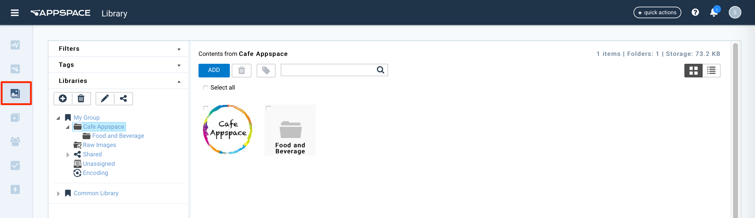
Select the desired folder in the library, and click the ADD button, and select Create Card.
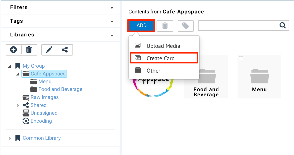
Select a card template and follow the instructions based on the selected card below:
Appspace Supported Cards:
Community Cards:
- Data Table Card
- Donut Chart Card
- Facebook Card
- Line Chart Card
- RSS Card
- Google Slides Card
- Youtube Card
- Social Media Card by Seenspire
Announcement Card
Fill in the Headline and Summary text to be displayed on the card. The Text Editor can be used to customize the text styles.
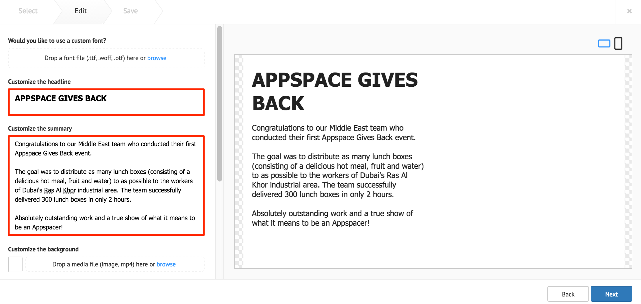
The following card customization options can be done:
- Upload a custom font, to be used in the Text Editor
- Customize the card background color, image, or video.
- Add an image, with image stretch options.
- Add a logo.
- Select the card layout, with additional customization options.
Note
The latest Announcement card template now supports video backgrounds (.mp4).
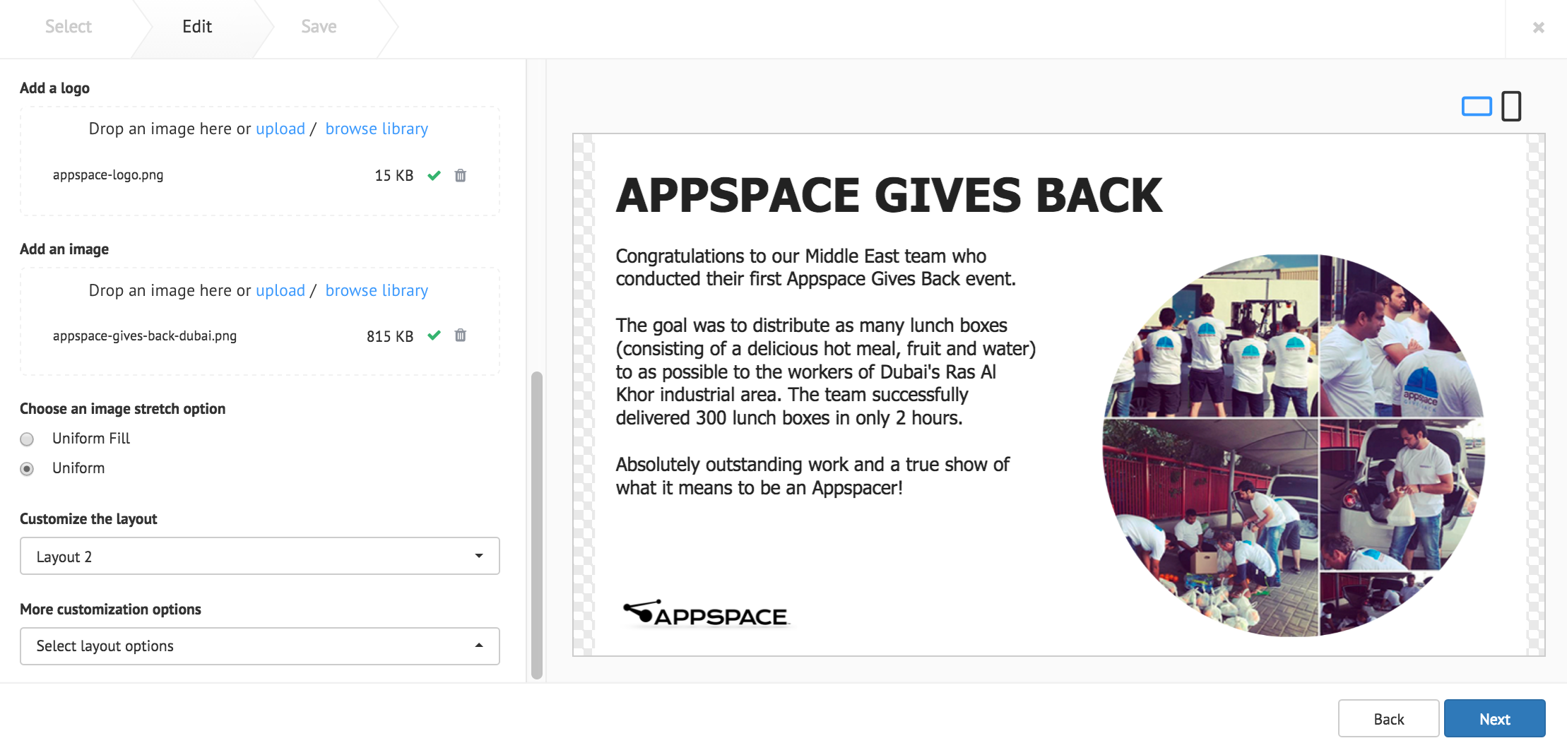
Click Next.
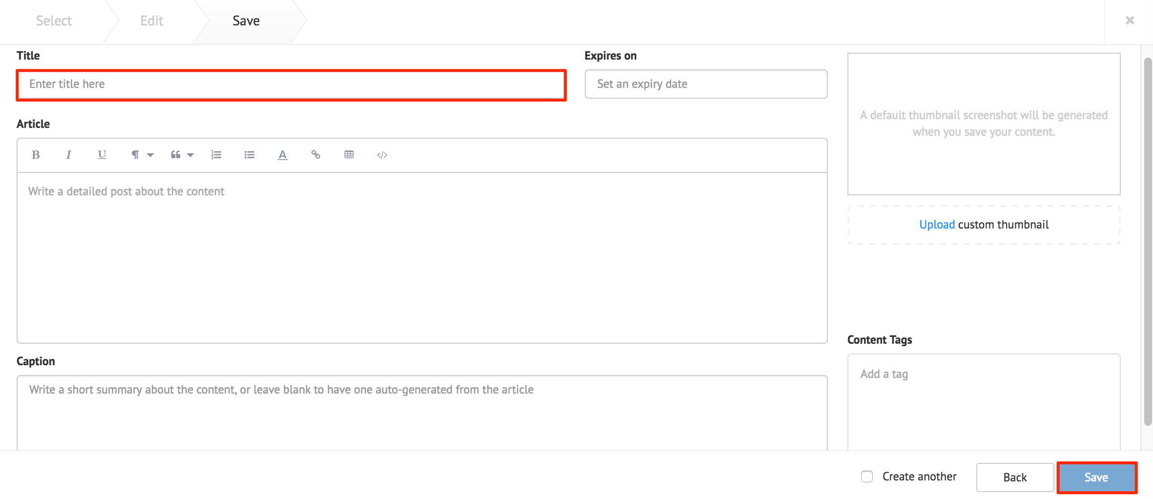
Fill in the Title, as this is a mandatory field. Optionally, you may fill in the Article, Caption, Content Expiry, Content Tags and even upload a custom thumbnail for the content.
Web View Card
Fill in the desired website URL in the Enter website URL field.
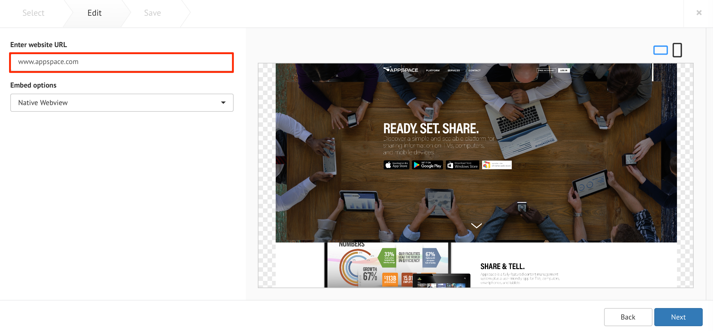
Select one of the following Embed options:
Native Webview - Displays the web page in the device’s browser without the ability to customize, as the web page is set as source and is not embedded.
XHR Proxy - Uses XMLHttpRequest (XHR) proxy to by-pass some browser security settings, to display websites that do not allow embedding.
Basic Authentication - Allows web pages with basic authentication using the XHR proxy method.
Iframe - Uses the most basic way to embed web pages, and only works if the web page allows embedding. It may not work for websites that disallow embedding, such as social media web sites.
Additional customization options are available when XHR Proxy, or Iframe is selected.
Select Set website scaling to configure the following:
- Fit to screen - Allows the web page to be displayed to match the screen resolution
- Custom size - Allows the web page to be displayed at a custom resolution.
- Custom size with crop - Allows a particular section of the web page to be displayed.
Select More customization options to configure the following:
- Disable interactivity - Prevents users from clicking or scrolling the web page on devices with touchscreen or mouse attached.
- Display while loading - Displays the web page before it is fully loaded, with certain elements loaded after the web page is displayed.
Customize the card background color, or image.
Click Next.
Fill in the Title, as this is a mandatory field. Optionally, you may fill in the Article, Caption, Content Expiry, Content Tags and even upload a custom thumbnail for the content.
Data Table Card
Fill in the Headline and Summary text to be displayed on the card. The Text Editor can be used to customize the text styles.
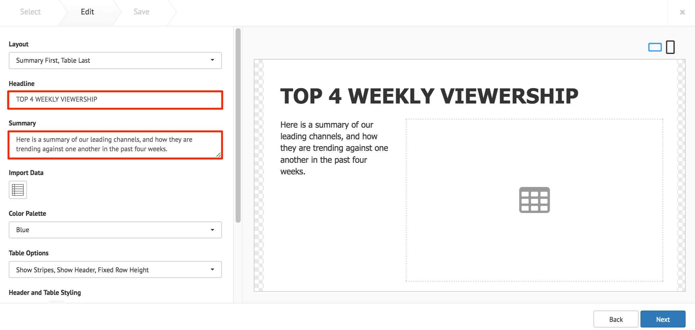
Click the Import Data button, and populate the card’s table using one of the following methods:
- Manually enter the data.
- Copy and paste data from an external table.
- Import data from an Excel spreadsheet (.xlsx).
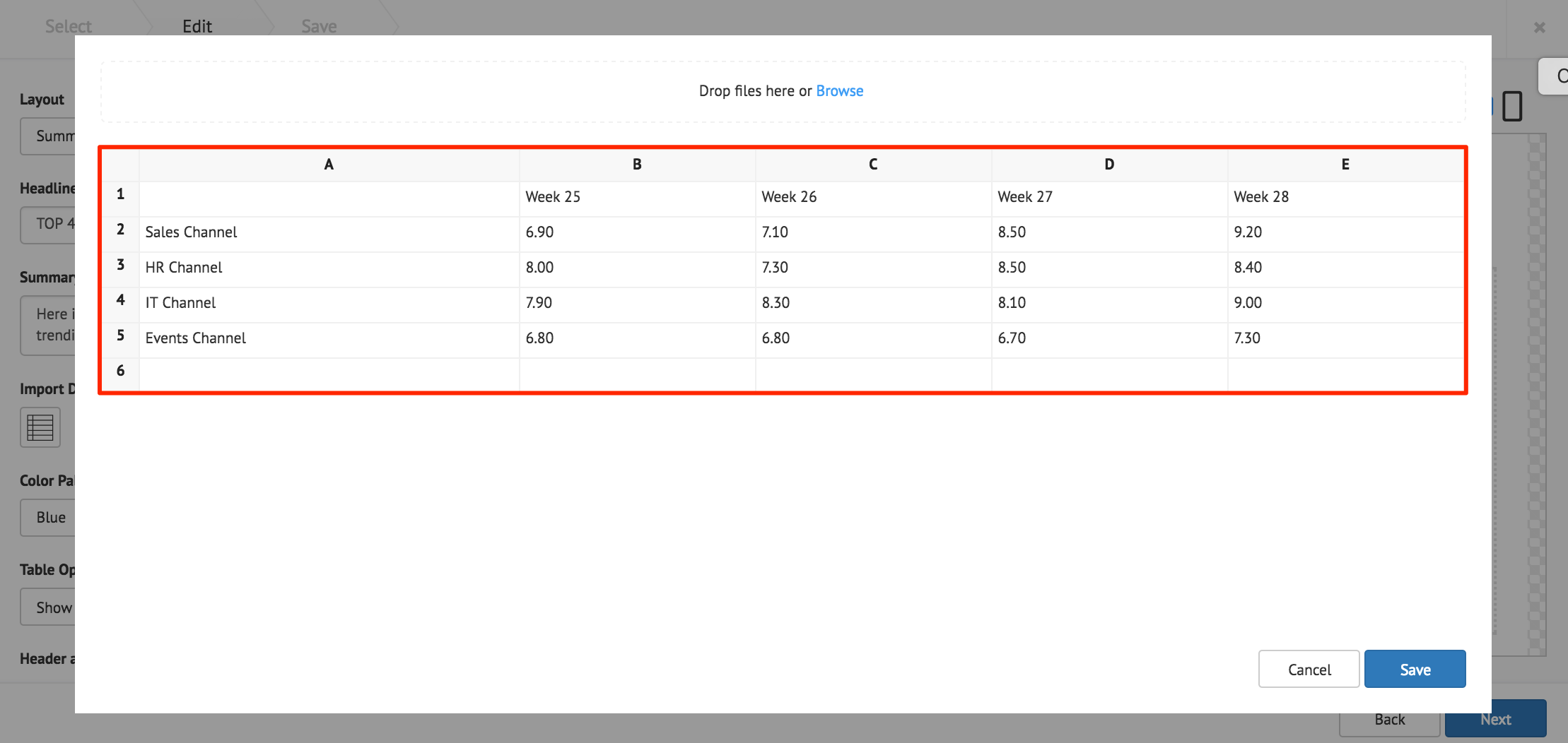
Click Save once done.
The following card customization options can be done:
- Select the card layout.
- Select the data table color palette.
- Select the data table options.
- Customize the Header and Table style.
- Customize the table cell style.
- Customize the card background color, or image.
Click Next.
Fill in the Title, as this is a mandatory field. Optionally, you may fill in the Article, Caption, Content Expiry, Content Tags and even upload a custom thumbnail for the content.
Donut Chart Card
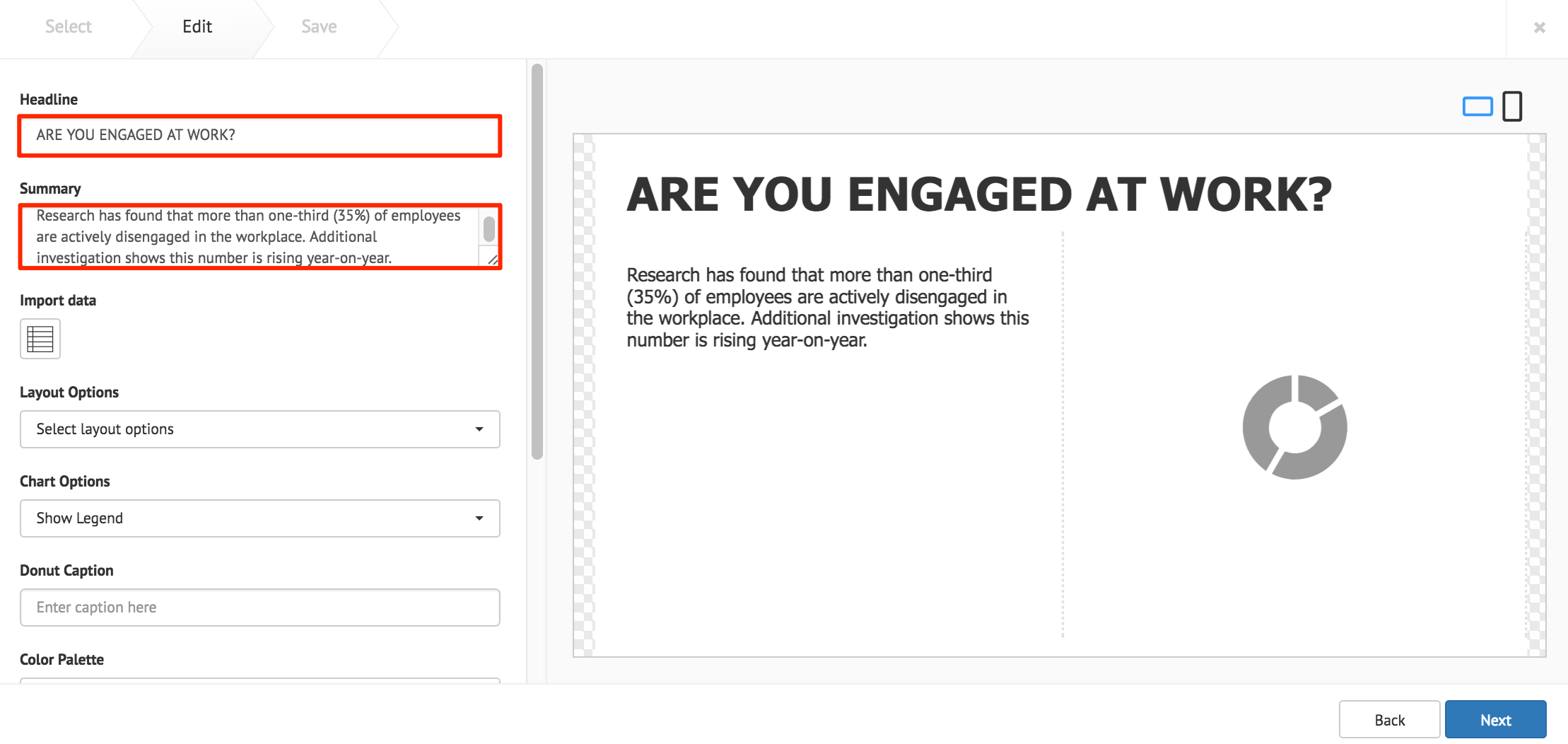
Fill in the Headline and Summary text to be displayed on the card. The Text Editor can be used to customize the text styles.
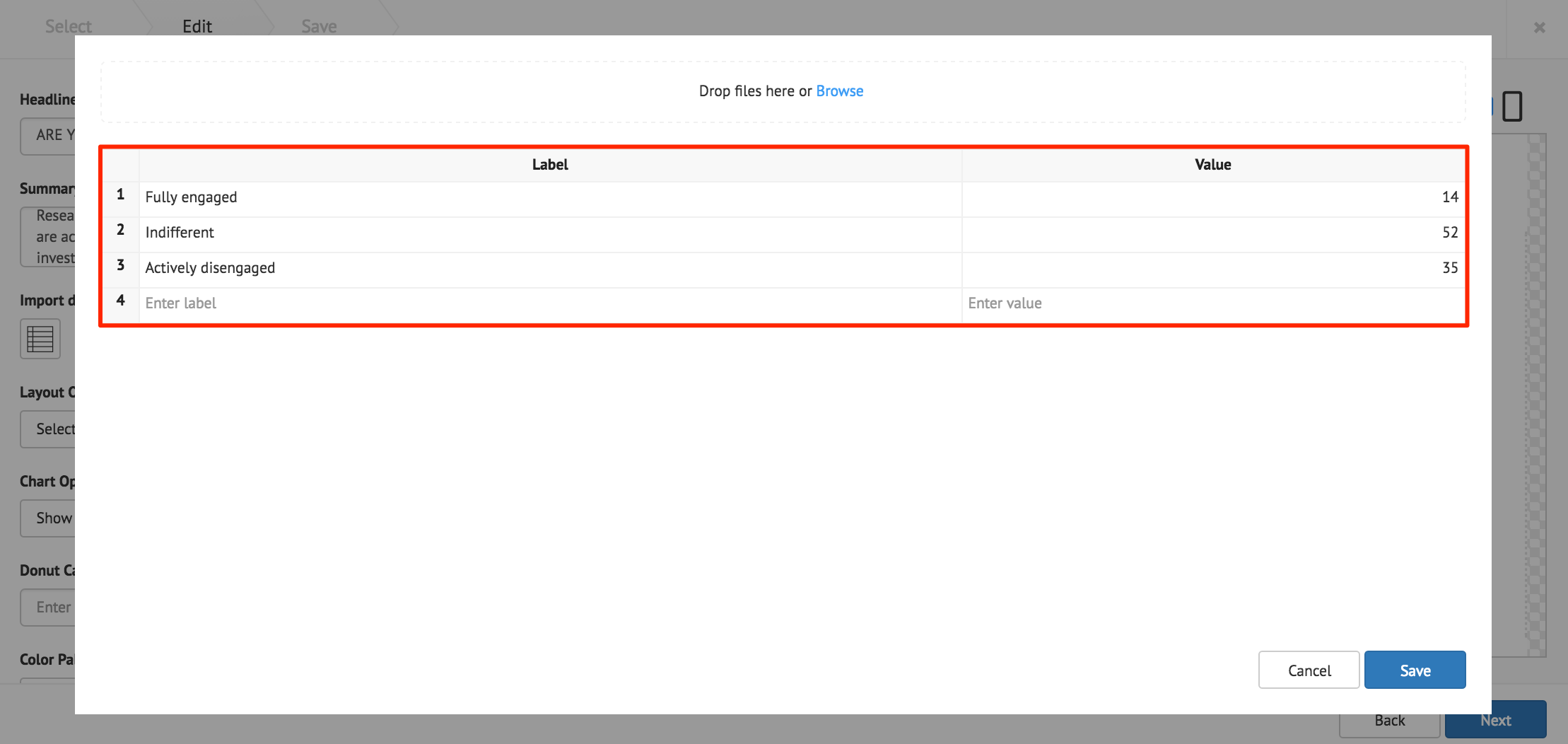
Click the Import Data button, and populate the cards table using one of the following methods:
- Manually enter the data.
- Copy and paste data from an external table.
- Import data from an Excel spreadsheet (.xlsx).
The Label column accepts text strings, and the Value column only accepts numeric values.
Note
The chart only displays the largest eight slices, anything more is combined into one slice and labelled Others.
Important
When importing data from an Excel spreadsheet, the header columns must be titled as, label and value.
Click Save once done.
The following card customization options can be done:
- Select the card layout.
- Select the chart options.
- Add a caption inside the donut chart.
- Select the chart color palette.
- Customize the table style
- Customize the chart legend style.
- Upload a logo.
- Customize the card background color, or image.
Note
Additional Table Style or Legend Style customizations, are only displayed when Show Table, or Show Legend is selected in the Chart Options.
Click Next.
Fill in the Title, as this is a mandatory field. Optionally, you may fill in the Article, Caption, Content Expiry, Content Tags and even upload a custom thumbnail for the content.
Facebook Card
Fill in the desired Facebook Page name (as displayed on the Facebook page), and click Validate.
If the Facebook page displayed in the preview pane is incorrect, or an error appears, input the Facebook Page ID instead. You may visit http://findmyfbid.com/ to find the Facebook Page ID.
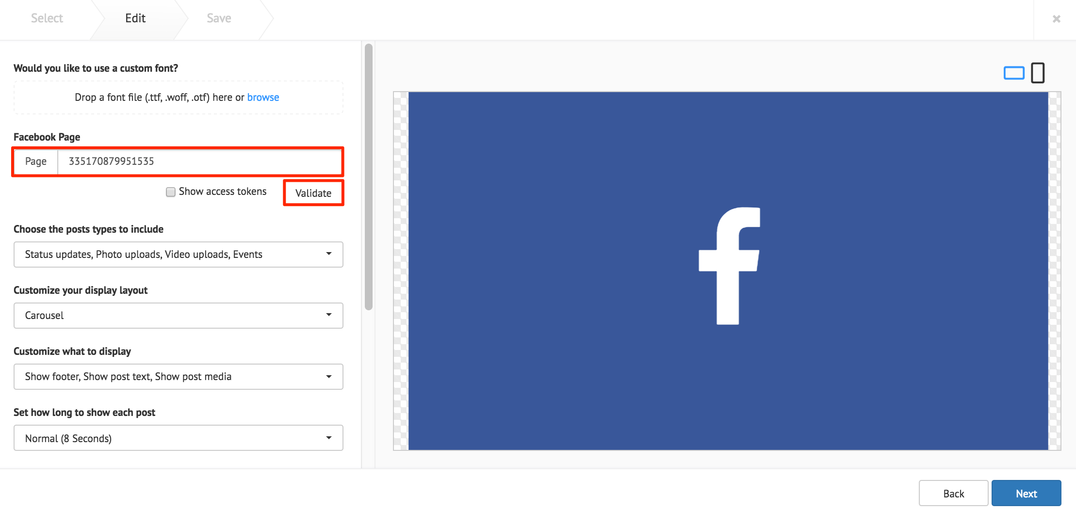
The Show access tokens option displays developer options.
Note
Facebook feeds appear with images by default. Images with less than 200px do not appear, and is replaced with the Facebook Page profile picture.
The following card customization options can be done:
- Upload a custom font.
- Select the types of Facebook posts to be displayed.
- Select the card layout.
- Customize the layout items that is displayed.
- Select the interval duration between Facebook posts
- Customize the Facebook text style.
- Customize the Facebook logo color.
- Customize the Facebook footer.
- Customize the card background color, or image.
Click Next.
Fill in the Title, as this is a mandatory field. Optionally, you may fill in the Article, Caption, Content Expiry, Content Tags and even upload a custom thumbnail for the content.
Line Chart Card
Fill in the Headline and Summary text to be displayed on the card. The Text Editor can be used to customize the text styles.

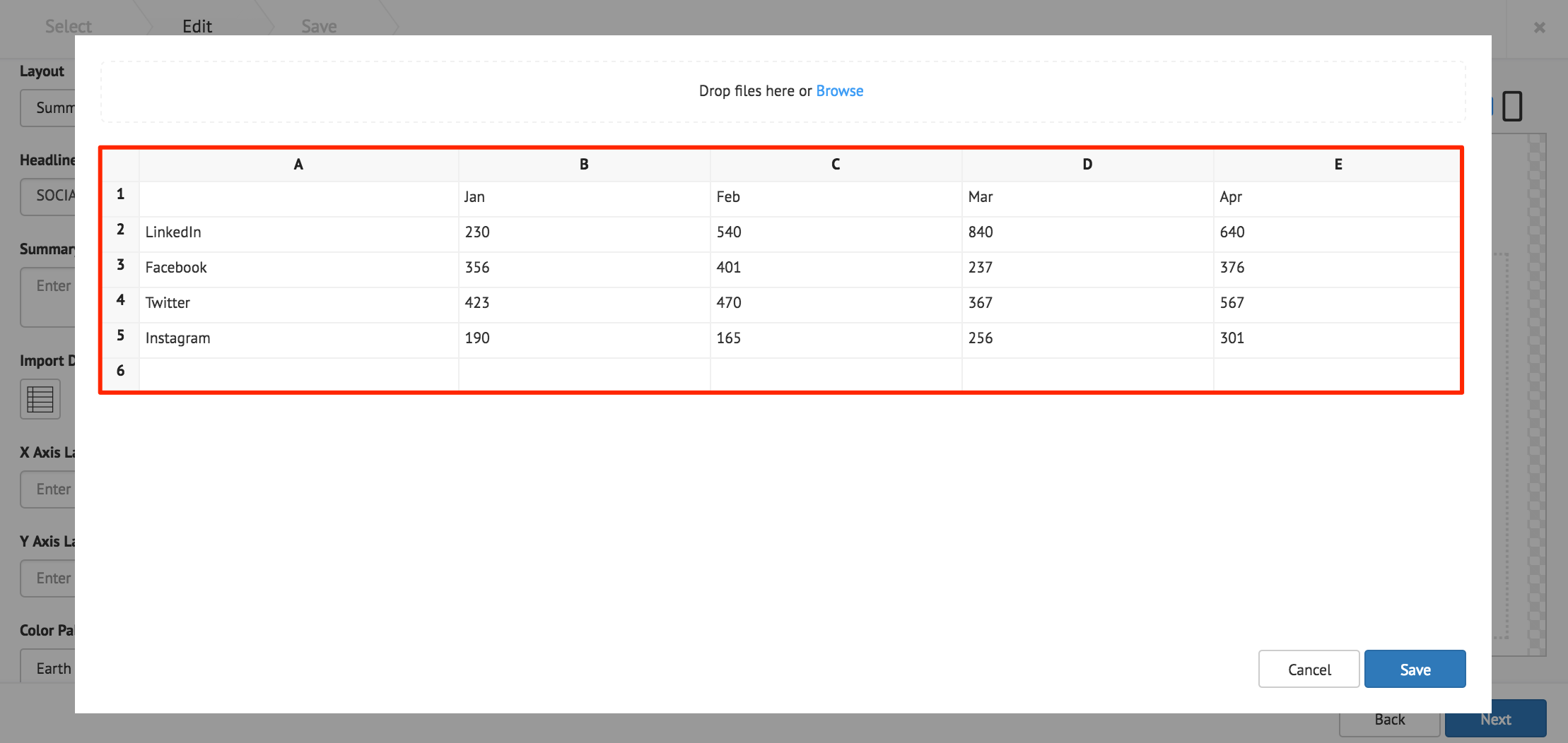
Click the Import Data button, and populate the cards table using one of the following methods:
- Manually enter the data.
- Copy and paste data from an external table.
- Import data from an Excel spreadsheet (.xlsx).
Data populated in rows represent the X Axis, and data populated in columns represent the Y Axis.
Click Save once done.
The following card customization options can be done:
- Select the card layout.
- Fill in the X and Y axis labels.
- Select the line chart color palette.
- Select the chart options.
- Customize the chart legend style.
- Customize the Axis label color.
- Customize the card background color, or image.
Note
Additional Legend Style or Axis Label Color customizations, are only displayed when Show Legend, or Show Axis is selected in the Chart Options.
Click Next.
Fill in the Title, as this is a mandatory field. Optionally, you may fill in the Article, Caption, Content Expiry, Content Tags and even upload a custom thumbnail for the content.
RSS Card
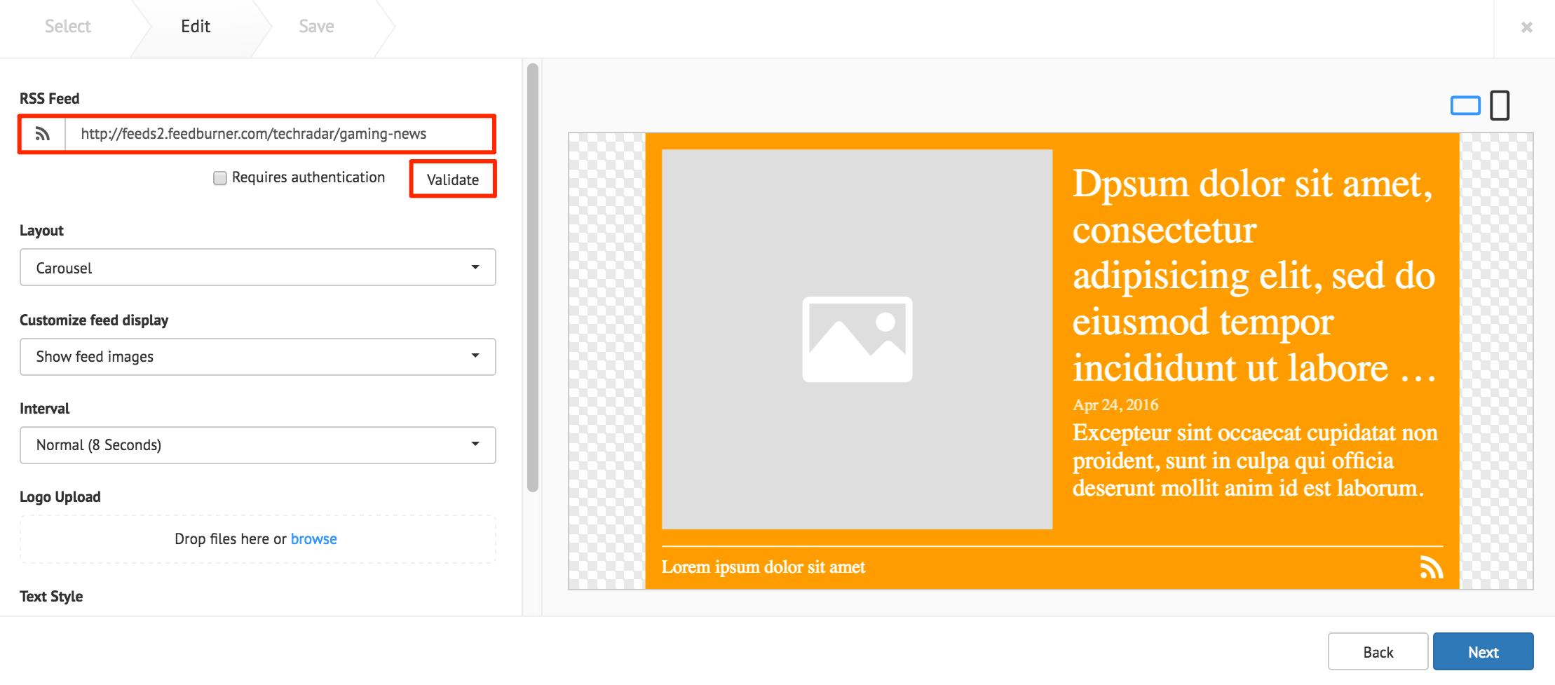
Enter in the RSS feed URL in to the address field, and click Validate. If authentication is required, check the Requires authentication checkbox, and fill in the required credentials.
Note
Supported RSS formats: RSS 1.0, RSS 2.0, mRSS, Atom 1.0
The following card customization options can be done:
- Select the card layout.
- Customize the RSS feed display.
- Select the interval duration between RSS posts
- Upload a customized RSS feed logo.
- Customize the RSS text style.
- Customize the card background color, or image.
Click Next.
Fill in the Title, as this is a mandatory field. Optionally, you may fill in the Article, Caption, Content Expiry, Content Tags and even upload a custom thumbnail for the content.
Google Slides Card
Enter in the Google Slides ID or URL link in to the address field.
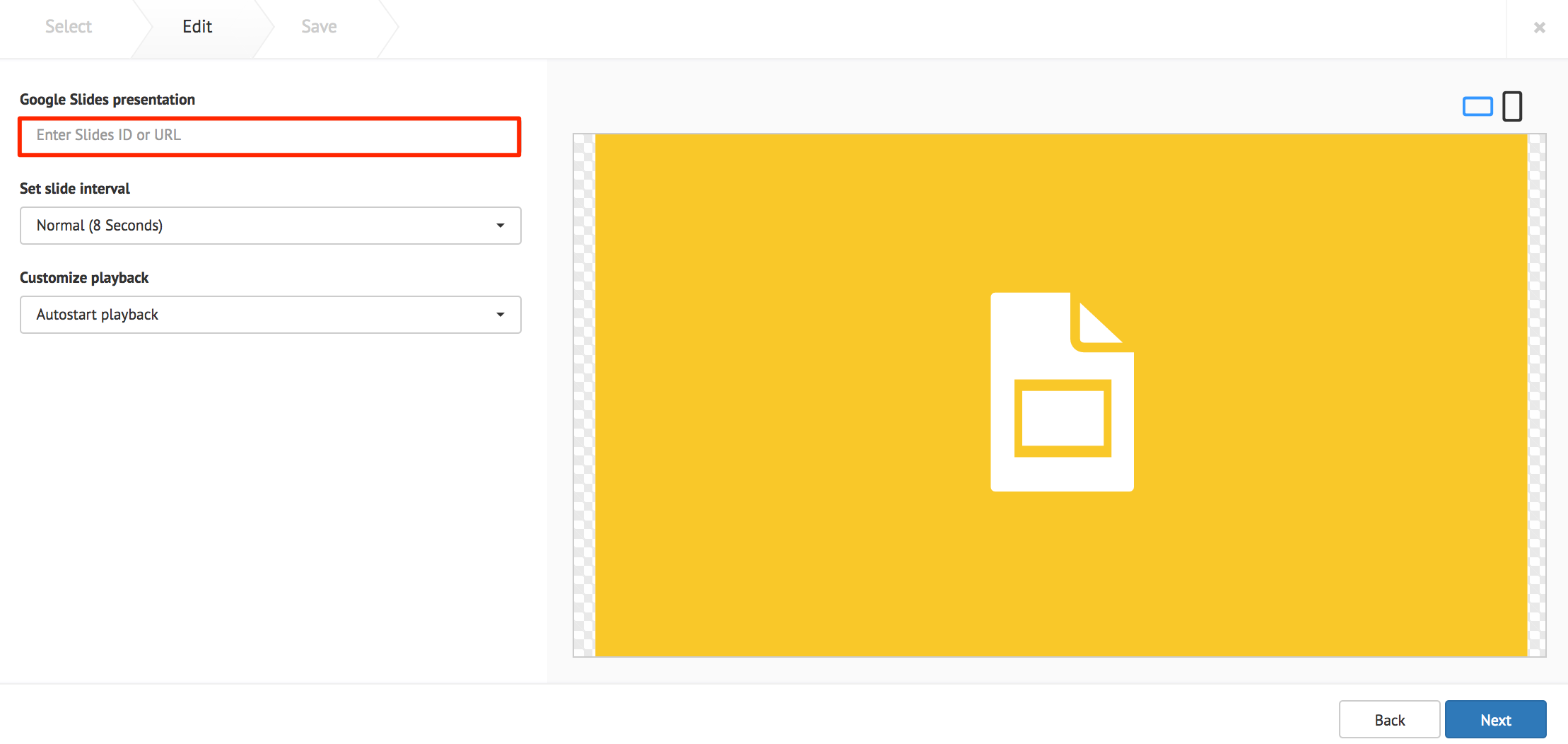
The following card customization options can be done:
- Set the interval duration between slides.
- Customize the playback behavior of the presentation.
Click Next.
Fill in the Title, as this is a mandatory field. Optionally, you may fill in the Article, Caption, Content Expiry, Content Tags and even upload a custom thumbnail for the content.
Youtube Card
Enter in the Youtube URL or playlist link in to the address field.
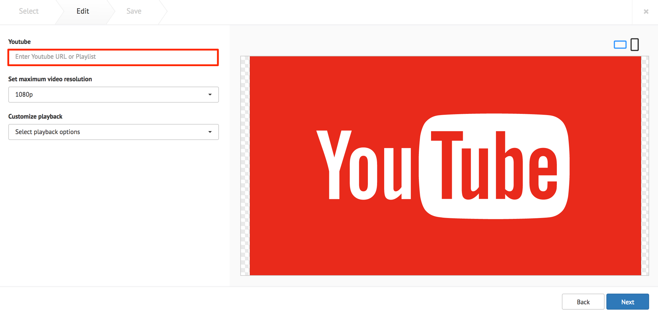
The following card customization options can be done:
- Set the maximum video resolution.
- Customize the playback behavior of the video.
Click Next.
Fill in the Title, as this is a mandatory field. Optionally, you may fill in the Article, Caption, Content Expiry, Content Tags and even upload a custom thumbnail for the content.
Social Media Card by Seenspire
Enter in the Seenspire credentials, and click Login
Click Connect to Seenspire to authenticate the account.
Click Next.
Fill in the Title, as this is a mandatory field. Optionally, you may fill in the Article, Caption, Content Expiry, Content Tags and even upload a custom thumbnail for the content.