There are two kinds of widgets from the styling point of view in the Hero:
-
HTML/CSS/JS
-
Adaptive cards (JSON and power automate widgets)
Both kinds of widgets have a slightly different way of adding and applying CSS that we’ll cover in the present document.
HTML/CSS/JS custom widgets
In the case of the HTML/CSS/JS custom widgets, you are free to use any code you want, and that content will be rendered inside a sandboxed iframe in its corresponding Hero block.
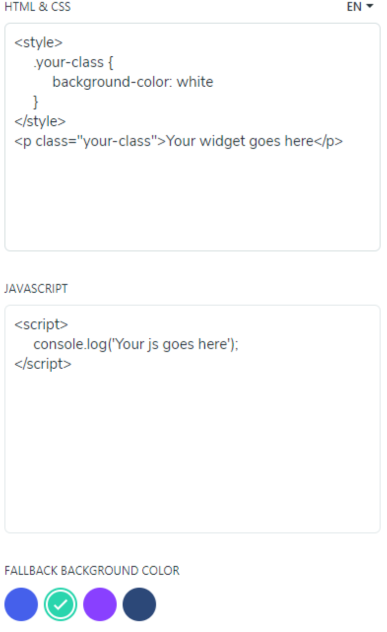
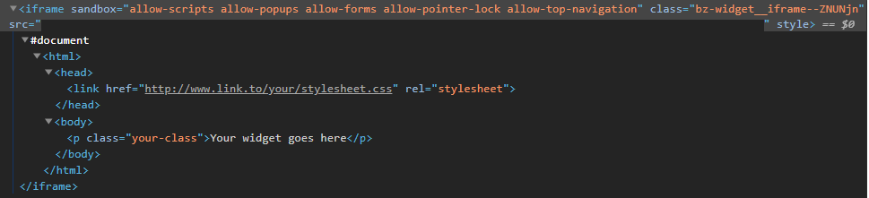
So, for example, with this code in the Hero settings:
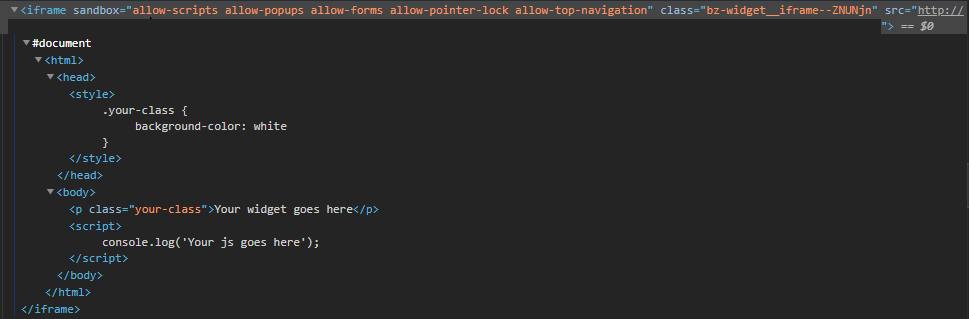
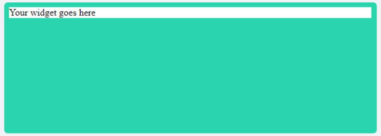
We’ll get this result:
Please consider that any resource used in a Hero block cannot be re-used from another block, as they are separate HTML files inside their respective iframe. The same happens in the case of the adaptive cards.
CSS styling for HTML/JS/CSS custom widgets
There are two ways you can add CSS to this kind of widget:
-
Directly in the “HTML & CSS” settings field inside a style tag:

In this case, the style tag and its CSS declarations will be extracted and rendered inside the head tag (see screenshot above).
-
Through an external stylesheet linked from the settings field: link href=”http://www.link.to/your/stylesheet.css” rel=”stylesheet”
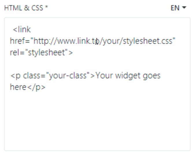
Also, in this case, the link tag will be rendered inside the head of the content of its iframe.
In both scenarios, we recommend the following default styles to improve the design of the custom widgets:
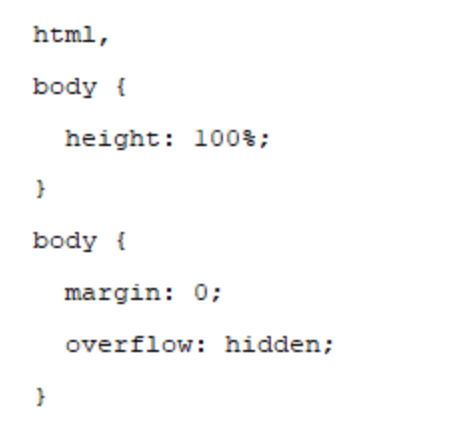
To know the effects of this CSS, please refer to “CSS styling” for Adaptive Cards, above. If any background color is applied to any tag that has 100% width and 100% height, the “Default background color” in the Hero settings will be hidden.
Using custom fonts in the HTML/CSS/JS custom widget
You can use custom fonts in the HTML/CSS/JS custom widgets just like in any other webpage. Please refer to “Using custom fonts in the adaptive cards” below. The only difference is that you don’t have to declare any font in any hostconfig file.
Responsive layout and custom widgets
As stated above, the iframe elements in which the widgets are rendered stretch by default to the 100% width and height of its container block, so they take advantage of responsive design. However, be aware that being inside an iframe means that you will have to use the dimensions of that iframe to make your media queries instead of the size of the browser window.
Some media queries that you can use are (please, ignore the values in pixels between brackets, they are only given as reference based in a standard root font size of 16px):
-
Mobile block: all widgets up to 1023px of the Browser window width: @media screen and (min-height: 27.8125rem [445px]) and (min-width: 20.875rem [334px])
-
Narrow block Tablet: widgets in Hercules from 1024px to 1279px of the browser window width: @media screen and (min-width: 15rem [240px]) and (max-width: 18.9375rem [303px]) and (max-height: 20.75rem [332px])
-
Wide block Tablet: widgets in Atalanta and Achilles from 1024px to 1279px of the browser window width: @media screen and (max-width: 25.4375rem [407px]) and (min-height: 13.5rem [216px]) and (max-height: 13.6875rem [219px])
-
Narrow block Desktop: widgets in Hercules from 1280px to 1920px of the browser window: @media screen and (min-height: 20.75rem [332px]) and (min-width: 18.8125rem [301px])
-
Wide block Desktop: widgets in Atalanta and Achilles from 1280px to 1920px of the browser window: @media screen and (min-width: 25.3125rem [405px]) and (min-height: 13.5625rem [217px]) and (max-height: 13.6875rem [219px])
Adaptive cards
Adaptive Cards are an open card exchange format enabling developers to exchange UI content in a common and consistent way. From the standpoint of styling, there are three fields in the Hero settings:
-
Template JSON: the JSON object with the data that will be rendered.
-
Hostconfig styling: a basic and across devices basic way of applying formats to the data.
-
CSS styling (optional): an extra way of polishing design aspects for web browsers.
How the adaptive card is embedded inside the Hero
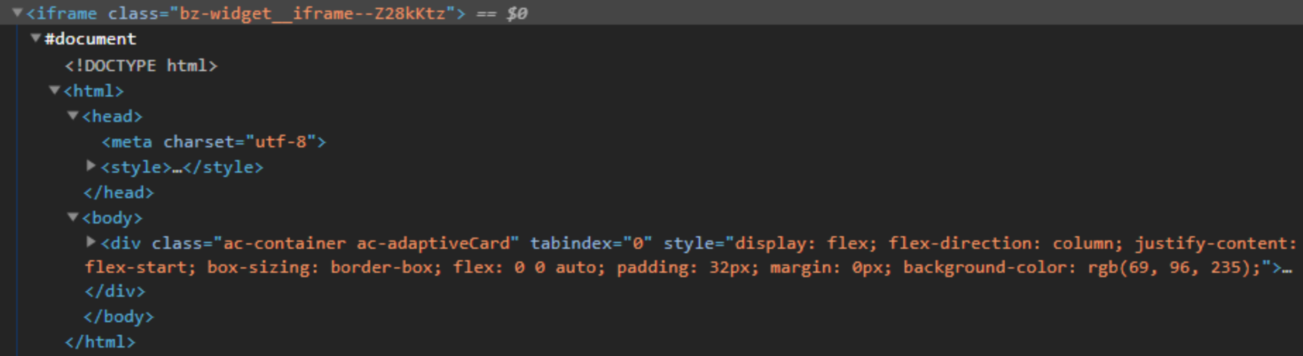
It is important to know how the adaptive cards are inserted inside their blocks in the Hero: the content of each one of them is included inside an iframe in its block. There will be a head tag with the optional stylesheet you might have added, and a body tag with the content configured with the template.json plus the inline styles set via its hostconfig.json:
Styling adaptive cards
There are two ways you can add styling to the adaptive cards, both simultaneously:
-
Through the hostconfig.json: this will set the basic styling and theming skeleton and some behaviors (for example, the max number of actions) for the adaptive card. This method is compatible with all the platforms in which the adaptive cards can be rendered(Android, web browser, Microsoft Teams, iOS, etc.)
-
Through an external stylesheet to polish and fine-tune those elements not targeted with the hostconfig.json. This method will work in our case: the Hero in a web browser.
In both cases, each way of styling the widgets work on a block basis: the CSS or hostconfig must be set individually for each adaptive card. Thus, for example, the CSS of widget A doesn’t affect widget B.
Hostconfig.json
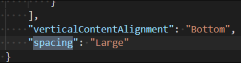
HostConfig is a cross-platform configuration object that specifies how an Adaptive Card Renderer generates the UI. With the hostconfig.json you can set the parameters for the basic style properties of font and image sizes, spacings, color theming for font and background, etc. For example, in the case of spacings, you can set the values for “small”, “default” and so on like this:
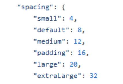
… and then apply them to the structure of your data in the template.json this way:
You can read about the options for the hostconfig and its parameters in: https://docs.microsoft.com/en-us/adaptive-cards/rendering-cards/host-config. And here you will find some examples of hostconfigs as a starting point: https://github.com/microsoft/AdaptiveCards/tree/main/samples/HostConfig. You can test your how your hostconfig renders your adaptive card in this visualizer by Microsoft: https://github.com/microsoft/AdaptiveCards/tree/main/samples/HostConfig.
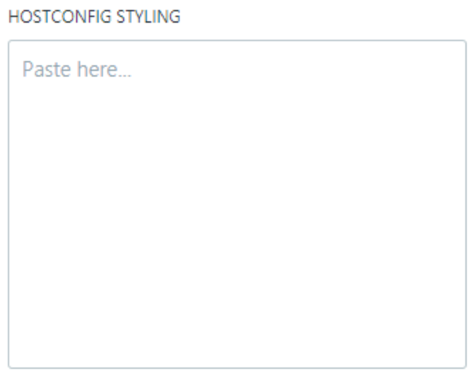
In the settings of the Hero, please insert the code of your hostconfig in this field:
CSS styling for Adaptive Cards
An extra stylesheet can be added to fine-tune the look of elements not covered by the hostconfig.json. By targeting the DOM elements with CSS selectors, the design of our Adaptive Cards can be greatly adapted to match the look and feel of the Hero.
Here is a list of CSS classes you can use to create a stylesheet for your custom adaptive card: https://docs.microsoft.com/en-us/adaptive-cards/sdk/rendering-cards/javascript/native-styling. And here you have some examples of stylesheets you can use as a reference: https://github.com/microsoft/AdaptiveCards/tree/main/source/nodejs/adaptivecards-designer/src/containers.
In the case of the settings for the Hero, you must enter the content of your stylesheet in this field:
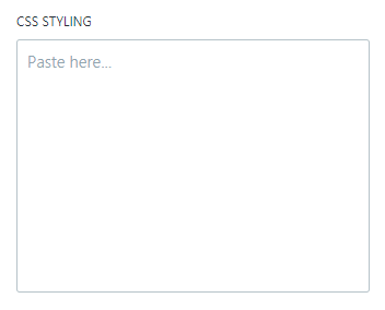
You must write CSS your code directly (that is, no < style >…< / style > tags are needed).
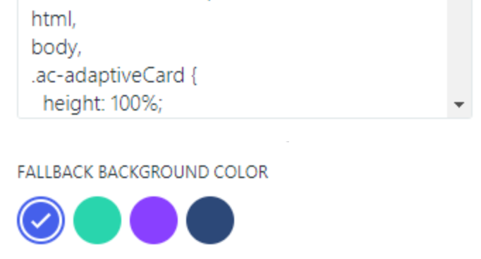
In the case of the Hero, some basic CSS we strongly recommend to reset undesired styles and take advantage of the responsive behavior are:
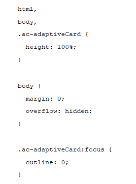
With these styles:
-
we make the container of the adaptive card take the whole height of its parent (its own Hero widget block) and make it the same size as the other blocks in the Hero. This way, the background color of the adaptive card also “hides” the fallback background color of the settings
-
we remove the default margin of the body tag inside the iframe of our adaptive card, and the undesirable scrollbar that may appear if the content is bigger than its parent block.
-
we remove an undesired outline that shows when the adaptive card is focused with the mouse in some browsers.
By default, the iframe (not the HTML document inside) that contains the adaptive card is set to stretch to the dimensions of its parent block (100% of its height and width), so you don’t have to add any styles to adapt it.
Using specific fonts in the adaptive cards
If you want to use some specific fonts in your adaptive cards, they must be defined in the hostconfig.json (just like any other “skeleton” styling).
If you want to make sure this particular font renders even if the user doesn’t have it installed on its computer, do it as in any other webpage: you must include the font file as a webfont in the CSS STYLING field with the @font-face rules for its family (including, of course, the URL for the font files).
Or, also just like any other webpage, you can include an external stylesheet with the font family declarations through an @import rule from the “CSS STYLING” field:
Was this article helpful?