In all our new design layouts, we prioritize responsive layout designs allowing images to adjust to various screen sizes seamlessly. Images added naturally fit their containers while being vertically and horizontally centered. As a result, we are unable to provide an exact image size to be used.
However, to help you create content that is visually striking and impactful without running into pixelation or unexpected cropping issues, we recommend the following image size specifications across the Appspace SharePoint Intranet platform. The indicated measurements are minimum recommended sizes, however, we recommend doubling this (2x both width and height) to account for retina screens.
A safe suggestion for Blog Banners would be around 1200-1400 px wide and 230 px tall, ensuring a good balance of visual appeal while maintaining responsiveness.
Profile
Profile Picture: 136 x 136 px
Profile Banner: 1180 x 350 px

Community
Community Image: 250 x 250 px
Community Banner: 1180 x 350 px

Banner
Knowledge Center Banner: 1180 x 80 px

Story Banner: 1180 x 400 px

Page banner: 780 x 240 px

Site banner: 1920 x 344 px

Topic/Channel image: 1180 x 284 px

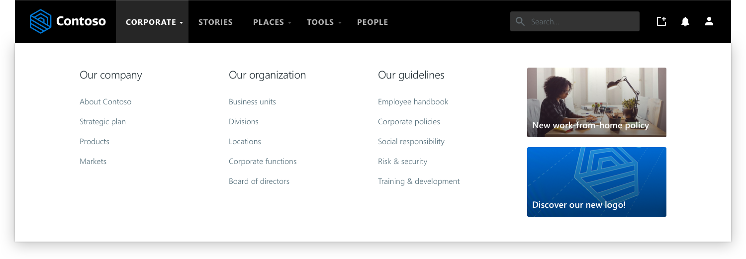
Megamenu images: 280 x 140 px

Posts
These measurements (expressed W x H) are the minimum recommended size for images to look nice and crisp on desktop. We recommend using large and suggestive images in general, so that they look well across all-devices (i.e. the Hero has different proportions on our mobile apps than on desktop).
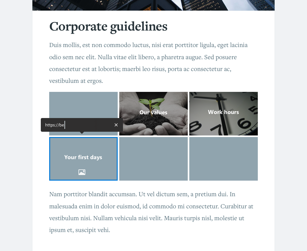
Link tile images: 220 x 140 px

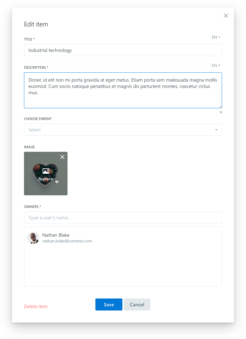
Organization structure item: 100 x 100 px

Was this article helpful?