These release notes provide information on the new features, enhancements, resolved escalations, and bug fixes completed in each release for the Announcement card.
v 3.5
Release Date: 9 Dec 2023
Card Improvements
The following improvements have been made to the Announcement card:
- The Announcement card introduces new enhanced content caching abilities, by ensuring a thorough caching of all card assets and files into the card’s cache storage via a Workbox service worker, enabling efficient local storage and access.
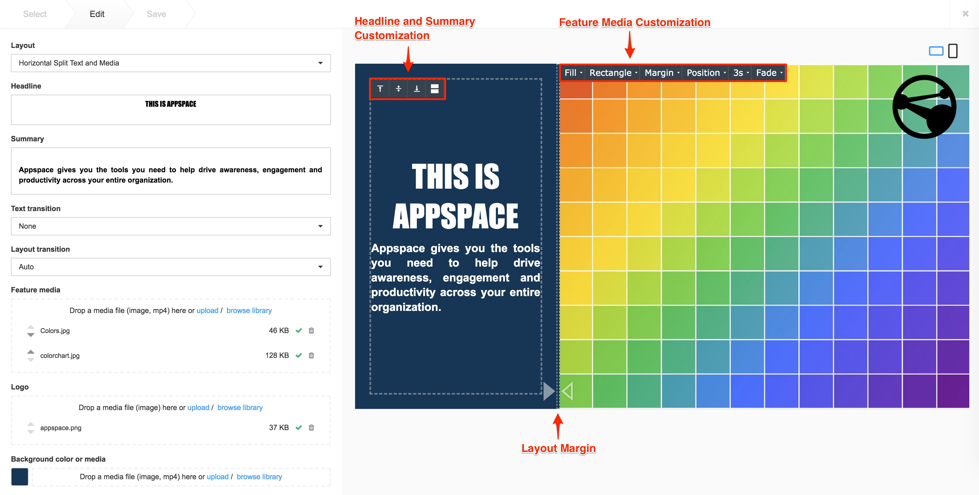
- Card UI improvements focused on displaying the Logo on cards:
- Introducing Anchored Logos, allowing users to position the logo in the predefined sections, while Freeform Logos hide the position and size options.
v 3.4
Release Date: 24 Feb 2022
Resolved Escalations
- AE-7672 – Content in the Announcement card does not align to the center or cut-off when published to the device.
Patch Updates
v 3.4.1
Release Date: 26 July 2022
Resolved Bugs
- CT-2251 – The Transition animation for playout elements are not smooth on certain devices.
- CT-3258 – Six Announcement Card themes using the template variable fail to render Arabic text from left to right.
Resolved Escalations
- AE-8144 – Punctuations (periods, exclamations, etc) return to the right side when using Arabic text.
v 3.3
Release Date: 8 Oct 2021
Improved UI
The following UI improvements have been made to the Announcement card:
- The Announcement card, originally tagged with the Messaging category in the Appspace Library, will now be tagged under the Communication category.
- This change will be visible in the Template Type drop-down menu when creating a card in the Appspace Library.
v 3.2
Release Date: 26 Feb 2021
Improved UI
The following UI improvements have been made to the card theme:
- Improved feature media position:
- Media image position fixed when the aspect ratio is set to “Fill”.
- Object position is set to “Center when the aspect ratio is set to “Fill”.
- Clicking the Flip icon in the card editor flips both text and media positions when creating the card.
Resolved Bugs
- CT-2192 – Inconsistent indent width between ordered and unordered lists.
- CT-2420 – The layout lines between text and media becomes unresponsive when dragged to the minimum size.
Patch Updates
v 3.3.1
Release Date: 22 Sept 2021
Resolved Escalations
- AE-7375 – When the Verticle split text and media layout option is selected when creating a new Announcement card, the text alignment buttons are unable to align the text accordingly.

v 3.2.3
Release Date: 10 Sept 2021
Resolved Escalations
- AE-6949 – Force upper case option when configuring Announcement themes is not working as expected.
v 3.2.2
Release Date: 9 July 2021
Resolved Bugs
- CT-2108 – There is a delay when loading card transitions in Announcement 2.0 cards with custom fonts .
v 3.2.1
Release Date: 17 March 2021
Support for 2.0 Compatibility
Support for 2.0 compatibility allows Announcement 2.0 card themes with custom data structures to be imported and used with the latest Announcement 3.0 card.
Resolved Bugs
- CT-2436 – Importing and editing card themes that were created with Announcement 2.0 card templates, become blank when saved using the Announcement 3.0 card.
v 3.1
Release Date: 29 Jan 2021
Updated Card Theme
The following updates have been made to the card theme:
- The card theme has been updated in the Library with a new design, improving card standardization.
- The card base theme will not be generated during deployment, as the BaseCardTemplate property has been set to false in the manifest.json file in the card template.
- The default fonts have been updated to the following:
- Header text = Poppin font, previously Monserrat.
- Body text = Roboto font, previously Lato.
- The card template has been assigned to use the “Culture and Values” as the default content category.
Introducing Card Content Categories
With the introduction of Content Categories in Appspace 8.0 ac.22, all card themes will be assigned with a default content category, allowing organizations to create content, build channels, and target messaging according to workplace communications best practices and internal communication goals.
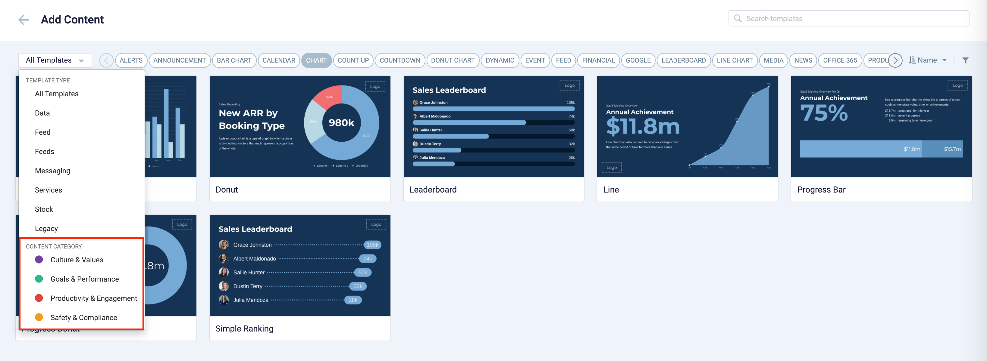
These content categories can be changed during card creation by the Publisher or Author, as the card theme has been assigned a content category based on the messaging focus. These content categories are defined as follows:
- Culture & Values – Content that promotes company values and affects the employee experience, to help customers drive company values throughout their organization.
- Goals & Performance – content that showcases both long- and short-term goals and measurements of performance, to create shared ownership of company goals and drive employee performance.
- Productivity & Engagement – content with information that keeps the company running, day-to-day, facilitating organizational productivity.
- Safety & Compliance – content with information that supports employee safety and ensures company compliance with regulatory requirements, to help create a safe environment and promote safe behavior amongst employees.
Users will also be able to view the Content Category for every piece of content within a channel playlist. However, cards created prior to this release will not contain a content category and will be considered as “Unassigned”.
v 3.0
Release Date: 19 Jan 2021
Improvements
The Announcement card version. 3.0 is coded using the Angular 8 framework, which provides better architecture, structure, and security to match our newest card templates.
Below is a list of improvements and enhancements that are available in this version:
- When the Tracking transition is selected, the Fill aspect ratio is automatically set, while disabling the Fit, Stretch, and None aspect ratios.
- When Fit, Stretch, and None aspect ratios are selected, then the Tracking transition is disabled.
- Transition names have been standardized, as follows:
- Slide bottom (sentence case) – Bottom Swipe (Title case)
- Slide top (sentence case) – Top Swipe (Title case)
- Slide left (sentence case) – Left Swipe (Title case)
- Slide right (sentence case) – Right Swipe (Title case)
- The Headline and Summary mock data is displayed in preview mode.
- Margin sliders now support keyboard Up and Down arrows.
- Font types are now defaulted to “Poppin” and “Lato”, while the previous default fonts “Monserrat” and “Roboto” have been removed.
- Support for backward compatibility of Announcement 2.x cards.
v 2.3
Release Date: 6 Nov 2020
New Transitions for Text and Layout
The Announcement card receives a new transition update which increases the list of transitions users can select to provide eye-catching announcement messages. However, instead of users being able to select the text and layout transitions independently like before, the text and layout transition fields are now combined. The transitions effects animate all elements, such as the Headline, Summary, and Feature Media, as one within the Announcement card.
Below is the list of transitions that will be available:
- None
- Auto (Default)
- Bounce
- Fade In
- Fade In Bottom Left
- Fade In Bottom Right
- Fade In Down
- Fade In Left
- Fade In Right
- Fade In Top Left
- Fade In Top Right
- Fade In Up
- Flash
- Flip
- Head Shake
- Heart Beat
- Jack In The Box
- Jello
- Pulse
- Roll In
- Rubber Band
- Shake X
- Shake Y
- Swing
- Tada
- Typewriter
- Wobble
v 2.2
Release Date: 8 July 2020
The Announcement card content creation workflow and card editing user interface has been updated and streamlined in conjunction with the release of the completely redesigned Library module in Appspace 8.0.
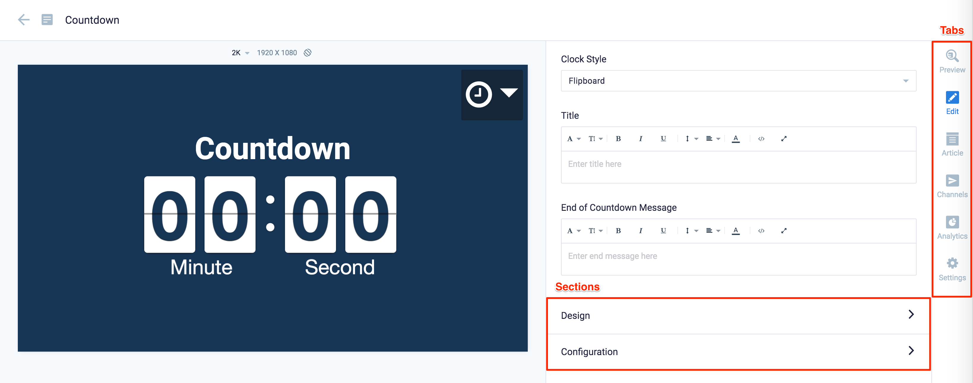
Redesigned Card Editor
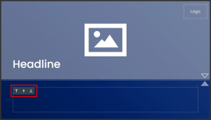
The card editor has been updated with a new UI and workflow, which groups key functions and features into tabs and sections for improved user experience, such as:
- Preview tab – this tab appears only after the content is saved and the editor window is opened. Preview options include Responsive, Responsive 16:9, 2K, 4K, Tablet, Phone, or Custom.
- Edit tab – configure the card layout, message title and summary, logo, background and a featured media/image. Also, depending on card or template type, you may see these additional sections:
- Design section – includes customized design options for each card type, which includes color palette, background, logo, and style selection options.
- Configuration section – includes customized configuration options for each card type, such as chart options.
- Article tab – write the content article, caption, and include a referral link if any.
- Schedule tab – here you add the content directly to any existing channel, and configure its playback schedule and display properties.
- Settings tab – in this tab you may add a name for this card, configure its expiry date, add tags, and add a thumbnail image.
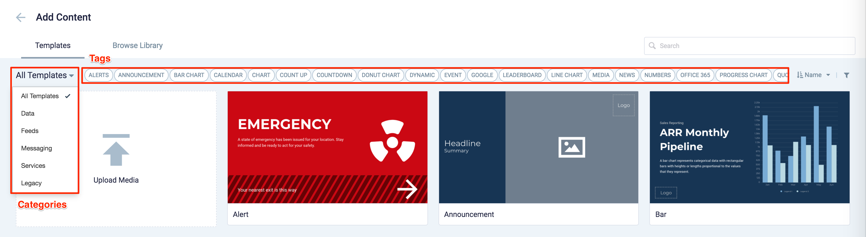
New Category and Tags
When creating a card, you now have the option to filter results based on tags and card template categories which are based on card types such as Messaging, Data, Services, Feeds, and Legacy content – to easily find what you need from a huge list of templates available.
Patch Updates
v 2.2.3
Release Date: 17 Sept 2020
Feature Media with Circle Masking Improvements
The configuration of the feature media positions with circle masking has been improved, by displaying the image while taking into account the aspect ratio and margins set in the card editor.
Resolved Bugs
- CT-493 – The Summary text does not display in the preview screen when the “Vertical Split Text and Media” layout is selected in the card editor.
v 2.2.2
Release Date: 15 Sept 2020
Feature Media Improvements
The configuration of the feature media positions has been improved, by displaying the image while taking into account the aspect ratio and margins set in the card editor.
Resolved Bugs
- CT-468 – Image does not reflect correctly on the device and preview screen, when “Fit” and “Rounded” image features are selected in the card editor.
v 2.2.1
Release Date: 5 Aug 2020
Resolved Bugs
- CT-2079 – New card editor displays inline action when previewing in portrait mode.
Resolved Escalations
- AE-6120 – Unable to disable card text editor in card schema to prevent users from changing text styling in card.
- AE-6135 – Announcement card does not format correctly on the new card editor in Appspace 8.0.
v 2.1
Release Date: 10 April 2019
The Announcement card has been updated to include the following enhancements and features:
- The Headline and Summary fields’ text layouts can now be aligned to the “Top, Bottom, Middle, 50-50 Middle”.
- Feature media’s new aspect ratio option, “None”, allows uploaded media to be displayed at it’s actual size.
- Images can now be positioned easily via a new anchoring option available when users select “None”, “Fit”, or “Fill”.
- Transitions for layout and text are now separated into individual drop-down menus, each having its own set of transition options. A new text animation is available in the text transition drop-down menu.
- All card themes have been updated to include the additional features, and color schemes that are aligned to the Appspace branding guideline.
Refer to Create Announcement Card for more information.
Patch Updates
v 2.1.3
Release Date: 20 May 2020
Resolved Escalations
- AE-5865 – BrightSign devices occasionally freeze during playback, when a channel playlist contains an Announcement card.
v 2.1.2
Release Date: 10 Apr 2020
Resolved Escalations
- AE-5956 – Inconsistency with bullet points formatting in cards.
v 2.1.1
Release Date: 14 Aug 2019
Improvements
- An update to the Announcement card ensures that margins applied to a feature media with positions anchored, respect the set aspect ratio.
v 2.0
Release Date: 10 Aug 2018
An enhanced Announcement card with animations that include the following features:
- Playlist capabilities with multiple images and video.
- Support for playout duration and transitions for images.
- New formatting options such as aspect ratio, border, and margin.
- A special tracking effect which is a combination of pan and zoom effects applied to images for motion.
- Text and feature media elements are animated into the layout during every channel transition.
- New layout control and layout formatting options.
- Ability to position and resize custom logo.
- New use-case specific themes.
Existing Appspace Announcement card templates (prior to this release) will be disabled by default. Administrators may enable it if needed. However, user created themes will still remain in the Library.
LG devices:
- It is recommended that animations be turned off as LG devices have performance issues on transitions.
BrightSign devices:
- It is recommended that video be added only in the feature media component and not in the background.
- We also recommend adding only one (1) video in each card, as BrightSign only supports one video layer at a time.
- When video is added to the feature media, border formatting will not be applied.
Was this article helpful?