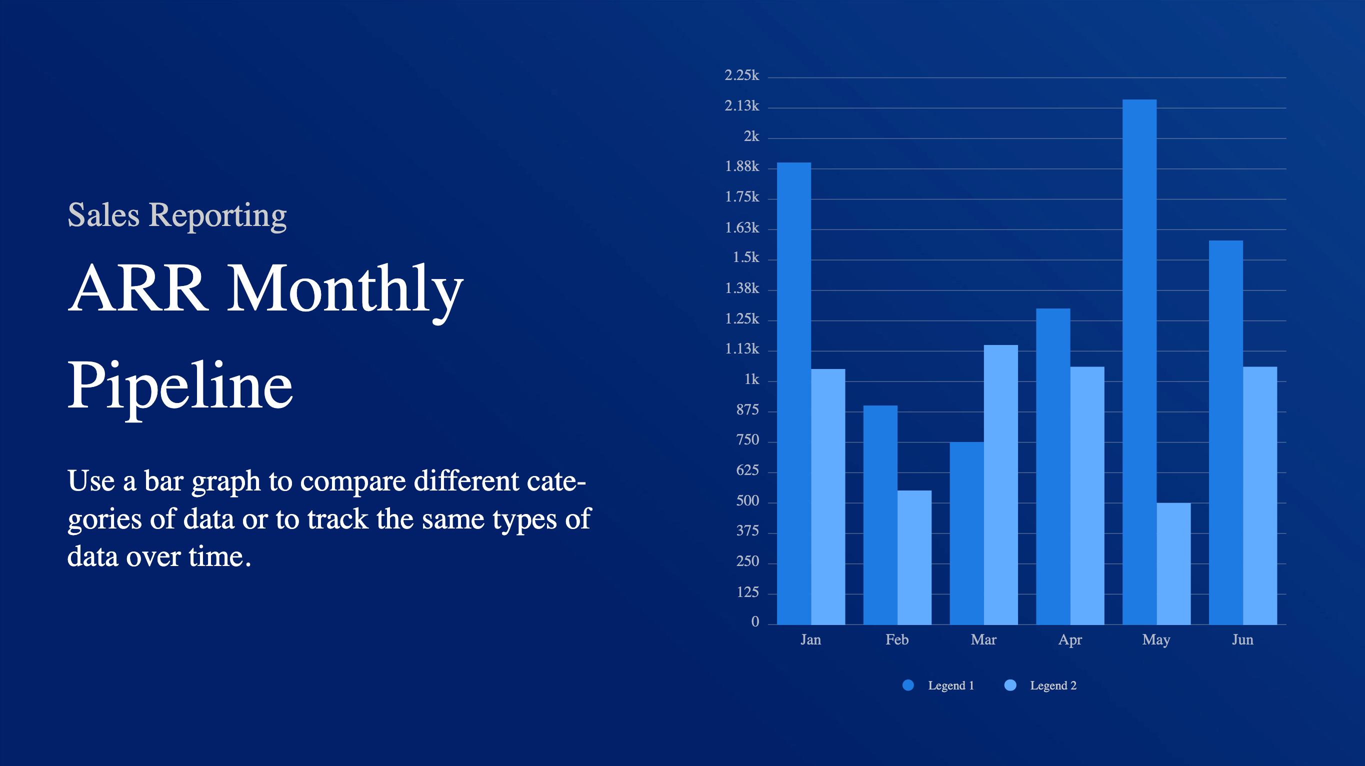
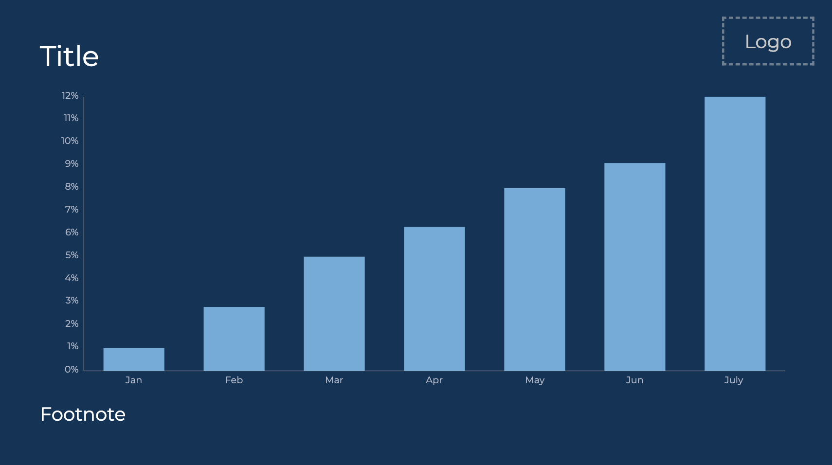
The bar chart is a Data Visualization card theme, which displays categorical data with rectangular bars with heights or lengths proportional to the values that they represent. Bar charts are often used to compare categories of data, either by allowing each category to be viewed intuitively or when a comparison of data is needed for a group of categories.
The Data Visualization card is an Appspace supported card, which is officially created and periodically updated by Appspace with new templates and features.
Apart from the basic card customizations, the following customizations, features, and functionality are available for the Bar chart:
- With the introduction of Content Categories in Appspace 8.0 ac.22, the Data Visualization card template is assigned with the Goals & Performance content category.
- Chart features and customizations include:
- Able to display animated vertical or horizontal bars.
- Able to include up to 8 items in the data series.
- A legend, gridlines, and labels.
- A custom color palette that allows users to select the color of the value, and bar.
- Supports percentage % data, and small range percentage data up, i.e. between -1 and 0, between 0 and 1, between 1 and 2.
NoteThe small range decimal values are only applied to datasets with a difference of less than 10 units, thus anything above 10 units will be rendered on the chart as per usual. This is to ensure that the titles in the Y-axis are not too cluttered.
This article provides instructions to create and configure the Bar chart theme:
Prerequisite
- Ensure your device is compatible. Refer to the Supported Appspace Cards article.
- Account Owner, Publisher, Editor, or Content Producer (Author) role to add or edit content in Library.
Create Bar Chart
The instructions below allow you to create a bar chart in Library.
- Log in to your Appspace console.
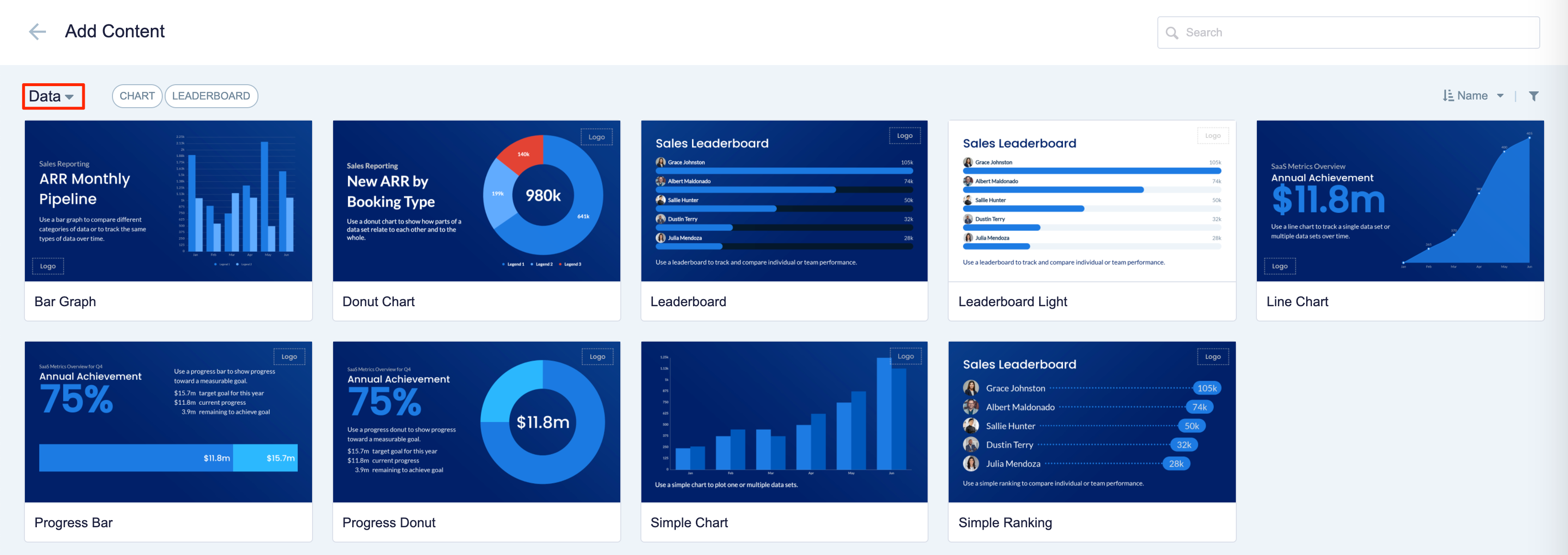
- To create this card, select one of the following options:
- Click +Quick Action from the Appspace menu bar on the top right, and select Create Card.
- Click Library from the ☰ Appspace menu, and select a library or folder you wish to create the content in. Click +CREATE, and select Card.
- To create and add the card directly to an existing channel, refer to Add Content to Playlist Channels.
- Select Data from the All Templates drop-down menu, and click Bar.
ImportantIf you are unable to locate the content, try using either the Search bar, the Order by, or Filter icon to narrow down the content that you are looking for. - Enter the Title of the content as this will also act as the filename for the content. This is a mandatory field.
- In the Edit tab:
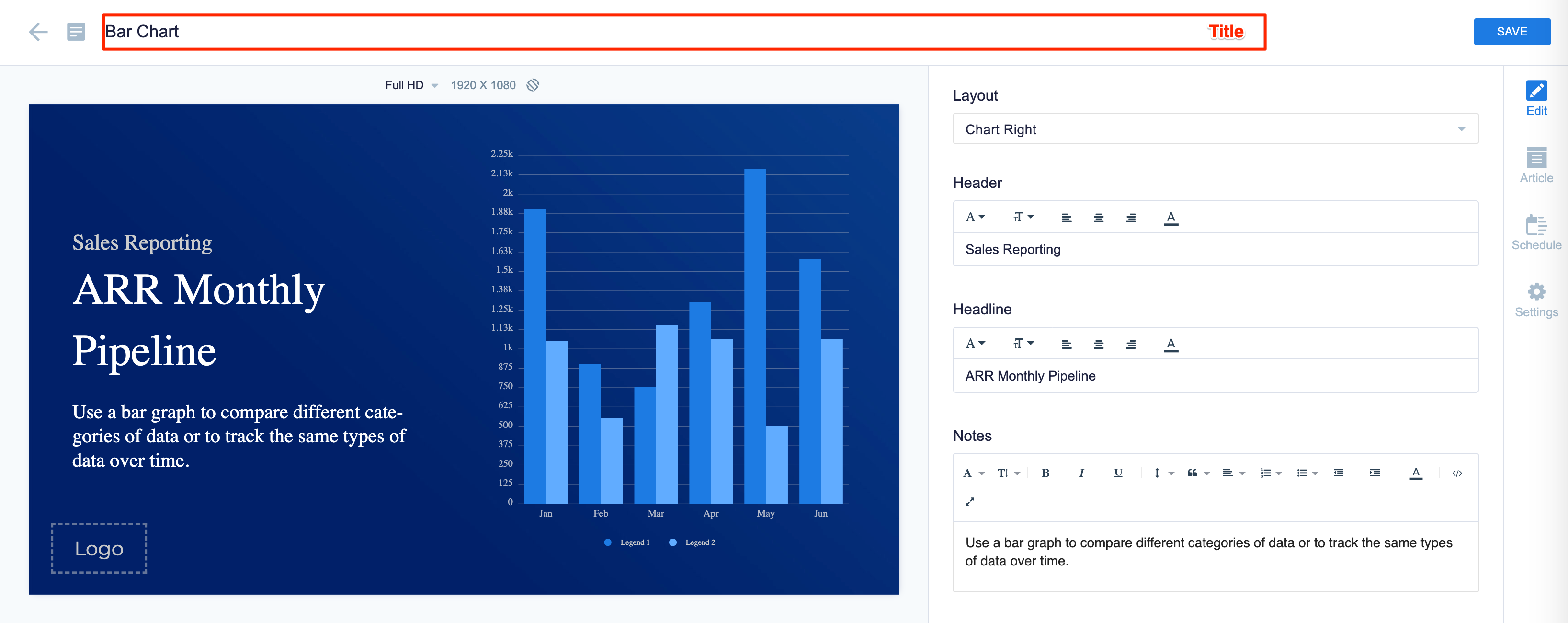
- Select the Layout of the chart.
- Enter the Header, Headline, and Notes text fields with the preferred messaging text. Use the Text Editor to customize the text font and style.
The Headline and Summary text can be customized to the following positions:
- Top
- Middle
- Bottom
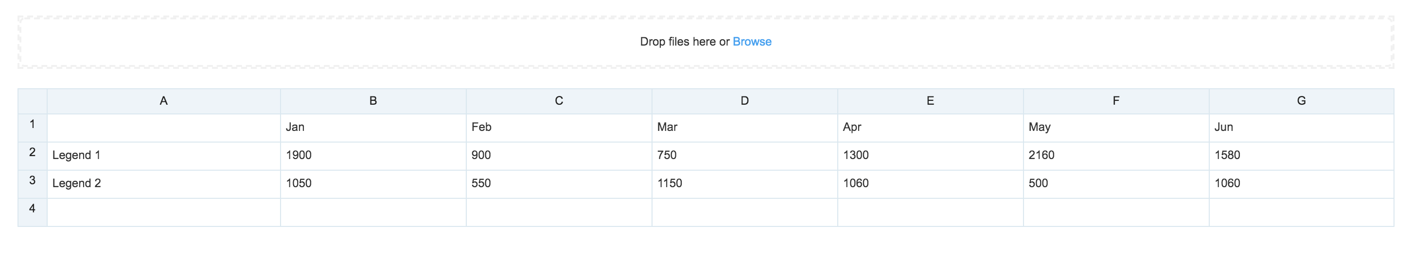
- Click Add Data to populate the Data Set table using one of the following methods:
- Manually enter the data.
- Copy and paste data from an external table.
- Import data from an Excel spreadsheet (.xlsx).
Data populated in the first column represents the data series, and the second column represents the value. The maximum number of rows that can be added to the data series is 8.
- In the Design section; click the arrow to expand.
- Customize the Label Style.
- Customize the Custom Color Palette, and the Background color or image.
- Upload a Logo.
- In the Configuration section; click the arrow to expand.
- Select the following Chart Options:
- Show as horizontal bar
- Show legend
- Show axis lines
- Show vertical labels
- Show horizontal labels
- Show vertical gridlines
- Show horizontal gridlines
- Enable animation
- Use custom color palette – Allows you to select the color of each slice of the chart.
- Select the following Chart Options:
- In the Article tab: This section may be skipped.
- Include an Article or Caption to accompany the content item when being displayed on mobile apps, tablets, and other social collaboration apps.
- Enter a Referral Link to link more information to the content.
- In the Schedule tab: This section may be skipped.
- You may add the content to a channel by selecting the channel from the Add to channel drop-down menu, or leave it unassigned to be added later.
- When the content is assigned to a channel, the SCHEDULING and DISPLAY PROPERTIES options are displayed. Refer to the Configure Content Playback Properties: Dayparting, Frequency, Scheduling, in a Playlist Channel article for detailed configuration instructions.
- In the Settings tab: This section may be skipped.
- The Name field will be auto-populated to match the Title of the content which will also act as the filename for the content. This is a mandatory field.
- Select the Content Category from the drop-down menu to match the focus of the message, or leave it at the default content category.
- Enter any relevant Tags for the content. (Optional)
- Select a folder for the content in the Library Location drop-down menu to change the default folder location.
- Select an expiry date for the content from the Auto Delete Content from Library drop-down menu. (Optional)
- Upload an image to be used as the Thumbnail for the content.
- Once done, click SAVE.
Edit Bar Chart
The instructions below show you how to edit a bar chart.
- Log in to your Appspace console.
- Click Library from the ☰ Appspace menu, and select a library or folder containing the content you wish to edit.
- Select and click the Bar chart to edit, and select the desired tab to edit or view.
- In the Edit, Article, and Settings tabs:
- You may edit the content the same way as it was configured. For detailed instructions on how to do this, please refer to the Create Bar Chart section above.
- In the Preview tab:
- Preview how the content is displayed on your device.
- In the Channels tab:
- You may add the content to a channel by selecting the channel from the Add to channel drop-down menu, or leave it unassigned to be added later.
- When the content is assigned to a channel, the SCHEDULING and DISPLAY PROPERTIES options are displayed. Refer to the Configure Content Playback Properties: Dayparting, Frequency, Scheduling, in a Playlist Channel article for detailed configuration instructions.
- In the Analytics tab:
- View the individual content analytics in this tab. For more information, please refer to the Individual Content Analytics section of the Analytics article.
- In the Edit, Article, and Settings tabs:
- Once done, click SAVE.
Was this article helpful?