This article provides the instructions to create and configure the Data Visualization card. You may choose to create and customize the Data Visualization card as desired with multiple customization options, or you may use one of the following themes that Appspace has created (in the Library), ideal for displaying various graphs, charts, and progress charts:
- Bar – A bar chart represents categorical data with rectangular bars with heights or lengths proportional to the values that they represent.
- Donut – A pie or donut chart is a type of graph in which a circle is divided into sectors that each represent a proportion of the whole.
- Leaderboard – A multiple progress bar chart representing a ranked list of items to determine the best in the series.
- Line – Line chart can also be used to compare changes over the same period of time for more than one series.
- Progress Bar – Use a progress bar chart to show the progress of a goal such as monetary value, time, or achievements.
- Progress Donut – Use a progress donut chart to show the progress of a goal such as monetary value, time, or achievements.
Important
- Please refer to our An Introduction to Cards guide for an in-depth introduction to the types of cards that are ideal for your signage solutions.
- Cards are only supported on devices with the Appspace App. Legacy devices are not supported.
The Data Visualization card is an Appspace supported card, which is officially created and periodically updated by Appspace with new templates and features.
What’s in this article:
Prerequisite
- Account Owner, Publisher, Editor, or Content Producer (Author) role to add or edit content in Library.
Create and Configure Data Visualization Card
Follow the instructions below to create and configure the card:
- Log in to the Appspace console.
- To create content, select one of the following options:
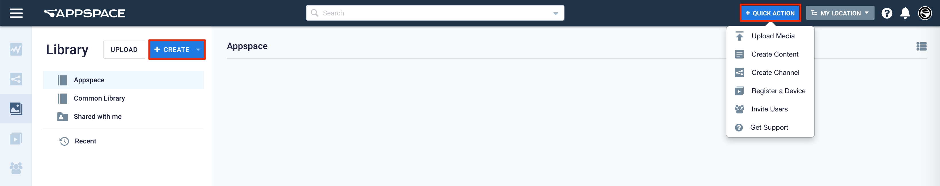
- Click +QUICK ACTION from the Appspace menu bar on the top right, and select Create Content.
- Click Library from the ☰ Appspace menu, and select a library or folder you wish to create the content in. Click +CREATE, and select Content. [svu_spacer size=”10″]
- To add content to an existing channel refer to Add Content to Playlist Channels.
- Select Data from the All Templates drop-down menu, and click the desired chart template.
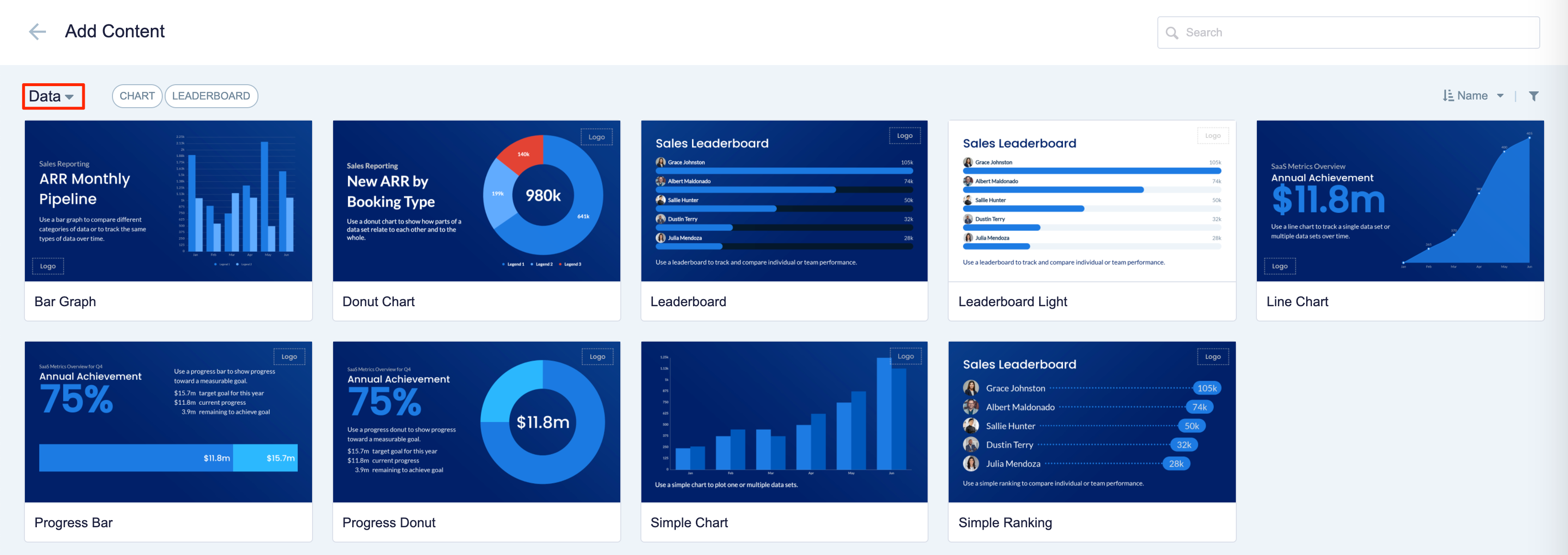
For detailed configuration information, click the links below.
-
- Bar – A bar chart represents categorical data with rectangular bars with heights or lengths proportional to the values that they represent.
- Donut – A pie or donut chart is a type of graph in which a circle is divided into sectors that each represent a proportion of the whole.
- Leaderboard – A multiple progress bar chart representing a ranked list of items to determine the best in the series.
- Line – Line chart can also be used to compare changes over the same period of time for more than one series.
- Progress Bar – Use a progress bar chart to show the progress of a goal such as monetary value, time, or achievements.
- Progress Donut – Use a progress donut chart to show the progress of a goal such as monetary value, time, or achievements.
Was this article helpful?