These release notes provide information on the new features, enhancements, resolved escalations, and bug fixes completed in each release for the Alert card, which is also an Appspace supported card.
v 1.4
Release Date: 8 Oct 2021
Improved UI
The following UI improvements have been made to the Alert card:
- The Alert card, originally tagged with the Messaging category in the Appspace Library, will now be tagged under the Communication category.
- This change will be visible in the Template Type drop-down menu when creating a card in the Appspace Library.
v 1.3
Release Date: 3 Mar 2021
Support for Alert Alarm Sounds
The Alerts card now supports audio playback, allowing for alarm sounds to be played in a continuous loop.
The Alert card comes preconfigured with a default alarm sound which users can enable or disable when configuring their Alert card. Users also have the ability to upload up to 20 mp3 audio files, one for each alert type, as necessary.
Wayfinding Configuration
The wayfinding (exit building direction) arrows can now also be configured directly from the card theme editor via a drop-down menu, as opposed to the previous option of using a device property.
However, only the following directions can be configured directly on the card; using the device property has more options:
- Right
- Left
- Up
- Down
v 1.2
Release Date: 29 Jan 2021
Updated Card Theme
The following updates have been made to the card theme:
- The card theme has been updated in the Library with a new design, improving card standardization.
- The card base theme will not be generated during deployment, as the BaseCardTemplate property has been set to false in the manifest.json file in the card template.
- The default fonts have been updated to the following:
- Header text = Poppin font, previously Monserrat.
- Body text = Roboto font, previously Lato.
- The card template has been assigned to use the “Productivity and Engagement” as the default content category.
Introducing Card Content Categories
With the introduction of Content Categories in Appspace 8.0 ac.22, all card themes will be assigned with a default content category, allowing organizations to create content, build channels, and target messaging according to workplace communications best practices and internal communication goals.
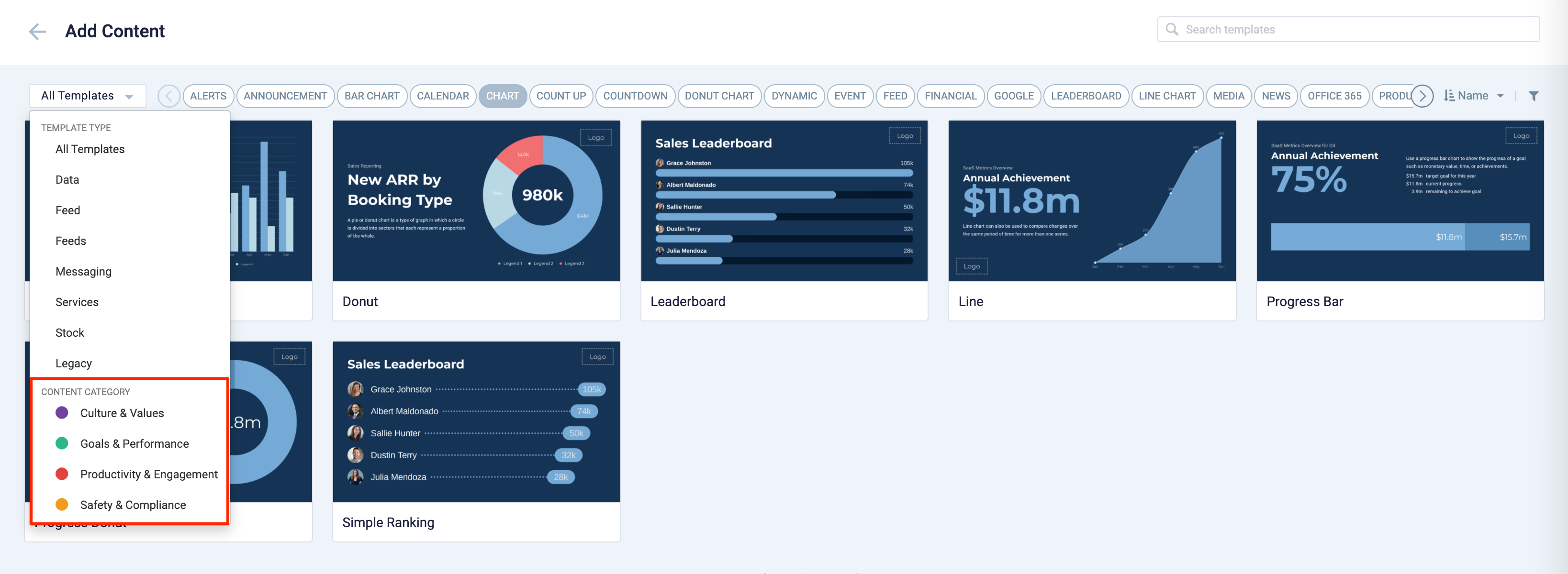
These content categories can be changed during card creation by the Publisher or Author, as the card theme has been assigned a content category based on the messaging focus. These content categories are defined as follows:
- Culture & Values – Content that promotes company values and affects the employee experience, to help customers drive company values throughout their organization.
- Goals & Performance – content that showcases both long- and short-term goals and measurements of performance, to create shared ownership of company goals and drive employee performance.
- Productivity & Engagement – content with information that keeps the company running, day-to-day, facilitating organizational productivity.
- Safety & Compliance – content with information that supports employee safety and ensures company compliance with regulatory requirements, to help create a safe environment and promote safe behavior amongst employees.
Users will also be able to view the Content Category for every piece of content within a channel playlist. However, cards created prior to this release will not contain a content category, and will be considered as “Unassigned”.
v 1.1
Release Date: 8 July 2020
The Alert card content creation workflow and card editing user interface has been updated and streamlined in conjunction with the release of the completely redesigned Library module in Appspace 8.0.
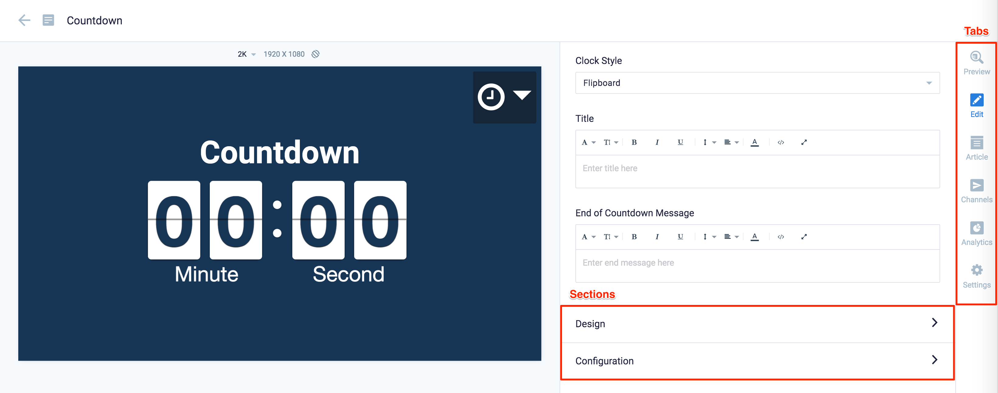
Redesigned Card Editor
The card editor has been updated with a new UI and workflow, which groups key functions and features into tabs and sections for improved user experience, such as:
- Preview tab – this tab appears only after the content is saved and the editor window is opened. Preview options include Responsive, Responsive 16:9, 2K, 4K, Tablet, Phone, or Custom.
- Edit tab – configure the card layout, message title and summary, logo, background and a featured media/image. Also, depending on card or template type, you may see these additional sections:
- Design section – includes customized design options for each card type, which includes color palette, background, logo, and style selection options.
- Configuration section – includes customized configuration options for each card type, such as chart options.
- Article tab – write the content article, caption, and include a referral link if any.
- Schedule tab – here you add the content directly to any existing channel, and configure its playback schedule and display properties.
- Settings tab – in this tab you may add a name for this card, configure its expiry date, add tags, and add a thumbnail image.
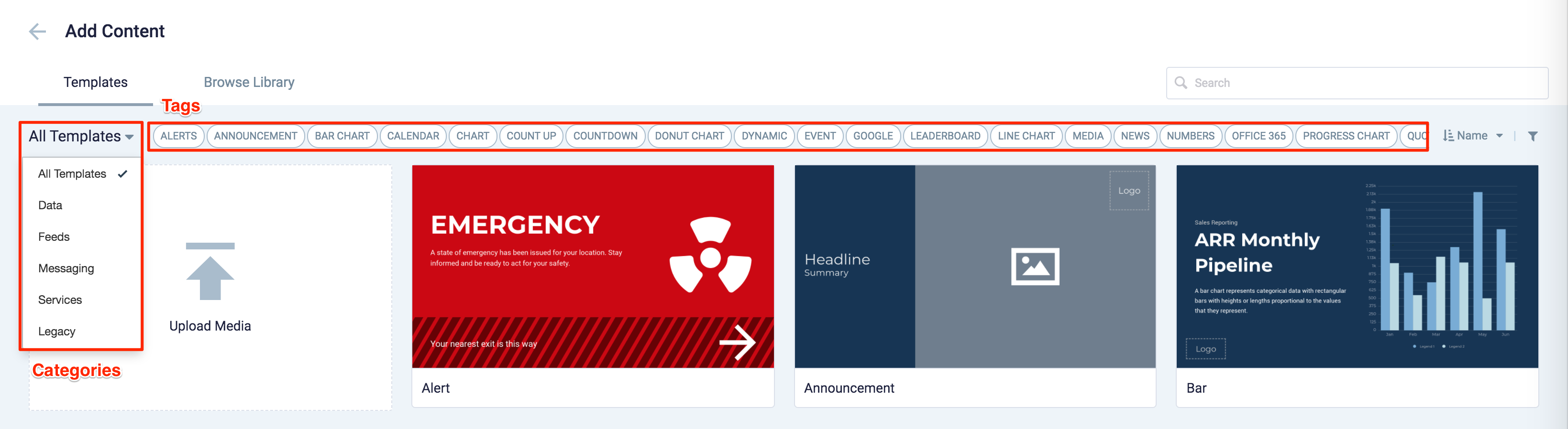
New Category and Tags
When creating a card, you now have the option to filter results based on tags and card template categories which are based on card types such as Messaging, Data, Services, Feeds, and Legacy content – to easily find what you need from a huge list of templates available.
v 1.0
Release Date: 17 Apr 2020
Introducing the Alert card that allows users to publish important or critical messages such as evacuation notices, fire alerts, weather warnings, etc. immediately or at a scheduled time. Users can select one of the 12 different default alert themes available in the Library, or customize their own alert messaging, images, fonts, and colors according to their branding requirements.
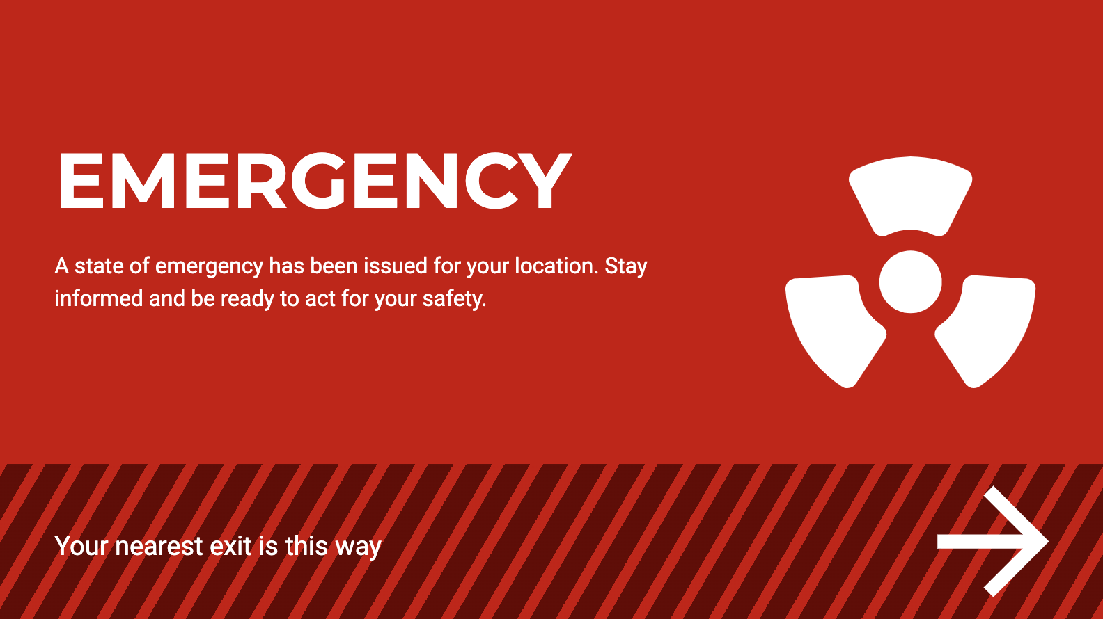
The following features and customizations are available on the Alert card:
- The Alert card comes preconfigured with 12 default themes.
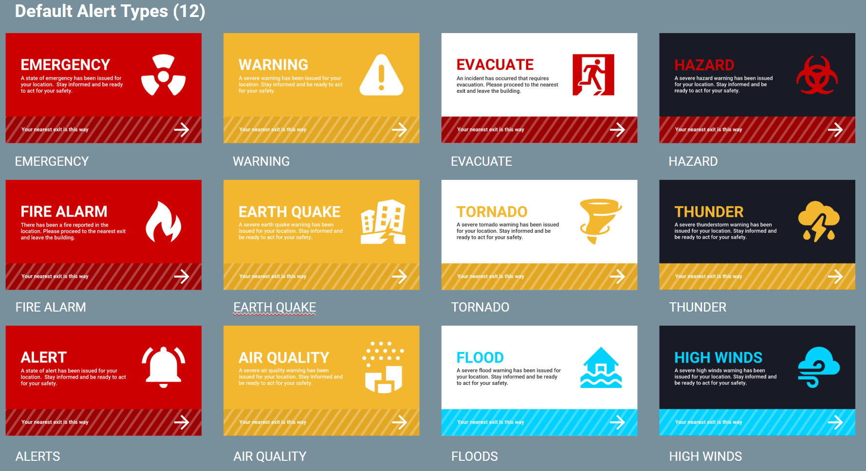
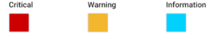
- There are three default alert types which are Critical (red), Warning (yellow), and Information (blue), each with its corresponding default color.
- But you can Custom alert colors to define the following alert types:
- There are three different color themes for any chosen alert type, which are regular, dark, and light.
- Users can also create custom alert types manually, or upload a .xlsx file that has the following header row:
- Title
- Summary
- Graphic
- Theme Style
- Exit Building NoteThe cells for Graphic and Exit Building must be left blank.
- Users can customize the text and fonts for the Title and Summary of the card.
- Users are able to upload a custom font.
- Users can use a player property to define the direction to the building exit point during an emergency:
- Player Property Name: card.alert.exitdirection
- Player Property Value(s): right / left / down / up / upright / downright / upleft / downleft / elevatorup / elevatordown / escalatorup / escalatordown / stairsup / stairsdown
- Only one player property value can be supported at one time.
- If there is no player property the bottom banner with the direction on the card will be disabled.
- Supported image formats: JPEG, PNG, SVG (recommended)
Was this article helpful?