These release notes provide information on the new features, enhancements, resolved escalations, and bug fixes completed in each release for the Data Visualization card. The following cards available in the Library, use the Data Visualization card as their base template:
Therefore, the updates in this release notes are applicable to these cards as well.
v 1.10.0
Release Date: 19 Nov 2024
FEATURE IMPROVEMENTS
- This release updates the cloud libraries for the Data Visualization card.
v 1.9.1
Release Date: 19 Oct 2023
FIXED BUGS
- CT-3843 – The mishandling of the script code ‘ ${model.chartKeyresult.value} ‘ within the HTML leads to the display of ‘<span>…’ as text, due to the card’s interpretation of the HTML as a string.
- CT-3845 – The percentage, current, and goal values become misplaced when users activate the ‘Enable animation’ feature in the Chart Options.
v 1.9.0
Release Date: 8 Dec 2022
FEATURE IMPROVEMENTS
- The font size of the label(s) is now correctly displayed when the user switches to different resolution(s) and orientation when creating a data visualisation card and selecting the Donut Chart type.
FIXED BUGS
- CT-3498 – While creating a Data Visualization and selecting the Donut chart type and entering a dataset, the font size of labels is improperly presented in the editor preview when switching between different card resolutions and orientations.
- CT-3603 – When creating the Data Visualization card and selecting Donut chart type as Pie and entering dataset, the label font size is improperly presented in the editor preview when switching to different card resolution and orientation.
v 1.8.0
Release Date: 1 Sept 2022
FEATURE IMPROVEMENTS
- For Data Visualization templates, the Force upper case option has been added to the Title and Footnote text components.
- The Bar, Line, Donut, and Ranking data visualization cards now allow values to be displayed in two decimal points instead of one (e.g. 0.40 instead of 0.4).
RESOLVED ESCALATIONS
- AE-8150 – On the Donut chart, the label text and the middle text overlap.
v 1.7
Release Date: 29 Jan 2021
Updated Card Theme
The following updates have been made to the card theme:
- The card theme has been updated in the Library with a new design, improving card standardization.
- The card base theme will not be generated during deployment, as the BaseCardTemplate property has been set to false in the manifest.json file in the card template.
- The default fonts have been updated to the following:
- Header text = Poppin font, previously Monserrat.
- Body text = Roboto font, previously Lato.
- The card template has been assigned to use the “Goals and Performance” as the default content category.
Introducing Card Content Categories
With the introduction of Content Categories in Appspace 8.0 ac.22, all card themes will be assigned with a default content category, allowing organizations to create content, build channels, and target messaging according to workplace communications best practices and internal communication goals.
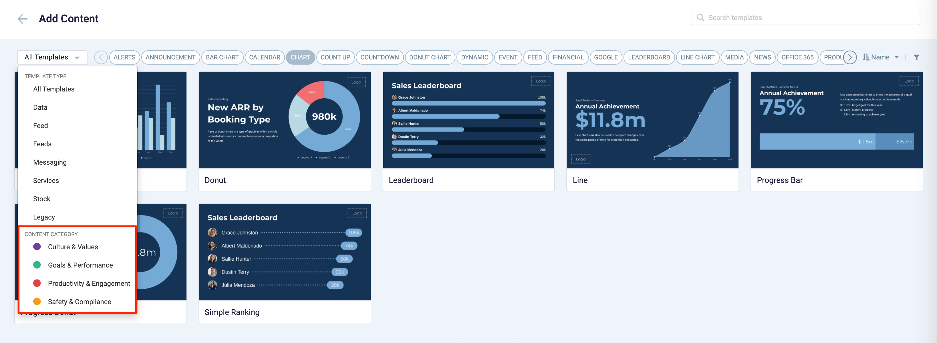
These content categories can be changed during card creation by the Publisher or Author, as the card theme has been assigned a content category based on the messaging focus. These content categories are defined as follows:
- Culture & Values – Content that promotes company values and affects the employee experience, to help customers drive company values throughout their organization.
- Goals & Performance – content that showcases both long- and short-term goals and measurements of performance, to create shared ownership of company goals and drive employee performance.
- Productivity & Engagement – content with information that keeps the company running, day-to-day, facilitating organizational productivity.
- Safety & Compliance – content with information that supports employee safety and ensures company compliance with regulatory requirements, to help create a safe environment and promote safe behavior amongst employees.
Users will also be able to view the Content Category for every piece of content within a channel playlist. However, cards created prior to this release will not contain a content category, and will be considered as “Unassigned”.
Patch Updates
v 1.7.2
Release Date: 9 July 2021
Resolved Escalations
- AE-6966 – Unable to populate data table on Leaderboard card via a .xlsx file upload.
v 1.7.1
Release Date: 26 Feb 2021
Resolved Bugs
- CT-2341 – Unable to correctly render the simple ranking chart when displayed in Ultra High-Definition in the card editor.
v 1.6
Release Date: 8 July 2020
The Data Visualization card content creation workflow and card editing user interface has been updated and streamlined in conjunction with the release of the completely redesigned Library module in Appspace 8.0.
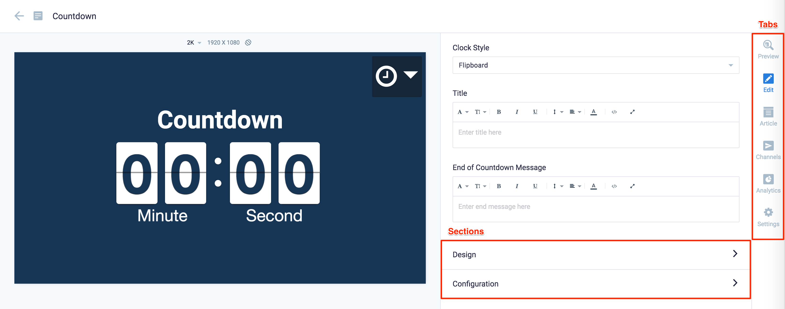
Redesigned Card Editor
The card editor has been updated with a new UI and workflow, which groups key functions and features into tabs and sections for improved user experience, such as:
- Preview tab – this tab appears only after the content is saved and the editor window is opened. Preview options include Responsive, Responsive 16:9, 2K, 4K, Tablet, Phone, or Custom.
- Edit tab – configure the card layout, message title and summary, logo, background and a featured media/image. Also, depending on card or template type, you may see these additional sections:
- Design section – includes customized design options for each card type, which includes color palette, background, logo, and style selection options.
- Configuration section – includes customized configuration options for each card type, such as chart options.
- Article tab – write the content article, caption, and include a referral link if any.
- Schedule tab – here you add the content directly to any existing channel, and configure its playback schedule and display properties.
- Settings tab – in this tab you may add a name for this card, configure its expiry date, add tags, and add a thumbnail image.
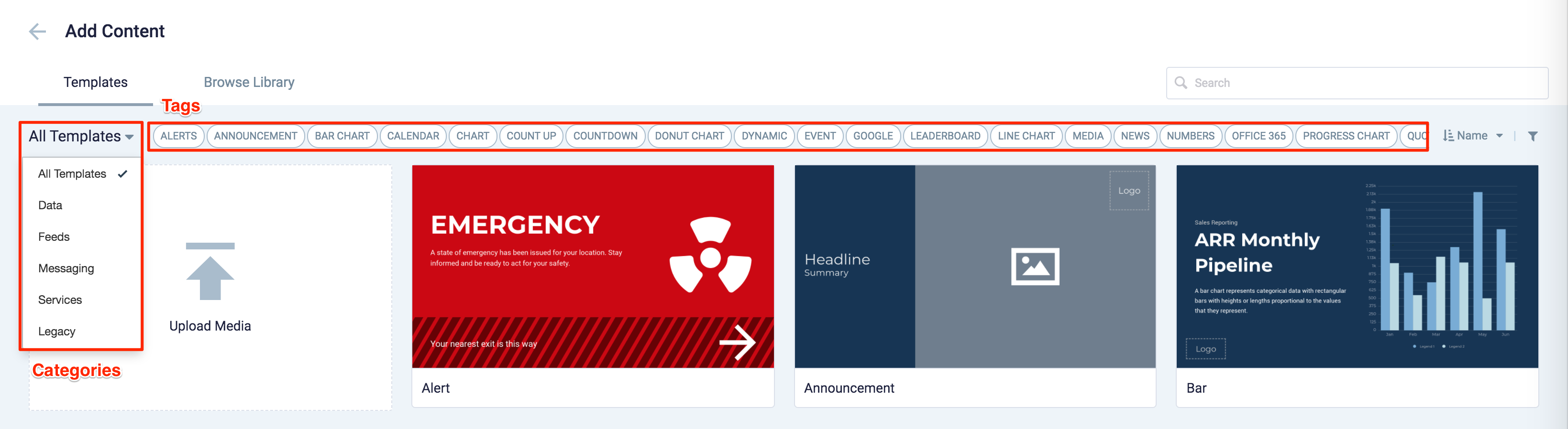
New Category and Tags
When creating a card, you now have the option to filter results based on tags and card template categories which are based on card types such as Messaging, Data, Services, Feeds, and Legacy content – to easily find what you need from a huge list of templates available.
Patch Updates
v 1.6.1
Release Date: 25 Sept 2020
The Data Visualization card now supports % data. If the data in the first column (B2) is entered in percentage value, Line and Bar charts will convert all the datasets to percentages. The value axes in the chart will then display as percentages.
Resolved Escalations
- AE-6227 – Unable to display the “%” percentage symbol from the source data on Bar and Line charts in Data Visualization cards.
v 1.6.2
Release Date: 20 Oct 2020
We now support the display of decimals for small range % data, i.e. between -1 and 0, between 0 and 1, between 1 and 2, etc, on the Y-axis in Bar Charts and Line Charts.
However, the small range decimal values are only applied to datasets with a difference of less than 10 units, thus anything above 10 units will be rendered on the chart as per usual. This is to ensure that the titles in the Y-axis are not too cluttered.
Resolved Escalations
- AE-6307 – Unable to display the “%” percentage symbol for numbers between 0 and 1.
v 1.5
Release Date: 15 May 2020
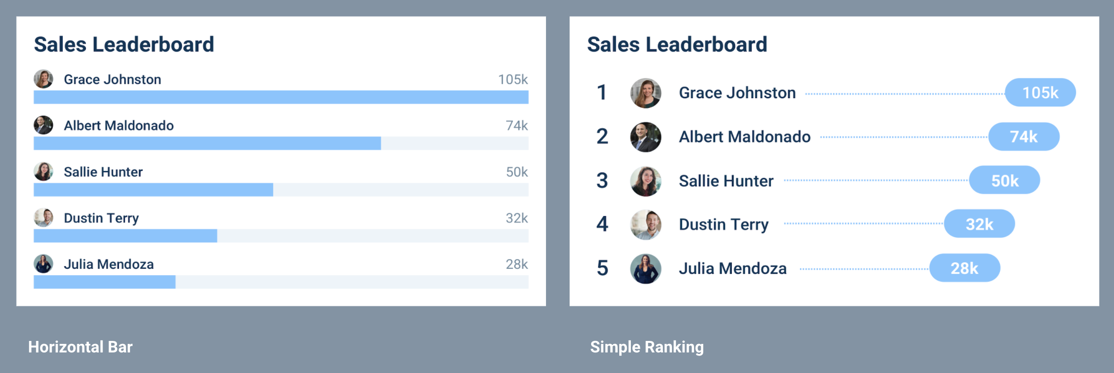
- A new Simple Ranking design layout has been added to the Leaderboard chart theme, providing users an additional customization option besides the default Horizontal Bar theme.
v 1.4
Release Date: 29 Apr 2020
- The Data Visualization card has been updated to include another chart type, the Leaderboard chart, which contains the following features:
- Able to display multiple horizontal bars to represent data that is ranked.
- Able to include up to 8 items in the data series.
- A title, footnote, and logo.
- A custom color palette that allows users to select the color of the bars in the Bar chart.
- The default chart type for the Data Visualization template and base theme has been updated to Bar Chart, from Progress Bar Chart before.
v 1.3
Release Date: 29 July 2019
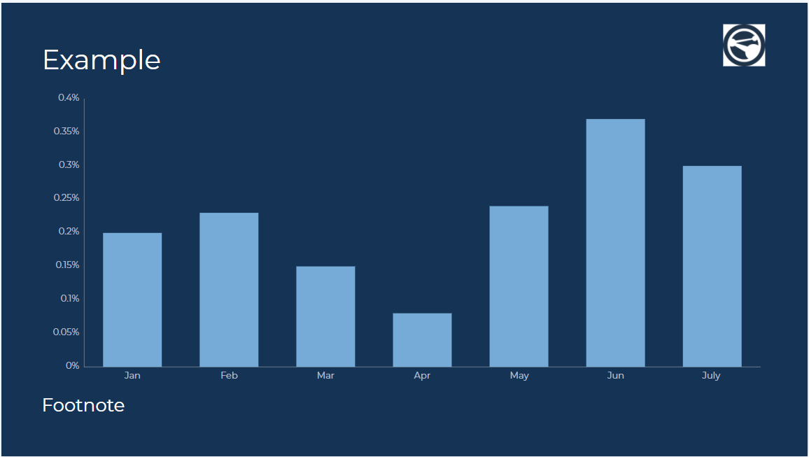
The Data Visualization card has been updated to include another chart type, the Bar chart, which contains the following features:
- Able to display animated vertical or horizontal bars.
- Able to include up to 8 items in the data series.
- A legend, gridlines, and labels.
- A custom color palette that allows users to select the color of the value, remainder, and progress bar.
Patch Updates
v 1.3.1
Release Date: 14 Aug 2019
The Data Visualization card has been updated to fix a schema error that breaks the UI. The card is also enhanced to accept datasets that include commas, abbreviations, symbol prefixes, and the zero numeric when plotting a chart.
v 1.2
Release Date: 13 July 2019
The Data Visualization card has been updated to include another chart type, the Donut chart (the previous Donut chart has been renamed as Progress Donut chart), and a minor update to the Line chart that is now capable of displaying the point labels.
This new Donut chart brings the following features:
- Able to include up to 8 items in the data series.
- A legend.
- A custom color palette that allows users to select the color of the chart slice.
v 1.1
Release Date: 17 May 2019
Updates to the Data Visualization card include:
- The option to align text to the top, middle, or bottom, of a layout.
- The option to display or hide axis lines on the Line chart card.
- New fonts have been added to the font list, while font size values are displayed in ascending order.
- A smaller logo placeholder.
- The default color for gridlines has been updated.
- Chart options have been renamed for a better user experience.
- Data visualization themes have been updated to be inline with current Appspace branding guidelines.
Refer to Create data visualization cards for more information.
v 1.0
Release Date: 9 March 2018
An all new Data Visualization card that enables you to create progress bar, donut, and line charts, with a variety of multiple layout options, customizations and animations.
This is a full Appspace supported card, which will include periodic enhancements and refinements.
Users may select the following chart customization options depending on their selected theme:
- Progress Bar and Donut chart
- Show Percentage
- Show Current
- Show Goal
- Show Animation
- Line chart
- Show Point
- Show as Line
- Show Vertical Axis Gridlines
- Show Horizontal Axis Gridlines
- Show Vertical Axis Labels
- Show Horizontal Axis Labels
- Show Animation
Users would also have the option of selecting from a variety of display layouts for more customization options:
- Chart Middle
- Chart Left
- Chart Right
- Chart Top
- Chart Bottom
The Data Visualization card also allows for custom logos to be uploaded, and positioned freely anywhere within the layout. The custom logo can be resized and is displayed at the topmost layer.
The Donut Chart card under Community Cards will be deprecated with the introduction of the Data Visualization card.
Was this article helpful?