Create a card
Cards are a simple and fast way to create great looking content and sharing it on TVs, computers, and mobile devices. You can add text, images, video, and customized information for your audience when they are viewing your card on their device of choice that is compatible with the HTML5 based Appspace App.
Cards can come in many different flavors and do everything from display charts & graphs, social media feeds, live data feeds, and integrate (or control) other content sources and systems.
Brand owners can simplify and speed-up the content creation process for authors by creating card themes. These are pre-made card designs that can incorporate your corporate colors, fonts, imagery, and rich styling that enable an author to enter very basic information and the result be great looking content. All options can be individually locked so that brand consistency is maintained throughout, with little to no effort.
We currently have two categories of cards available:
Appspace supported cards
Appspace supported cards are officially created and supported by Appspace. These cards are periodically updated by Appspace with new templates and features.
- Announcement card - an enhanced card with animations ideal for corporate messaging and signage.
- Room Schedule card - designed for single room scheduling, view upcoming schedules and book instantly.
- Schedule Board card - view and book schedule of multiple meeting spaces in one place, ideal for larger displays placed in common areas with many nearby meeting spaces.
- Web View card - embed an external website into the card, with multiple embedding and website scaling options.
- Data Visualization card - display customized progress charts, or import data from external spreadsheets and display customized graphs.
- Google Slides card - displays content from a Google Slides presentation.
- Google Sheets card - displays content from a Google Sheets spreadsheet.
- YouTube card - displays content from YouTube.
- RSS card - displays content from a RSS feed.
Community cards
Community cards are basic cards created by Appspace, but will be customized and supported, by a third-party community developer using Appspace card APIs. As cards are simple HTML packets, it’s very easy for a developer who is familiar with today’s standard web technologies to create custom cards for their organization. Community cards will be turned off by default.
- Data Table card
- Social Media by Seenspire card
Visit our Appspace developer community that handles the development, custom integrations, support and troubleshooting of community cards.
Important
Please refer to our An Introduction to Cards and Channels guide for an in-depth introduction to the types of cards that are ideal for your signage solutions.
Cards are only supported on devices with the Appspace App. To ensure your device is compatible, please refer to the Supported Card Types section in the Compare device media player capabilities article.
Legacy devices are not supported.
Create card
Important
If you would like to set a corporate branding theme to your cards, please refer to this article prior to creating a card: Create a card theme
Follow the instructions below to create a card:
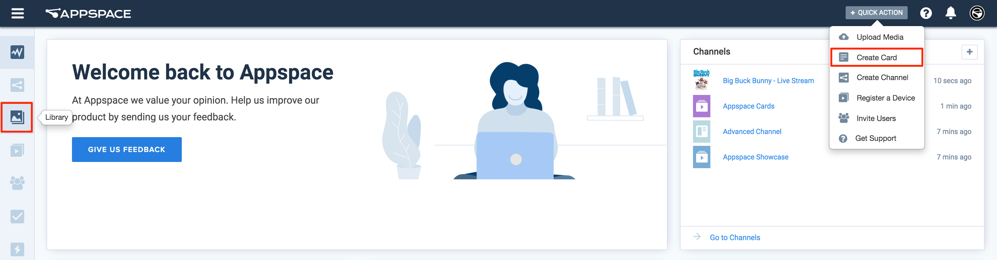
Click the Quick Actions menu on the top right and select Create Card, and proceed to step 3 below.
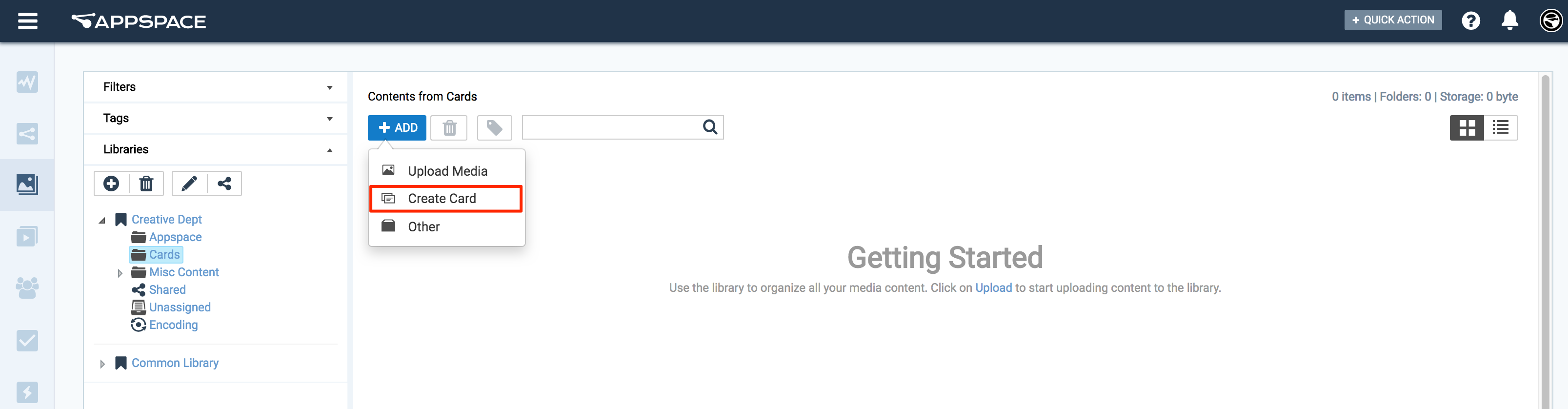
Or click Library from the Appspace Menu navigation bar on the left, and proceed to step 2 below.
Select the desired folder in the library, and click the ADD button, and select Create Card.
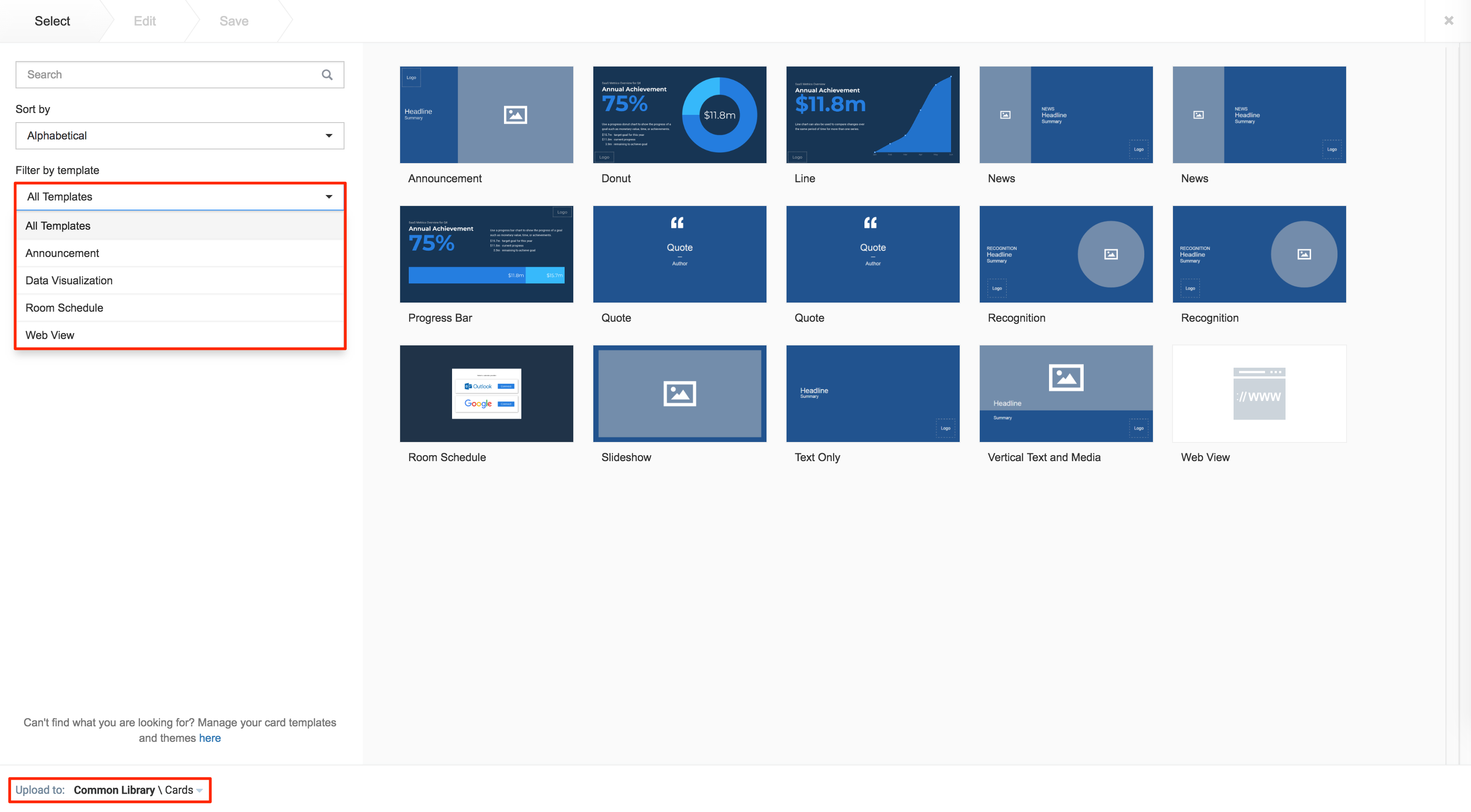
Select an available template from the Filter by template menu, and continue to configure the card as per the on-screen instructions.
If the card was created via the Quick Actions menu, ensure the Upload Location points to the correct folder within the Library, as it defaults to the Common Library folder.
Please take note of the following pointers when configuring the card:
The card title is also the name used when saving the card to the Library. Therefore this is a mandatory field.
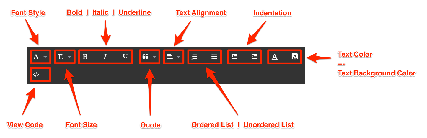
The Text Editor is only displayed for each field when you click and type in the field (Title, Headline, Summary). It provides basic text editing capabilities such as Font Size, Font Style, Text Alignment, and Text Color.
You can add images to the card by browsing the library for existing content. You can also upload, or drag and drop an image directly into the image placeholder, from a folder in your computer.
However, you may only upload one image to the image placeholder.

The Color Picker, enables color selection for text and backgrounds in the Card.
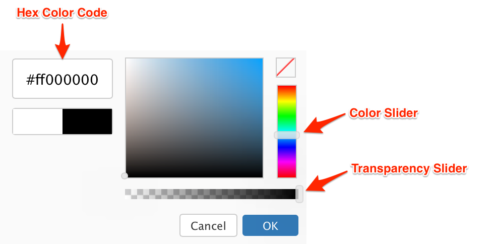
The first two characters in the Hex Color Code are the Transparency value, while the next six characters are the Color values. Please be mindful when including a custom Hex color code.

For detailed configuration information for each card type, click the links below.
Appspace supported cards
- Create announcement cards
- Create room scheduling cards
- Create dynamic visualization cards
- Create web view cards
- Create Google cards
- Create YouTube cards
- Create RSS cards
Community cards