The Checkpoint card allows users to access an integral part of Enhanced Services’ Visitor Management system, providing a flexible and efficient way to manage space reservations in a hybrid workplace. Our primary objective is to thoroughly assess the diverse use cases for these cards and devise effective strategies for extending their accessibility to all our Visitor Management clients. This strategic expansion aims to enrich the overall visitor experience, ensuring that enterprises in the modern landscape can offer seamless reservation and visit processes.
The Checkpoint card features three distinct themes, playing a pivotal role in our system by delivering three essential functions:
- Legal Document
- Questionnaire
- Reservation Services
These themed Checkpoint cards play a central role in facilitating a smooth and error-free visitor experience, ensuring that businesses can offer a streamlined and efficient reservation and visit workflow, regardless of whether the visitor’s interaction revolves around a questionnaire, legal document submission, or a reservation.
Visit our Appspace Card Gallery to find the perfect card to deliver your message.
This article provides admins with instructions to create, configure, and customize the Checkpoint card within the Library.
Prerequisite
- An Account Owner, Publisher, or Author permissions that have been assigned Platform User licenses.
- An Appspace Visitor Management system configured.
- The Space Reservations system configured with buildings, locations, resources, and a booking calendar provider.
- The Checkpoint rule has to be configured to the Form that is listed in the Requirement section.
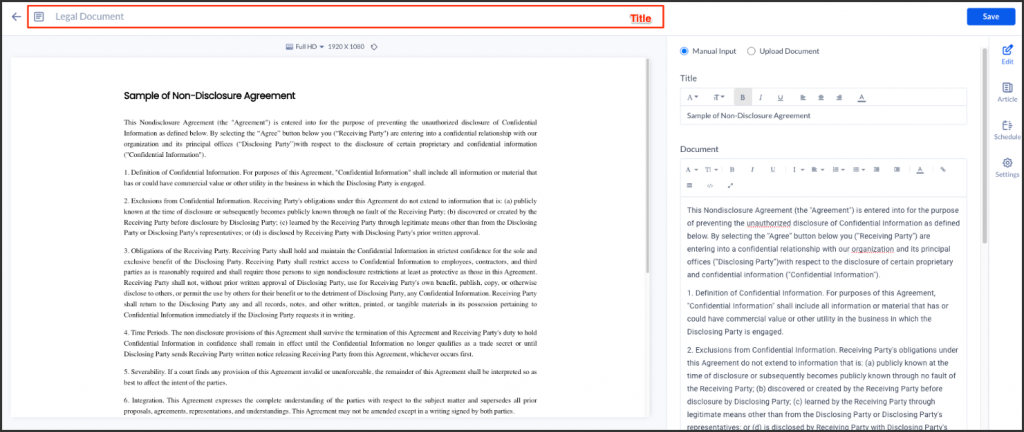
Create and Configure the Legal Document Card
Follow the instructions below to create and configure the Checkpoint Card:
- Log in to your Appspace console.
- Click Library from the ☰ Appspace menu, and click the + CREATE button.
Alternative
- Click +Quick Action from the Appspace menu bar on the top right, and select Create Card.
- Select Checkpoints from the templates panel and select Legal Document card.
NoteIf you are unable to locate the card, you may use the search bar, filters, or side panel to narrow down the content you’re looking for.
- Category Type: Checkpoints
- Content Category Type: N/A
- Tags: Checkpoint
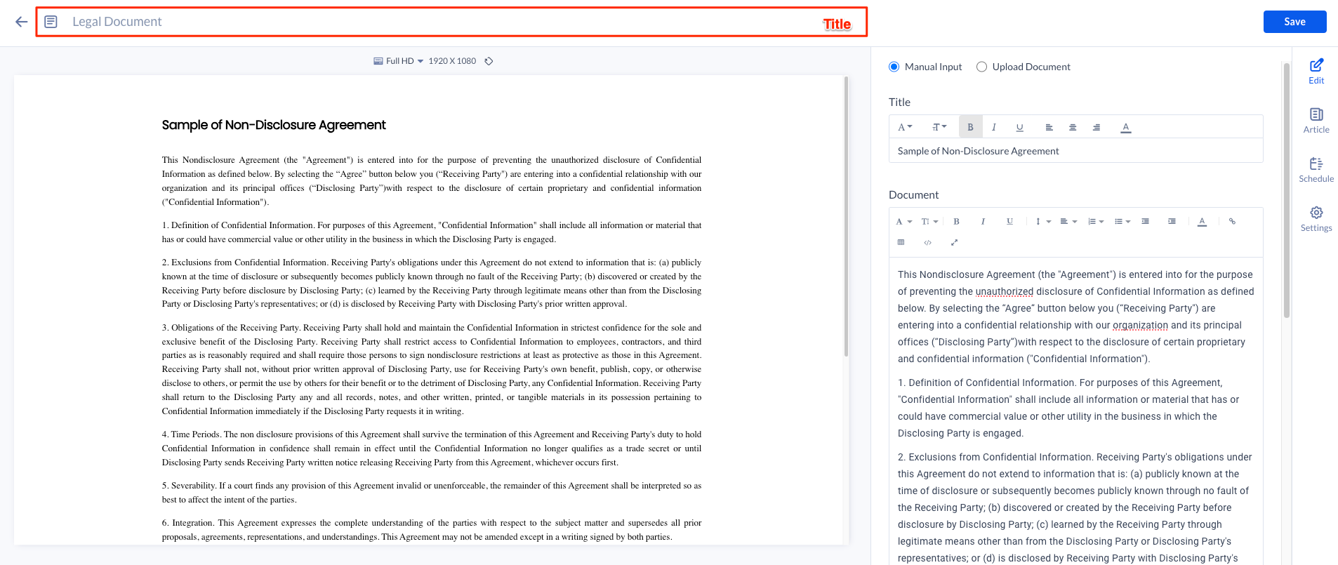
- Enter the Title of the card as this acts as the filename for the card content. This is a mandatory field.
- In the Edit tab section:
- For Legal Document card, you may do the following:
- Select Manual Input or Upload Document.
NoteFile formats supported for document upload include “pdf,” “jpg,” “.png,” “.bmp,” “.jpeg,” “.svg,” or “.gif.” Take note that only one file may be submitted at a time, and future uploads will overwrite it. Users can navigate through and preview uploaded documents with more than one page on the card preview, however, the card does not support pagination.
-
Edit the Title in the title section.
- Edit the document in the document section.
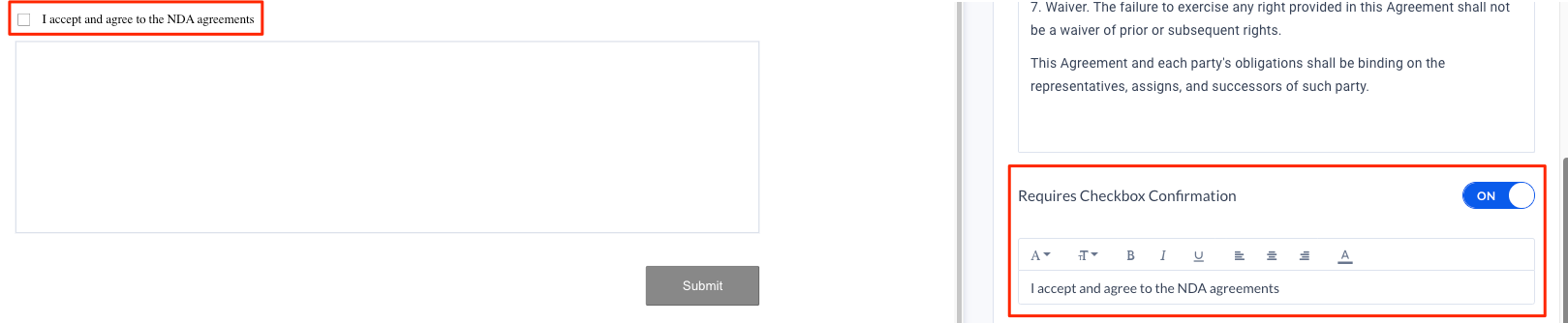
- Requires Checkbox Confirmation – Toggle the switch to ON if you want the checkbox to appear in the document. You may add a text in the confirmation text box.
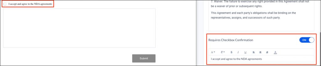
- Requires Signature – Switch the toggle to the ON position if you wish to have the signature box displayed in the document.
- Able to add Logo to the document.
- Select Manual Input or Upload Document.
- For Legal Document card, you may do the following:
- In the Article tab section: Optional.
- Include an Article or Caption to accompany the content when displayed on the Employee App and other social collaboration apps.
- Add a Referral Link to link more information to the content.
- In the Settings tab: Optional.
- The Name field will be auto-populated to match the Title of the content which will also act as the filename for the content. This is a mandatory field.
- Select the Content Category from the drop-down menu to match the focus of the message, or leave it at the default content category.
- Enter any relevant Tags for the content. (Optional)
- Select a folder for the content in the Library Location drop-down menu to change the default folder location.
- Select an expiry date for the content from the Auto Delete Content from Library drop-down menu. (Optional)
- Upload an image to be used as the Thumbnail for the content.
- Once done, click SAVE.
Create and Configure the Questionnaire Card
Follow the instructions below to create and configure the Checkpoint Card:
- Log in to your Appspace console.
- Click Library from the ☰ Appspace menu, and click the + CREATE button.
Alternative
- Click +Quick Action from the Appspace menu bar on the top right, and select Create Card.
- Select Checkpoints from the templates panel and select Questionnaire card.
NoteIf you are unable to locate the card, you may use the search bar, filters, or side panel to narrow down the content you’re looking for.
- Category Type: Checkpoints
- Content Category Type: N/A
- Tags: Checkpoint
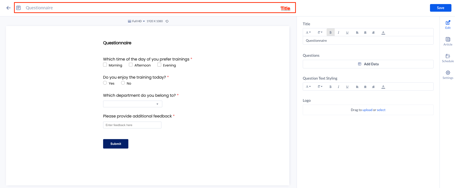
- Enter the Title of the card as this acts as the filename for the card content. This is a mandatory field.
- In the Edit tab section:
- For Questionnaire card, you may do the following:
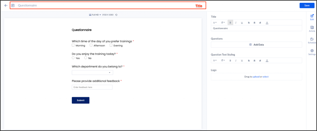
- Edit the Title of the Questionnaire form in the title section.
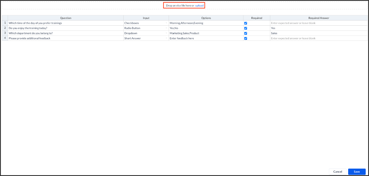
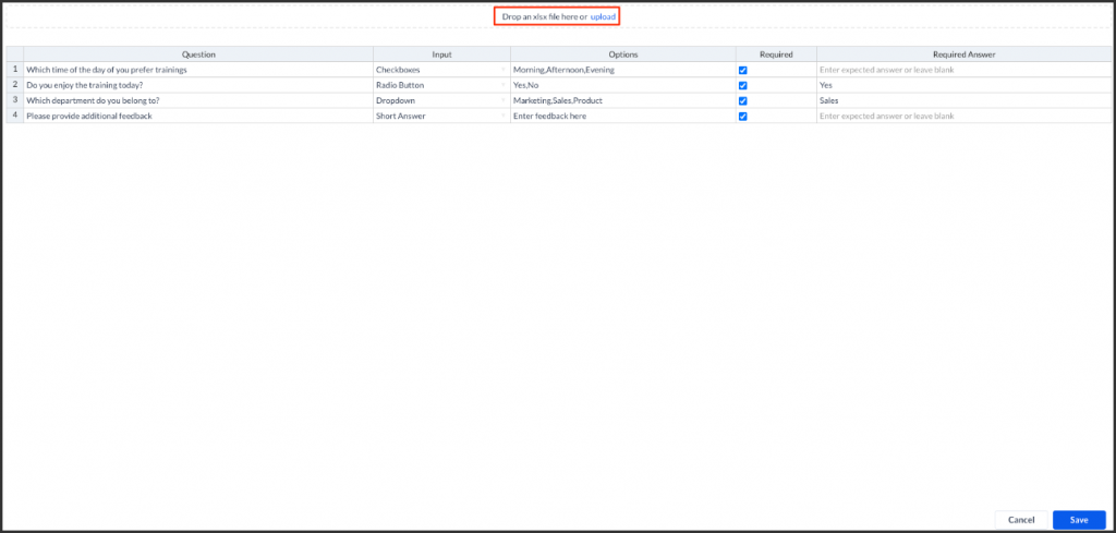
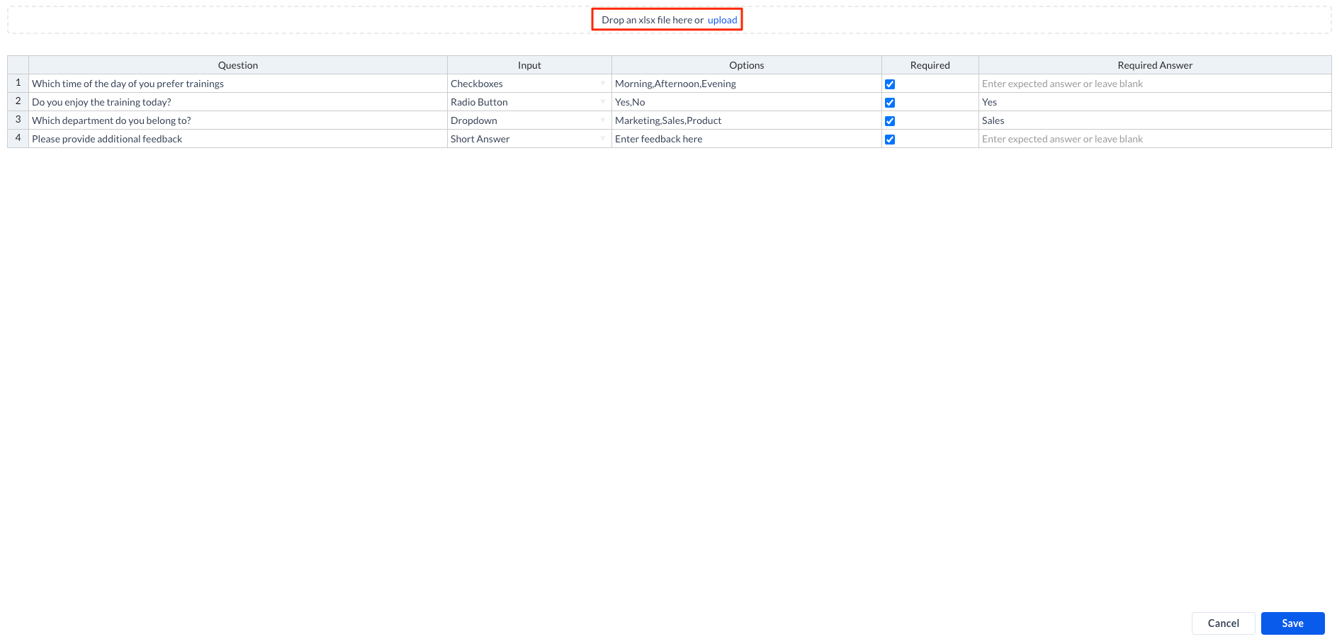
- The user has the option to use and edit the information in Questions column, or they may manually define their own content. To proceed, click the Add Data.
- You may also upload a .xlxs file with content details. The table headers in the file must correspond to the headers in the card editor table shown above i.e. Question, Input, Options, Required, Expected Answer. Ensure the Options format user needs to define the options in a comma-separated list input, while the Input values are exactly the same as displayed in the table drop down for the .xlsx to upload correctly.
-
The following describes the table data:
-
- Question: A text string. Currently there is no limit to the number of characters allowed and no limit to the number of questions able to be inserted as well.
- Input: The user needs to select one input method from the drop-down list which includes:
-
- Checkboxes: At least one checkbox is selected for the validation to pass.
- Radio Button: One radio button is selected for the validation to pass.
- Dropdown: One option is selected for the validation to pass.
- Short Answer: At least one character is added to the input field for the validation to pass.
-
- Options: The user can define the options to be displayed for each question.
- For Checkboxes, Radio button, and dropdown input methods, the user needs to define the options in a comma-separated list input. Take note that it does not matter if there is spacing between the comma and the next value.
- For Short Answer, the user can define a placeholder text.
- Required: To determine if the question mandatory to be answered. If marked as mandatory, the question will have an asterisk * for indication.
- Expected Answer: The user can define a required answer for each input. This means that the answer(s) must match this required answer for the validation of the checkpoint to be successful.
-
- Once done click Save.
- You may also upload a .xlxs file with content details. The table headers in the file must correspond to the headers in the card editor table shown above i.e. Question, Input, Options, Required, Expected Answer. Ensure the Options format user needs to define the options in a comma-separated list input, while the Input values are exactly the same as displayed in the table drop down for the .xlsx to upload correctly.
- Edit the questions styling in the Question Text Styling section.
- Able to add Logo to the document.
- For Questionnaire card, you may do the following:
- In the Article tab section: Optional.
- Include an Article or Caption to accompany the content when displayed on the Employee App and other social collaboration apps.
- Add a Referral Link to link more information to the content.
- In the Settings tab: Optional.
- The Name field will be auto-populated to match the Title of the content which will also act as the filename for the content. This is a mandatory field.
- Select the Content Category from the drop-down menu to match the focus of the message, or leave it at the default content category.
- Enter any relevant Tags for the content. (Optional)
- Select a folder for the content in the Library Location drop-down menu to change the default folder location.
- Select an expiry date for the content from the Auto Delete Content from Library drop-down menu. (Optional)
- Upload an image to be used as the Thumbnail for the content.
- Once done, click SAVE.
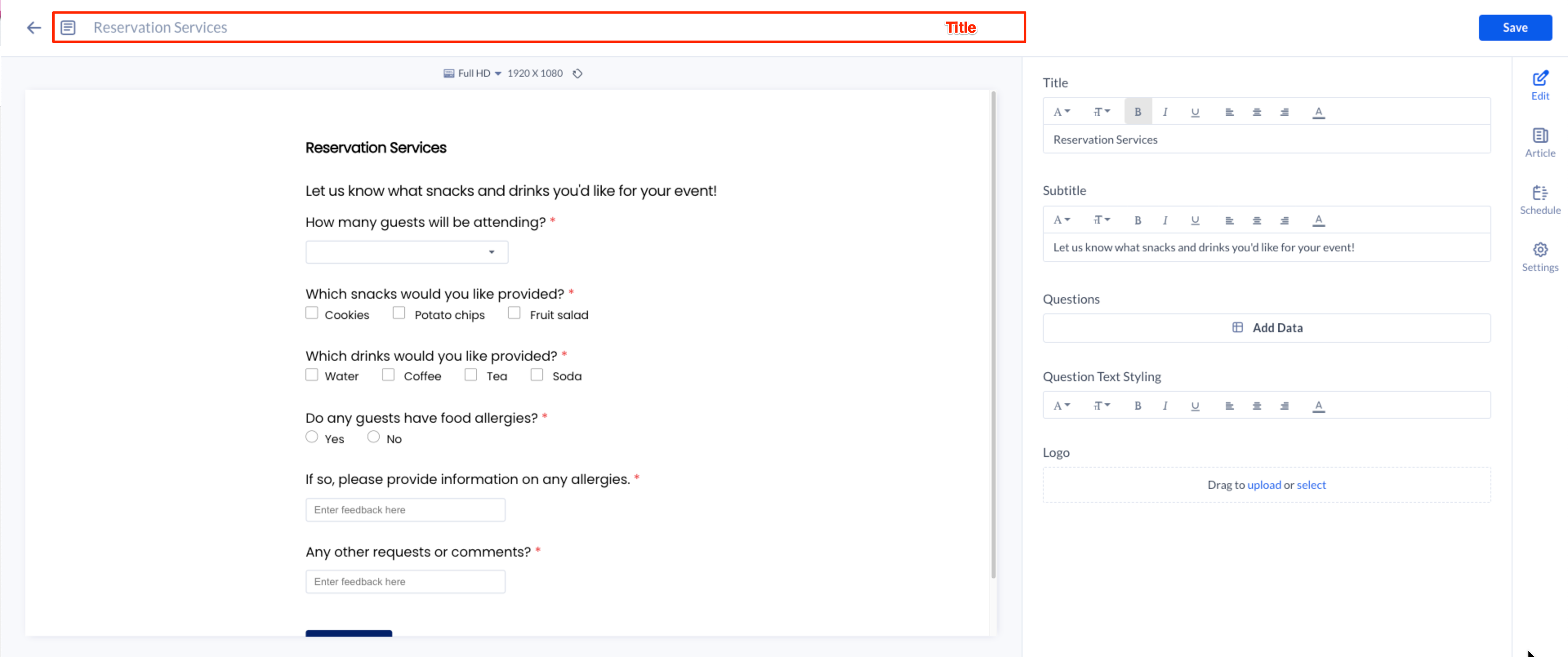
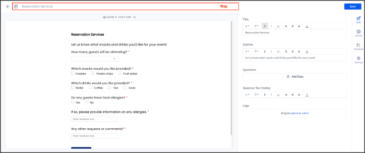
Create and Configure the Reservation Services Card
Follow the instructions below to create and configure the Checkpoint Card:
- Log in to your Appspace console.
- Click Library from the ☰ Appspace menu, and click the + CREATE button.
Alternative
- Click +Quick Action from the Appspace menu bar on the top right, and select Create Card.
- Select Checkpoints from the templates panel and select the Reservation Services card .
NoteIf you are unable to locate the card, you may use the search bar, filters, or side panel to narrow down the content you’re looking for.
- Category Type: Checkpoints
- Content Category Type: N/A
- Tags: Checkpoint
- Enter the Title of the card as this acts as the filename for the card content. This is a mandatory field.
- In the Edit tab section:
- For Reservation Services card, you may do the following:
- Edit the Title of the Reservation Services form in the title section.
- The user has the option to use and edit the information in Questions column, or they may manually define their own content. To proceed, click the Add Data.
- You may also upload a .xlxs file with content details. The table headers in the file must correspond to the headers in the card editor table shown above i.e. Question, Input, Options, Required, Expected Answer. Ensure the Options format user needs to define the options in a comma-separated list input, while the Input values are exactly the same as displayed in the table drop down for the .xlsx to upload correctly.
- The following describes the table data:
-
- Question: A text string. Currently there is no limit to the number of characters allowed and no limit to the number of questions able to be inserted as well.
- Input: The user needs to select one input method from the drop-down list which includes:
-
- Checkboxes: At least one checkbox is selected for the validation to pass.
- Radio Button: One radio button is selected for the validation to pass.
- Dropdown: One option is selected for the validation to pass.
- Short Answer: At least one character is added to the input field for the validation to pass.
-
- Options: The user can define the options to be displayed for each question.
- For Checkboxes, Radio button, and dropdown input methods, the user needs to define the options in a comma-separated list input. Take note that it does not matter if there is spacing between the comma and the next value.
- For Short Answer, the user can define a placeholder text.
- Required: To determine if the question mandatory to be answered. If marked as mandatory, the question will have an asterisk * for indication.
- Expected Answer: The user can define a required answer for each input. This means that the answer(s) must match this required answer for the validation of the checkpoint to be successful.
-
- Once done click Save.
- You may also upload a .xlxs file with content details. The table headers in the file must correspond to the headers in the card editor table shown above i.e. Question, Input, Options, Required, Expected Answer. Ensure the Options format user needs to define the options in a comma-separated list input, while the Input values are exactly the same as displayed in the table drop down for the .xlsx to upload correctly.
- Edit the questions styling in the Question Text Styling section.
- Able to add Logo to the document.
- For Reservation Services card, you may do the following:
- In the Article tab section: Optional.
- Include an Article or Caption to accompany the content when displayed on the Employee App and other social collaboration apps.
- Add a Referral Link to link more information to the content.
- In the Settings tab: Optional.
- The Name field will be auto-populated to match the Title of the content which will also act as the filename for the content. This is a mandatory field.
- Select the Content Category from the drop-down menu to match the focus of the message, or leave it at the default content category.
- Enter any relevant Tags for the content. (Optional)
- Select a folder for the content in the Library Location drop-down menu to change the default folder location.
- Select an expiry date for the content from the Auto Delete Content from Library drop-down menu. (Optional)
- Upload an image to be used as the Thumbnail for the content.
- Once done, click SAVE.