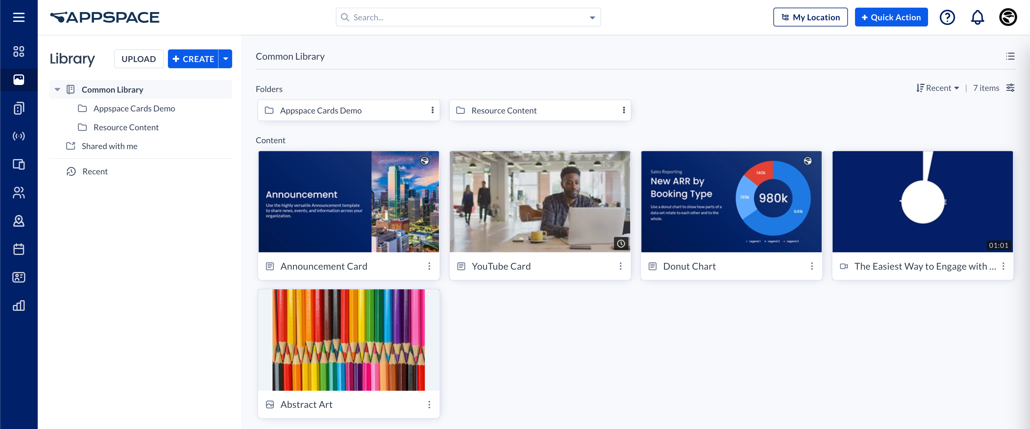
The Library is the primary content management center that allows you to organize and manage all your Appspace content. Appspace 8.0 introduces a brand new user interface with a streamlined design and workflows for improved user experience.
This article provides you with an introduction to all the new features available and instructions on navigating the new Library module.
New & Improved Features
Redesigned User Interface
The dashboard, all the functionality, and the workflows, in the Library, have been completely revamped to match the brand new user interface and streamlined design for improved user experience.
The user interface is now faster and more responsive.
Updated Content Creation Workflows
We have not only improved the existing workflows but also added new functionality in the Library, such as:
- The content creation workflow has been streamlined for all content types. The creation process will follow the same workflow and UI, whether you create it from the Library, via the Quick Actions menu, or directly from inside a channel.
- Create any type of content easily – all in one place. Just click the +CREATE button to create a folder, upload files, or simply to create content from a multitude of card templates available.
- Create and schedule your content in one workflow. When creating the content, you can configure and schedule the playback options including dayparting, configure the interactive display properties, and add the content to any desired channel(s) – all in the same workflow.
- Publish content to a channel directly from the Library – either add existing content to a channel directly from the Library dashboard or publish whilst creating the card.
- Support for massive instant previews throughout the content creating, editing, and configuring process. You may choose to preview with display options such as Responsive, Responsive 16:9, 2K, 4K, Tablet, Phone, or Custom.
Improved Functionality
User interactivity improvements include new click operations and improved search and filter functionalities. as follows:
- Use the mouse pointer to drag and select multiple content or folders.
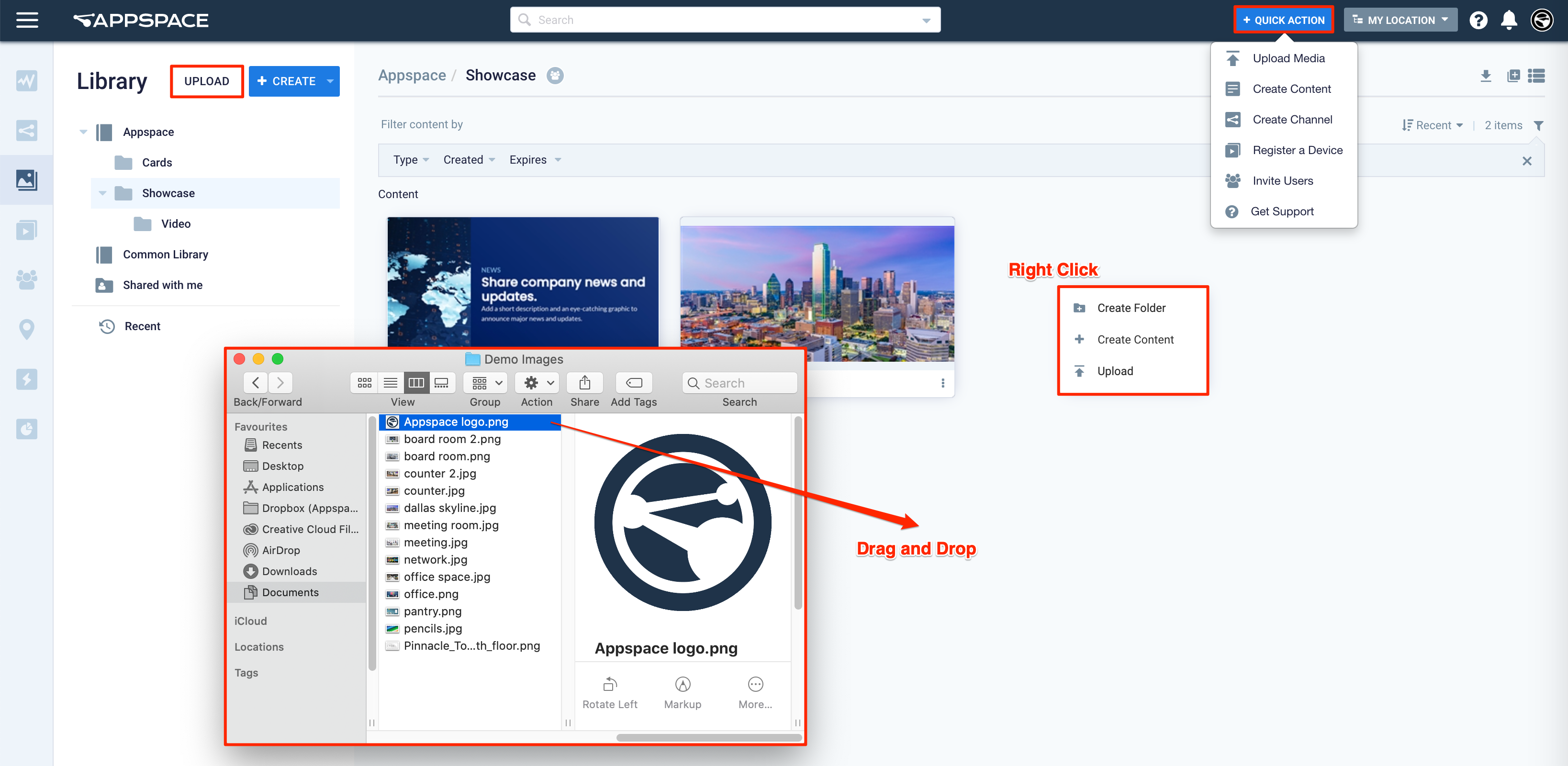
- Ability to right-click anywhere in the Library to reveal operation options such as Create Folder, Create Content, and Upload.
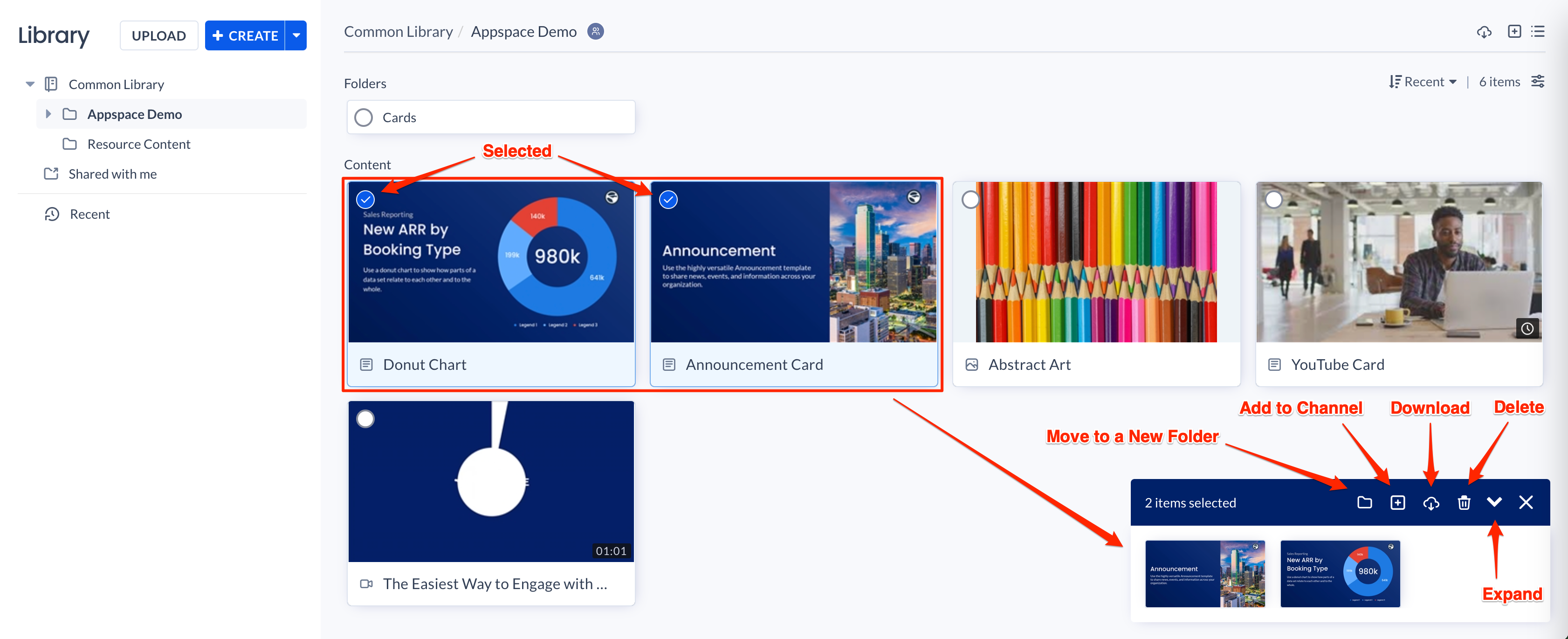
- Ability to right-click on any item below the Content section to select from a multitude of operation options such as Move to a New Folder, Add to Channel, Tags & Expiry, Download, Create Copy, and Delete.
- Perform batch operations in the Library. You may select more than one content, and either download it, move it all to a folder, or add it all to a channel – all with just a few clicks.
- Improved Search functionality with filtered search results. You may choose to search in a folder using tag names, or by content type.
- New filter options – you may filter content in the Library by content type, created date, or expiry date.
- The Library navigation tree also has a Recent item – allowing you to view all recently created/updated content.
- Content section is enhanced to display content information to meet tracking requirements, content ownership, and versioning. – New
User Interface & Navigation
Dashboard
The Library can be accessed by clicking the Library icon from the Appspace menu, bringing you to the Library dashboard.
The dashboard includes the following two buttons for creating content:
- Create button – Allows you to create folders or content such as cards.
- Upload Media button – Allows you to upload media such as images, videos, and audio to the library.
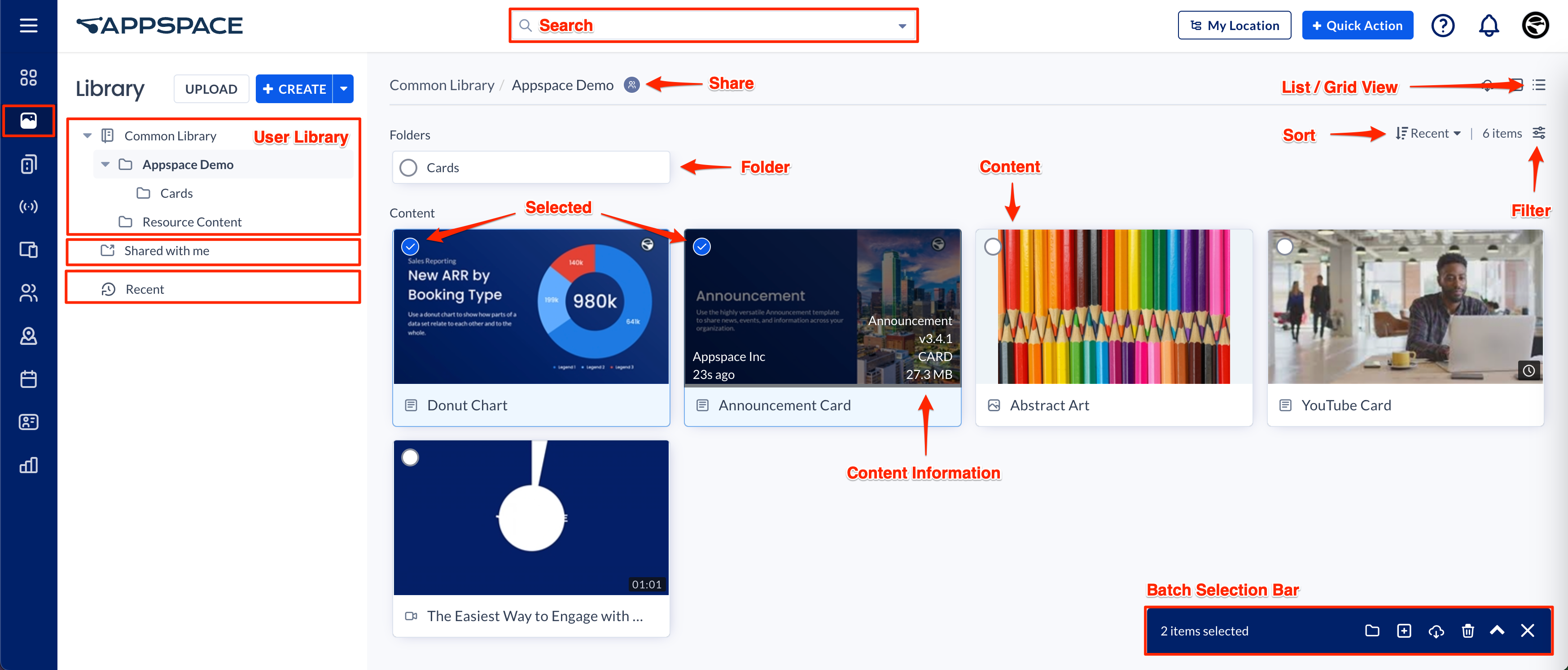
The library navigation tree displays all user libraries and content folders that are available to you, allowing you to easily organize or share content with others. The following items are displayed:
- User Library – Displays the user library that you and all Account Owners have access to, which may include the Common Library.
- Shared with me – Displays the content folders that your peers have shared with you.
- Recent content – Displays the recent content that has been created or uploaded.
Contents now display quick content details when hovered upon, while accessing the content’s Settings tab provides more detailed information, such as the following:
- Card
- Type
- Template
- Size
- Created date and user
- Modified date and user
- Location
- Version
- Image
- Type
- Codec
- Size
- Resolution
- Bit Depth
- Created date and user
- Modified date and user
- Location
- Video
- Type
- Codec
- Size
- Resolution
- Bitrate
- FPS
- Duration
- Created date and user
- Modified date and user
- Location
Search
The Search function allows you to search for content within the library using the content name or any keyword. CLick the drop-down arrow to use the advanced search options such as location (library folders), content type, or a tag name.
Folders
Use folders to organize content. Clicking the ellipsis of the folder, or right-clicking the folder displays an action menu that allows you to perform the following functions:
- Add to Channels
- Share with Others
- Rename
- Download
- Delete
Content
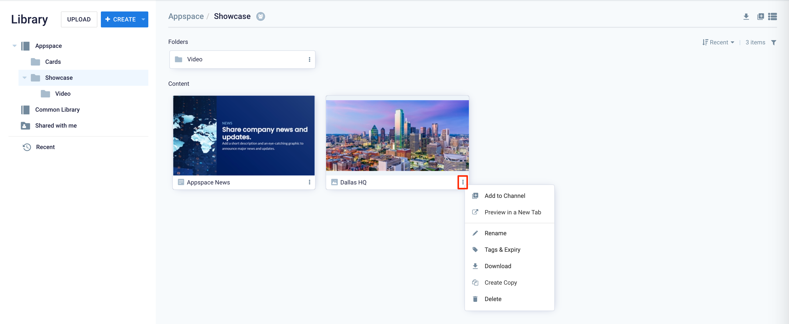
Content items created or uploaded to the library are displayed according to the folders you organize them in. Unassigned content will be listed in the default root library. Clicking the ellipsis or right-clicking any content displays an action menu that allows you to perform the following functions:
- Add to Channel
- Preview in a New Tab
- Rename
- Tags & Expiry
- Download
- Create Copy
- Delete
List and Grid Views
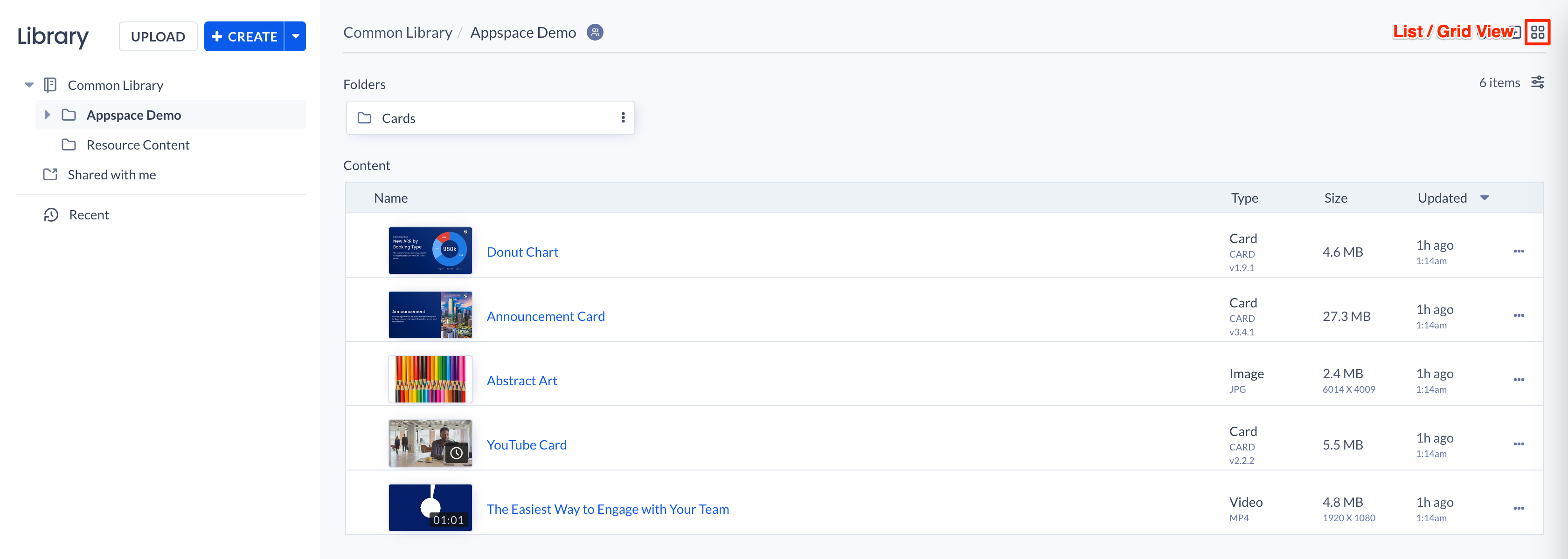
The Library now allows content to be displayed in Grid View or List View, both allowing users to quickly search and identify content. The user can toggle between the Grid View and List view by clicking the view icon in the Library.
Grid View
The Grid View displays the content filename and thumbnail, enabling users to quickly identify the content type and contents. Hovering over the content further reveals other content information depending on the content type. This view is best suited when trying to identify or browse through images or photos in the library.
- Card
- User
- Created Date
- Card Template
- Card Version
- Content Type
- Content Size
- Image / Video
- User
- Created Date
- Image Resolution
- Content Type
- Content Size
List View
The List View displays the content thumbnail, filename, type, size, and when it was last updated in rows, enabling users to quickly identify the type, size, or when the content was last updated in the library. This view is best suited for users trying to identify or browse through the content that has recently been updated, or by size.
Batch Selection Bar
When multiple content items are selected, the batch selection bar will be displayed allowing users to perform the following actions:
- Move to a new folder
- Add to channel
- Download
- Delete
Sort
Allows you to sort content based on Recent, Oldest, and by Name (Ascending or Descending)
Filter
Allows you to filter content by Type, Created date, or Expiry date.
Content Creation Workflow
The new Library improves and streamlines all the content creation workflows into a single workflow, ensuring that you’ll always encounter the same UI and workflow, no matter where you start creating content from within the Appspace console.
Upload Content
The following are some of the ways users are able to upload content to the library in Appspace:
- Library
- Click the Upload Media button.
- Right-click the content or folder area of the library.
- Drag and drop content from your computer directly to the library.
- Console dashboard
- Click the QUICK ACTION button, and select Upload Media.
- Channels
- When adding content to channels.
- Alerts
- When allocating content to Alert templates.
- Appspace content portal
- When adding content to channels.
For complete instructions on how to upload content to your Library, click the Create Content/Upload Media article.
Creating Content
The following are several entry points for users to create content in the Appspace console:
- Library
- Click the +CREATE button.
- Right-click the content or folder area of the library.
- Appspace dashboard
- Click the QUICK ACTION button, and select Create Content.
- Channels
- When adding content to channels.
- Appspace content portal
- When adding content to channels.
Content and Card Editor
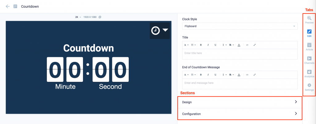
The card editor has been updated with a new UI and workflow, which groups key functions and features into tabs and sections for improved user experience, such as:
- Preview tab – this tab appears only after the content is saved and the editor window is opened. Preview options include Responsive, Responsive 16:9, 2K, 4K, Tablet, Phone, or Custom.
- Edit tab – configure the card layout, message title and summary, logo, background and a featured media/image. Also, depending on card or template type, you may see these additional sections:
- Design section – includes customized design options for each card type, which includes color palette, background, logo, and style selection options.
- Configuration section – includes customized configuration options for each card type, such as chart options.
- Article tab – write the content article, caption, and include a referral link if any.
- Schedule tab – here you add the content directly to any existing channel, and configure its playback schedule and display properties.
- Settings tab – in this tab you may add a name for this card, configure its expiry date, add tags, and add a thumbnail image.
Content Categories, Tags, and Templates Categories
The Appspace Library provides an extensive number of templates for quick content creation, and this will only grow in time. Thus for a better overall content organization, and to make searching templates quickly during the content creation workflow, the Library in Appspace 8.0 introduces content categories, tags, and card categories which can be found in the editor window when adding content to the library or a channel.
Content Categories
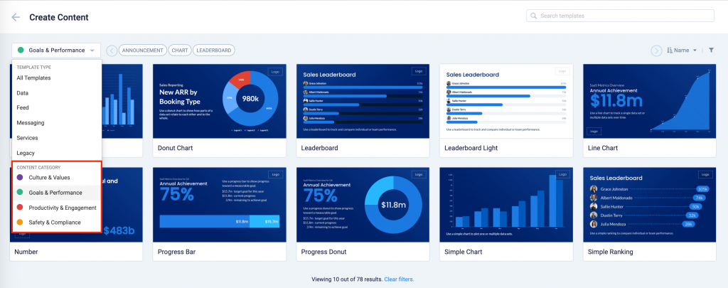
Content Categories are assigned to every card template in the Library by default. Content Categories are a measure for organizations to create content, build channels, and target messaging according to workplace communications best practices and internal communication goals.
Appspace has defined the following four major content categories based on the focus of the content:
- Culture and Values – Content that promotes company values and affects the employee experience, to help customers drive company values throughout their organization.
- Goals and Performance – Content that showcases both long- and short-term goals and measurements of performance, to create shared ownership of company goals and drive employee performance.
- Productivity and Engagement – Content with information that keeps the company running, day-to-day, facilitating organizational productivity.
- Safety and Compliance – Content with information that supports employee safety and ensures company compliance with regulatory requirements, to help create a safe environment and promote safe behavior amongst employees.
With the Content Categories feature in place, users will be able to perform the following functions in the console:
- Filter card templates based on content categories via the All Templates drop-down menu when creating content in the Library.
- Change the default content category for a card in the Settings tab during card creation, if they have Publisher or Author user permissions.
- Assign a content category when uploading content to the Library.
- View the Content Category for every piece of content added to a channel playlist.
Cards created prior to this release will not contain a Content Category, and will be considered as “Unassigned”. However, you may assign a category when editing/updating the card.
Tags
Content tags are used to organize, filter, and group content. Tags can be applied to all types of content such as images, videos, and even cards – from the library or when adding content directly to a channel.
Tagging content not only improves organization and content search capabilities but also allows playlist channels to automatically populate content based on the same tag, even when the content is in different folders.
More information on tags and managing tag content can be found in the Tag Content article.
Template Categories
When creating a card, you now have the option to filter results based on tags and card template categories which are based on card types such as Messaging, Data, Services, Feeds, and Legacy content – to easily find what you need from a huge list of templates available.
The following cards and legacy content are now grouped based on its function below:
Messaging
Data
Charts with Data Visualization Card
- Bar Chart Card
- Donut Chart
- Leaderboard Chart
- Line Chart
- Progress Bar Chart
- Progress Donut Chart
- Table Card
Feeds
- Google Sheets Card
- Google Slides Card
- Weather Card
- RSS Card
- Social Media Feeds by Seenspire Card
- YouTube Card
- Weather Card
- Web View Card
- Webex Recording Card
- World Clock Card
Services
- Schedule Board Card
- Room Schedule Card
Was this article helpful?
