This article provides the instructions to create and configure a Table card, which allows you to display data or quantitative information in a structured table, either by manually adding the data into the table, or importing it from an Excel spreadsheet.
The following features and customizations are available on the Table card:
- Manual data input or from an external source using a URL.
- Table title, header and body customizations.
- Background color and media support.
- Custom row height and column width settings.
- Conditional formatting.
- Column sorting.
- Data filtering.
- Table pagination, with transitions and custom durations.
Note
A completely redesigned Table card is made available on October 18th 2019. The Table card is now an Appspace Supported card, which will be periodically updated by Appspace with new templates and features.
Existing Table card templates (prior to this release) which were categorized as Community Cards will be removed from the Appspace console.
Important
- Please refer to our Introduction to Cards guide for an in-depth introduction to the types of cards that are ideal for your signage solutions.
- Cards are only supported on devices with the Appspace App. Legacy devices are not supported.
What’s in this article:
Prerequisites
- Ensure your device is compatible. Refer to Compatible Appspace Cards.
- Account Owner, Publisher, or Editor (author) role in Appspace to.

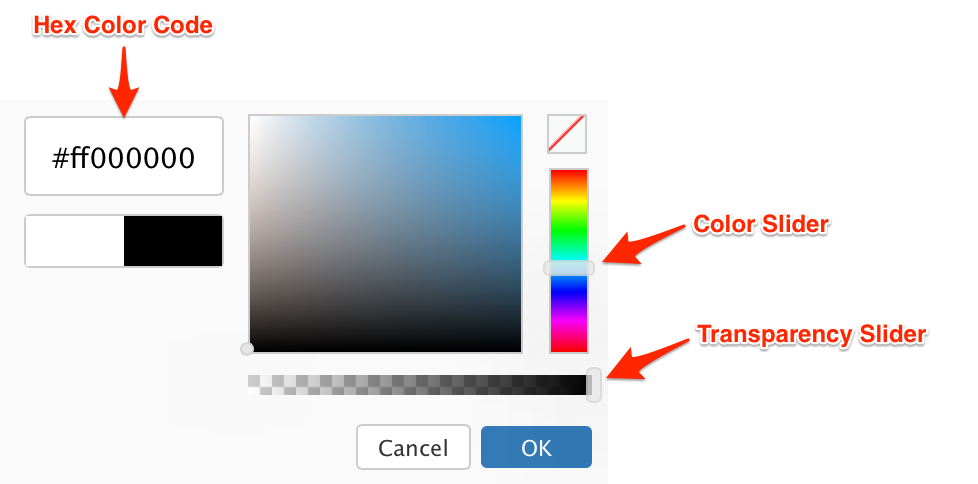 The first two characters in the Hex color code is the transparency value, while the next six characters are the color values. Please be mindful when including a custom Hex color code.
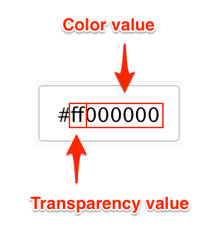
Create and Configure Table Card
Follow the instructions below to create and configure the card:
- Log in to the Appspace console.
- Click the QUICK ACTION menu on the top-right, select Create Card, and proceed to step 4 below. Or click Library from the Appspace menu navigation bar on the left, and proceed to step 3 below.
- Select the desired folder in the library, and click the ADD button, and select Create Card.
- Select Table from the Filter by template menu, and select a desired card template.
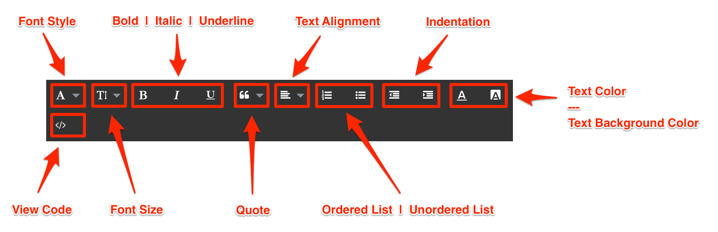
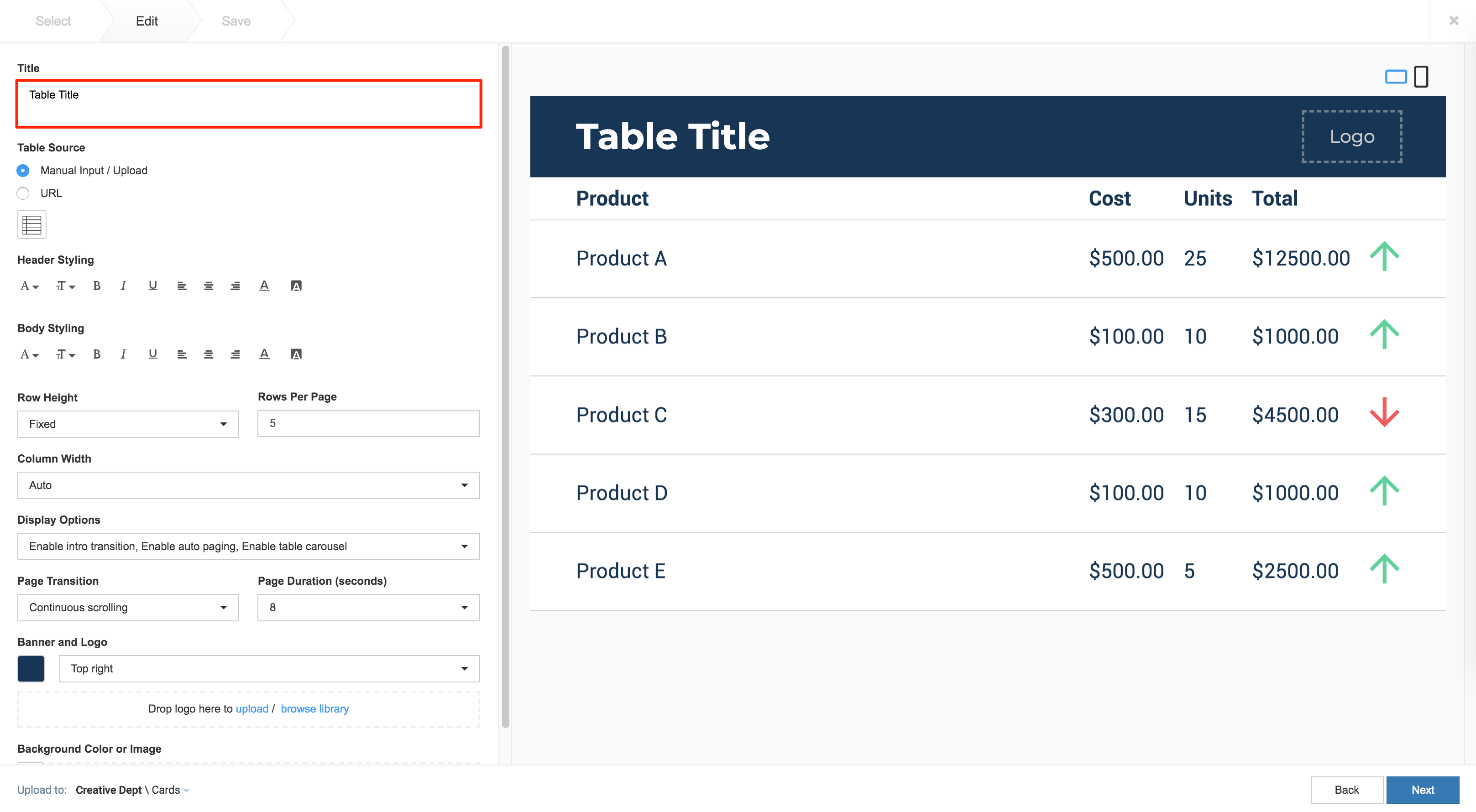
- Enter in the Title to be displayed on the card. The Text Editor can be used to customize the text styles.
- There are two options to populate data into the Table card, select your preferred option:
- URL (External Data Source) ImportantWe support URL links to an array of array object, a CSV file, or an XLSX file. However, the .xlsx file format requires Appspace App 2.10 to work correctly, which is scheduled to be released on the 10th of April 2020. If a .xlsx file is used in the card, the card and the Appspace App will crash during playback.
- Enter in the URL link for the external data source ( array of object array, .csv, or .xslx )
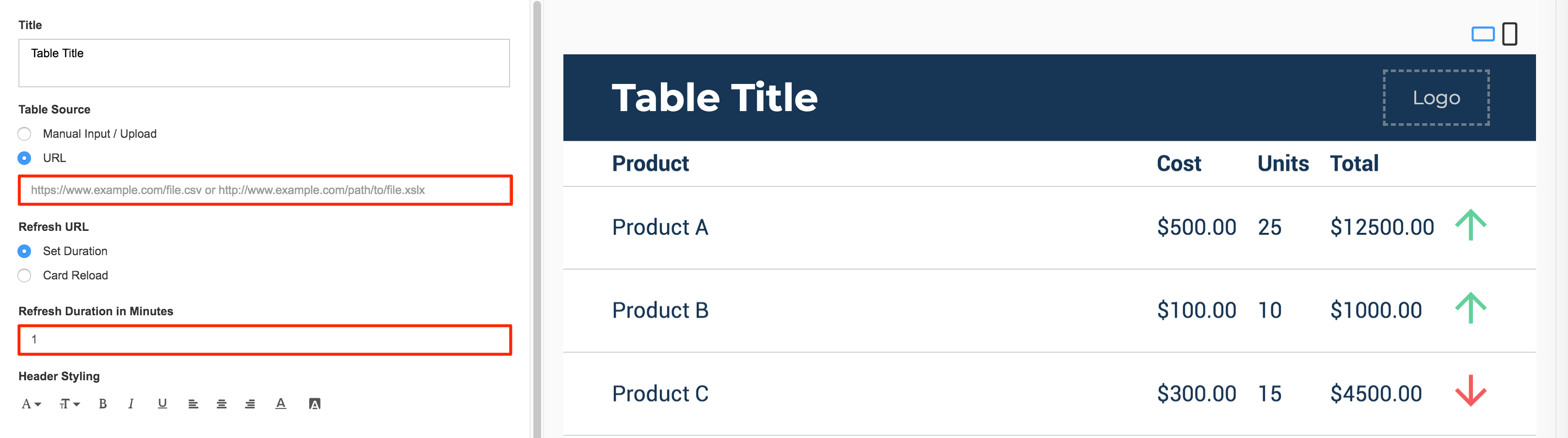
- Select the Refresh URL, and enter in the duration in minutes.
- Set Duration – Retrieves external data from the URL link provided depending on the duration set.
- Card Reload – Reloads the entire Table card depending on the duration set.
- Enter in the URL link for the external data source ( array of object array, .csv, or .xslx )
- Manual Input / Upload (Internal Data Source)
- Click the Table Data button, and populate the card’s table using one of the following methods:
- Manually enter in data or an image into the table.
- Copy and paste data from an external table.
- Import data from an Excel spreadsheet (.xlsx).
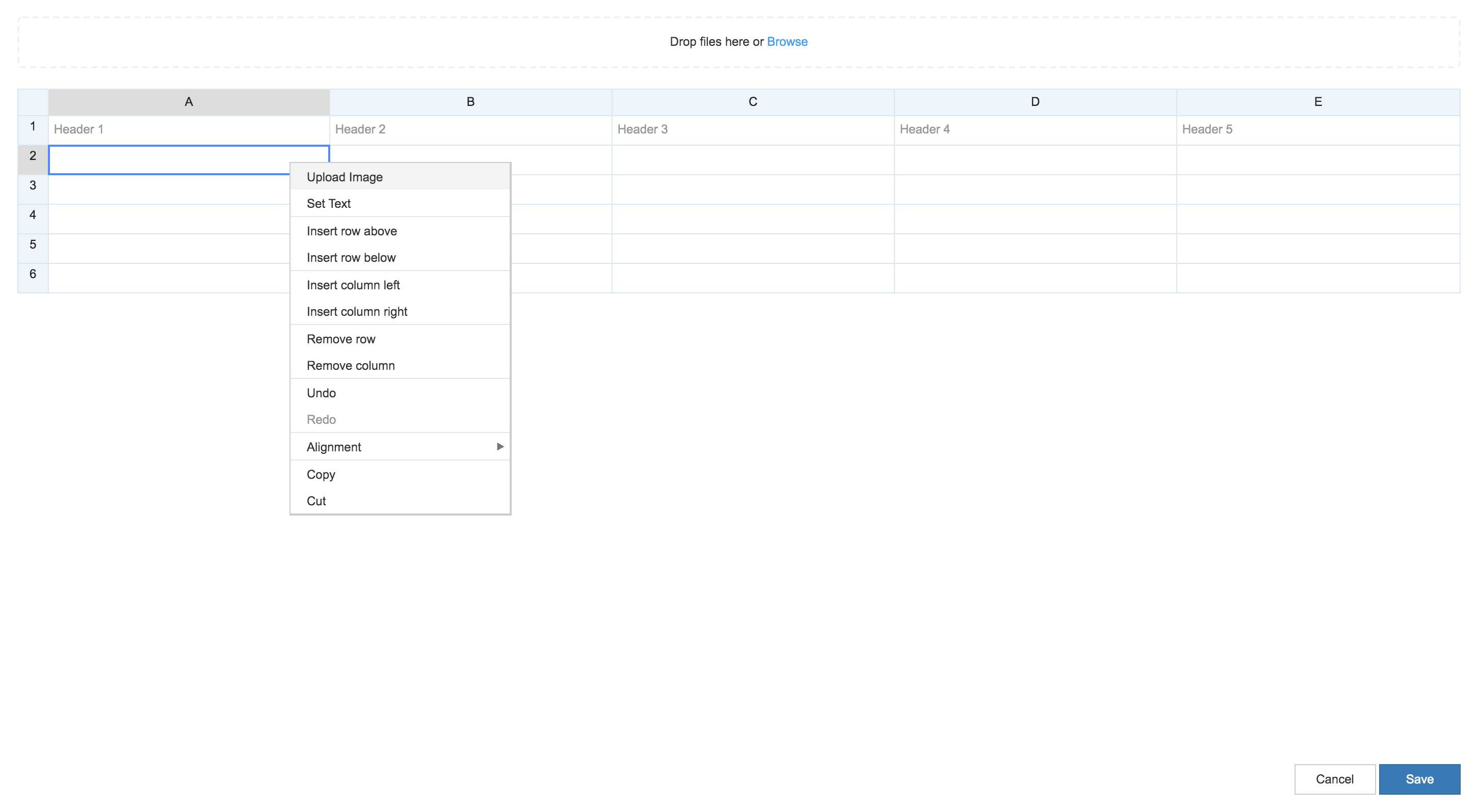 ImportantOnly Table Card 1.1 and later support adding images to a cell.
- Click Save.
- Click the Table Data button, and populate the card’s table using one of the following methods:
- URL (External Data Source)
- Customize the table with the following options:
- Customize the Header Styling and Row Styling, such as font, size, color, background.
- Select the Row Height:
- Auto
- Fixed – Displays the Rows per page option, allowing users to set the number of rows to display in a page.
- Select the Column Width:
- Auto
- Distribute equally
- Select the Display Options:
- Enable auto paging
- Enable word wrap
- Enable row shading
- Select the Page Transition
- Continuous scrolling
- Page-by-page
- Select the Page Duration (Seconds)
- 8 secs
- 12 secs
- 24 secs
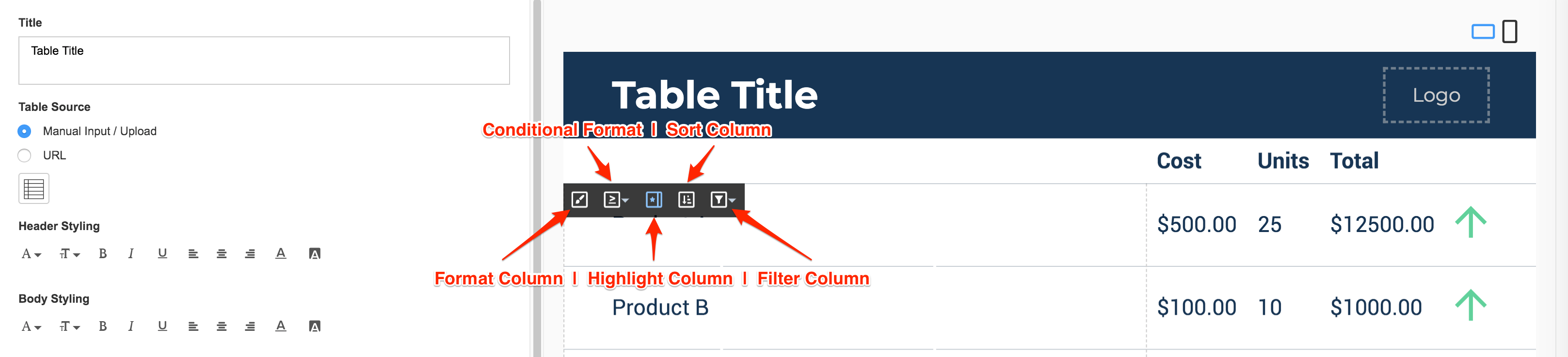
- Hover over the column to bring up the column inline controls, which allow users to:
- Format Column – Enables individual column styling and text wrapping options for the selected column.
- Conditional Formatting – Enables conditional formatting for the selected column.
The following conditional formatting options are available:- Positive values
- Negative values
- Is empty
- Is not empty
- Greater than
- Greater than or equals to
- Less than
- Less than or equals to
- In range
- Out of range
- Text contains
- Text does not contains
- Text is exactly
- Exactly
- Highlight Column – Expands the selected column by using the remaining width of the table, once non-highlighted columns take on the natural width of the table.
- Sort Column – Enables the selected column to be sorted either acsending or descending order.
The acsending order is sorted based on the following sequence:- Empty value
- Number
- Date
- Character
- Media
- Filter Column – Enables the selected column to display only the filtered records.
The following filter options are available:- Positive values
- Negative values
- Is empty
- Is not empty
- Greater than
- Greater than or equals to
- Less than
- Less than or equals to
- In range
- Out of range
- Text contains
- Text does not contains
- Text is exactly
- The following card customizations options can be done:
- Select the Banner color and logo position.
- Select the Background color or image.
- Once customizations have been made, click Next.
- In the Save tab, enter in the Title, as this is a mandatory field. Optionally, you may enter in the Article, Caption, Content Expiry, Content Tags and even upload a custom thumbnail for the content.
- Click Save to complete, and you may now proceed to add the card into a playlist channel.
Was this article helpful?