The Announcement card allows businesses to publish corporate messaging, and workplace updates, and information, ideal for keeping the remote workforce engaged via our Employee App portal and enterprise messaging apps.
The card is also ideal for digital signage on any supported set-top box devices, System on Chip (SoC) displays, tablets, or mobile devices, multi-screen displays, video walls, or even wallpaper displays on collaboration devices, for customer engagement at the workplace.
The Announcement card can be configured easily and quickly published to any existing displays around the office, collaboration devices in meeting rooms, or even a browser, with the company’s branding and design in place.
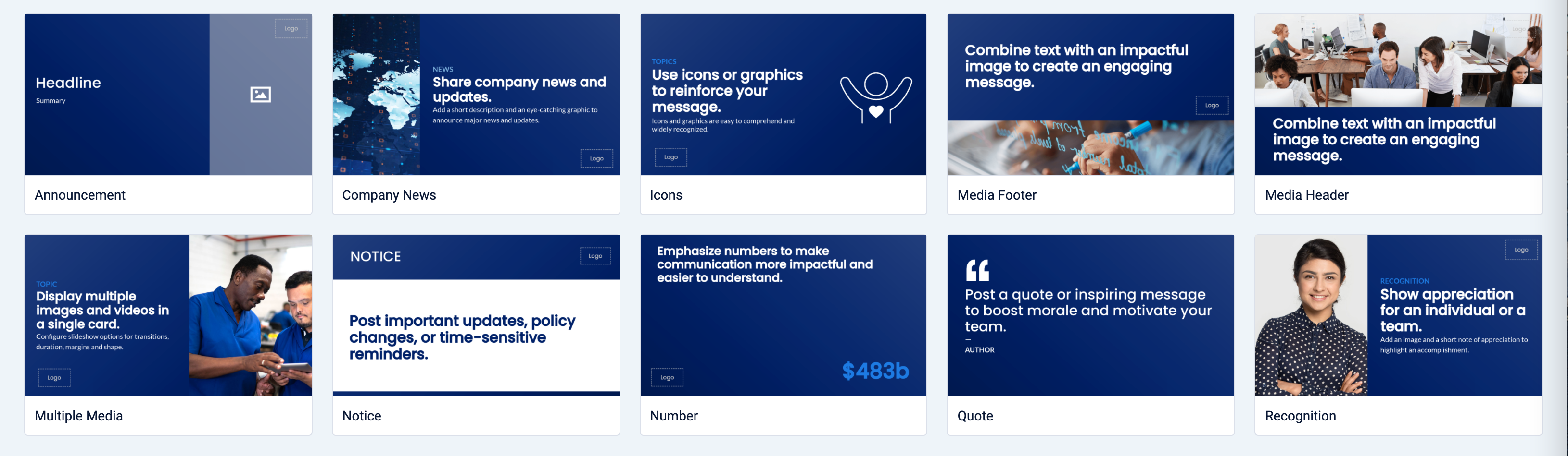
Appspace has also included the following card themes based on the Announcement card, allowing for quick and focused messaging:
- Annoucement (Base Theme)
- Company News
- Evens
- Icons
- Media Footer
- Media Header
- Message
- Multiple Media
- Notice
- Number
- Quote
- Recognition
- Slideshow
- Banner
The following customizations, features, and functionality are available for the Announcement card:
- With the introduction of Content Categories in Appspace 8.0 ac.22, the Announcement card template is assigned with the Culture & Values content category.
- A special tracking effect which is a combination of pan and zoom effects applied to images for motion.
- Support for playout duration and transitions for images.
- Formatting options such as aspect ratio, borders, and margin.
- Text and feature media elements are animated into the layout during every channel transition.
- New layout control and layout formatting options.
- Ability to position and resize custom logo.
- Playlist capabilities with multiple images and video.
- New transitions to animate both text and feature media.
Visit our Appspace Card Gallery to find the perfect card to deliver your message.
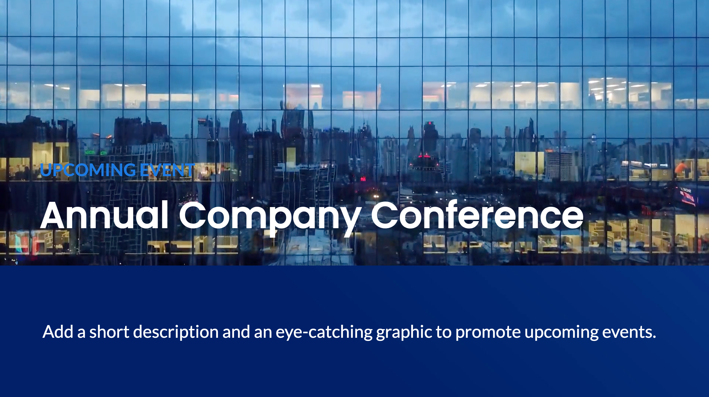
This article provides instructions to configure and create an Announcement card, a simple, but augmented card customizable with animations, ideal for corporate messaging, signage, and wallpapers.
What’s in this article:
Prerequisites
- Ensure your device is compatible. Refer to the Supported Appspace Cards article.
- Account Owner, Publisher, or Author role to add or edit content in the Library.
Recommendations
BrightSign devices
- It is recommended that video be added only in the feature media component and not in the background.
- We also recommend adding only one (1) video in each card, as BrightSign only supports one video layer at a time.
- When video is added to the feature media, border formatting will not be applied.
- When using BrightSign LS devices, ensure all transitions are disabled when displaying images and videos in full screen.
- When using BrightSign HD devices, ensure all transitions are disabled.
- The cropping/formatting feature for video content is not supported on BrightSign devices due to how BrightSign handles the video layer.
- Images and videos must be formatted in such a way that the aspect ratios all match so that they can be displayed consistently without needing to crop/reformat. Otherwise, it is recommended to run only images, or only videos that can fit without any additional formatting in the card itself.
LG devices
- It is recommended that animations be turned off as LG devices have performance issues with transitions.
Create and Configure Announcement Card
Follow the instructions below to create announcements and messages:
- Log in to your Appspace console.
- To create this card, select one of the following options:
- Click +Quick Action from the Appspace menu bar on the top right, and select Create Card.
- Click Library from the ☰ Appspace menu, and select a library or folder you wish to create the content in. Click +CREATE, and select Card.
- To create and add the card directly to an existing channel, refer to Add Content to Playlist Channels.
- Select Communication from the All Templates panel, and click Announcement.ImportantIf you are unable to locate the content, try using either the Search bar, the Order by, or Filter icon to narrow down the content that you are looking for.
- Enter the Title of the content as this will also act as the filename for the content. This is a mandatory field.
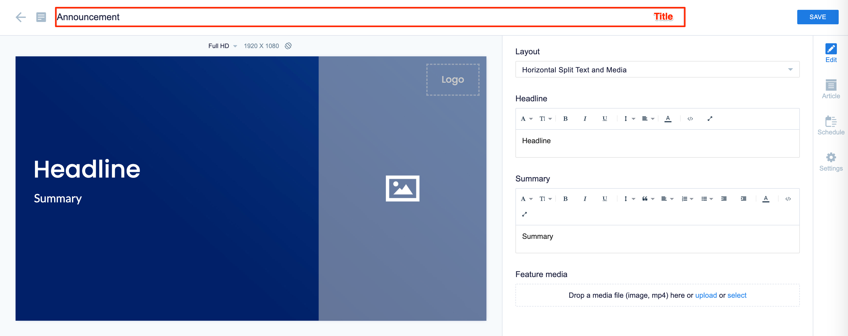
- In the Edit tab:
- Select the Layout of the chart.
- Text Only
- Horizontal Split Text and Media
- Vertical Split Text and Media
- Text and Media
NoteYou may adjust the width of your layout sections by dragging the lines.
- Enter the Headline, and Summary text fields with the preferred messaging text. Use the Text Editor to customize the text font and style. The Headline and Summary text can be customized to the following positions:
- Top
- Middle
- Bottom
- 50-50 Middle
- Add a Feature media. Drag-and-drop files directly, select from the Library, or upload content. The Feature media can be customized with the following options:
- Aspect Ratio – Fill (default), Fit, Stretch, or None.
- Shape – Rectangle (default), Rounded, or Circle.
- Margin – Size of the image margin in relation to the card layout. (Keyboard Up and Down arrows are supported, with each key press increases the margin by 0.5 steps)
- Position – Position of the image in relation to the card layout.
- Duration – Image displayed duration (3 (default), 6, 8, 12, 24 seconds)
- Image Transition – None, Fade (default), Tracking, Bottom Swipe, Left Swipe, Top Swipe, Right Swipe.
- Width – Width adjustment between the text and image sections in the card layout.
Note
- You can add multiple images or video. Images take the default duration, while videos take the native duration.
- The Duration and Image Transition options are only available when multiple images are added to the Feature media.
- When the Tracking transition is selected, the Fill aspect ratio is automatically selected, while the rest are disabled.
- When Fit, Stretch, and None aspect ratios are selected, then the Tracking transition is disabled.
- Customize the Background color or image.
- Upload a Logo.
- In the Configuration section: click the arrow to expand.
- Select the Transition for the card:
- None
- Auto (Default)
- Bounce
- Fade In
- Fade In Bottom Left
- Fade In Bottom Right
- Fade In Down
- Fade In Left
- Fade In Right
- Fade In Top Left
- Fade In Top Right
- Fade In Up
- Flash
- Flip
- Head Shake
- Heart Beat
- Jack In The Box
- Jello
- Pulse
- Roll In
- Rubber Band
- Shake X
- Shake Y
- Swing
- Tada
- Typewriter
- Wobble
- Select the Transition for the card:
- Select the Layout of the chart.
- In the Article tab:
- Include an Article or Caption to accompany the content item when being displayed on mobile apps, tablets, and other social collaboration apps.
- Enter a Referral Link to link more information to the content.
- In the Schedule tab:
- You may add the content to a channel by selecting the channel from the Add to channel drop-down menu, or leave it unassigned to be added later.
- When the content is assigned to a channel, the SCHEDULING and DISPLAY PROPERTIES options are displayed. Refer to the Configure Content Playback Properties: Dayparting, Frequency, Scheduling, in a Playlist Channel article for detailed configuration instructions.
- In the Settings tab:
- The Name field will be auto-populated to match the Title of the content which will also act as the filename for the content. This is a mandatory field.
- Select the Content Category from the drop-down menu to match the focus of the message, or leave it at the default content category.
- Enter any relevant Tags for the content. (Optional)
- Select a folder for the content in the Library Location drop-down menu to change the default folder location.
- Select an expiry date for the content from the Auto Delete Content from Library drop-down menu. (Optional)
- Upload an image to be used as the Thumbnail for the content.
- Once done, click SAVE.
Edit Announcement Card
Follow the instructions below to edit the Announcement card:
- Log in to your Appspace console.
- Click Library from the ☰ Appspace menu, and select a library or folder containing the content you wish to edit.
- Select and click the Announcement card to edit, and select the desired tab to edit or view.
- In the Edit, Article, and Settings tabs:
- You may edit the content the same way as it was configured. For detailed instructions on how to do this, please refer to the Create and Configure Announcement Card section above.
- In the Preview tab:
- Preview how the content is displayed on your device.
- In the Channels tab:
- You may add the content to a channel by selecting the channel from the Add to channel drop-down menu, or leave it unassigned to be added later.
- When the content is assigned to a channel, the SCHEDULING and DISPLAY PROPERTIES options are displayed. Refer to the Configure Content Playback Properties: Dayparting, Frequency, Scheduling, in a Playlist Channel article for detailed configuration instructions.
- In the Analytics tab:
- View the individual content analytics in this tab. For more information, please refer to the Individual Content Analytics section of the Analytics article.
- In the Edit, Article, and Settings tabs:
- Once done, click SAVE.
Technical Limitations
- The Announcement card on LG WebOS devices cannot display feature media that has been uploaded and configured to be displayed with mask type rounded and circle.
- The Announcement card on a Webex Board device with rounded or circular media masking and media transition will not render. However, if the media transition is set to “None” (no animation), then the rounded and circle media masking will work as expected.
- The Announcement card on Samsung SSP Tizen devices cannot render videos due to device limitations.
Was this article helpful?