Create data cards with charts, tables, and graphs
This article provides the instructions to creating data cards with charts, tables, and graphs. These cards, also categorized as Community Cards, are basic cards that are created by Appspace but will be customized according to your needs by a third-party community developer using Appspace card APIs.
Important
Community cards will be turned off by default. Contact us to learn more about our developer community.
Data type cards such as the Data Table card, Donut Chart card, and Line Chart card, allow you to import data from external spreadsheets/documents and display customized charts, graphs, and tables.
Note
For more information on the basic functionality of creating a card and types of available cards, please refer to the Create a card article.
Important
Cards are only supported on devices with the Appspace App. To ensure your device is compatible, please refer to the Supported Card Types section in the Compare device media player capabilities article.
Legacy devices are not supported.
Create Card
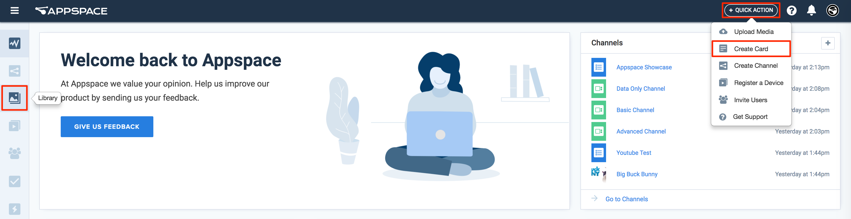
Click the Quick Actions menu on the top right and select Create Card, and proceed to step 3 below.
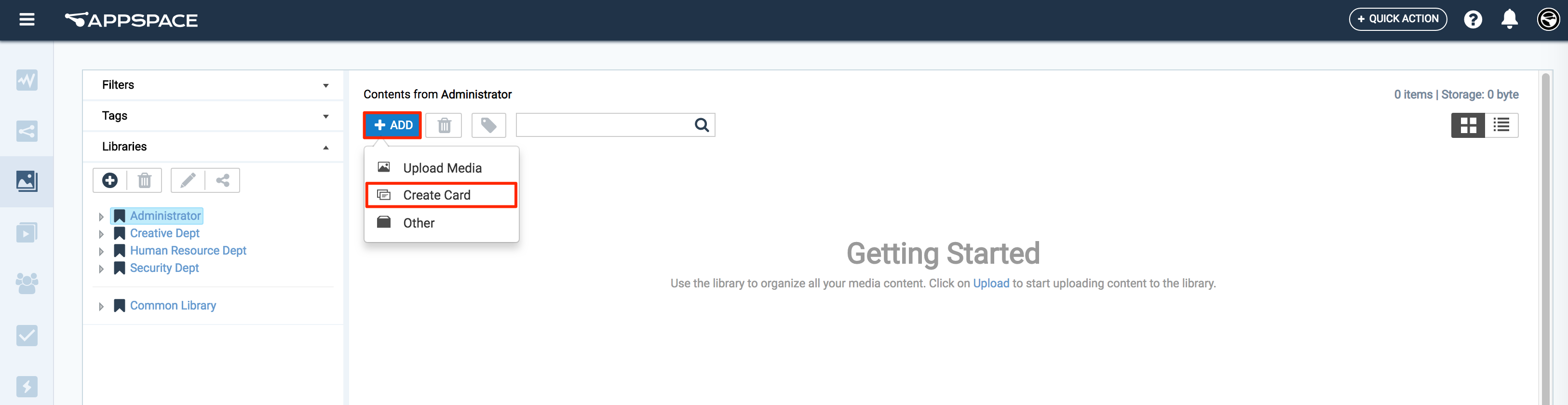
Or click Library from the Appspace Menu navigation bar on the left, and proceed to step 2 below.
Select the desired folder in the library, and click the ADD button, and select Create Card.
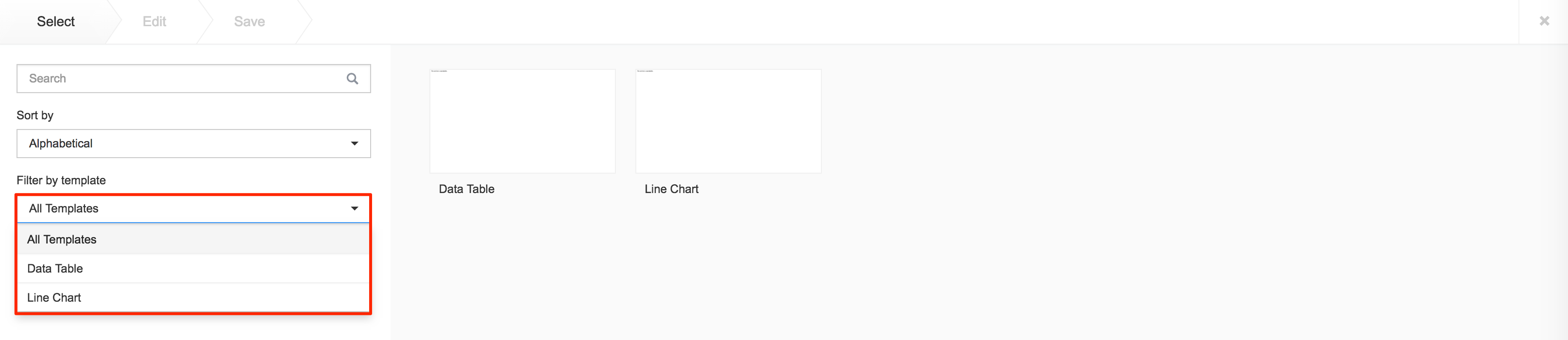
Select an available template from the Filter by template menu, and continue to configure the card as per the on-screen instructions.
If the card was created via the Quick Actions menu, ensure the Upload Location points to the correct folder within the Library, as it defaults to the Common Library folder.
For detailed configuration information, click the links below.
- Data Table Card
- Line Chart Card
- Deprecated Cards
Data Table Card
Fill in the Headline and Summary text to be displayed on the card. The Text Editor can be used to customize the text styles.
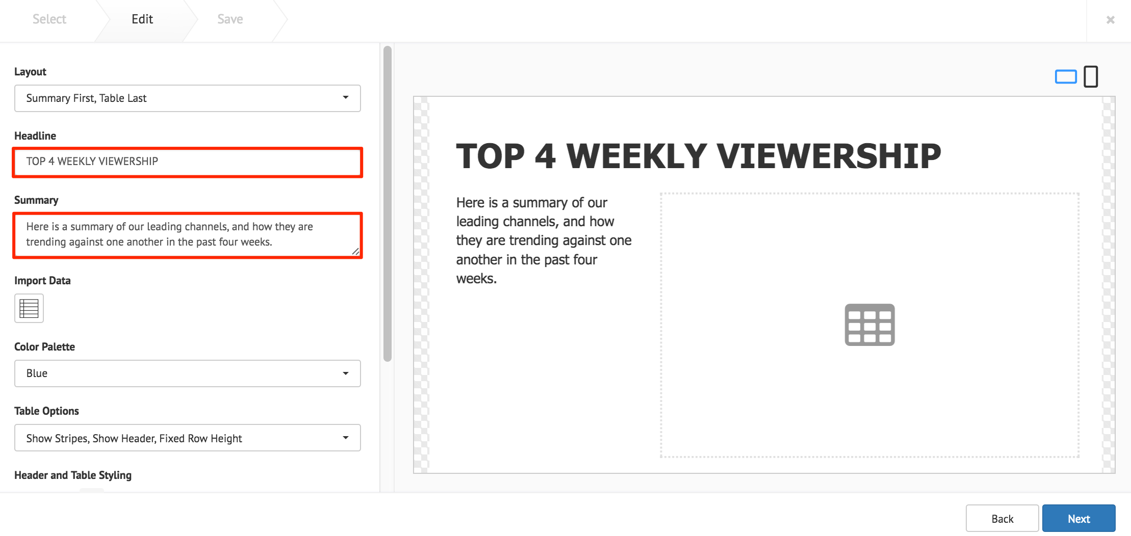
Click the Import Data button, and populate the card’s table using one of the following methods:
- Manually enter the data.
- Copy and paste data from an external table.
- Import data from an Excel spreadsheet (.xlsx).
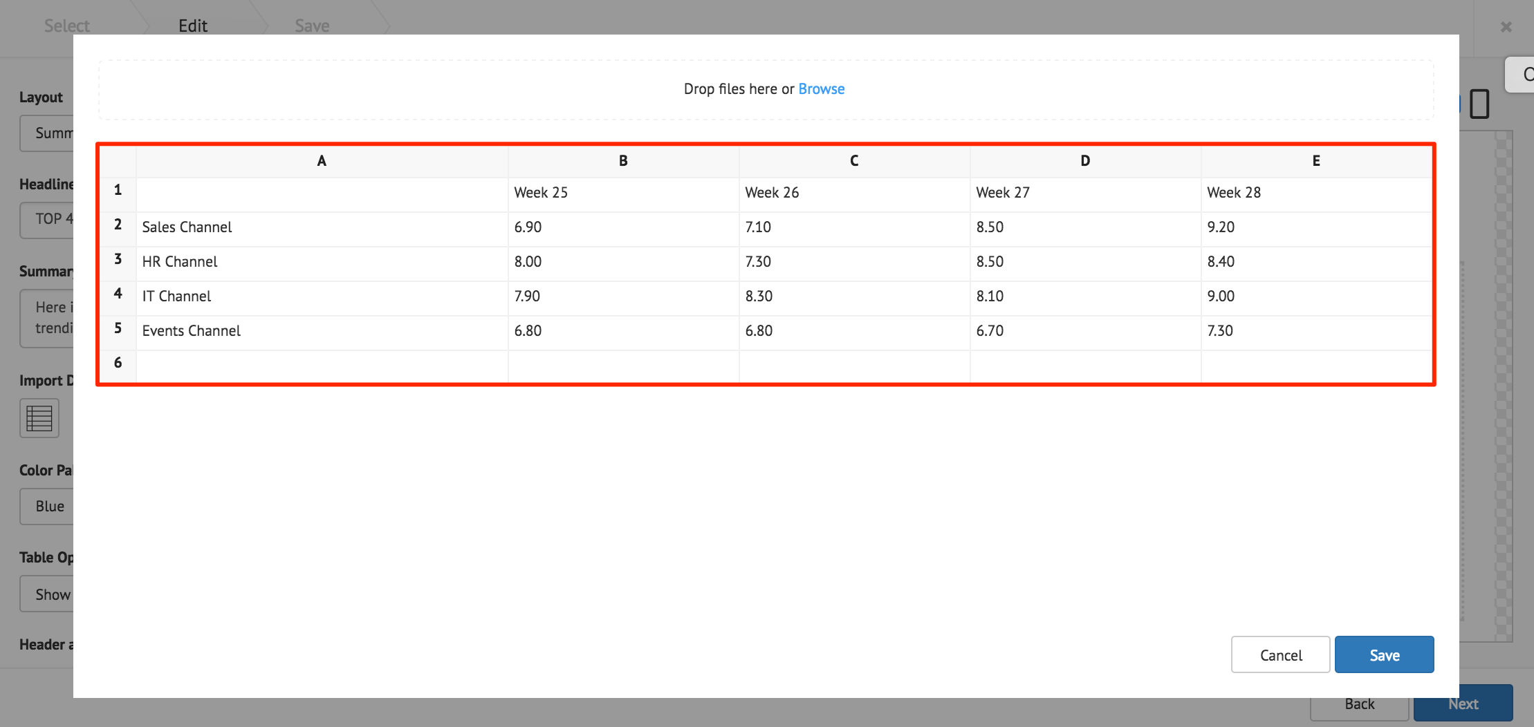
Click Save once done.
The following card customization options can be done:
- Select the card layout.
- Select the data table color palette.
- Select the data table options.
- Customize the Header and Table style.
- Customize the table cell style.
- Customize the card background color, or image.
Click Next.
Fill in the Title, as this is a mandatory field. Optionally, you may fill in the Article, Caption, Content Expiry, Content Tags and even upload a custom thumbnail for the content.
Click the Save button.
Donut Chart Card
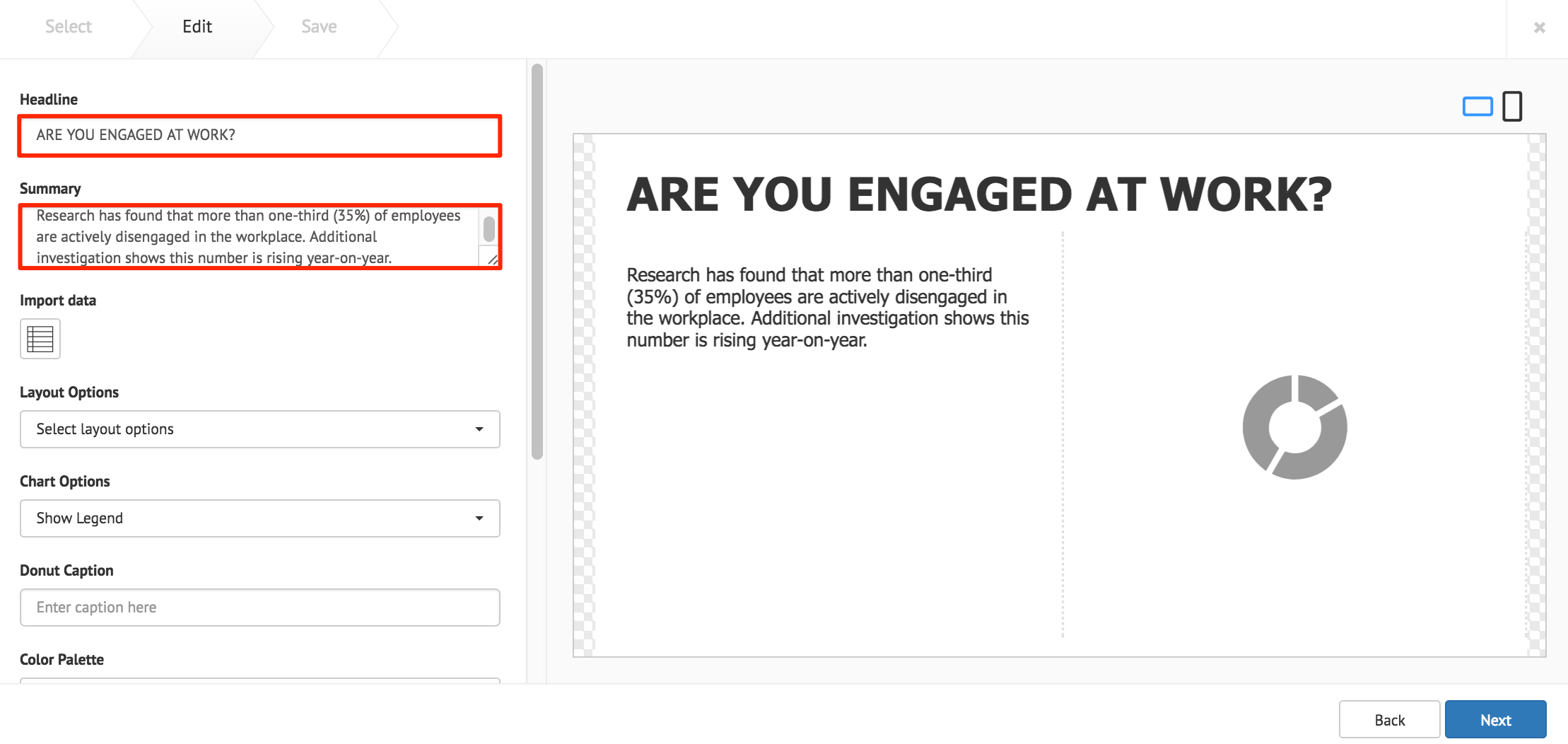
Fill in the Headline and Summary text to be displayed on the card. The Text Editor can be used to customize the text styles.
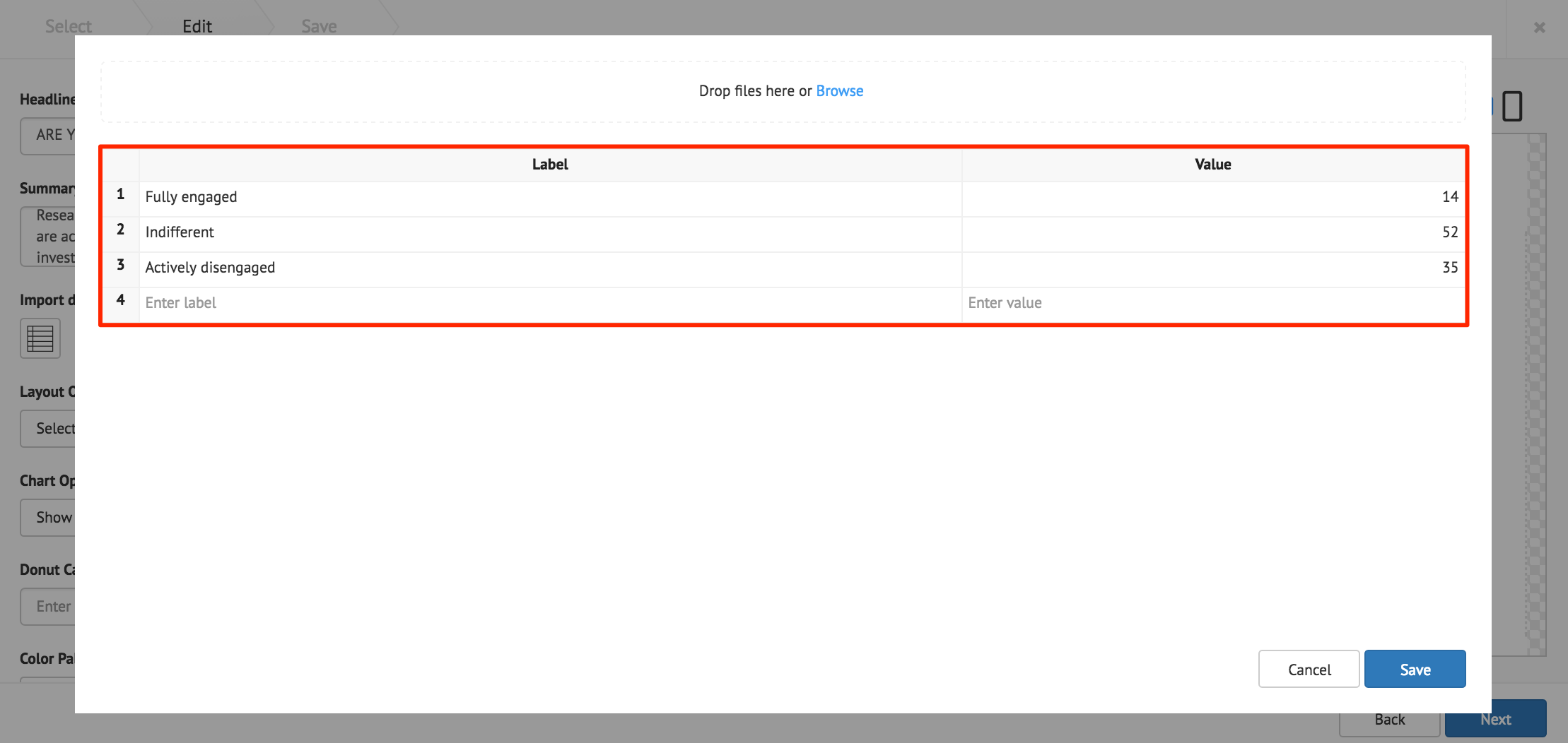
Click the Import Data button, and populate the cards table using one of the following methods:
- Manually enter the data.
- Copy and paste data from an external table.
- Import data from an Excel spreadsheet (.xlsx).
The Label column accepts text strings, and the Value column only accepts numeric values.
Note
The chart only displays the largest eight slices, anything more is combined into one slice and labelled Others.
Important
When importing data from an Excel spreadsheet, the header columns must be titled as, label and value.
Click Save once done.
The following card customization options can be done:
- Select the card layout.
- Select the chart options.
- Add a caption inside the donut chart.
- Select the chart color palette.
- Customize the table style
- Customize the chart legend style.
- Upload a logo.
- Customize the card background color, or image.
Note
Additional Table Style or Legend Style customizations, are only displayed when Show Table, or Show Legend is selected in the Chart Options.
Click Next.
Fill in the Title, as this is a mandatory field. Optionally, you may fill in the Article, Caption, Content Expiry, Content Tags and even upload a custom thumbnail for the content.
Click the Save button.
Line Chart Card
Fill in the Headline and Summary text to be displayed on the card. The Text Editor can be used to customize the text styles.

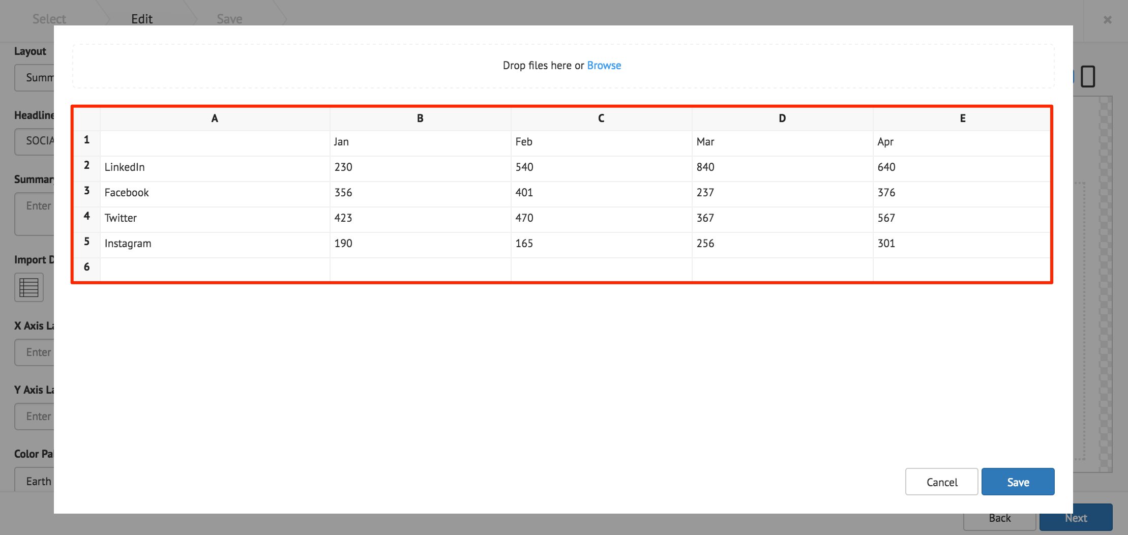
Click the Import Data button, and populate the cards table using one of the following methods:
- Manually enter the data.
- Copy and paste data from an external table.
- Import data from an Excel spreadsheet (.xlsx).
Data populated in rows represent the X Axis, and data populated in columns represent the Y Axis.
Click Save once done.
The following card customization options can be done:
- Select the card layout.
- Fill in the X and Y axis labels.
- Select the line chart color palette.
- Select the chart options.
- Customize the chart legend style.
- Customize the Axis label color.
- Customize the card background color, or image.
Note
Additional Legend Style or Axis Label Color customizations, are only displayed when Show Legend, or Show Axis is selected in the Chart Options.
Click Next.
Fill in the Title, as this is a mandatory field. Optionally, you may fill in the Article, Caption, Content Expiry, Content Tags and even upload a custom thumbnail for the content.
Click the Save button.