Create Data Table card (Community Card)
This article provides the instructions to creating data cards with charts, tables, and graphs. These cards, also categorized as Community Cards, are basic cards that are created by Appspace but will be customized according to your needs by a third-party community developer using Appspace card APIs.
Data type cards such as the Data Table card, Donut Chart card, and Line Chart card, allow you to import data from external spreadsheets/documents and display customized charts, graphs, and tables.
Important
The Donut Chart and Line Chart (Community Cards) have been deprecated. If you would like to create a card with a donut chart, pleaser refer to our new Create Data Visualization card article.
Community cards will be turned off by default. Contact us to learn more about our developer community.
Important
Please refer to our An Introduction to Cards and Channels guide for an in-depth introduction to the types of cards that are ideal for your signage solutions.
Cards are only supported on devices with the Appspace App. To ensure your device is compatible, please refer to the Supported Card Types section in the Compare device media player capabilities article.
Legacy devices are not supported.
Create Data Table Card
Important
For more information on the basic functionality of creating a card, please refer to the Create a card article.
If you would like to set a corporate branding theme to your cards, please refer to this article prior to creating a card: Create a card theme
Follow the instructions below to create and configure a Data Table card:
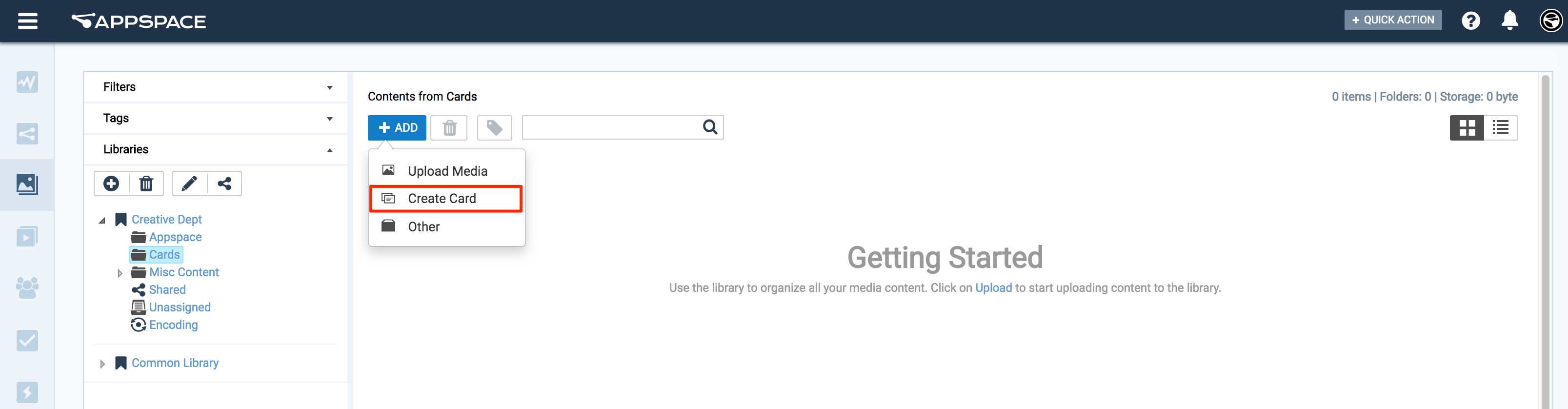
Click the Quick Actions menu on the top right and select Create Card, and proceed to step 3 below.
Or click Library from the Appspace Menu navigation bar on the left, and proceed to step 2 below.
Select the desired folder in the library, and click the ADD button, and select Create Card.
Select an available template from the Filter by template menu, and continue to configure the card as per the on-screen instructions.
If the card was created via the Quick Actions menu, ensure the Upload Location points to the correct folder within the Library, as it defaults to the Common Library folder.
Fill in the Headline and Summary text to be displayed on the card. The Text Editor can be used to customize the text styles.

Click the Import Data button, and populate the card’s table using one of the following methods:
- Manually enter the data.
- Copy and paste data from an external table.
- Import data from an Excel spreadsheet (.xlsx).
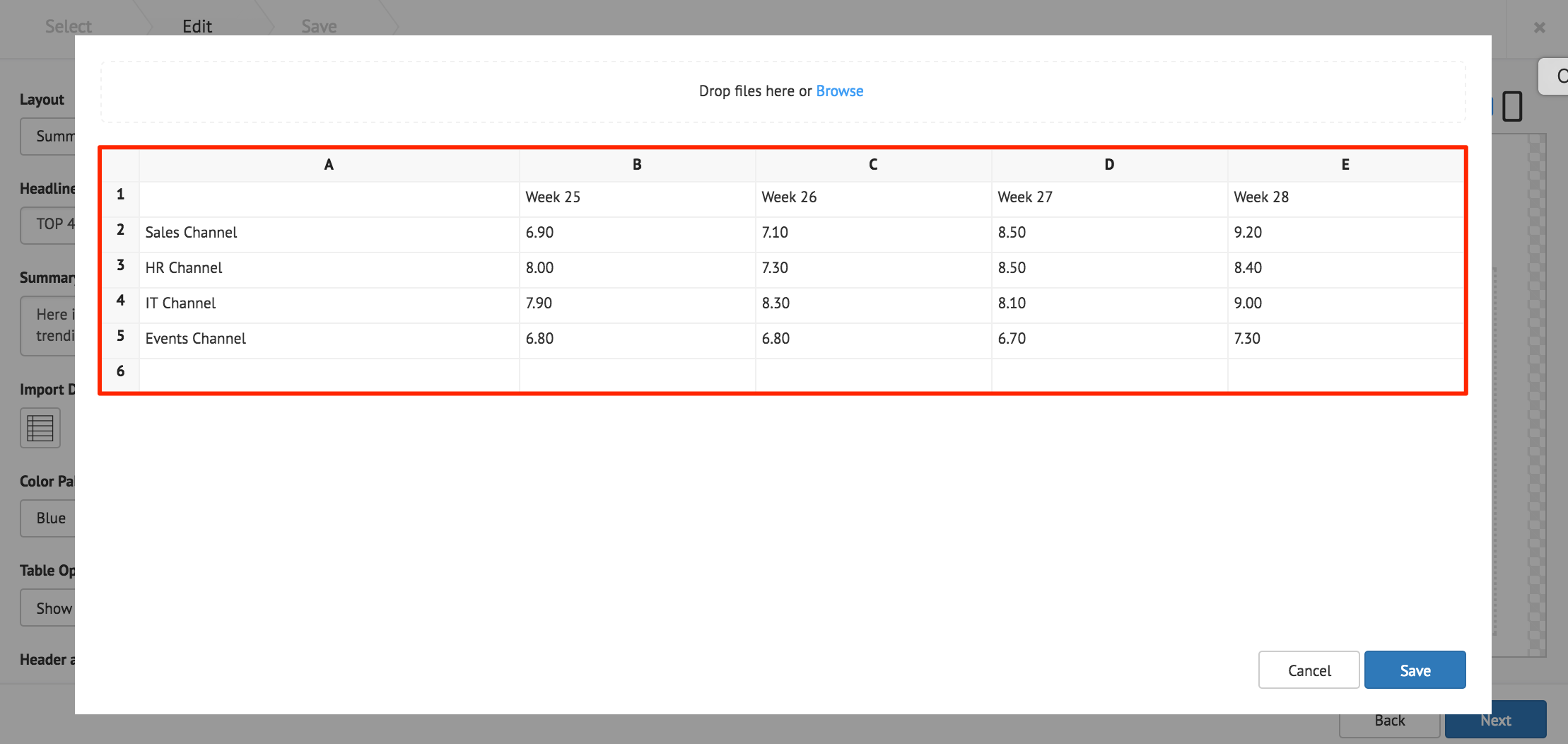
Click Save once done.
The following card customization options can be done:
- Select the card layout.
- Select the data table color palette.
- Select the data table options.
- Customize the Header and Table style.
- Customize the table cell style.
- Customize the card background color, or image.
Click Next.
Fill in the Title, as this is a mandatory field. Optionally, you may fill in the Article, Caption, Content Expiry, Content Tags and even upload a custom thumbnail for the content.
Click the Save button.
Donut Chart Card
Important
The Data Table (Community Card) has been deprecated. If you would like to create a card with a donut chart, pleaser refer to our new Create Data Visualization card article.
Line Chart Card
Important
The Line Chart (Community Card) has been deprecated. If you would like to create a card with a line chart, pleaser refer to our new Create Data Visualization card article.