Adding a card
This article provides the instructions to adding a card in the Library.
Appspace Supported cards are officially created by Appspace, and are available to all cloud users, while cards that are created by a third-party community developer are categorized as Community Cards.
Important
Cards are only supported on devices with the Appspace App. To ensure your device is compatible, please refer to the Supported Card Types section in the Media player support capability comparison article.
Legacy devices are not supported.
Listed below are the available cards:
Appspace Supported cards
Announcement card
Community cards
- Data Table card
- Donut Chart card
- Line Chart card
- RSS card
- Google Slides card
- Youtube card
- Seenspire Social Media card
Note
The Seenspire Social Media card is a community developed card and is compatible with Appspace 6.2.2 and later. For detailed configuration instructions of the card, please contact Seenspire. Contact us <https://www.appspace.com/contact>`_ to learn more about our developer community.
Important
Please take note of the following when adding a card:
The card title is also the name used when saving the card to the Library. Therefore this is a mandatory field.
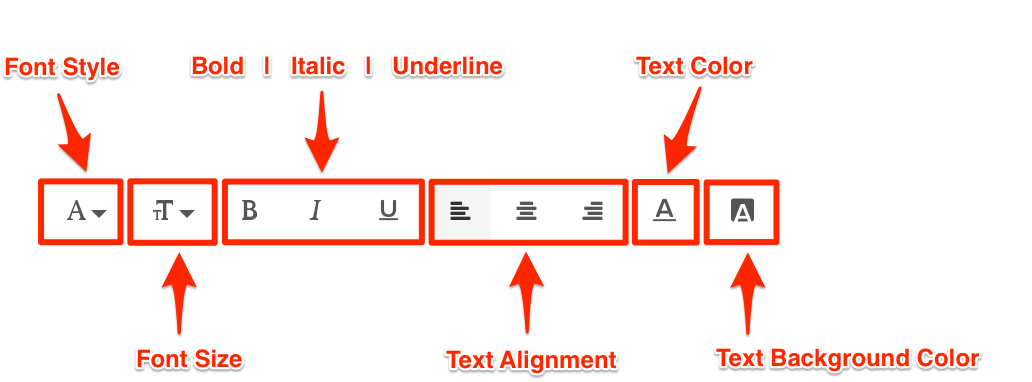
The Text Editor is only displayed for each field when you click and type in the field (Title, Headline, Summary). It provides basic text editing capabilities such as Font Size, Font Style, Text Alignment, and Text Color.
You may only upload one image to the image placeholder.
The Color Picker, enables color selection for text and backgrounds in the Card.
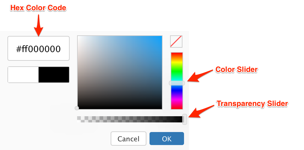
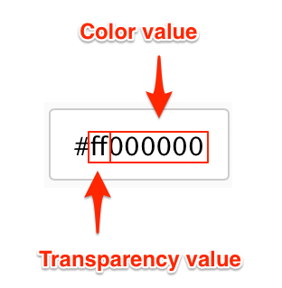
The first two characters in the Hex Color Code are the Transparency value, while the next six characters are the Color values. Please be mindful when including a custom Hex color code.
Note
Prior to adding a card, please read the Introduction to cards article.
Add a Card
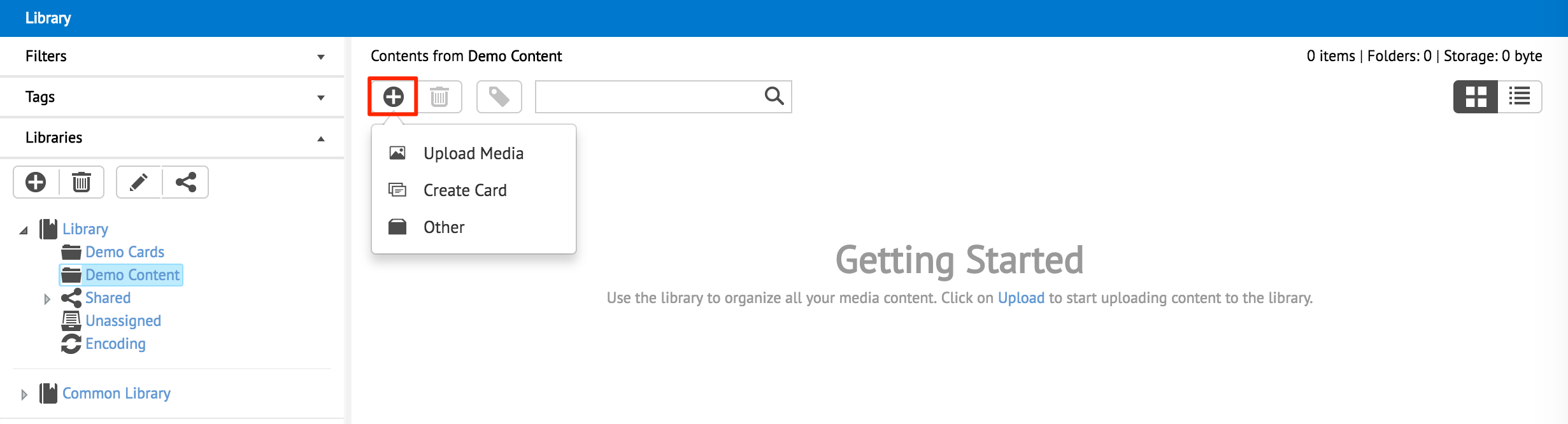
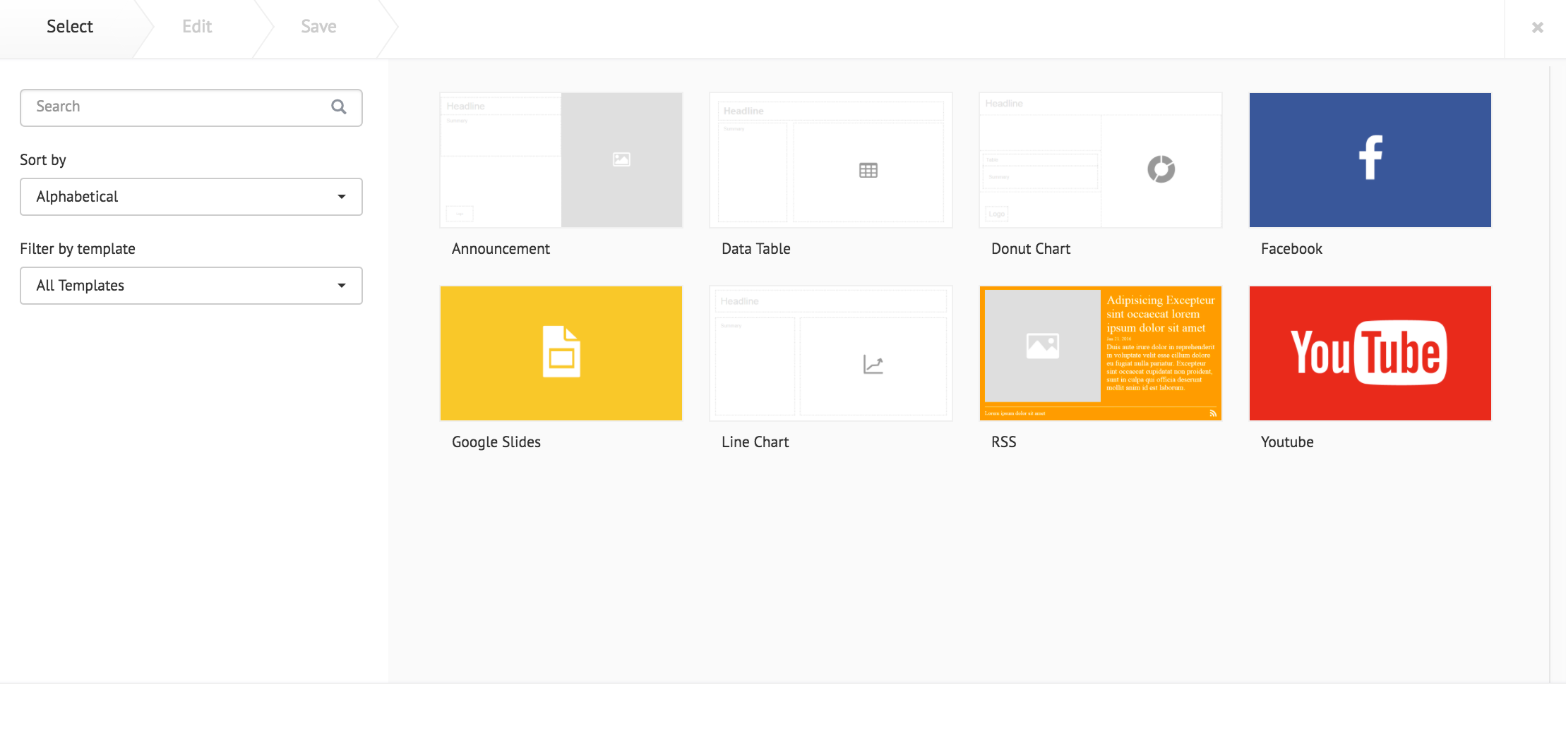
In Library, select the desired folder. Click the Upload button, and select Create Card.
Select a card template and follow the instructions based on the selected card below:
Appspace Supported Cards:
Community Cards:
- Data Table Card
- Donut Chart Card
- Line Chart Card
- RSS Card
- Google Slides Card
- Youtube Card
- Facebook Card
Announcement Card
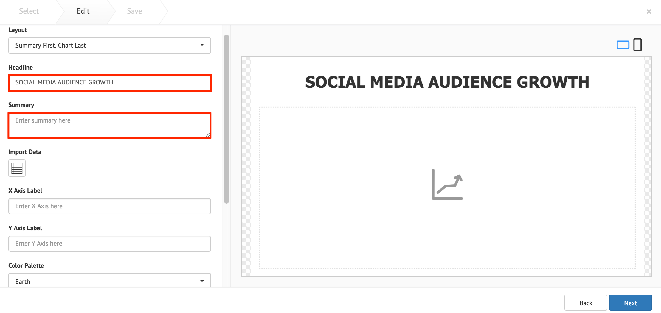
Fill in the Headline and Summary text to be displayed on the card. The Text Editor can be used to customize the text styles.
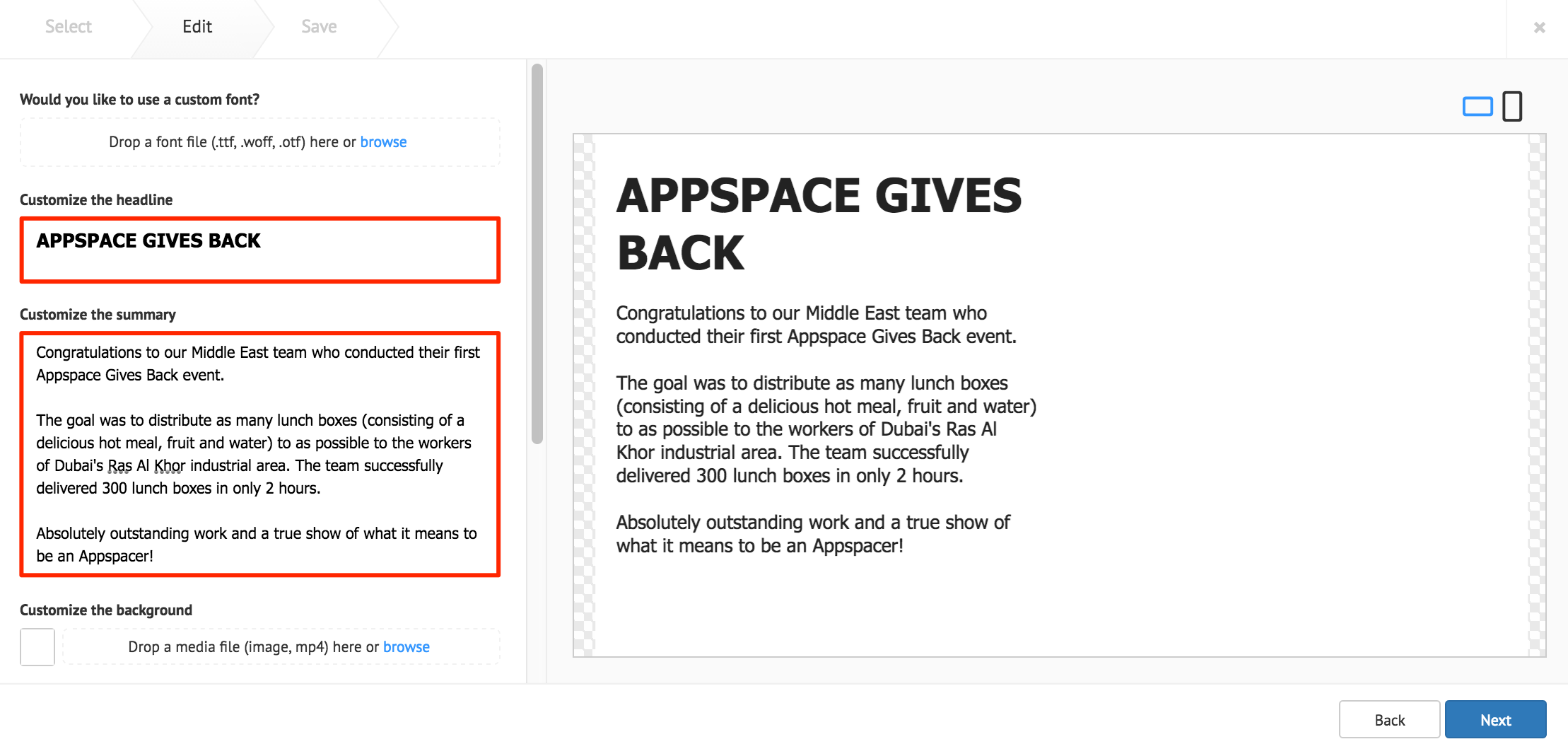
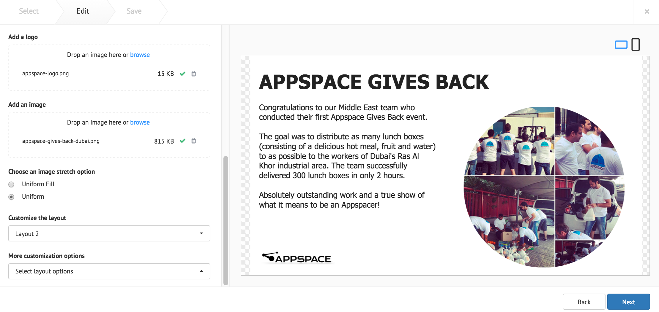
The following card customization options can be done:
- Upload a custom font, to be used in the Text Editor
- Customize the card background color, image, or video.
- Add an image, with image stretch options.
- Add a logo.
- Select the card layout, with additional customization options.
Note
The latest Announcement card template now supports video backgrounds (.mp4).
Click Next once done.
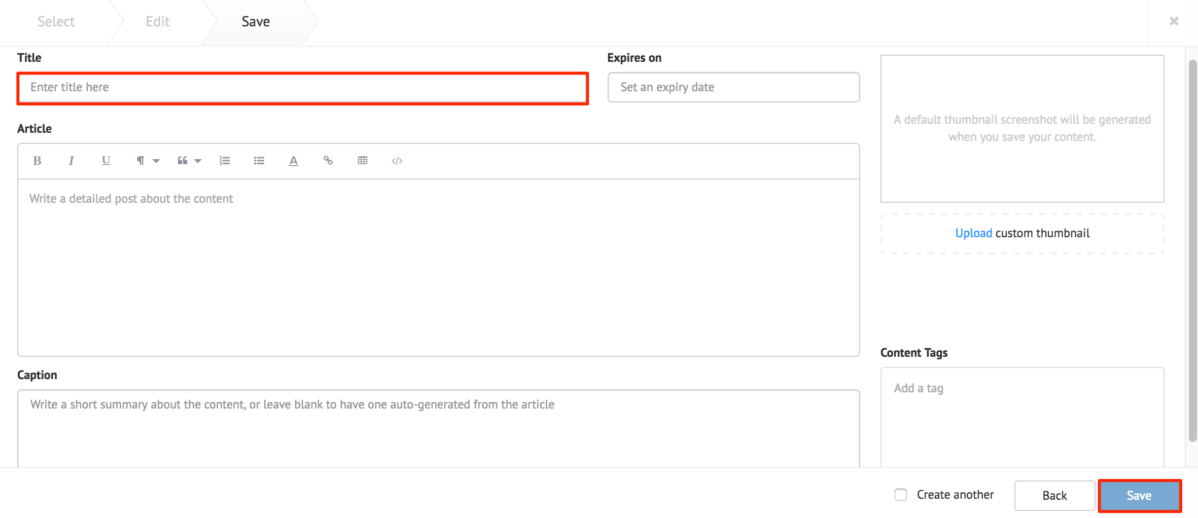
Fill in the Title, as this is a mandatory field. Optionally, you may fill in the Article, Caption, Content Expiry, Content Tags and even upload a custom thumbnail for the content.
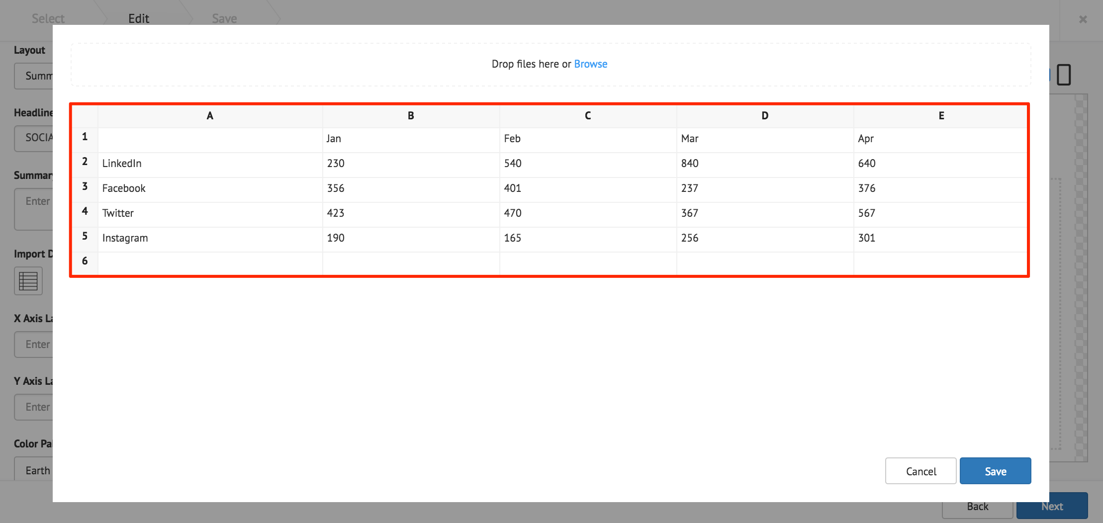
Data Table Card
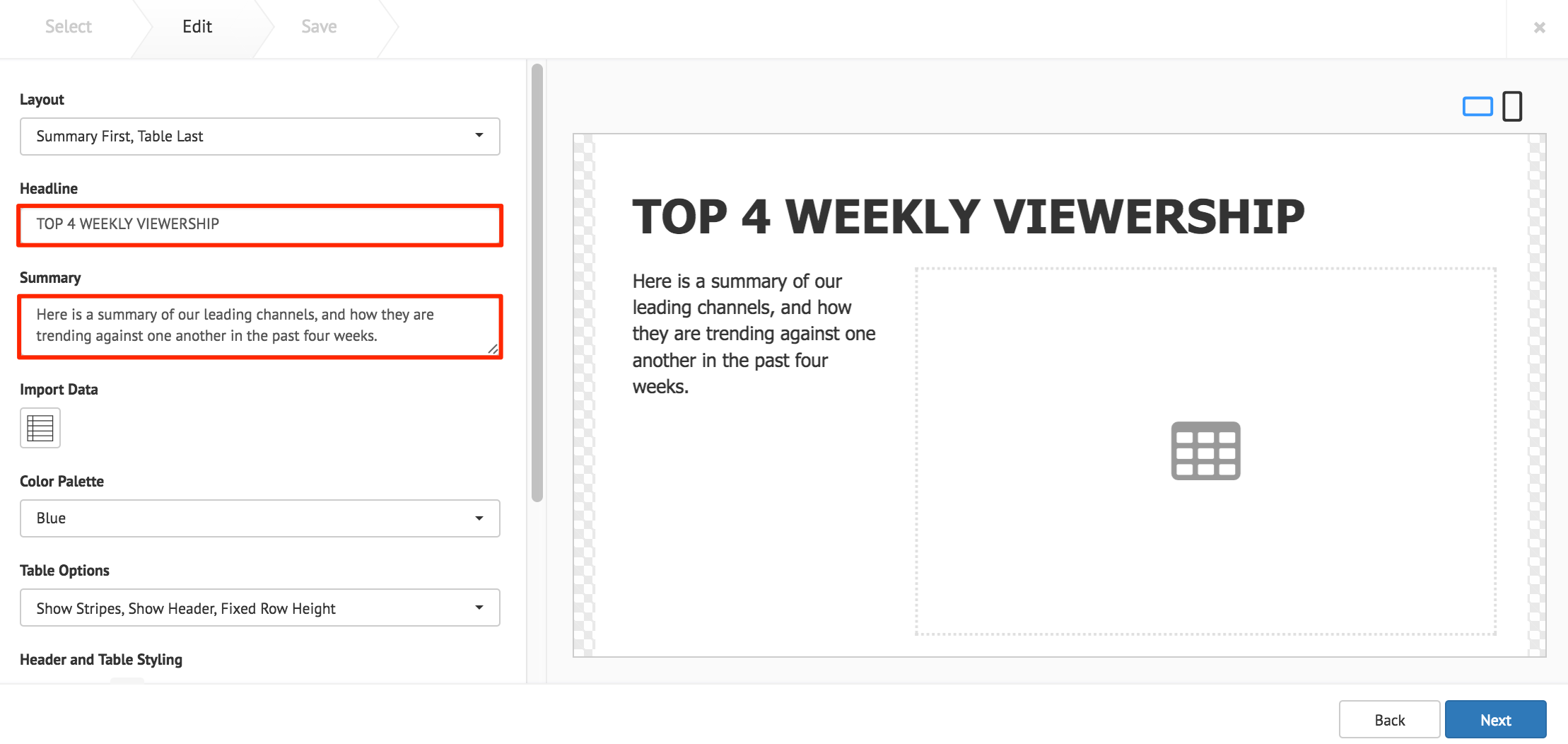
Fill in the Headline and Summary text to be displayed on the card. The Text Editor can be used to customize the text styles.
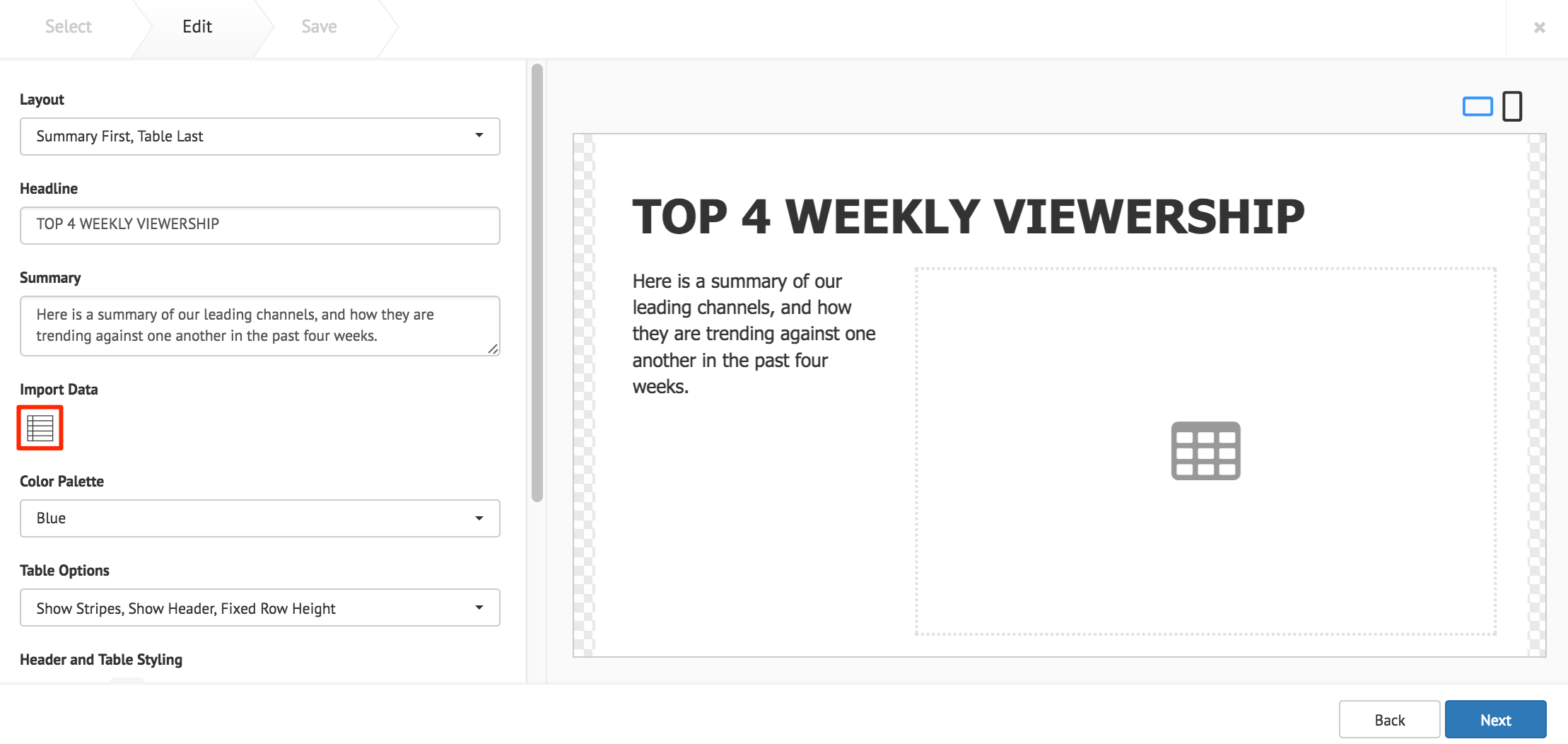
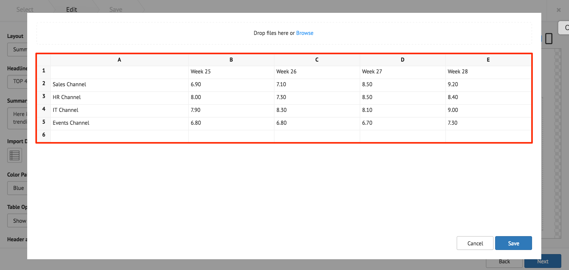
Click the Import Data button, and populate the card’s table using one of the following methods:
- Manually enter the data.
- Copy and paste data from an external table.
- Import data from an Excel spreadsheet (.xlsx).
Click Save when done.
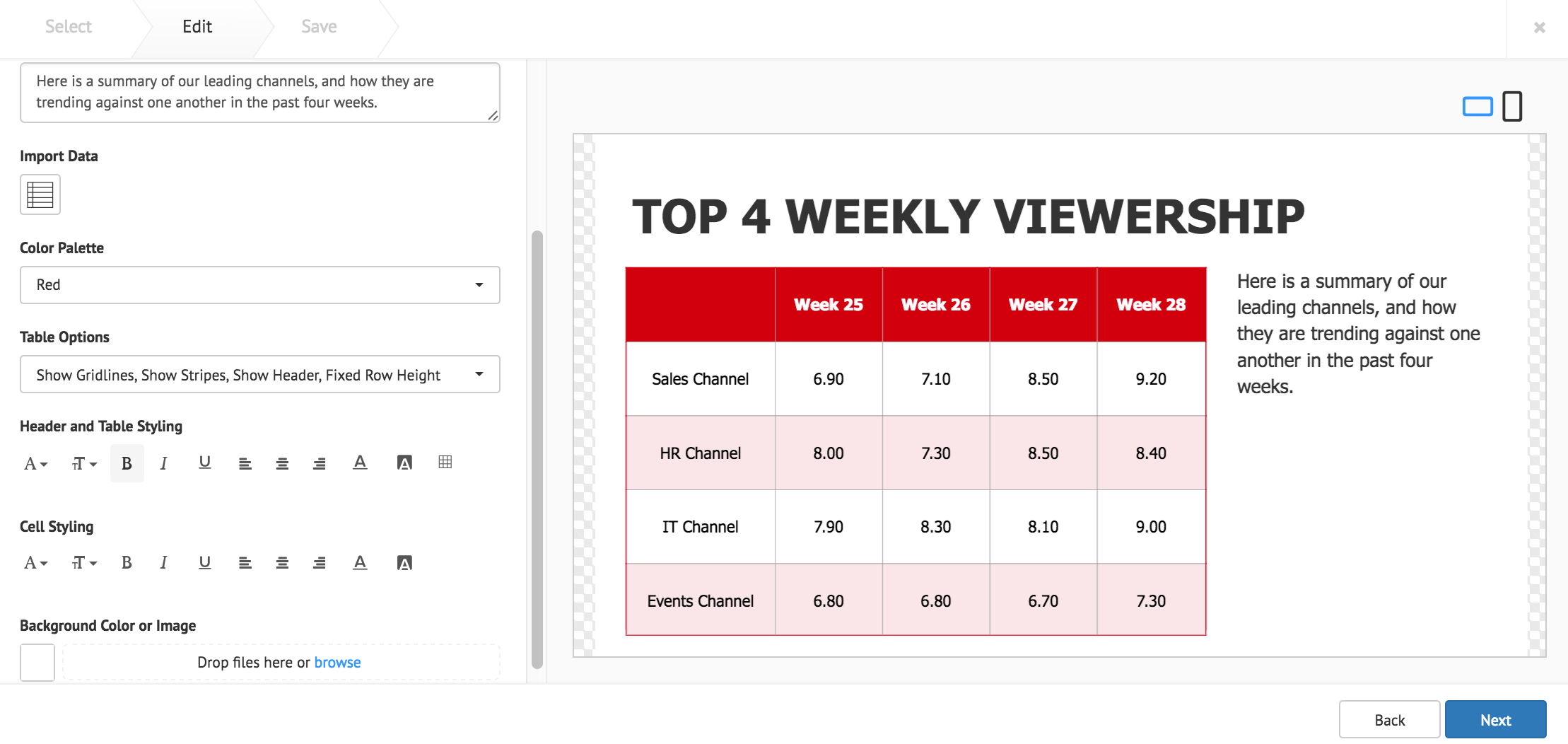
The following card customization options can be done:
- Select the card layout.
- Select the data table color palette.
- Select the data table options.
- Customize the Header and Table style.
- Customize the table cell style.
- Customize the card background color, or image.
Click Next once done.
Fill in the Title, as this is a mandatory field. Optionally, you may fill in the Article, Caption, Content Expiry, Content Tags and even upload a custom thumbnail for the content.
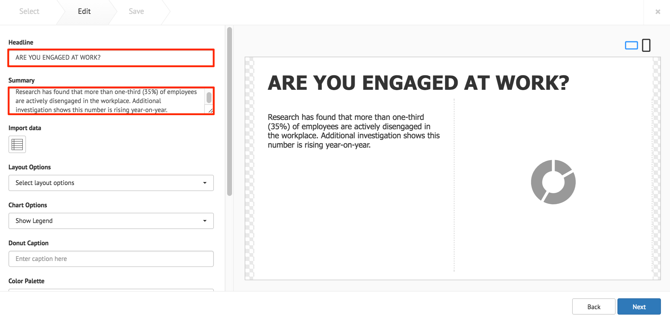
Donut Chart Card
Fill in the Headline and Summary text to be displayed on the card. The Text Editor can be used to customize the text styles.
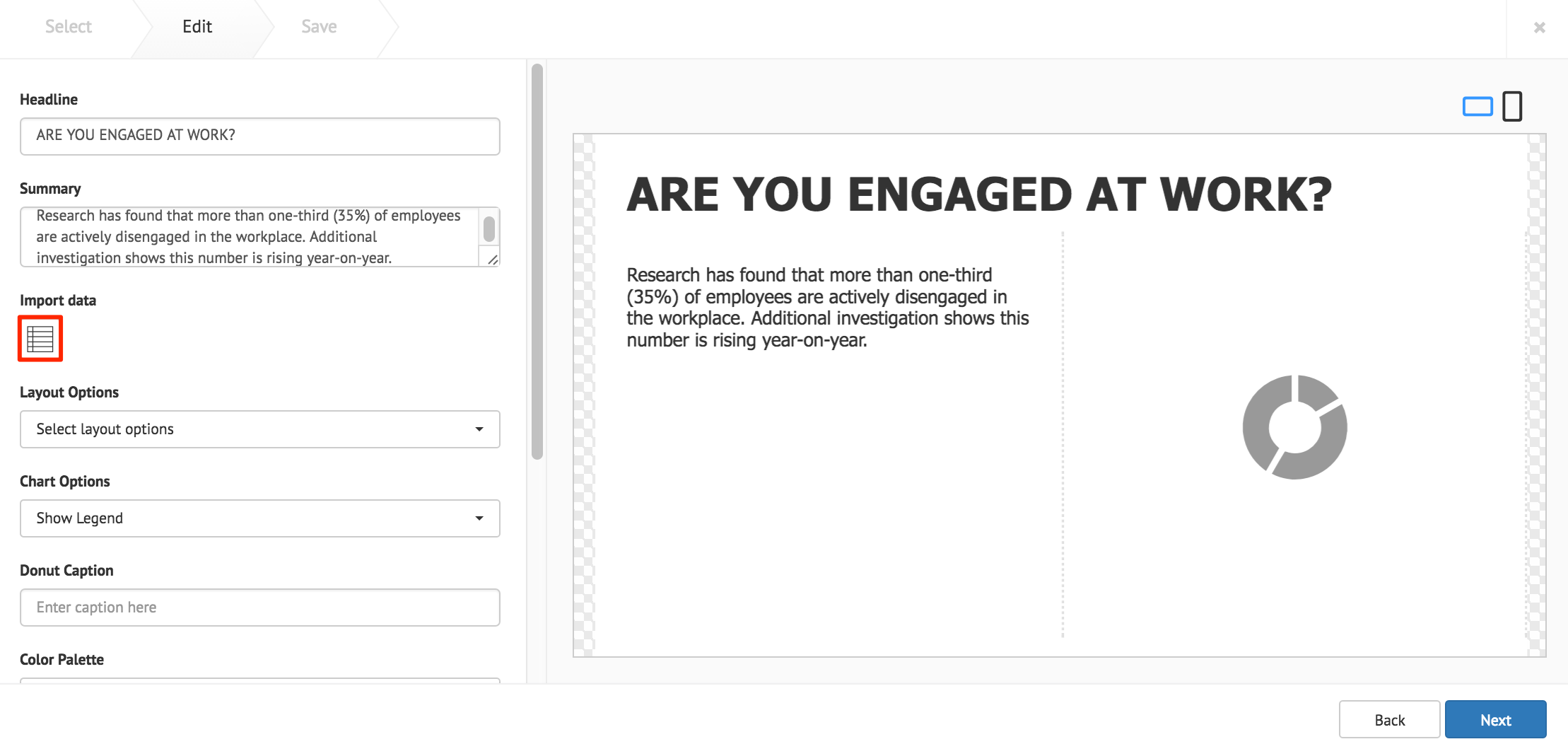
Click the Import Data button, and populate the cards table using one of the following methods:
- Manually enter the data.
- Copy and paste data from an external table.
- Import data from an Excel spreadsheet (.xlsx).
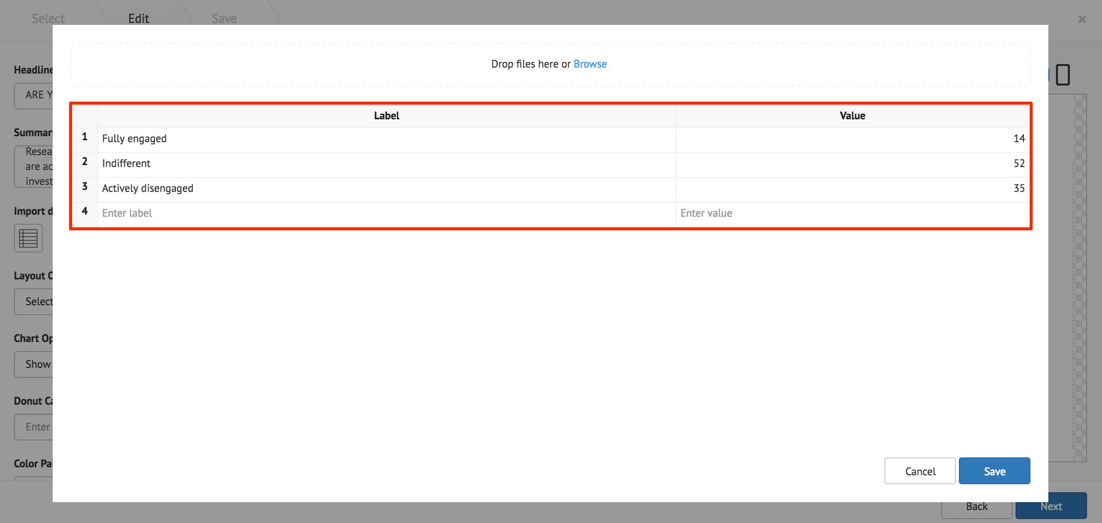
The Label column accepts text strings, and the Value column only accepts numeric values. Click Save when done.
Note
The chart only displays the largest eight slices, anything more is combined into one slice and labelled ‘Others’.
Important
When importing data from an Excel spreadsheet, the header columns must be titled as, “label” and “value”.
The following card customization options can be done:
- Select the card layout.
- Select the chart options.
- Add a caption inside the donut chart.
- Select the chart color palette.
- Customize the table style
- Customize the chart legend style.
- Upload a logo.
- Customize the card background color, or image.
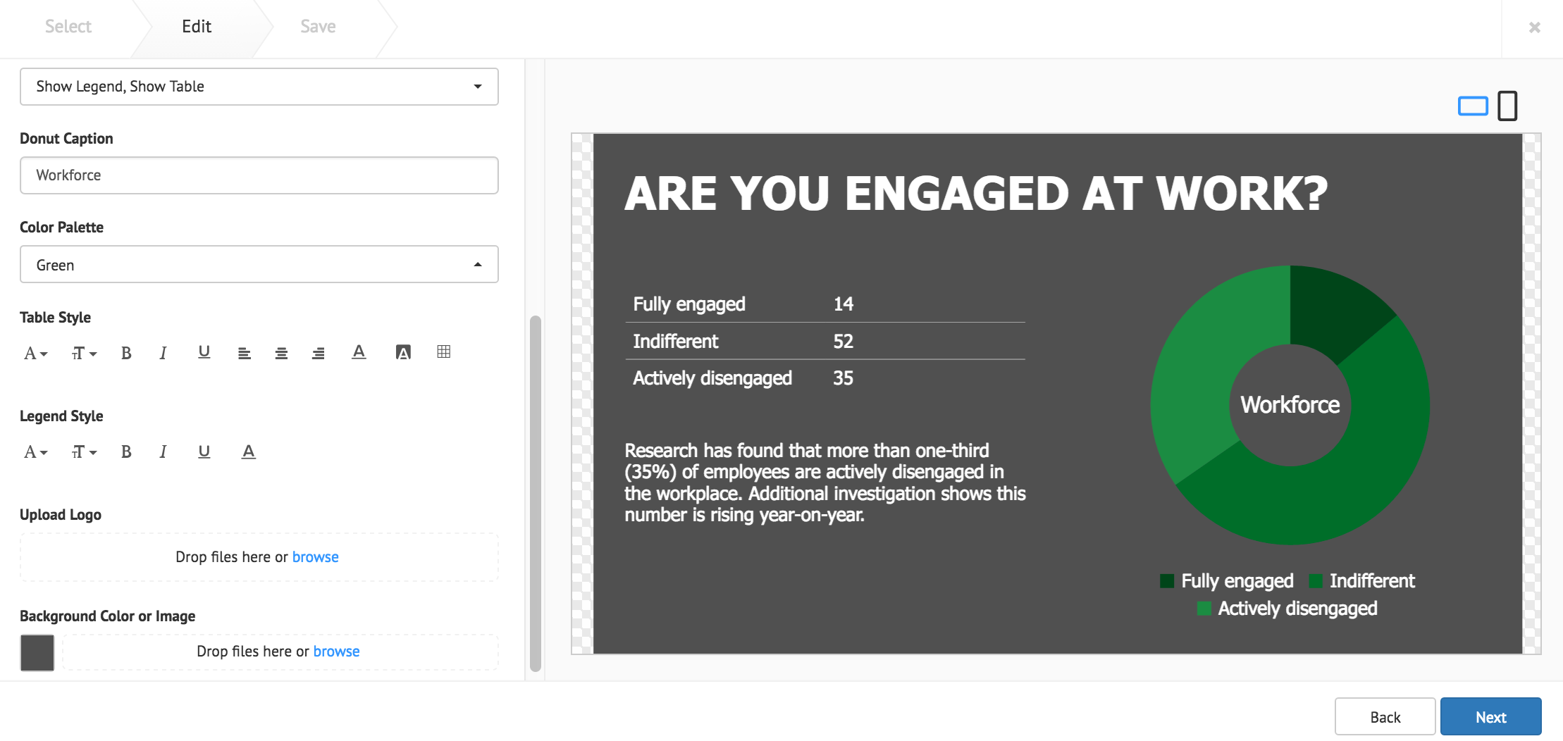
Note
Additional Table Style or Legend Style customizations, are only displayed when “Show Table”, or “Show Legend” is selected in the Chart Options.
Click Next once done.
Fill in the Title, as this is a mandatory field. Optionally, you may fill in the Article, Caption, Content Expiry, Content Tags and even upload a custom thumbnail for the content.
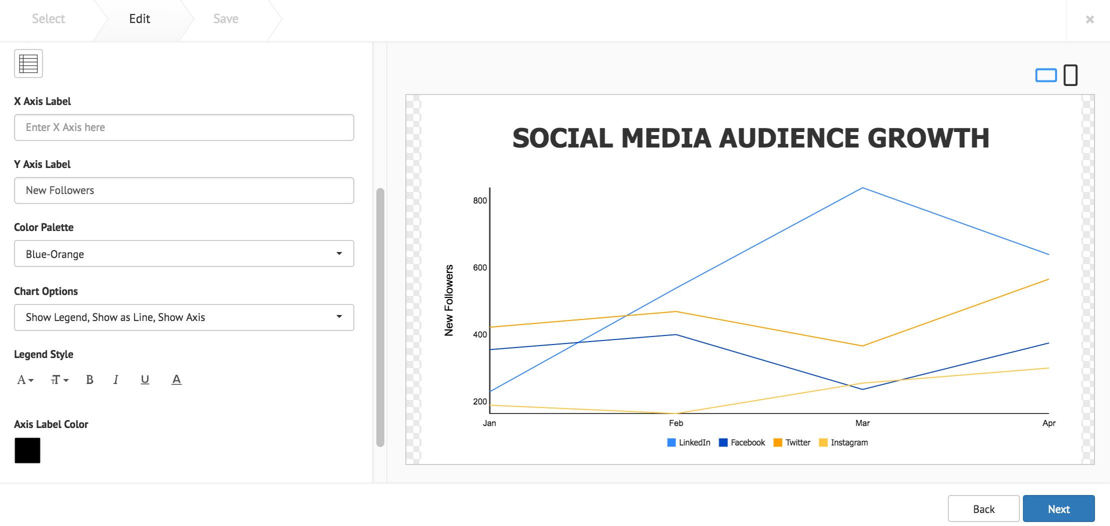
Line Chart Card
Fill in the Headline and Summary text to be displayed on the card. The Text Editor can be used to customize the text styles.
Click the Import Data button, and populate the cards table using one of the following methods:
- Manually enter the data.
- Copy and paste data from an external table.
- Import data from an Excel spreadsheet (.xlsx).

Data populated in rows represent the X Axis, and data populated in columns represent the Y Axis. Click Save when done.
The following card customization options can be done:
- Select the card layout.
- Fill in the X and Y axis labels.
- Select the line chart color palette.
- Select the chart options.
- Customize the chart legend style.
- Customize the Axis label color.
- Customize the card background color, or image.
Note
Additional Legend Style or Axis Label Color customizations, are only displayed when “Show Legend”, or “Show Axis” is selected in the Chart Options.
Click Next once done.
Fill in the Title, as this is a mandatory field. Optionally, you may fill in the Article, Caption, Content Expiry, Content Tags and even upload a custom thumbnail for the content.
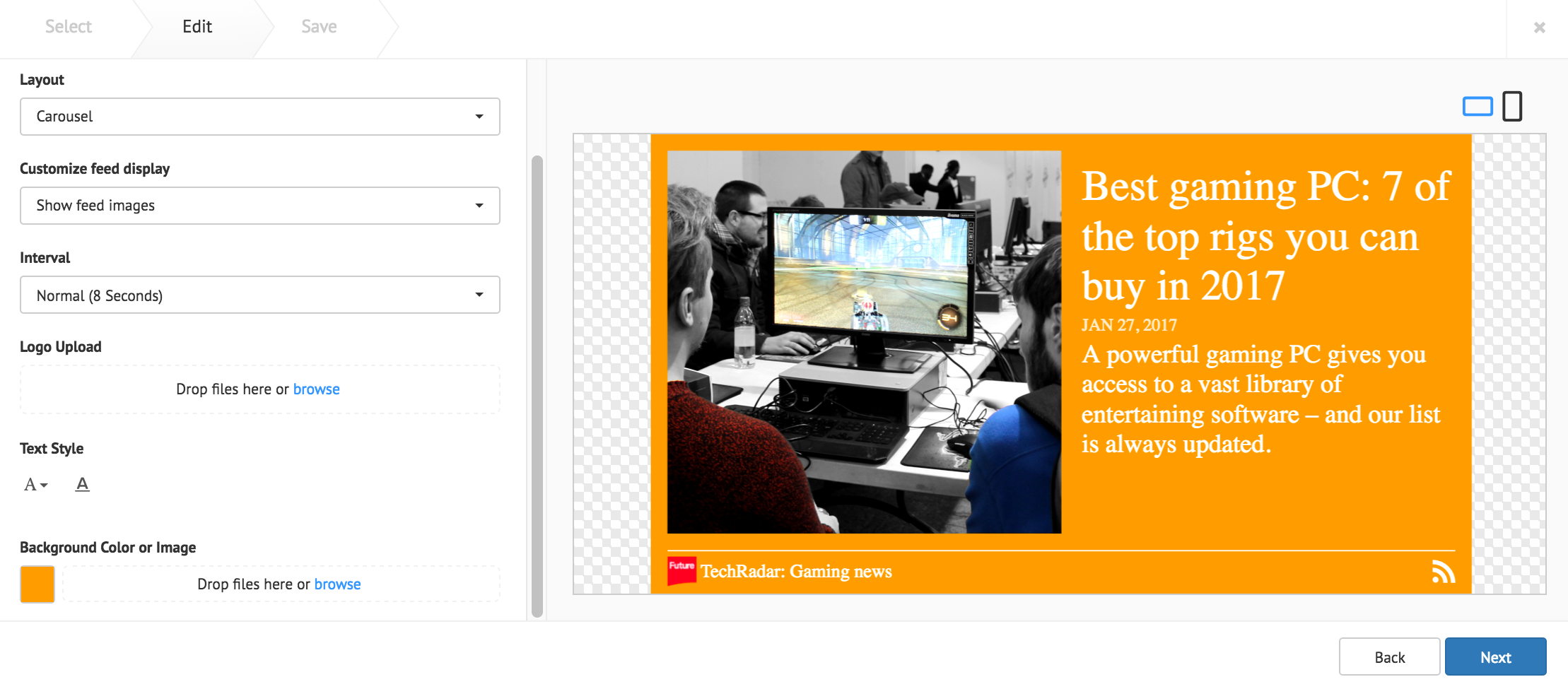
RSS Card
Enter in the RSS feed URL in to the address field, and click Validate. If authentication is required, check the Requires authentication checkbox, and fill in the required credentials.

The following card customization options can be done:
- Select the card layout.
- Customize the RSS feed display.
- Select the interval duration between RSS posts
- Upload a customized RSS feed logo.
- Customize the RSS text style.
- Customize the card background color, or image.
Click Next once done.
Fill in the Title, as this is a mandatory field. Optionally, you may fill in the Article, Caption, Content Expiry, Content Tags, and even upload a custom thumbnail for the content.
Google Slides Card
Enter in the Google Slides ID or URL link in to the address field.
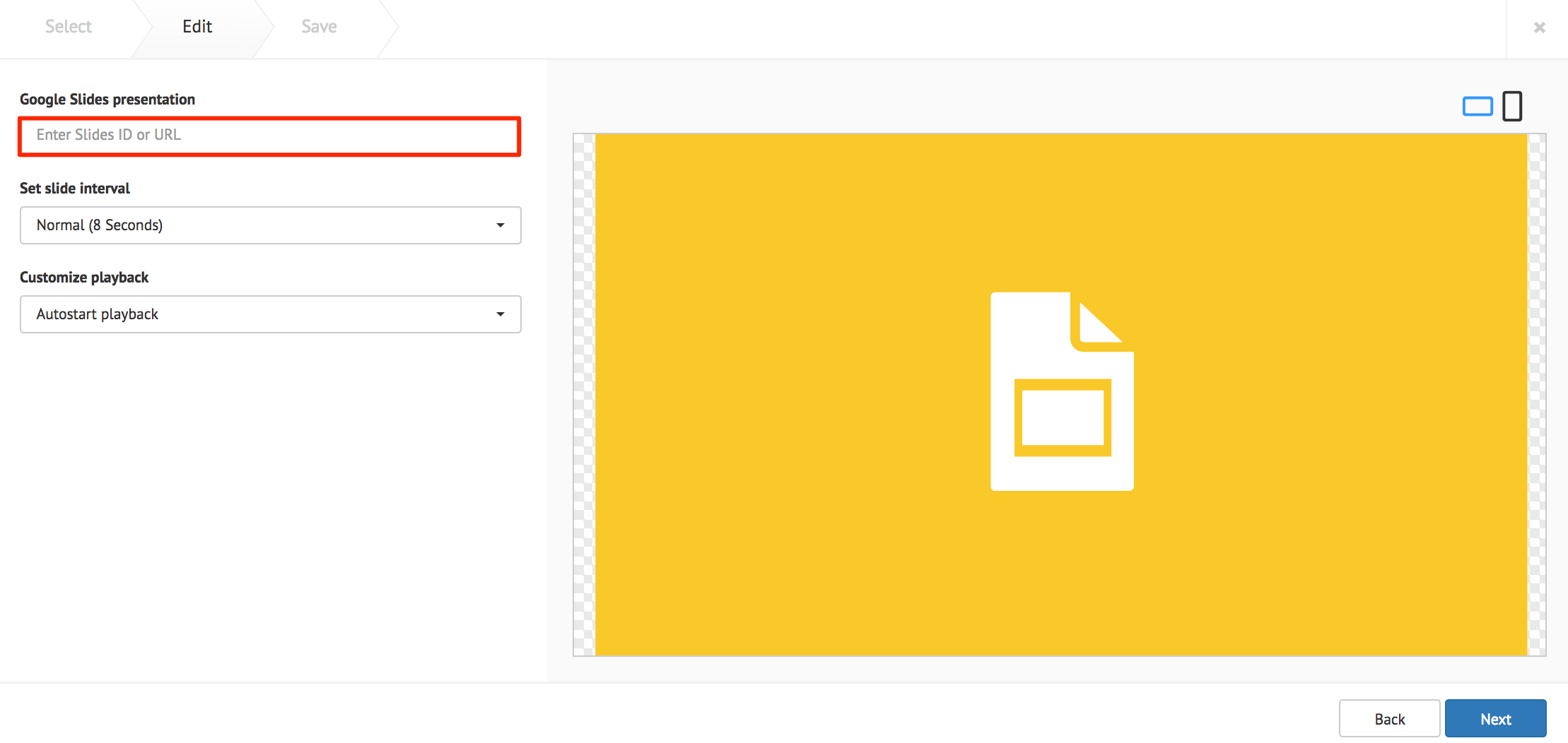
The following card customization options can be done:
- Set the interval duration between slides.
- Customize the playback behavior of the presentation.
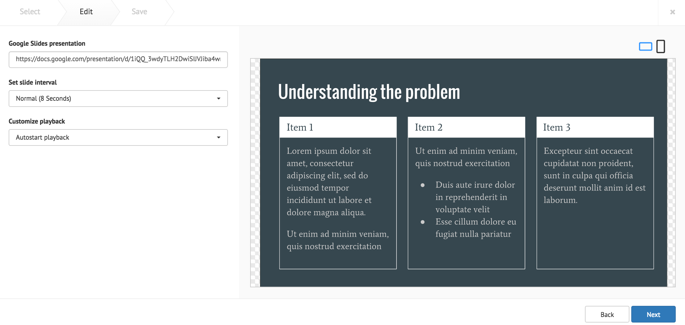
Click Next once done.
Fill in the Title, as this is a mandatory field. Optionally, you may fill in the Article, Caption, Content Expiry, Content Tags, and even upload a custom thumbnail for the content.
Youtube Card
Enter in the Youtube URL or playlist link in to the address field.
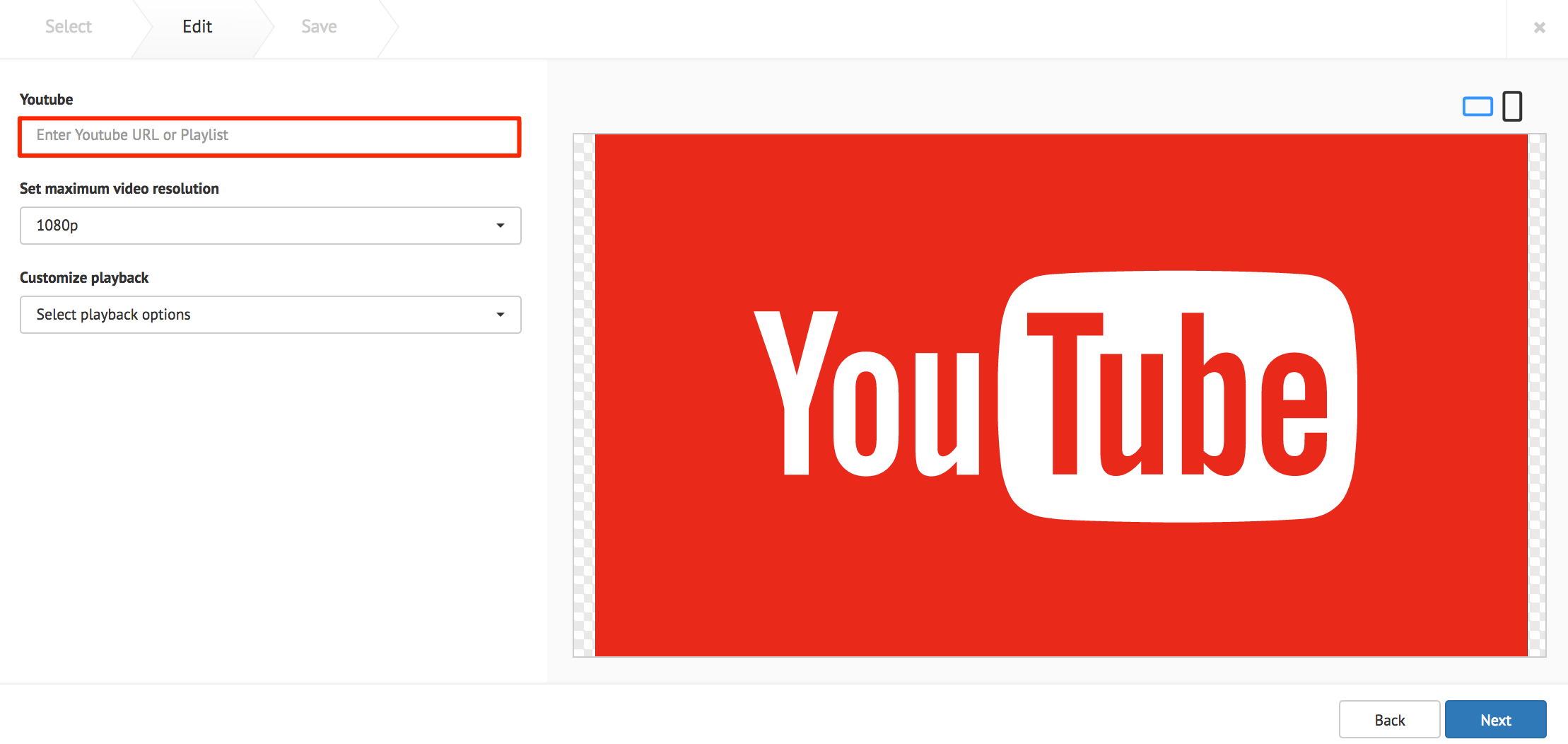
The following card customization options can be done:
- Set the maximum video resolution.
- Customize the playback behavior of the video.
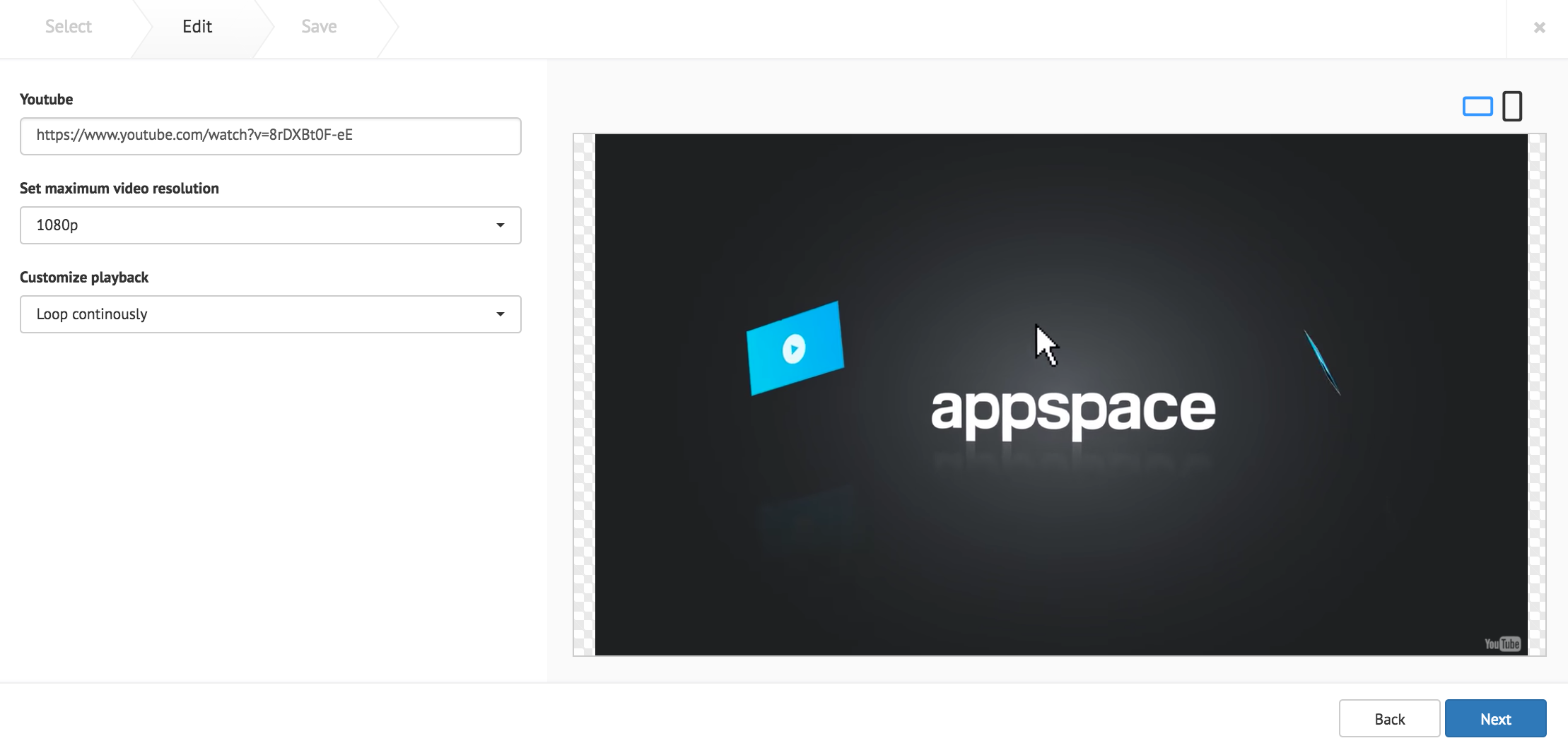
Click Next once done.
Fill in the Title, as this is a mandatory field. Optionally, you may fill in the Article, Caption, Content Expiry, Content Tags, and even upload a custom thumbnail for the content.
Facebook Card
Warning
The Facebook card is no longer available as part of our Community Cards as of August 2018. We recommend using the Social Media by Seenspire Card for your social media needs.
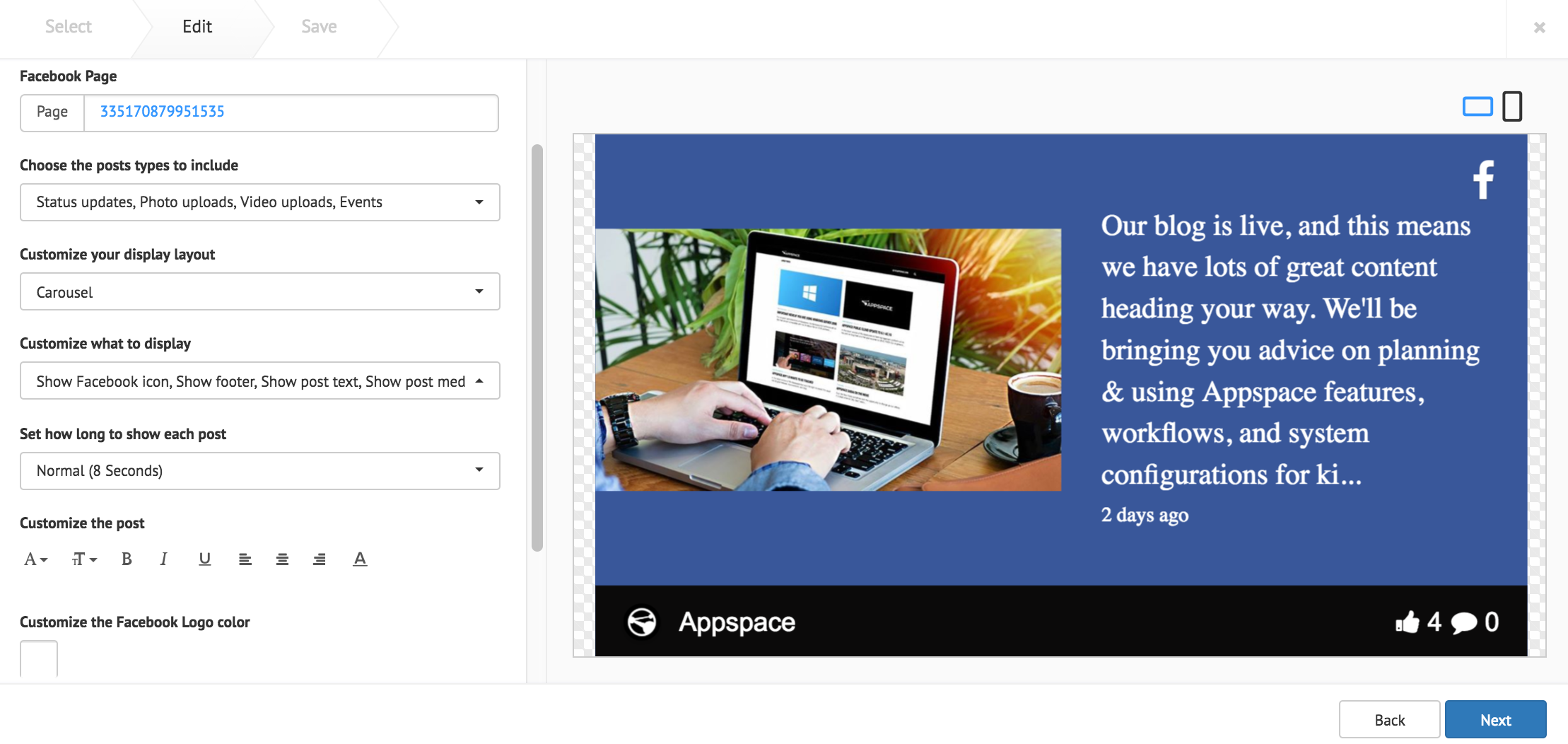
Fill in the desired Facebook Page name (as displayed on the Facebook page), and click Validate. If the Facebook page displayed in the preview pane is incorrect, or an error appears, input the Facebook Page ID instead. You may visit http://findmyfbid.com/ to find the Facebook Page ID.
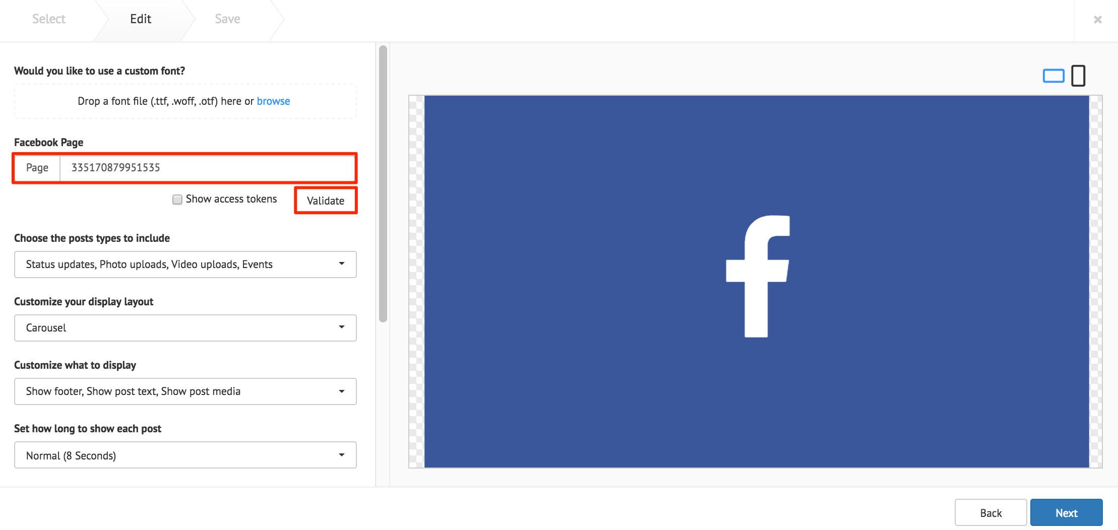
The ‘Show access tokens’ option displays developer options.
Note
Facebook feeds appear with images by default. Images with less than 200px do not appear, and is replaced with the Facebook Page profile picture.
The following card customization options can be done:
- Upload a custom font.
- Select the types of Facebook posts to be displayed.
- Select the card layout.
- Customize the layout items that is displayed.
- Select the interval duration between Facebook posts
- Customize the Facebook text style.
- Customize the Facebook logo color.
- Customize the Facebook footer.
- Customize the card background color, or image.
Click Next once done.
Fill in the Title, as this is a mandatory field. Optionally, you may fill in the Article, Caption, Content Expiry, Content Tags and even upload a custom thumbnail for the content.