Application Creation Guidelines
Introduction
The purpose of this guide is to assist users in developing Appspace applications that are effective, relevant and able to captivate end-users with a richer media experience. This guideline will be covering:
Signage Design Principles
Digital signage design should be clean and simple, yet attractive. Display only the most important messages. As a rule of thumb, each layout should have a limitation of ten to fifteen words that a viewer will have to read. The viewer should be able to comprehend single-image layouts within five seconds and a series of layouts within eight to ten seconds. Using multiple layouts allows word count limitations to be extended while allowing viewers to comfortably comprehend the displayed messages.
The following subsections detail the core principles of digital signage design.
Simplicity
One of the key principles of digital signage design is to keep things simple. Good design involves the process of subtraction whereby the best communicators know when to stop adding more and when to take away.
Contrast and Legibility
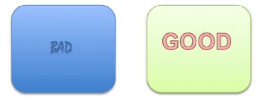
A message can get lost if the viewer can’t easily visually separate the design elements. Contrast is the primary factor for legibility whereby poor contrast reduces legibility and good contrast improves it. It is of good design practice to make sure there’s plenty of contrast between the background and the foreground colors, especially for text. Shown below is an example of good contrast versus poor contrast.
Text Sizes
When designing content, it is of good design practice to always keep in mind the average distance between the viewer and the screen. Good design practice dictates that large size text should be used to improve readability at a distance. Therefore, when designing an application in Appspace, it is recommended to use text fonts of 40 to 50 pixels in size for comfortable reading.
Text Styles
Words on a screen serve one sole purpose, to communicate a clear and concise message. Maintain font consistency in a single design and use italics sparingly, as it reduces readability at distances. “Serif” like fonts (Times New Roman) have small strokes on each character and are better suited for long texts as they help the human eye track one word to the next. “Sans-serif” fonts (Arial) do not have small strokes on each character and are thus better suited for short messages.
Fonts
Appspace provides users with a collection of fonts that can be used when designing an application. Some of the more common fonts used in Appspace are Arial, Century Gothic, Comic Sans MS, Georgia, Tahoma, Times New Roman, Trebuchet MS and Verdana. Note that in order for a device to display the font, it has to have that font installed on that said device.
At times, digital video includes typographic representations. These might be the opening titles from a TV newscast or translated subtitles from a foreign film. Should the need for a custom font arise, the user will have to do one of the options listed below:
Install the font onto the device
Should the device support font installation; a user can proceed to install the custom font onto that device. The font should be in either True Type Font (TTF) or Open Type Font (OTF) file format.
Embed Fonts into SWF Animations
When a font is embedded within a Shockwave Flash (SWF) file in the application, the corresponding font will be rendered correctly although the font is not installed on the device.
Fonts Specified in Third-party Website HTML or CSS
Cisco devices use factory-installed software and fonts to render webpage text for applications. Those devices use font substitution methods when they render a webpage that is designed to use unavailable fonts.
Colours and Perception
Proper colour selection creates good contrasts between the foreground elements such as text and background design. The three basic colours used for colour mixing are red, green and blue. The human eye is most sensitive to green, with red coming in second, and the least sensitive being blue.
Three key points to consider when designing an application are:
- Use contrasting colours – Light on dark or dark on light.
- Understand what the target viewer’s eye is drawn to – Selecting a colour palette that will be more appealing the target viewer.
- Control the impact of information – Selectively displaying key pieces of information instead of flooding the display with information.
Focus
Using focus techniques to guide the eye to critical information first will create a visual hierarchy in the design. Headlines, graphics, bright colors and high contrast items will pull the eye to them. Size also tells the audience the priority of design elements, as does their arrangement, angles and open space.
Previewing
When previewing the application, consider where your eye goes to first and adjust the design to ensure that the most important elements take priority. Be sure to test readability and visibility before assigning the application to an endpoint. Have at least five feet of distance between yourself and the monitor as this simulates your target audience’s perspective for viewing screens at a distance.
Content Specification
This section covers the specifications for supported media types that can be used when designing an application in Appspace.
Image Formats
To ensure the highest display quality, it is important to pay attention to the size and resolution of images and videos being displayed. For optimum clarity, ensure images are at least 72dpi when being viewed at 100%. Using low-resolution images will resort in pixilation and distortion.
Supported Image Compression Formats:
- PNG – used when smaller sized files are needed with no loss in quality. PNG-24 format is the preferred format to get the best results for images with text, large blocks of colour or simple shapes. PNG-24 also offers the best results when using images that contain transparency.
- Non-progressive JPEG – Used for photographs and other high colour images. JPEG is not suitable for images with text, large blocks of colour or simple shapes as crisp lines may appear blurry.
Note
- PNG rendering may be slow on the DMP4310G and 4400G, therefore JPEG is recommended as the preferred format for these devices.
- JPEG images should utilise the RGB profile.
Audio and Video Formats
Videos should be at minimum, 720p (1280×720 pixels) at 30 frames per second although a 1080p (1920×1080 pixels) video is preferred. Videos with an aspect ratio of 16:9 are encouraged. Note that other formats are supported but are device dependent.
Recommended Video Compression Formats
- MPEG-4 Part 2 or Part 10/H.264 codec
- WMV 9, VC-1 (Simple or Main profile)
Recommended Audio Formats
- MP3 (DMP4310 and DMP4400 do not support MP3 with embedded cover art)
- AAC
Note
The video compression formats listed above are only supported on firmware 5.4 (and above) for DMPs, firmware 1.4 (and above) for Edge 300 and firmware 1.0.5 (and above) for Edge 340.
SWF Animations
Rather than crashing when they run low on memory, the devices are designed to restart automatically. This behavior clears their memory and causes downtime of much less than 1 minute, as opposed to the lengthy downtime that a hard crash would cause. In the rare cases when devices do run out of memory and restart automatically, SWF files are almost always responsible. The known scenarios when this can occur are as follows.
- The SWF file size is greater than 500KB. Larger SWF files do work correctly in most cases, but it is recommended as a best practice that SWF files be limited in size. Smaller files are far less likely to be burdensome to the devices.
- The SWF file uses bitmapped image files outside itself that have a very large file size, either individually or collectively. Any bitmapped image files that you use in the production of an SWF file should be small files. It is important to note that merely reducing the height and width of the flash file’s placeholder on the canvas in Adobe Flash (or any similar authoring tool) will not reduce the actual file size.
- The web page displayed uses too many embedded SWF files.
Additionally, it is recommended to use the following guidelines to create SWF files.
- The resolution of the SWF can be up to 1920 x 1080 when animations within the SWF are small and are restricted to a 640×480 region.
- Avoid redrawing of the whole screen in Flash animations.
- Distributed movements (on different parts of the screen) may affect performance than localised movements.
Note
The SWF animations content creation guidelines are taken from Cisco’s best practices document and the cited values are approximate. Do not deploy any design until you have tested its playback performance on at least one device.
Transparency Considerations for SWF Animations
- Transparent SWF files are not supported.
- Alpha transparency is most effective for objects whose dimensions are less than 200px by 150px.
Performance Considerations for SWF Animations
All complex SWF animations will require CPU power to render. Overshooting the CPU capacity of any device will result in severe performance issues. These following guidelines will help to avoid or reduce SWF complexities to improve playback performance.
Dimensions
- Ensure that each animation is smaller than 640 x 480 pixels.
- Ensure that none of the animations contain embedded or referenced objects of dimensions greater than 640 x 480 pixels.
Timeline Segments
- Ensure that there’s only one animation effect per timeline segment. For example, do not fade an object in a segment where that same object is to be resized.
- When using an animation effect to resize an object, avoid changing its dimensions by more than 10 percent per timeline segment.
Other Tips
- Split animations apart by function into smaller files. For example, instead of combining a text ticker and a slideshow into one animation file, separate them into two animation files.
- Avoid combining animations with multiple or complex JavaScripts.
- Avoid shape-tweening.
- Animation frame rates should be set to 12 frames per second (fps) or less.
- General playback performance can be affected by file size and the speed of motion within the flash animation. If the playback appears choppy or does not load properly, it is recommended to export the SWF file as an MPEG file and be imported into Appspace as a video. This will ensure smooth playback of the Flash media.
Note
DMP 4310G or 4400G with firmware 5.4 does not support audio in Shockwave Flash media.
Installed Flash Version on Appspace Supported Devices
- DMP 4310G runs FlashLite 3.1, which supports ActionScript 2.
- DMP 4400G runs Flash 10, which supports ActionScript 2 and 3.
- Edge 300 runs Flash 10.2, which supports ActionScript 2 and 3.
- Edge 340 runs Flash 11, which supports ActionScript 2 and 3.
HTML and JavaScript
It is not recommended to use JavaScript code generators such as Microsoft Word or ASP.NET for DMPs as they produce elaborate yet wasteful code that can deplete memory. When a DMP interprets such code, memory usage grows significantly and the DMP’s performance degrades.
Other restrictions
- Avoid using more than two JavaScript timers per playlist.
- Avoid refreshing webpages frequently on DMPs. It is recommended that AJAX or Shockwave Flash (SWF) be used to load dynamic content.
- URLs for media assets should not be longer than 128 characters and must not contain any spaces. It should also use ISO/IEC-8859 (Latin-1) character encoding.
- DMPs are not able to render webpages from servers with self-signed certificates.
- Some webpages with embedded SWF contents use JavaScript code that includes multiple getElementByld() calls or multiple timers such as setDuration or setInterval which can cause the DMP to run out of memory and reboot. This may also cause the DMP to render a white screen. These cases are the combined result of Flash 7 memory leak and an over-reliance on JavaScripts.
Application Design Best Practices
The early stages of application design typically involve wireframes and design elements planning. The visual layout of the application begins with discussions and information gathered from client which is translated into a wireframe. The wireframe is then used to create a mockup based on the requirement analysis.
Transferring Mockups to Layout Design
A mockup is a visual representation of an application. It defines the entire application layout including organizing the design elements in layers. A mockup typically includes information such as:
- layout resolution
- number of content placeholders
- content placeholder’s size
- content placeholder’s position
- content type
In Appspace, widgets act as content placeholders in an application’s layout. Among the most commonly used widgets are media zones, clock, text and text ticker widgets.
Using Multiple Layouts
When designing an application, consider spreading the design elements across multiple layouts. A carefully organised design element does not overwhelm the audience with too many options. It also allows structured grouping of related information and functions. As a rule of thumb, an application should have a limitation of six to ten layouts.
Using Widgets
Widgets are the building blocks of applications that describe data and visual elements. Almost all applications, both passive and interactive, can be created with a key selection of widgets.
Reusing Widgets
If you repeatedly use the same type of widgets in a specific way throughout the application, consider reusing the widgets across multiple layouts. Appspace allows user to reuse widgets from other layouts as this feature helps to greatly reduce the widget’s load time.
Copying Widgets
Copying widgets can be very helpful. When a widget is copied, its settings and properties will be copied as well. This reduces the need to manually configure each copy of the widget. Using this feature is particularly useful if you are adding the same widget type in the one single layout during design phase.
Widget Layering
Adding widgets in layers will create a sense of depth. Layering is a process of grouping widgets so that it shares the same plane on the screen. In Appspace, the order of layered widgets can be changed easily.
Layout Scheduling vs Playlist Scheduling
To achieve maximum signage flexibility when designing an application, scheduling should be used. The most commonly used type of schedules are layout and playlist scheduling. A planned layout or playlist schedule conveys time-sensitive messages at a pre-defined time.
Using Tag Rules
Tag rules provide a quick and simple way of targeting content playback to specific groups of players running the same application. By using player tags, playback of content in a media zone widget can be filtered. A tag rule can be applied to a specific content in a playlist or schedule. This eliminates the need to create the multiple applications catering for different sets of content.